30.2 Visualization
Before diving into estimation, it is always wise to (i) confirm the treatment pattern and (ii) eyeball the outcomes.
The panelView package offers quick heatmaps and outcome traces that make these checks painless.
30.2.1 Data check
library(panelView)
library(fixest)
library(tidyverse)
base_stagg <- fixest::base_stagg |>
    # treatment status
    dplyr::mutate(treat_stat = dplyr::if_else(time_to_treatment < 0, 0, 1)) |>
    select(id, year, treat_stat, y)

head(base_stagg)
#>   id year treat_stat           y
#> 2 90    1          0  0.01722971
#> 3 89    1          0 -4.58084528
#> 4 88    1          0  2.73817174
#> 5 87    1          0 -0.65103066
#> 6 86    1          0 -5.33381664
#> 7 85    1          0  0.49562631
30.2.2 Treatment Assignment Heatmap
Figure 30.1 shows the heatmap of treatment status for each unit over 10 years.
panelView::panelview(
    y ~ treat_stat,
    data = base_stagg,
    index = c("id", "year"),
    xlab = "Year",
    ylab = "Unit",
    display.all = F,
    gridOff = T,
    by.timing = T
)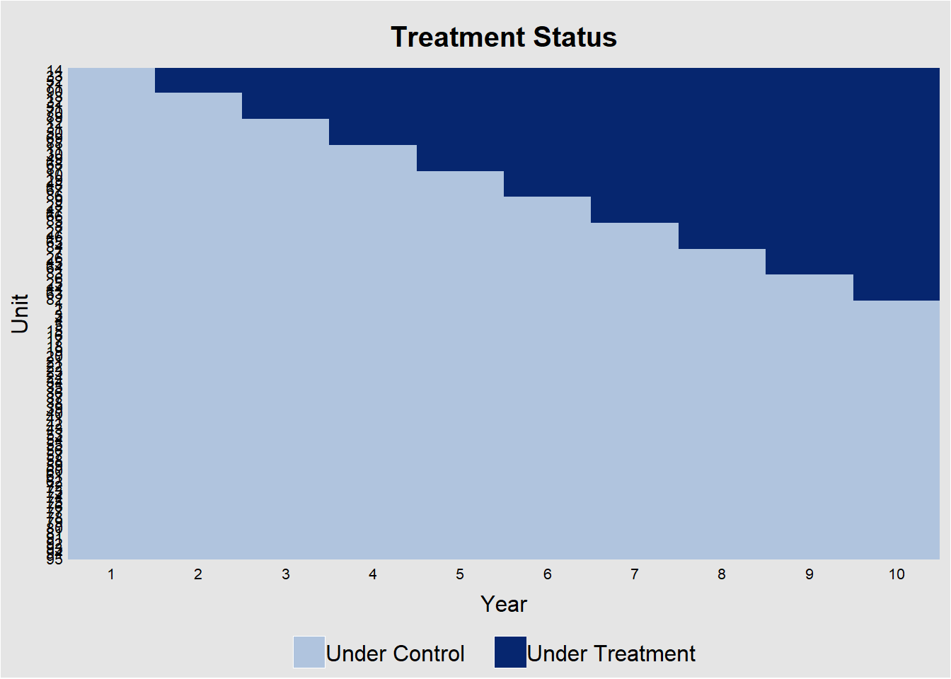
Figure 30.1: Treatment Assignment Over Time by Unit
The diagonal “step” confirms that not all units adopt at once. This would be a perfect for a staggered-DiD design. Horizontal segments without a color change indicate units that never adopt.
Alternatively, specifying the outcome and treatment status will also return the exact figure (Figure 30.2)
# alternatively specification
panelView::panelview(
    Y = "y",
    D = "treat_stat",
    data = base_stagg,
    index = c("id", "year"),
    xlab = "Year",
    ylab = "Unit",
    display.all = F,
    gridOff = T,
    by.timing = T
)
Figure 30.2: Staggered Treatment Timing Across Units
30.2.3 Raw Outcome Trajectories
Figure 30.3 shows the trajectories of different cohorts overtime.
# Average outcomes for each cohort
panelView::panelview(
    data = base_stagg,
    Y = "y",
    D = "treat_stat",
    index = c("id", "year"),
    by.timing = T,
    display.all = F,
    type = "outcome",
    by.cohort = T
)
#> Number of unique treatment histories: 10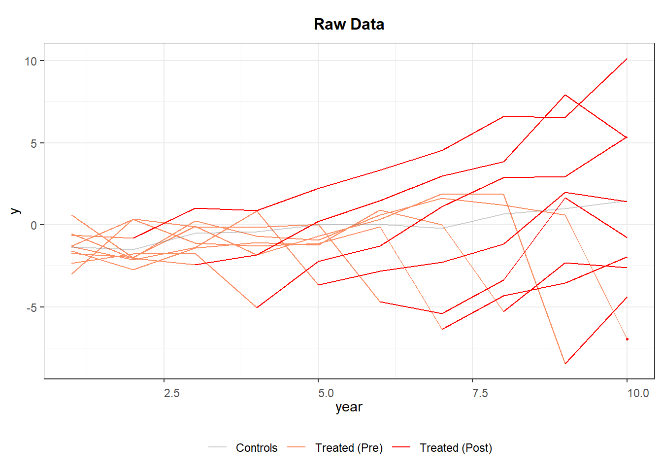
Figure 30.3: Raw Panel Data by Treatment Status Over Time
If the red segments diverge immediately after treatment while the orange segments blend with gray beforehand, the visual evidence is supportive of a treatment effect and parallel pre-trends.
30.2.4 Event-time Averages
A more focused diagnostic is to plot the average outcome in event time (years relative to first treatment) (Figure 30.4).
base_stagg |>
    group_by(event_time = year - min(year[treat_stat == 1])) |>
    summarise(y_mean = mean(y),
              se     = sd(y) / sqrt(n())) |>
    ggplot(aes(event_time, y_mean)) +
    geom_line(color = "#377eb8", linewidth = 1) +
    geom_ribbon(aes(ymin = y_mean - se, ymax = y_mean + se),
                fill = "#377eb8",
                alpha = .2) +
    geom_vline(xintercept = 0, linetype = "dashed") +
    labs(x = "Years relative to treatment",
         y = "Mean outcome (y)",
         title = "Event-time plot: do outcomes change at treatment onset?") +
    theme_minimal()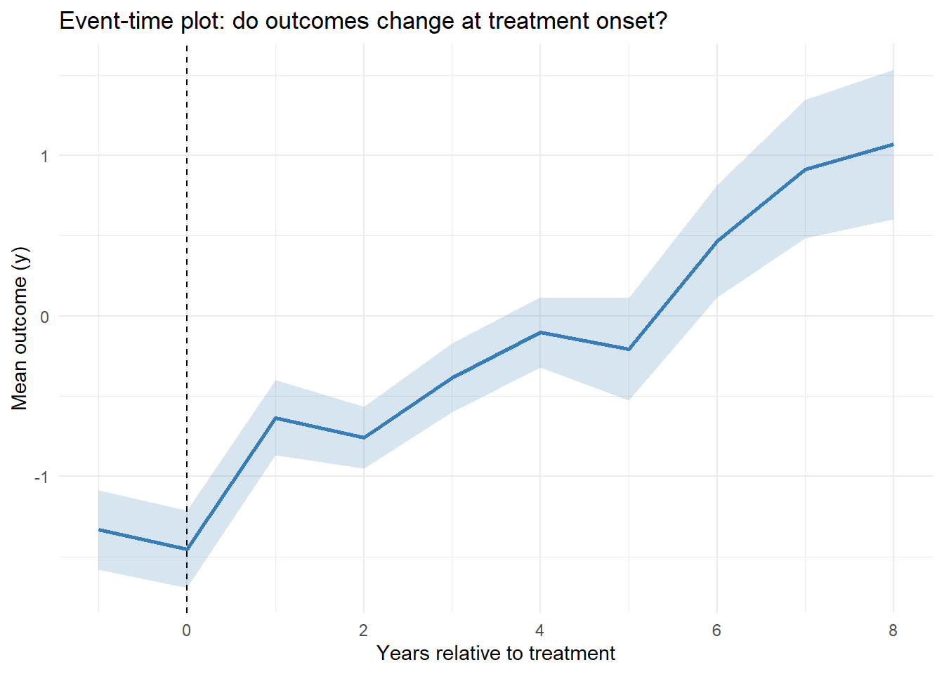
Figure 30.4: Event Time Averages
A flat pre-trend (negative event times) and a noticeable jump at event-time 0 support the identifying assumptions for staggered DiD.