42.2 Specification Curve Analysis
Specification curve analysis (also known as multiverse analysis or the specification robustness graph) provides a systematic way to examine how results vary across a large set of defensible specifications. Rather than reporting a single “preferred” specification, this approach acknowledges that multiple specifications may be equally justifiable and examines the distribution of estimates across all of them.
42.2.1 Conceptual Foundation
The specification curve approach was formalized by Simonsohn, Simmons, and Nelson (2020), though similar ideas have appeared under various names in the literature. The key insight is that researchers make many decisions when specifying a model: which controls to include, which fixed effects to add, how to cluster standard errors, etc. And these decisions can be viewed as creating a “multiverse” of possible specifications. By systematically varying these choices and examining the resulting distribution of estimates, we can assess whether our main conclusion depends on arbitrary specification choices.
A specification curve typically consists of two panels:
- The coefficient panel: Shows the point estimate and confidence interval for the main variable of interest across all specifications, typically sorted by coefficient magnitude
- The specification panel: Shows which modeling choices were made in each specification (e.g., which controls were included, which fixed effects were used)
This visualization makes it easy to see whether results are driven by particular specification choices and whether the finding is robust across the specification space.
42.2.2 The starbility Package
The starbility package provides a flexible and user-friendly implementation of specification curve analysis. It works seamlessly with various model types and allows for sophisticated customization.
42.2.2.1 Installation and Setup
# Install from GitHub
# devtools::install_github('https://github.com/AakaashRao/starbility')
library(starbility)

# Load other required packages
library(tidyverse)  # For data manipulation and visualization
library(lfe)        # For fixed effects models
library(broom)      # For tidying model output
library(cowplot)    # For combining plots
42.2.2.2 Basic Specification Curve with Multiple Controls
Let’s start with an example using the diamonds dataset. This example demonstrates how to systematically vary control variables and visualize the resulting specification curve.
library(tidyverse)
library(starbility)
library(lfe)

# Load and prepare data
data("diamonds")
set.seed(43)  # For reproducibility

# Create a subset for computational efficiency
# In practice, you'd use your full dataset
indices = sample(1:nrow(diamonds),
                 replace = FALSE,
                 size = round(nrow(diamonds) / 20))
diamonds = diamonds[indices, ]

# Create additional variables for demonstration
diamonds$high_clarity = diamonds$clarity %in% c('VS1','VVS2','VVS1','IF')
diamonds$log_price = log(diamonds$price)
diamonds$log_carat = log(diamonds$carat)
Now let’s define our specification universe. The key is to think carefully about which specification choices are defensible and should be explored:
# Base controls: These are included in ALL specifications
# Use this for controls that you believe should always be included based on theory
base_controls = c(
  'Diamond dimensions' = 'x + y + z'  # Physical dimensions
)

# Permutable controls: These will be included in all possible combinations
# These are controls where theory doesn't give clear guidance on inclusion
perm_controls = c(
  'Depth' = 'depth',
  'Table width' = 'table'
)

# Permutable fixed effects: Different types of fixed effects to explore
# Useful when you have multiple ways to control for unobserved heterogeneity
perm_fe_controls = c(
  'Cut FE' = 'cut',
  'Color FE' = 'color'
)

# Non-permutable fixed effects: Alternative specifications (only one included at a time)
# Use this when you have mutually exclusive ways of controlling for something
nonperm_fe_controls = c(
  'Clarity FE (granular)' = 'clarity',
  'Clarity FE (binary)' = 'high_clarity'
)

# If you want to explore instrumental variables specifications
instruments = 'x + y + z'

# Add sample weights for robustness
diamonds$sample_weights = runif(n = nrow(diamonds))
42.2.2.3 Custom Model Functions
One of the most powerful features of starbility is the ability to use custom model functions. This allows you to implement your preferred estimation approach, including custom standard errors, specific inference procedures, or alternative confidence intervals.
# Custom function for felm models with robust standard errors
# This function must return a vector of: c(coefficient, p-value, upper CI, lower CI)
starb_felm_custom = function(spec, data, rhs, ...) {
  # Convert specification string to formula
  spec = as.formula(spec)

  # Estimate the model using lfe::felm
  # felm is particularly useful for models with multiple fixed effects
  model = lfe::felm(spec, data = data) %>%
    broom::tidy()  # Convert to tidy format

  # Extract results for the variable of interest (rhs)
  row  = which(model$term == rhs)
  coef = model[row, 'estimate'] %>% as.numeric()
  se   = model[row, 'std.error'] %>% as.numeric()
  p    = model[row, 'p.value'] %>% as.numeric()

  # Calculate confidence intervals
  # Here we use 99% CI for more conservative inference
  z = qnorm(0.995)  # 99% confidence level
  upper_ci = coef + z * se
  lower_ci = coef - z * se

  # For one-tailed tests, divide p-value by 2
  # Remove this if you want two-tailed p-values
  p_onetailed = p / 2

  return(c(coef, p_onetailed, upper_ci, lower_ci))
}

# Alternative: Custom function with heteroskedasticity-robust SEs
starb_lm_robust = function(spec, data, rhs, ...) {
  spec = as.formula(spec)

  # Estimate with HC3 robust standard errors
  model = lm(spec, data = data)
  robust_se = sandwich::vcovHC(model, type = "HC3")

  # Use lmtest for robust inference
  coef_test = lmtest::coeftest(model, vcov = robust_se)

  row  = which(rownames(coef_test) == rhs)
  coef = coef_test[row, 'Estimate']
  se   = coef_test[row, 'Std. Error']
  p    = coef_test[row, 'Pr(>|t|)']

  z = qnorm(0.975)  # 95% confidence level
  return(c(coef, p, coef + z * se, coef - z * se))
}
42.2.2.4 Creating the Specification Curve
Now we can generate our specification curve with all the bells and whistles (Figure 42.1)
# Generate specification curve
# This will create plots showing how the coefficient varies across specifications
plots = stability_plot(
    data = diamonds,
    lhs = 'price',           # Dependent variable
    rhs = 'carat',           # Main independent variable of interest
    model = starb_felm_custom,  # Use our custom model function

    # Clustering and weights
    cluster = 'cut',            # Cluster standard errors by cut
    weights = 'sample_weights', # Use sample weights

    # Control variable specifications
    base = base_controls,       # Always included
    perm = perm_controls,       # All combinations
    perm_fe = perm_fe_controls, # All combinations of these FEs

    # Alternative: Use non-permutable FE (only one at a time)
    # nonperm_fe = nonperm_fe_controls,
    # fe_always = FALSE,  # Set to FALSE to include specs without any FEs

    # Instrumental variables (if needed)
    # iv = instruments,

    # Sorting and display options
    sort = "asc-by-fe",  # Options: "asc", "desc", "asc-by-fe", "desc-by-fe"

    # Visual customization
    error_geom = 'ribbon',  # Display error bands as ribbons (alternatives: 'linerange', 'none')
    # error_alpha = 0.2,    # Transparency of error bands
    # point_size = 1.5,     # Size of coefficient points
    # control_text_size = 10,  # Size of control labels

    # For datasets with fewer specifications, you might want:
    # control_geom = 'circle',  # Use circles instead of rectangles
    # point_size = 2,
    # control_spacing = 0.3,

    # Customize the y-axis range if needed
    # coef_ylim = c(-5000, 35000),

    # Adjust spacing between panels
    # trip_top = 3,

    # Relative height of coefficient panel vs control panel
    rel_height = 0.6
)
Figure 42.1: Specification curve for the effect of carat on price
The specification curve uses color coding to indicate statistical significance:
- Red: \(p < 0.01\) (highly significant)
- Green: \(p < 0.05\) (significant)
- Blue: \(p < 0.1\) (marginally significant)
- Black: \(p > 0.1\) (not significant)
This color scheme makes it easy to see at a glance whether your finding is robust across specifications, or whether significance depends on particular specification choices.
42.2.3 Advanced Specification Curve Techniques
42.2.3.1 Step-by-Step Control of the Process
For maximum flexibility, starbility allows you to control each step of the specification curve generation process. This is useful when you want to modify the grid of specifications, use custom model functions, or create highly customized visualizations.
# Ensure high_clarity variable exists
diamonds$high_clarity = diamonds$clarity %in% c('VS1','VVS2','VVS1','IF')

# Redefine controls for this example
base_controls = c(
  'Diamond dimensions' = 'x + y + z'
)

perm_controls = c(
  'Depth' = 'depth',
  'Table width' = 'table'
)

perm_fe_controls = c(
  'Cut FE' = 'cut',
  'Color FE' = 'color'
)

nonperm_fe_controls = c(
  'Clarity FE (granular)' = 'clarity',
  'Clarity FE (binary)' = 'high_clarity'
)

# Step 1: Create the control grid
# This generates all possible combinations of controls
grid1 = stability_plot(
  data = diamonds,
  lhs = 'price',
  rhs = 'carat',
  perm = perm_controls,
  base = base_controls,
  perm_fe = perm_fe_controls,
  nonperm_fe = nonperm_fe_controls,
  run_to = 2  # Stop after creating the grid
)

# Examine the grid structure
knitr::kable(grid1 %>% head(10))| Diamond dimensions | Depth | Table width | Cut FE | Color FE | np_fe |
|---|---|---|---|---|---|
| 1 | 0 | 0 | 0 | 0 | |
| 1 | 1 | 0 | 0 | 0 | |
| 1 | 0 | 1 | 0 | 0 | |
| 1 | 1 | 1 | 0 | 0 | |
| 1 | 0 | 0 | 1 | 0 | |
| 1 | 1 | 0 | 1 | 0 | |
| 1 | 0 | 1 | 1 | 0 | |
| 1 | 1 | 1 | 1 | 0 | |
| 1 | 0 | 0 | 0 | 1 | |
| 1 | 1 | 0 | 0 | 1 |
# Each row represents a different specification
# Columns indicate which controls/FEs are included (1 = yes, 0 = no)

# Step 2: Generate model expressions
# This creates the actual formula for each specification
grid2 = stability_plot(
  grid = grid1,  # Use the grid from step 1
  data = diamonds,
  lhs = 'price',
  rhs = 'carat',
  perm = perm_controls,
  base = base_controls,
  run_from = 2,  # Start from step 2
  run_to = 3     # Stop after generating expressions
)

# View the formulas
knitr::kable(grid2 %>% head(10))| Diamond dimensions | Depth | Table width | np_fe | expr |
|---|---|---|---|---|
| 1 | 0 | 0 | 0 | price~carat+x+y+z|0|0|0 |
| 1 | 1 | 0 | 0 | price~carat+x+y+z+depth|0|0|0 |
| 1 | 0 | 1 | 0 | price~carat+x+y+z+table|0|0|0 |
| 1 | 1 | 1 | 0 | price~carat+x+y+z+depth+table|0|0|0 |
| 1 | 0 | 0 | 0 | price~carat+x+y+z|0|0|0 |
| 1 | 1 | 0 | 0 | price~carat+x+y+z+depth|0|0|0 |
| 1 | 0 | 1 | 0 | price~carat+x+y+z+table|0|0|0 |
| 1 | 1 | 1 | 0 | price~carat+x+y+z+depth+table|0|0|0 |
| 1 | 0 | 0 | 0 | price~carat+x+y+z|0|0|0 |
| 1 | 1 | 0 | 0 | price~carat+x+y+z+depth|0|0|0 |
# Now each row has an 'expr' column with the full model formula

# Step 3: Estimate all models
# This runs the actual regressions
grid3 = stability_plot(
  grid = grid2,
  data = diamonds,
  lhs = 'price',
  rhs = 'carat',
  perm = perm_controls,
  base = base_controls,
  run_from = 3,
  run_to = 4
)

# View estimation results
knitr::kable(grid3 %>% head(10))| Diamond dimensions | Depth | Table width | np_fe | expr | coef | p | error_high | error_low |
|---|---|---|---|---|---|---|---|---|
| 1 | 0 | 0 | 0 | price~carat+x+y+z|0|0|0 | 10461.86 | p<0.01 | 11031.84 | 9891.876 |
| 1 | 1 | 0 | 0 | price~carat+x+y+z+depth|0|0|0 | 10808.25 | p<0.01 | 11388.81 | 10227.683 |
| 1 | 0 | 1 | 0 | price~carat+x+y+z+table|0|0|0 | 10423.42 | p<0.01 | 10992.00 | 9854.849 |
| 1 | 1 | 1 | 0 | price~carat+x+y+z+depth+table|0|0|0 | 10851.31 | p<0.01 | 11428.58 | 10274.037 |
| 1 | 0 | 0 | 0 | price~carat+x+y+z|0|0|0 | 10461.86 | p<0.01 | 11031.84 | 9891.876 |
| 1 | 1 | 0 | 0 | price~carat+x+y+z+depth|0|0|0 | 10808.25 | p<0.01 | 11388.81 | 10227.683 |
# Now includes coefficient estimates, p-values, and confidence intervals

# Step 4: Prepare data for plotting
# This creates the two dataframes needed for visualization
dfs = stability_plot(
  grid = grid3,
  data = diamonds,
  lhs = 'price',
  rhs = 'carat',
  perm = perm_controls,
  base = base_controls,
  run_from = 4,
  run_to = 5
)

coef_grid = dfs[[1]]      # Data for coefficient panel
control_grid = dfs[[2]]   # Data for control specification panel

knitr::kable(coef_grid %>% head(10))| Diamond dimensions | Depth | Table width | np_fe | expr | coef | p | error_high | error_low | model |
|---|---|---|---|---|---|---|---|---|---|
| 1 | 0 | 0 | 0 | price~carat+x+y+z|0|0|0 | 10461.86 | p<0.01 | 11031.84 | 9891.876 | 1 |
| 1 | 1 | 0 | 0 | price~carat+x+y+z+depth|0|0|0 | 10808.25 | p<0.01 | 11388.81 | 10227.683 | 2 |
| 1 | 0 | 1 | 0 | price~carat+x+y+z+table|0|0|0 | 10423.42 | p<0.01 | 10992.00 | 9854.849 | 3 |
| 1 | 1 | 1 | 0 | price~carat+x+y+z+depth+table|0|0|0 | 10851.31 | p<0.01 | 11428.58 | 10274.037 | 4 |
| 1 | 0 | 0 | 0 | price~carat+x+y+z|0|0|0 | 10461.86 | p<0.01 | 11031.84 | 9891.876 | 5 |
| 1 | 1 | 0 | 0 | price~carat+x+y+z+depth|0|0|0 | 10808.25 | p<0.01 | 11388.81 | 10227.683 | 6 |
| 1 | 0 | 1 | 0 | price~carat+x+y+z+table|0|0|0 | 10423.42 | p<0.01 | 10992.00 | 9854.849 | 7 |
| 1 | 1 | 1 | 0 | price~carat+x+y+z+depth+table|0|0|0 | 10851.31 | p<0.01 | 11428.58 | 10274.037 | 8 |
| 1 | 0 | 0 | 0 | price~carat+x+y+z|0|0|0 | 10461.86 | p<0.01 | 11031.84 | 9891.876 | 9 |
| 1 | 1 | 0 | 0 | price~carat+x+y+z+depth|0|0|0 | 10808.25 | p<0.01 | 11388.81 | 10227.683 | 10 |
# Step 5: Create the plot panels
# This generates the two ggplot objects
panels = stability_plot(
  data = diamonds,
  lhs = 'price',
  rhs = 'carat',
  coef_grid = coef_grid,
  control_grid = control_grid,
  run_from = 5,
  run_to = 6
)

# Step 6: Combine and display
# Final step to create the complete visualization
final_plot = stability_plot(
  data = diamonds,
  lhs = 'price',
  rhs = 'carat',
  coef_panel = panels[[1]],
  control_panel = panels[[2]],
  run_from = 6,
  run_to = 7
)
42.2.3.2 Specification Curves for Non-Linear Models
Specification curve analysis is not limited to linear models. Here’s how to implement it with logistic regression (Figure 42.2).
# Create binary outcome variable
diamonds$above_med_price = as.numeric(diamonds$price > median(diamonds$price))

# Add sample weights for logit model
diamonds$weight = runif(nrow(diamonds))

# Define controls
base_controls = c('Diamond dimensions' = 'x + y + z')

perm_controls = c(
  'Depth' = 'depth',
  'Table width' = 'table',
  'Clarity' = 'clarity'
)

lhs_var = 'above_med_price'
rhs_var = 'carat'

# Step 1: Create initial grid
grid1 = stability_plot(
    data = diamonds,
    lhs = lhs_var,
    rhs = rhs_var,
    perm = perm_controls,
    base = base_controls,
    fe_always = FALSE,  # Include specifications without FEs
    run_to = 2
)

# Step 2: Manually create formulas for logit model
# The starbility package creates expressions for lm/felm by default
# For glm, we need to create our own formula structure
base_perm = c(base_controls, perm_controls)

# Create control part of formula
grid1$expr = apply(
  grid1[, 1:length(base_perm)],
  1,
  function(x) {
    paste(
      base_perm[names(base_perm)[which(x == 1)]],
      collapse = '+'
    )
  }
)

# Complete formula with LHS and RHS variables
grid1$expr = paste(lhs_var, '~', rhs_var, '+', grid1$expr, sep = '')

knitr::kable(grid1 %>% head(10))| Diamond dimensions | Depth | Table width | Clarity | np_fe | expr |
|---|---|---|---|---|---|
| 1 | 0 | 0 | 0 | above_med_price~carat+x + y + z | |
| 1 | 1 | 0 | 0 | above_med_price~carat+x + y + z+depth | |
| 1 | 0 | 1 | 0 | above_med_price~carat+x + y + z+table | |
| 1 | 1 | 1 | 0 | above_med_price~carat+x + y + z+depth+table | |
| 1 | 0 | 0 | 1 | above_med_price~carat+x + y + z+clarity | |
| 1 | 1 | 0 | 1 | above_med_price~carat+x + y + z+depth+clarity | |
| 1 | 0 | 1 | 1 | above_med_price~carat+x + y + z+table+clarity | |
| 1 | 1 | 1 | 1 | above_med_price~carat+x + y + z+depth+table+clarity |
# Step 3: Create custom logit estimation function
# This function estimates a logistic regression and extracts results
starb_logit = function(spec, data, rhs, ...) {
  spec = as.formula(spec)

  # Estimate logit model with weights, suppressing separation warning
  model = suppressWarnings(
    glm(
      spec,
      data = data,
      family = 'binomial',
      weights = data$weight
    )
  ) %>%
    broom::tidy()

  # Extract coefficient for variable of interest
  row  = which(model$term == rhs)
  coef = model[row, 'estimate'] %>% as.numeric()
  se   = model[row, 'std.error'] %>% as.numeric()
  p    = model[row, 'p.value'] %>% as.numeric()

  # Return coefficient, p-value, and 95% CI bounds
  return(c(coef, p, coef + 1.96*se, coef - 1.96*se))
}

# Generate specification curve for logit model
logit_curve = stability_plot(
  grid = grid1,
  data = diamonds,
  lhs = lhs_var,
  rhs = rhs_var,
  model = starb_logit,  # Use our custom logit function
  perm = perm_controls,
  base = base_controls,
  fe_always = FALSE,
  run_from = 3  # Start from estimation step
)
Figure 42.2: Specification Curve (Logit Curve)
42.2.3.3 Marginal Effects for Non-Linear Models
For non-linear models like logit or probit, we often want to report marginal effects (average marginal effects, AME) rather than raw coefficients, as they’re more interpretable. Here’s how to incorporate marginal effects into specification curves (Figure 42.3).
library(margins)  # For calculating marginal effects

# Enhanced logit function with marginal effects option
starb_logit_enhanced = function(spec, data, rhs, ...) {
  # Extract additional arguments
  l = list(...)
  get_mfx = ifelse(is.null(l$get_mfx), FALSE, TRUE)  # Default to FALSE

  spec = as.formula(spec)

  if (get_mfx) {
    # Calculate average marginal effects
    model = suppressWarnings(
      glm(
        spec,
        data = data,
        family = 'binomial',
        weights = data$weight
      )
    ) %>%
      margins() %>%  # Calculate marginal effects
      summary()

    # Extract AME results
    row = which(model$factor == rhs)
    coef = model[row, 'AME'] %>% as.numeric()  # Average Marginal Effect
    se   = model[row, 'SE'] %>% as.numeric()
    p    = model[row, 'p'] %>% as.numeric()
  } else {
    # Return raw coefficients (log-odds)
    model = suppressWarnings(
      glm(
        spec,
        data = data,
        family = 'binomial',
        weights = data$weight
      )
    ) %>%
      broom::tidy()

    row = which(model$term == rhs)
    coef = model[row, 'estimate'] %>% as.numeric()
    se   = model[row, 'std.error'] %>% as.numeric()
    p    = model[row, 'p.value'] %>% as.numeric()
  }

  # Use 99% confidence intervals for more conservative inference
  z = qnorm(0.995)
  return(c(coef, p, coef + z*se, coef - z*se))
}

# Generate specification curve with marginal effects
ame_curve = stability_plot(
  grid = grid1,
  data = diamonds,
  lhs = lhs_var,
  rhs = rhs_var,
  model = starb_logit_enhanced,
  get_mfx = TRUE,  # Request marginal effects
  perm = perm_controls,
  base = base_controls,
  fe_always = FALSE,
  run_from = 3
)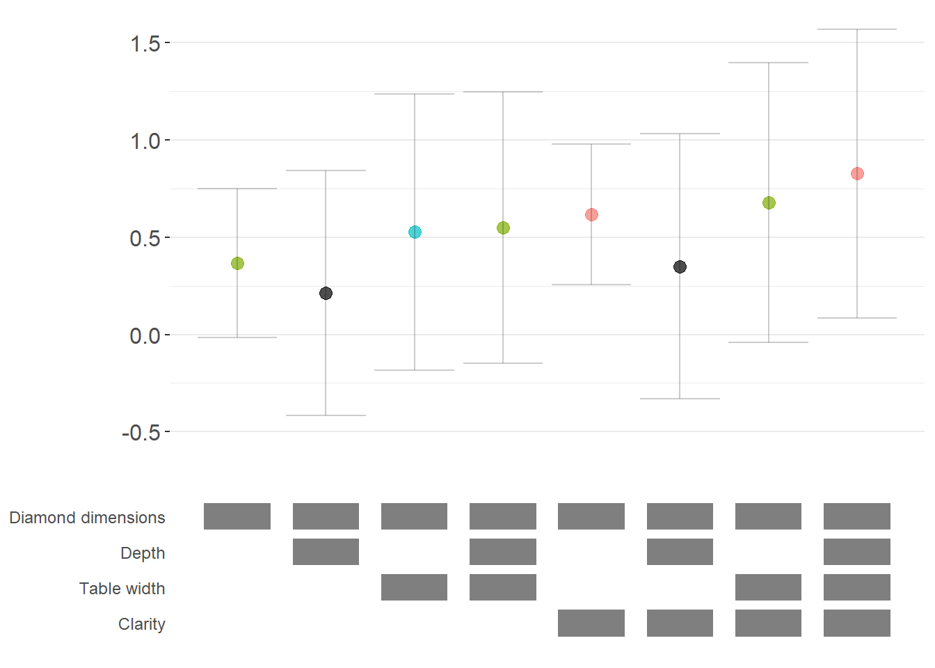
Figure 42.3: Robustness of diamond dimension effects with average marginal effects
42.2.3.4 Fully Customized Specification Curve Visualizations
When you need complete control over the appearance of your specification curve, you can extract the underlying data and create custom ggplot visualizations (Figure 42.4).
# Extract data for custom plotting
dfs = stability_plot(
  grid = grid1,
  data = diamonds,
  lhs = lhs_var,
  rhs = rhs_var,
  model = starb_logit_enhanced,
  get_mfx = TRUE,
  perm = perm_controls,
  base = base_controls,
  fe_always = FALSE,
  run_from = 3,
  run_to = 5  # Stop before plotting
)

coef_grid_logit = dfs[[1]]
control_grid_logit = dfs[[2]]

# Define plot parameters
min_space = 0.5  # Space at edges of plot

# Create highly customized coefficient plot
coef_plot = ggplot2::ggplot(
  coef_grid_logit,
  aes(
    x = model,
    y = coef,
    shape = p,
    group = p
  )
) +
  # Add confidence interval ribbons
  geom_linerange(
    aes(ymin = error_low, ymax = error_high),
    alpha = 0.75,
    size = 0.8
  ) +

  # Add coefficient points with color and shape by significance
  geom_point(
    size = 5,
    aes(col = p, fill = p),
    alpha = 1
  ) +

  # Use viridis color palette (colorblind-friendly)
  viridis::scale_color_viridis(
    discrete = TRUE,
    option = "D",
    name = "P-value"
  ) +

  # Different shapes for different significance levels
  scale_shape_manual(
    values = c(15, 17, 18, 19),
    name = "P-value"
  ) +

  # Reference line at zero
  geom_hline(
    yintercept = 0,
    linetype = 'dotted',
    color = 'red',
    size = 0.5
  ) +

  # Styling
  theme_classic() +
  theme(
    axis.text.x = element_blank(),
    axis.title = element_blank(),
    axis.ticks.x = element_blank(),
    plot.title = element_text(size = 14, face = "bold"),
    plot.subtitle = element_text(size = 11)
  ) +

  # Set axis limits
  coord_cartesian(
    xlim = c(1 - min_space, max(coef_grid_logit$model) + min_space),
    ylim = c(-0.1, 1.6)
  ) +

  # Remove redundant legends
  guides(fill = FALSE, shape = FALSE, col = FALSE) +

  # Add titles
  ggtitle('Specification Curve: Effect of Carat on Above-Median Price') +
  labs(subtitle = "Error bars represent 99% confidence intervals for average marginal effects")

# Create customized control specification plot
control_plot = ggplot(control_grid_logit) +
  # Use diamond shapes for controls
  geom_point(
    aes(x = model, y = y, fill = value),
    shape = 23,  # Diamond shape
    size = 4
  ) +

  # Black for included, white for excluded
  scale_fill_manual(values = c('#FFFFFF', '#000000')) +
  guides(fill = FALSE) +

  # Custom y-axis labels showing control names
  scale_y_continuous(
    breaks = unique(control_grid_logit$y),
    labels = unique(control_grid_logit$key),
    limits = c(
      min(control_grid_logit$y) - 1,
      max(control_grid_logit$y) + 1
    )
  ) +

  # X-axis shows specification number
  scale_x_continuous(
    breaks = c(1:max(control_grid_logit$model))
  ) +

  coord_cartesian(
    xlim = c(1 - min_space, max(control_grid_logit$model) + min_space)
  ) +

  # Minimal theme for control panel
  theme_classic() +
  theme(
    panel.grid.major.y = element_blank(),
    panel.grid.minor.y = element_blank(),
    axis.title = element_blank(),
    axis.text.y = element_text(size = 10),
    axis.ticks = element_blank(),
    axis.line = element_blank()
  )

# Combine plots vertically
cowplot::plot_grid(
  coef_plot,
  control_plot,
  rel_heights = c(1, 0.5),  # Coefficient plot gets more space
  align = 'v',
  ncol = 1,
  axis = 'b'  # Align bottom axes
)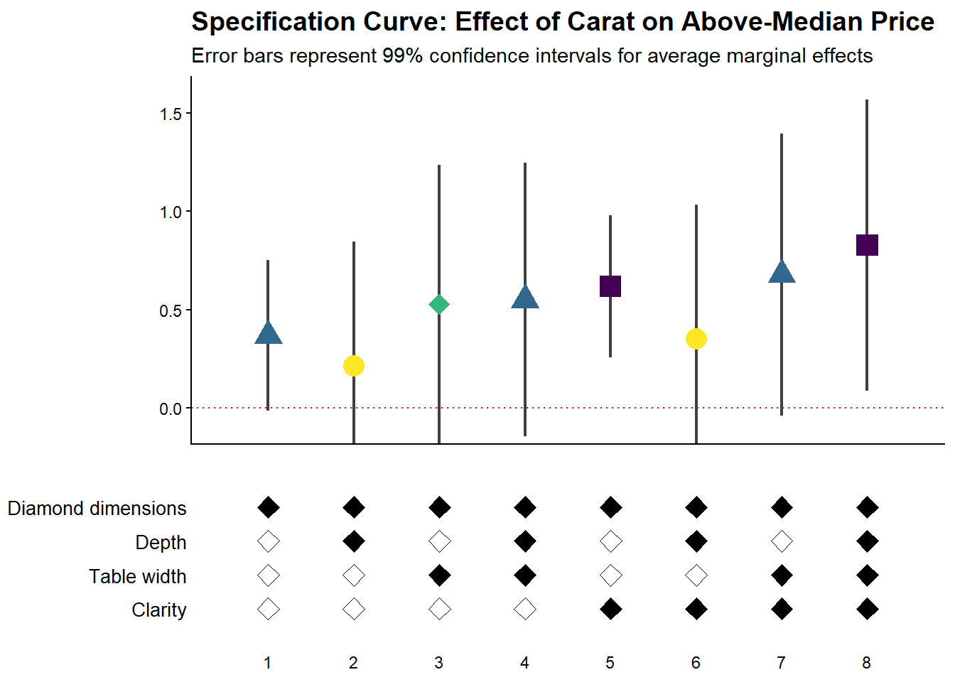
Figure 42.4: Specification curve showing the effect of carat on above-median diamond price
42.2.3.5 Comparing Multiple Model Types
A powerful extension is to compare results across different model types (e.g., logit vs. probit) in the same specification curve (Figure 42.5). This helps assess whether your findings are specific to a particular functional form assumption:
# Create custom probit estimation function
starb_probit = function(spec, data, rhs, ...) {
    # Extract additional arguments
    l = list(...)
    get_mfx = ifelse(is.null(l$get_mfx), FALSE, TRUE)

    spec = as.formula(spec)

    if (get_mfx) {
        # Calculate average marginal effects for probit
        model = suppressWarnings(
            glm(
                spec,
                data = data,
                family = binomial(link = 'probit'),  # Probit link
                weights = data$weight
            )
        ) %>%
            margins() %>%
            summary()

        row = which(model$factor == rhs)
        coef = model[row, 'AME'] %>% as.numeric()
        se   = model[row, 'SE'] %>% as.numeric()
        p    = model[row, 'p'] %>% as.numeric()
    } else {
        # Return raw probit coefficients
        model = suppressWarnings(
            glm(
                spec,
                data = data,
                family = binomial(link = 'probit'),
                weights = data$weight
            )
        ) %>%
            broom::tidy()

        row = which(model$term == rhs)
        coef = model[row, 'estimate'] %>% as.numeric()
        se   = model[row, 'std.error'] %>% as.numeric()
        p    = model[row, 'p.value'] %>% as.numeric()
    }

    # 99% confidence intervals
    z = qnorm(0.995)
    return(c(coef, p, coef + z * se, coef - z * se))
}

# Generate probit specification curve
probit_dfs = stability_plot(
    grid = grid1,
    data = diamonds,
    lhs = lhs_var,
    rhs = rhs_var,
    model = starb_probit,
    get_mfx = TRUE,
    perm = perm_controls,
    base = base_controls,
    fe_always = FALSE,
    run_from = 3,
    run_to = 5
)

# Adjust model numbers for probit to plot side-by-side with logit
coef_grid_probit = probit_dfs[[1]] %>%
    mutate(model = model + max(coef_grid_logit$model))

control_grid_probit = probit_dfs[[2]] %>%
    mutate(model = model + max(control_grid_logit$model))

# Combine logit and probit results
coef_grid_combined = bind_rows(coef_grid_logit, coef_grid_probit)
control_grid_combined = bind_rows(control_grid_logit, control_grid_probit)

# Generate combined plots
panels = stability_plot(
    coef_grid = coef_grid_combined,
    control_grid = control_grid_combined,
    data = diamonds,
    lhs = lhs_var,
    rhs = rhs_var,
    perm = perm_controls,
    base = base_controls,
    fe_always = FALSE,
    run_from = 5,
    run_to = 6
)

# Add annotations to distinguish model types
coef_plot_combined = panels[[1]] +
  # Vertical line separating logit and probit
  geom_vline(
    xintercept = max(coef_grid_logit$model) + 0.5,
    linetype = 'dashed',
    alpha = 0.8,
    size = 1
  ) +

  # Label for logit models
  annotate(
    geom = 'label',
    x = max(coef_grid_logit$model) / 2,
    y = 1.8,
    label = 'Logit models',
    size = 6,
    fill = '#D3D3D3',
    alpha = 0.7
  ) +

  # Label for probit models
  annotate(
    geom = 'label',
    x = max(coef_grid_logit$model) + max(coef_grid_probit$model) / 2,
    y = 1.8,
    label = 'Probit models',
    size = 6,
    fill = '#D3D3D3',
    alpha = 0.7
  ) +

  coord_cartesian(ylim = c(-0.5, 1.9))

control_plot_combined = panels[[2]] +
  geom_vline(
    xintercept = max(control_grid_logit$model) + 0.5,
    linetype = 'dashed',
    alpha = 0.8,
    size = 1
  )
# Display combined plot
cowplot::plot_grid(
coef_plot_combined,
control_plot_combined,
rel_heights = c(1, 0.5),
align = 'v',
ncol = 1,
axis = 'b'
)
Figure 42.5: Comparison of average marginal effects across logit and probit model specifications
42.2.4 The specr Package
The specr package provides an alternative implementation of specification curve analysis that focuses on concise specifications of the model space. Instead of defining a custom estimation function, the analyst specifies the sets of possible outcomes, focal predictors, controls, and sample restrictions. The package then enumerates all admissible specifications, estimates them, and offers summary and plotting methods.
In contrast to starbility, which is designed around user-supplied estimation functions and highly customized plotting, specr aims for a compact workflow that covers a broad range of standard models.
42.2.4.1 Preparing the Diamonds Example
To keep the exposition comparable to the starbility example, the same diamonds data are used. A subsample is created for speed, and log transformed variables are added to illustrate how specr can handle multiple outcomes and focal predictors.
library(tidyverse)
library(specr)

# Load data
data("diamonds", package = "ggplot2")

set.seed(43)

# Subsample for computational convenience
indices = sample(
  x       = seq_len(nrow(diamonds)),
  size    = round(nrow(diamonds) / 20),
  replace = FALSE
)

diamonds_specr = diamonds[indices, ] |>
  mutate(
    high_clarity = clarity %in% c("VS1", "VVS2", "VVS1", "IF"),
    log_price    = log(price),
    log_carat    = log(carat)
  )
The key idea is now to describe the specification universe in terms of:
- possible outcome variables,
- possible focal predictors,
- a set of optional controls that may or may not enter the model, and
- optional sample restrictions.
specr will then traverse this design and estimate all corresponding models.
42.2.4.2 Defining and Running the Specification Curve
The central function in the package is typically called via
where
yis a vector of outcome variable names,xis a vector of focal predictor names,modelspecifies the estimation method (for example"lm"for linear regression),controlsis a vector of candidate control variables, andsubsetsis an optional list that encodes sample restrictions.
The example below sets up a relatively rich specification universe:
- outcomes: either
priceorlog_price, - focal predictor: either
caratorlog_carat, - controls: any subset of seven potential covariates.
This already yields a sizable number of specifications and illustrates how quickly the design space expands.
specs_diamonds <- specr::setup(
  data     = diamonds_specr,
  y        = c("price", "log_price"),
  x        = c("carat", "log_carat"),
  model    = "lm",
  controls = c("x", "y", "z", "cut", "color")
) |>
  specr::specr()

# Inspect the resulting object
summary(specs_diamonds)
#> Results of the specification curve analysis
#> -------------------
#> Technical details:
#>
#>   Class:                          specr.object -- version: 1.0.0
#>   Cores used:                     1
#>   Duration of fitting process:    2.73 sec elapsed
#>   Number of specifications:       128
#>
#> Descriptive summary of the specification curve:
#>
#>  median    mad       min      max   q25     q75
#>    1.49 171.55 -15162.63 11362.39 -0.91 6432.23
#>
#> Descriptive summary of sample sizes:
#>
#>  median  min  max
#>    2697 2697 2697
#>
#> Head of the specification results (first 6 rows):
#>
#> # A tibble: 6 × 24
#>   x     y     model controls      subsets formula   estimate std.error statistic
#>   <chr> <chr> <chr> <chr>         <chr>   <glue>       <dbl>     <dbl>     <dbl>
#> 1 carat price lm    no covariates all     price ~ …    7710.      62.3     124.
#> 2 carat price lm    x             all     price ~ …   10340.     286.       36.2
#> 3 carat price lm    y             all     price ~ …    9815.     282.       34.8
#> 4 carat price lm    z             all     price ~ …    9345.     230.       40.6
#> 5 carat price lm    cut           all     price ~ …    7816.      62.7     125.
#> 6 carat price lm    color         all     price ~ …    8018.      63.2     127.
#> # ℹ 15 more variables: p.value <dbl>, conf.low <dbl>, conf.high <dbl>,
#> #   fit_r.squared <dbl>, fit_adj.r.squared <dbl>, fit_sigma <dbl>,
#> #   fit_statistic <dbl>, fit_p.value <dbl>, fit_df <dbl>, fit_logLik <dbl>,
#> #   fit_AIC <dbl>, fit_BIC <dbl>, fit_deviance <dbl>, fit_df.residual <dbl>,
#> #   fit_nobs <dbl>
The specs_diamonds object stores one row per estimated specification, including the estimated coefficient for the focal predictor, its standard error, confidence interval, and associated \(p\) value, plus a record of which modeling choices generated that estimate.
42.2.4.3 Visualizing the Specification Curve
specr provides a plot method that produces a specification curve directly from the results object. The exact appearance depends on the package version and plotting options, but the default is typically a curve where each point corresponds to one specification, the vertical axis shows the estimated coefficient, and uncertainty intervals are plotted around each point (Figure 42.6).

Figure 42.6: Caption: Specification curve analysis of diamond price effects with model choices
In this visualization (Figure 42.6), the user can typically read off:
- the range of estimates across all admissible specifications,
- how often the effect is statistically significant (for example, \(p < 0.05\)),
- whether sign changes occur as controls are added or removed, and
- how sensitive the effect size is to modeling choices.
Additional plotting options in specr generally allow the user to:
- show separate panels for different outcomes or focal predictors,
- display heatmaps of significance patterns,
- or summarize the distribution of coefficients.
The exact arguments are version dependent, so it is good practice to consult ?plot for the specr object to see the current capabilities and defaults.
42.2.4.4 Relation to the starbility Workflow
Both starbility and specr implement the same methodological idea: documenting the full set of defensible specifications and showing how the estimated effect of interest behaves across that universe.
From a practical perspective:
specris convenient when:- the relevant models are standard (for example linear regression, generalized linear models),
- the specification universe is naturally described in terms of outcome, focal predictor, controls, and simple subsets, and
- a concise, high level interface is preferred.
starbilityis preferable when:- fully custom estimation routines are needed,
- specialist estimators or complex clustering and weighting schemes are central to the analysis,
- or the user wants complete control over how coefficients, \(p\) values, and confidence intervals are computed.
In empirical work, it is entirely reasonable to begin with specr to get a quick overview of robustness patterns, then move to starbility when the analysis requires more specialized modeling choices than specr natively supports.
42.2.5 The rdfanalysis Package
While starbility is recommended for most applications, the rdfanalysis package by Joachim Gassen offers an alternative implementation with some unique features, particularly for research that follows a researcher degrees of freedom (RDF) framework.
42.2.5.1 Installation and Basic Usage
The rdfanalysis package focuses on documenting and visualizing researcher degrees of freedom throughout the research process (Figure 42.7), from data collection to model specification:
library(rdfanalysis)

# Load example estimates from the package documentation
load(url("https://joachim-gassen.github.io/data/rdf_ests.RData"))
# Generate specification curve
# The package expects a dataframe with estimates and confidence bounds
plot_rdf_spec_curve(
ests, # Dataframe with estimates
"est", # Column name for point estimates
"lb", # Column name for lower confidence bound
"ub" # Column name for upper confidence bound
)
Figure 42.7: Specification curve with multiverse analysis across analytical protocols
This level of transparency is particularly valuable for addressing concerns about p-hacking and researcher degrees of freedom.