21.2 Simpson’s Paradox
Simpson’s Paradox is one of the most striking examples of why causality matters and why simple statistical associations can be misleading.
At its core, Simpson’s Paradox occurs when:
A trend observed in an overall population reverses when the population is divided into subgroups.
This means that statistical associations in raw data can be misleading if important confounding variables are ignored.
Understanding Simpson’s Paradox is critical in causal inference because:
- It highlights the danger of naive data analysis – Just looking at overall trends can lead to incorrect conclusions.
- It emphasizes the importance of confounding variables – We must control for relevant factors before making causal claims.
- It demonstrates why causal reasoning is necessary – Simply relying on statistical associations (\(P(Y | X)\)) without considering structural relationships can lead to paradoxical results.
21.2.1 Comparison between Simpson’s Paradox and Omitted Variable Bias
Simpson’s Paradox occurs when a trend in an overall dataset reverses when broken into subgroups. This happens due to data aggregation issues, where differences in subgroup sizes distort the overall trend.
While this often resembles omitted variable bias (OVB)—where missing confounders lead to misleading conclusions—Simpson’s Paradox is not just a causal inference problem. It is a mathematical phenomenon that can arise purely from improper weighting of data, even in descriptive statistics.
Similarities Between Simpson’s Paradox and OVB:
- Both involve a missing variable:
In Simpson’s Paradox, a key confounding variable (e.g., customer segment) is hidden in the aggregate data, leading to misleading conclusions.
In OVB, a relevant variable (e.g., seasonality) is missing from the regression model, causing bias.
- Both distort causal conclusions:
OVB biases effect estimates by failing to control for confounding.
Simpson’s Paradox flips statistical relationships when controlling for a confounder.
Differences Between Simpson’s Paradox and OVB:
- Not all OVB cases show Simpson’s Paradox:
OVB generally causes bias, but it doesn’t always create a reversal of trends.
Example: If seasonality increases both ad spend and sales, omitting it inflates the ad spend → sales relationship but does not necessarily reverse it.
- Simpson’s Paradox can occur even without causal inference:
Simpson’s Paradox is a mathematical/statistical phenomenon that can arise even in purely observational data, not just causal inference.
It results from data weighting issues, even if causality is not considered.
- OVB is a model specification issue; Simpson’s Paradox is a data aggregation issue:
OVB occurs in regression models when we fail to include relevant predictors.
Simpson’s Paradox arises from incorrect data aggregation when groups are not properly analyzed separately.
The Right Way to Think About It
Simpson’s Paradox is often caused by omitted variable bias, but they are not the same thing.
OVB is a problem in causal inference models; Simpson’s Paradox is a problem in raw data interpretation.
How to Fix These Issues?
For OVB: Use causal diagrams, add control variables, and use regression adjustments.
For Simpson’s Paradox: Always analyze subgroup-level trends before making conclusions based on aggregate data.
Bottom line: Simpson’s Paradox is often caused by omitted variable bias, but it is not just OVB—it is a fundamental issue of misleading data aggregation.
21.2.2 Illustrating Simpson’s Paradox: Marketing Campaign Success Rates
Let’s explore this paradox using a practical business example.
Scenario: Marketing Campaign Performance
Imagine a company running two marketing campaigns, Campaign A and Campaign B, to attract new customers. We analyze which campaign has a higher conversion rate.
Step 1: Creating the Data
We will simulate conversion rates for two different customer segments:
- High-Value customers (who typically convert at a higher rate)
- Low-Value customers (who convert at a lower rate).
# Load necessary libraries
library(dplyr)

# Create a dataset where:
#  - B is better than A in each individual segment.
#  - A turns out better when we look at the overall (aggregated) data.

marketing_data <- data.frame(
  Campaign = c("A", "A", "B", "B"),
  Segment  = c("High-Value", "Low-Value", "High-Value", "Low-Value"),
  Visitors = c(500, 2000, 300, 3000),    # total visitors in each segment
  Conversions = c(290, 170, 180, 270)   # successful conversions
)

# Compute segment-level conversion rate
marketing_data <- marketing_data %>%
  mutate(Conversion_Rate = Conversions / Visitors)

# Print the data
print(marketing_data)
#>   Campaign    Segment Visitors Conversions Conversion_Rate
#> 1        A High-Value      500         290           0.580
#> 2        A  Low-Value     2000         170           0.085
#> 3        B High-Value      300         180           0.600
#> 4        B  Low-Value     3000         270           0.090
Interpreting This Data
Campaign B in the High-Value segment: \(\frac{180}{300} = 60\%\)
Campaign A in the High-Value segment: \(\frac{290}{500} = 58\%\)
=> B is better in the High-Value segment (60% vs 58%).
Campaign B in the Low-Value segment: \(\frac{270}{3000} = 9\%\)
Campaign A in the Low-Value segment: \(\frac{170}{2000} = 8.5\%\)
=> B is better in the Low-Value segment (9% vs 8.5%).
Thus, B outperforms A in each individual segment.
Step 2: Aggregating Data (Ignoring Customer Segments)
Now, let’s calculate the overall conversion rate for each campaign without considering customer segments.
# Compute overall conversion rates for each campaign
overall_rates <- marketing_data %>%
  group_by(Campaign) %>%
  summarise(
    Total_Visitors     = sum(Visitors),
    Total_Conversions  = sum(Conversions),
    Overall_Conversion_Rate = Total_Conversions / Total_Visitors
  )

# Print overall conversion rates
print(overall_rates)
#> # A tibble: 2 × 4
#>   Campaign Total_Visitors Total_Conversions Overall_Conversion_Rate
#>   <chr>             <dbl>             <dbl>                   <dbl>
#> 1 A                  2500               460                   0.184
#> 2 B                  3300               450                   0.136
Step 3: Observing Simpson’s Paradox
Let’s determine which campaign appears to have a higher conversion rate.
# Identify the campaign with the higher overall conversion rate
best_campaign_overall <- overall_rates %>%
    filter(Overall_Conversion_Rate == max(Overall_Conversion_Rate)) %>%
    select(Campaign, Overall_Conversion_Rate)

print(best_campaign_overall)
#> # A tibble: 1 × 2
#>   Campaign Overall_Conversion_Rate
#>   <chr>                      <dbl>
#> 1 A                          0.184
Even though Campaign B is better in each segment, you should see that Campaign A has a higher aggregated (overall) conversion rate!
Step 4: Conversion Rates Within Customer Segments
We now analyze the conversion rates separately for high-value and low-value customers.
# Compute conversion rates by customer segment
by_segment <- marketing_data %>%
  select(Campaign, Segment, Conversion_Rate) %>%
  arrange(Segment)

print(by_segment)
#>   Campaign    Segment Conversion_Rate
#> 1        A High-Value           0.580
#> 2        B High-Value           0.600
#> 3        A  Low-Value           0.085
#> 4        B  Low-Value           0.090
In High-Value, B > A.
In Low-Value, B > A.
Yet, overall, A > B.
This reversal is the hallmark of Simpson’s Paradox.
Step 5: Visualizing the Paradox
To make this clearer, let’s visualize the results.
library(ggplot2)

# Plot conversion rates by campaign and segment
ggplot(marketing_data,
       aes(x = Segment,
           y = Conversion_Rate,
           fill = Campaign)) +
  geom_bar(stat = "identity", position = "dodge") +
  labs(
    title = "Simpson’s Paradox in Marketing",
    x     = "Customer Segment",
    y     = "Conversion Rate"
  ) +
  theme_minimal()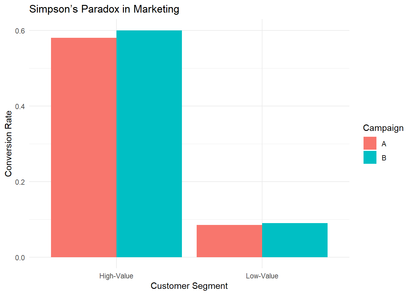
Figure 2.5: Simpson Paradox in Marketing
This bar chart reveals that for both segments, B’s bar is taller (i.e., B’s conversion rate is higher). If you only examined segment-level data, you would conclude that B is the superior campaign.
However, if you aggregate the data (ignore segments), you get the opposite conclusion — that A is better overall.
21.2.3 Why Does This Happen?
This paradox arises because of a confounding variable — in this case, the distribution of visitors across segments.
Campaign A has more of its traffic in the High-Value segment (where conversions are generally high).
Campaign B has many of its visitors in the Low-Value segment.
Because the volume of Low-Value visitors in B is extremely large (3000 vs. 2000 for A), it weighs down B’s overall average more, allowing A’s overall rate to exceed B’s.
21.2.4 How Does Causal Inference Solve This?
To avoid Simpson’s Paradox, we need to move beyond association and use causal analysis:
Use causal diagrams (DAGs) to model relationships
The marketing campaign choice is confounded by customer segment.
We must control for the confounding variable.
Use stratification or regression adjustment
Instead of comparing raw conversion rates, we should compare rates within each customer segment.
This ensures that confounding factors do not distort results.
Use the do-operator to simulate interventions
Instead of asking \(P(\text{Conversion} \mid \text{Campaign})\), ask: \(P(\text{Conversion} \mid do(\text{Campaign}))\)
This estimates what would happen if we randomly assigned campaigns (removing confounding bias).
21.2.5 Correcting Simpson’s Paradox with Regression Adjustment
Let’s adjust for the confounding variable using logistic regression.
# Logistic regression adjusting for the Segment
model <- glm(
  cbind(Conversions, Visitors - Conversions) ~ Campaign + Segment,
  family = binomial(),
  data   = marketing_data
)

summary(model)
#>
#> Call:
#> glm(formula = cbind(Conversions, Visitors - Conversions) ~ Campaign +
#>     Segment, family = binomial(), data = marketing_data)
#>
#> Coefficients:
#>                  Estimate Std. Error z value Pr(>|z|)
#> (Intercept)       0.32783    0.07839   4.182 2.89e-05 ***
#> CampaignB         0.06910    0.08439   0.819    0.413
#> SegmentLow-Value -2.70806    0.08982 -30.151  < 2e-16 ***
#> ---
#> Signif. codes:  0 '***' 0.001 '**' 0.01 '*' 0.05 '.' 0.1 ' ' 1
#>
#> (Dispersion parameter for binomial family taken to be 1)
#>
#>     Null deviance: 977.473003  on 3  degrees of freedom
#> Residual deviance:   0.012337  on 1  degrees of freedom
#> AIC: 32.998
#>
#> Number of Fisher Scoring iterations: 3
This model includes both Campaign and Segment as predictors, giving a clearer picture of the true effect of each campaign on conversion, after controlling for differences in segment composition.
21.2.6 Key Takeaways
Simpson’s Paradox demonstrates why causal inference is essential.
Aggregated statistics can be misleading due to hidden confounding.
Breaking data into subgroups can reverse conclusions.
Causal reasoning helps identify and correct paradoxes.
- Using causal graphs, do-calculus, and adjustment techniques, we can find the true causal effect.
Naïve data analysis can lead to bad business decisions.
- If a company allocated more budget to Campaign B based on overall conversion rates, it might be investing in the wrong strategy!