20.5 Causation versus Prediction
Understanding the relationship between causation and prediction is crucial in statistical modeling. Building on Kleinberg et al. (2015) and Mullainathan and Spiess (2017), consider a scenario where \(Y\) is an outcome variable dependent on \(X\), and we want to manipulate \(X\) to maximize some payoff function \(\pi(X,Y)\). Formally:
\[ \pi(X,Y) = \mathbb{E}\bigl[\,U(X,Y)\bigr] \quad \text{or some other objective measure}. \]
The decision on \(X\) depends on how changes in \(X\) influence \(\pi\). Taking a derivative:
\[ \frac{d\,\pi(X,Y)}{dX} = \frac{\partial \pi}{\partial X}(Y) + \frac{\partial \pi}{\partial Y}\,\frac{\partial Y}{\partial X}. \]
We can interpret the terms:
- \(\displaystyle \frac{\partial \pi}{\partial X}\): The direct dependence of the payoff on \(X\), which can be predicted if we can forecast how \(\pi\) changes with \(X\).
- \(\displaystyle \frac{\partial Y}{\partial X}\): The causal effect of \(X\) on \(Y\), essential for understanding how interventions on \(X\) shift \(Y\).
- \(\displaystyle \frac{\partial \pi}{\partial Y}\): The marginal effect of \(Y\) on the payoff.
Hence, Kleinberg et al. (2015) frames this distinction as one between predicting \(Y\) effectively (for instance, “If I observe \(X\), can I guess \(Y\)?”) versus managing or causing \(Y\) to change via interventions on \(X\). Empirically:
- To predict \(Y\), we model \(\mathbb{E}\bigl[Y\mid X\bigr]\).
- To infer causality, we require identification strategies that isolate exogenous variation in \(X\).
Empirical work in economics, or social science often aims to estimate partial derivatives of structural or reduced-form equations:
- \(\displaystyle \frac{\partial Y}{\partial X}\): The causal derivative; tells us how \(Y\) changes if we intervene on \(X\).
- \(\displaystyle \frac{\partial \pi}{\partial X}\): The effect of \(X\) on payoff, partially mediated by changes in \(Y\).
Without proper identification (e.g., randomization, instrumental variables, difference-in-differences, or other quasi-experimental designs), we risk conflating association (\(\hat{f}\) that predicts \(Y\)) with causation (\(\hat{\beta}\) that truly captures how \(X\) shifts \(Y\)).
To illustrate these concepts, consider the following directed acyclic graph (DAG):
library(ggdag)
library(dagitty)
library(ggplot2)


# Define the DAG structure with custom coordinates
dag <- dagitty('
dag {
  X0 [pos="0,1"]
  X [pos="1,2"]
  Y [pos="1,1"]
  II [pos="1,0"]

  X0 -> Y
  X0 -> II
  X -> Y
  Y -> II
}
')

# Convert to ggdag format with manual layout
dag_plot <- ggdag(dag) +
    theme_void() +
    geom_text(aes(x = 0.5, y = 1.2, label = "Causation"), size = 4) +
geom_text(aes(x = 0.3, y = 0.5, label = "Prediction"), size = 4) 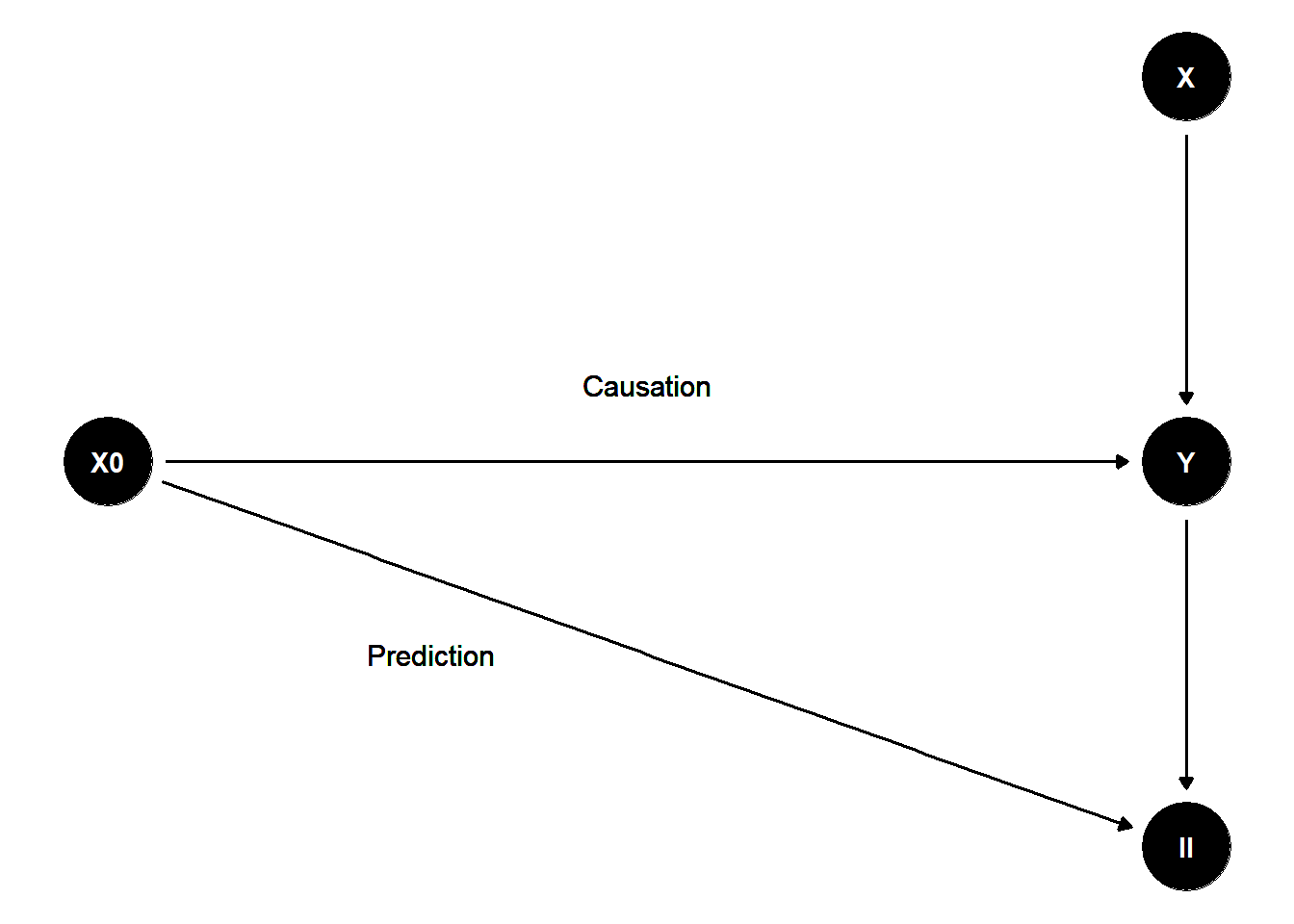
Figure 20.1: Flow Chart