marginaleffects
margins
mfx
emmeans
probemod
interactions
interactionR
sjPlot
microsynth
erer
MatchIt
designmatch
starbility
specr
rdfanalysis
robomit
mplot
konfound
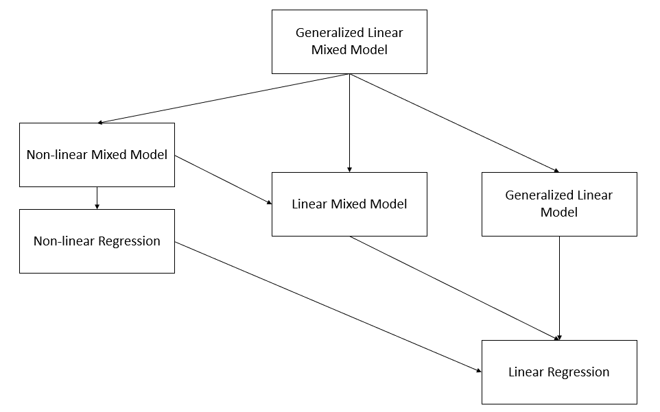
Figure 9.10: Taxonomy of Regression Models