37.1 Aggregation Bias
Aggregation bias, also known as ecological fallacy, refers to the error introduced when data are aggregated and an analysis is conducted at this aggregate level, rather than at the individual level. This can be especially problematic in econometrics, where analysts are often concerned with understanding individual behavior.
When the relationship between variables is different at the aggregate level than at the individual level, aggregation bias can result. The bias arises when inferences about individual behaviors are made based on aggregate data.
Example: Suppose we have data on individuals’ incomes and their personal consumption. At the individual level, it’s possible that as income rises, consumption also rises. However, when we aggregate the data to, say, a neighborhood level, neighborhoods with diverse income levels might all have similar average consumption due to other unobserved factors.
Step 1: Create individual level data
set.seed(123)

# Generate data for 1000 individuals
n <- 1000

income <- rnorm(n, mean = 50, sd = 10)
consumption <- 0.5 * income + rnorm(n, mean = 0, sd = 5)

# Individual level regression
individual_lm <- lm(consumption ~ income)
summary(individual_lm)
#>
#> Call:
#> lm(formula = consumption ~ income)
#>
#> Residuals:
#>      Min       1Q   Median       3Q      Max
#> -15.1394  -3.4572   0.0213   3.5436  16.4557
#>
#> Coefficients:
#>             Estimate Std. Error t value Pr(>|t|)
#> (Intercept) -1.99596    0.82085  -2.432   0.0152 *
#> income       0.54402    0.01605  33.888   <2e-16 ***
#> ---
#> Signif. codes:  0 '***' 0.001 '**' 0.01 '*' 0.05 '.' 0.1 ' ' 1
#>
#> Residual standard error: 5.032 on 998 degrees of freedom
#> Multiple R-squared:  0.535,  Adjusted R-squared:  0.5346
#> F-statistic:  1148 on 1 and 998 DF,  p-value: < 2.2e-16
This would show a significant positive relationship between income and consumption.
Step 2: Aggregate data to ‘neighborhood’ level
# Assume 100 neighborhoods with 10 individuals each
n_neighborhoods <- 100

df <- data.frame(income, consumption)
df$neighborhood <- rep(1:n_neighborhoods, each = n / n_neighborhoods)

aggregate_data <- aggregate(. ~ neighborhood, data = df, FUN = mean)

# Aggregate level regression
aggregate_lm <- lm(consumption ~ income, data = aggregate_data)
summary(aggregate_lm)
#>
#> Call:
#> lm(formula = consumption ~ income, data = aggregate_data)
#>
#> Residuals:
#>     Min      1Q  Median      3Q     Max
#> -4.4517 -0.9322 -0.0826  1.0556  3.5728
#>
#> Coefficients:
#>             Estimate Std. Error t value Pr(>|t|)
#> (Intercept) -4.94338    2.60699  -1.896   0.0609 .
#> income       0.60278    0.05188  11.618   <2e-16 ***
#> ---
#> Signif. codes:  0 '***' 0.001 '**' 0.01 '*' 0.05 '.' 0.1 ' ' 1
#>
#> Residual standard error: 1.54 on 98 degrees of freedom
#> Multiple R-squared:  0.5794, Adjusted R-squared:  0.5751
#> F-statistic:   135 on 1 and 98 DF,  p-value: < 2.2e-16
If aggregation bias is present, the coefficient for income in the aggregate regression might be different from the coefficient in the individual regression, even if the individual relationship is significant and strong.
library(ggplot2)

# Individual scatterplot
p1 <- ggplot(df, aes(x = income, y = consumption)) +
    geom_point(aes(color = neighborhood), alpha = 0.6) +
    geom_smooth(method = "lm",
                se = FALSE,
                color = "black") +
    labs(title = "Individual Level Data") +
    causalverse::ama_theme()

# Aggregate scatterplot
p2 <- ggplot(aggregate_data, aes(x = income, y = consumption)) +
    geom_point(color = "red") +
    geom_smooth(method = "lm",
                se = FALSE,
                color = "black") +
    labs(title = "Aggregate Level Data") +
    causalverse::ama_theme()

# print(p1)
# print(p2)

gridExtra::grid.arrange(grobs = list(p1, p2), ncol = 2)
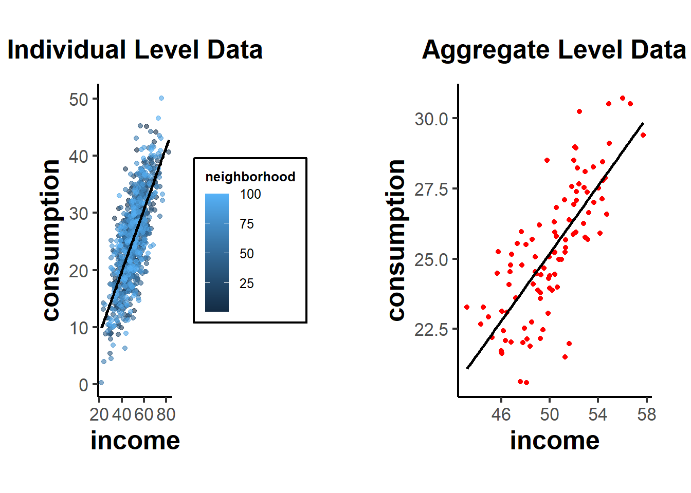
From these plots, you can see the relationship at the individual level, with each neighborhood being colored differently in the first plot. The second plot shows the aggregate data, where each point now represents a whole neighborhood.
Direction of Bias: The direction of the aggregation bias isn’t predetermined. It depends on the underlying relationship and the data distribution. In some cases, aggregation might attenuate (reduce) a relationship, while in other cases, it might exaggerate it.
Relation to Other Biases: Aggregation bias is closely related to several other biases in econometrics:
Specification bias: If you don’t properly account for the hierarchical structure of your data (like individuals nested within neighborhoods), your model might be mis-specified, leading to biased estimates.
Measurement Error: Aggregation can introduce or amplify measurement errors. For instance, if you aggregate noisy measures, the aggregate might not accurately represent any underlying signal.
Omitted Variable Bias (see Endogeneity): When you aggregate data, you lose information. If the loss of this information results in omitting important predictors that are correlated with both the independent and dependent variables, it can introduce omitted variable bias.
37.1.1 Simpson’s Paradox
Simpson’s Paradox, also known as the Yule-Simpson effect, is a phenomenon in probability and statistics where a trend that appears in different groups of data disappears or reverses when the groups are combined. It’s a striking example of how aggregated data can sometimes provide a misleading representation of the actual situation.
Illustration of Simpson’s Paradox:
Consider a hypothetical scenario involving two hospitals: Hospital A and Hospital B. We want to analyze the success rates of treatments at both hospitals. When we break the data down by the severity of the cases (i.e., minor cases vs. major cases):
Hospital A:
Minor cases: 95% success rate
Major cases: 80% success rate
Hospital B:
Minor cases: 90% success rate
Major cases: 85% success rate
From this breakdown, Hospital A appears to be better in treating both minor and major cases since it has a higher success rate in both categories.
However, let’s consider the overall success rates without considering case severity:
Hospital A: 83% overall success rate
Hospital B: 86% overall success rate
Suddenly, Hospital B seems better overall. This surprising reversal happens because the two hospitals might handle very different proportions of minor and major cases. For example, if Hospital A treats many more major cases (which have lower success rates) than Hospital B, it can drag down its overall success rate.
Causes:
Simpson’s Paradox can arise due to:
A lurking or confounding variable that wasn’t initially considered (in our example, the severity of the medical cases).
Different group sizes, where one group might be much larger than the other, influencing the aggregate results.
Implications:
Simpson’s Paradox highlights the dangers of interpreting aggregated data without considering potential underlying sub-group structures. It underscores the importance of disaggregating data and being aware of the context in which it’s analyzed.
Relation to Aggregation Bias
In the most extreme case, aggregation bias can reverse the coefficient sign of the relationship of interest (i.e., Simpson’s Paradox).
Example: Suppose we are studying the effect of a new study technique on student grades. We have two groups of students: those who used the new technique (treatment = 1) and those who did not (treatment = 0). We want to see if using the new study technique is related to higher grades.
Let’s assume grades are influenced by the starting ability of the students. Perhaps in our sample, many high-ability students didn’t use the new technique (because they felt they didn’t need it), while many low-ability students did.
Here’s a setup:
High-ability students tend to have high grades regardless of the technique.
The new technique has a positive effect on grades, but this is masked by the fact that many low-ability students use it.
set.seed(123)

# Generate data for 1000 students
n <- 1000

# 500 students are of high ability, 500 of low ability
ability <- c(rep("high", 500), rep("low", 500))

# High ability students are less likely to use the technique
treatment <-
  ifelse(ability == "high", rbinom(500, 1, 0.2), rbinom(500, 1, 0.8))

# Grades are influenced by ability and treatment (new technique),
# but the treatment has opposite effects based on ability.
grades <-
  ifelse(
    ability == "high",
    rnorm(500, mean = 85, sd = 5) + treatment * -3,
    rnorm(500, mean = 60, sd = 5) + treatment * 5
  )

df <- data.frame(ability, treatment, grades)

# Regression without considering ability
overall_lm <- lm(grades ~ factor(treatment), data = df)
summary(overall_lm)
#>
#> Call:
#> lm(formula = grades ~ factor(treatment), data = df)
#>
#> Residuals:
#>     Min      1Q  Median      3Q     Max
#> -33.490  -4.729   0.986   6.368  25.607
#>
#> Coefficients:
#>                    Estimate Std. Error t value Pr(>|t|)
#> (Intercept)         80.0133     0.4373   183.0   <2e-16 ***
#> factor(treatment)1 -11.7461     0.6248   -18.8   <2e-16 ***
#> ---
#> Signif. codes:  0 '***' 0.001 '**' 0.01 '*' 0.05 '.' 0.1 ' ' 1
#>
#> Residual standard error: 9.877 on 998 degrees of freedom
#> Multiple R-squared:  0.2615, Adjusted R-squared:  0.2608
#> F-statistic: 353.5 on 1 and 998 DF,  p-value: < 2.2e-16

# Regression within ability groups
high_ability_lm <-
  lm(grades ~ factor(treatment), data = df[df$ability == "high",])
low_ability_lm <-
  lm(grades ~ factor(treatment), data = df[df$ability == "low",])
summary(high_ability_lm)
#>
#> Call:
#> lm(formula = grades ~ factor(treatment), data = df[df$ability ==
#>     "high", ])
#>
#> Residuals:
#>      Min       1Q   Median       3Q      Max
#> -14.2156  -3.4813   0.1186   3.4952  13.2919
#>
#> Coefficients:
#>                    Estimate Std. Error t value Pr(>|t|)
#> (Intercept)         85.1667     0.2504 340.088  < 2e-16 ***
#> factor(treatment)1  -3.9489     0.5776  -6.837 2.37e-11 ***
#> ---
#> Signif. codes:  0 '***' 0.001 '**' 0.01 '*' 0.05 '.' 0.1 ' ' 1
#>
#> Residual standard error: 5.046 on 498 degrees of freedom
#> Multiple R-squared:  0.08581,    Adjusted R-squared:  0.08398
#> F-statistic: 46.75 on 1 and 498 DF,  p-value: 2.373e-11
summary(low_ability_lm)
#>
#> Call:
#> lm(formula = grades ~ factor(treatment), data = df[df$ability ==
#>     "low", ])
#>
#> Residuals:
#>      Min       1Q   Median       3Q      Max
#> -13.3717  -3.5413   0.1097   3.3531  17.0568
#>
#> Coefficients:
#>                    Estimate Std. Error t value Pr(>|t|)
#> (Intercept)         59.8950     0.4871 122.956   <2e-16 ***
#> factor(treatment)1   5.2979     0.5474   9.679   <2e-16 ***
#> ---
#> Signif. codes:  0 '***' 0.001 '**' 0.01 '*' 0.05 '.' 0.1 ' ' 1
#>
#> Residual standard error: 4.968 on 498 degrees of freedom
#> Multiple R-squared:  0.1583, Adjusted R-squared:  0.1566
#> F-statistic: 93.68 on 1 and 498 DF,  p-value: < 2.2e-16
From this simulation:
The
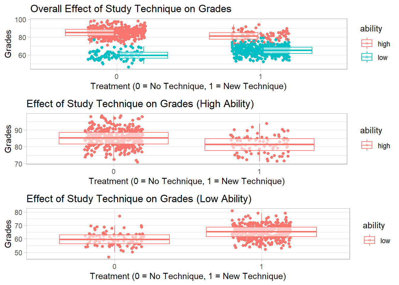
overall_lmmight show that the new study technique is associated with lower grades (negative coefficient), because many of the high-ability students (who naturally have high grades) did not use it.The
high_ability_lmwill likely show that high-ability students who used the technique had slightly lower grades than high-ability students who didn’t.The
low_ability_lmwill likely show that low-ability students who used the technique had much higher grades than low-ability students who didn’t.
This is a classic example of Simpson’s Paradox: within each ability group, the technique appears beneficial, but when data is aggregated, the effect seems negative because of the distribution of the technique across ability groups.
library(ggplot2)

# Scatterplot for overall data
p1 <-
  ggplot(df, aes(
    x = factor(treatment),
    y = grades,
    color = ability
  )) +
  geom_jitter(width = 0.2, height = 0) +
  geom_boxplot(alpha = 0.6, outlier.shape = NA) +
  labs(title = "Overall Effect of Study Technique on Grades",
       x = "Treatment (0 = No Technique, 1 = New Technique)",
       y = "Grades")

# Scatterplot for high-ability students
p2 <-
  ggplot(df[df$ability == "high", ], aes(
    x = factor(treatment),
    y = grades,
    color = ability
  )) +
  geom_jitter(width = 0.2, height = 0) +
  geom_boxplot(alpha = 0.6, outlier.shape = NA) +
  labs(title = "Effect of Study Technique on Grades (High Ability)",
       x = "Treatment (0 = No Technique, 1 = New Technique)",
       y = "Grades")

# Scatterplot for low-ability students
p3 <-
  ggplot(df[df$ability == "low", ], aes(
    x = factor(treatment),
    y = grades,
    color = ability
  )) +
  geom_jitter(width = 0.2, height = 0) +
  geom_boxplot(alpha = 0.6, outlier.shape = NA) +
  labs(title = "Effect of Study Technique on Grades (Low Ability)",
       x = "Treatment (0 = No Technique, 1 = New Technique)",
       y = "Grades")

# print(p1)
# print(p2)
# print(p3)
gridExtra::grid.arrange(grobs = list(p1, p2, p3), ncol = 1)