30.3 Sampling distribution: Expectation
The data for testing the hypothesis are shown below. The numerical summary (Sect. 24.1) must summarise the difference between the means (since the RQ is about the difference), and should summarise each group. All this information is found using software (jamovi: Fig. 30.1; SPSS: Fig. 30.2), and can be compiled into a table (Table 30.2).
The appropriate summary for graphically summarising the data is a boxplot (though a dot chart is also acceptable). An error bar chart (Fig. 24.7), which allows the sample means to be compared, should also be produced.
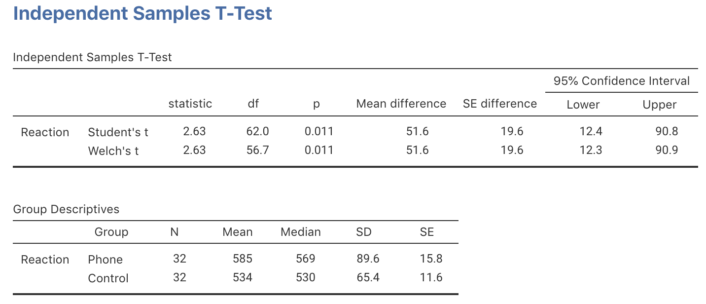
FIGURE 30.1: jamovi output for the phone reaction time data
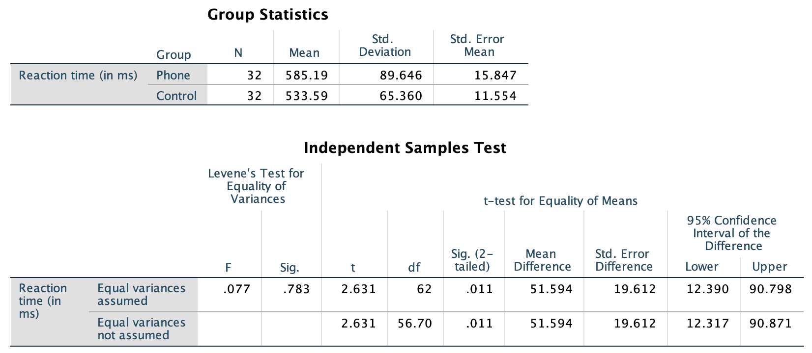
FIGURE 30.2: SPSS output for the phone reaction time data
The difference between the sample means is 51.59 ms… but this value will vary from sample to sample; that is, there is sampling variation. The sampling variation (expectation) for the values of \(\bar{x}_A - \bar{x}_B\) can be described as having:
- an approximate normal distribution;
- centred around \({\mu_{P}} - {\mu_{C}} = 0\) (from \(H_0\));
- with a standard deviation of \(\displaystyle\text{s.e.}(\bar{x}_P - \bar{x}_C)\), called the standard error for the difference between the means.
| Mean | Sample size | Standard deviation | Standard error | |
|---|---|---|---|---|
| Using phone | 585.19 | 32 | 89.65 | 15.847 |
| Not using phone | 533.59 | 32 | 65.36 | 11.554 |
| All students | 51.59 | NA | NA | 19.612 |