12.2 Graphing one quantitative variable
For quantitative data, a graph shows the distribution of the data: what values are present in the data, and how often those values appear.
The graphs discussed in this section usually work best for continuous quantitative data, but may also be useful for discrete quantitative data if many possible values are present. Sometimes, discrete quantitative data with very few values are best graphed using the graphs discussed in Sect. 12.3.
Three different types of graphs can be used to show how the values of one quantitative variable are distributed:
- Stemplot or stem-and-leaf plot: Best for small amounts of data; useful only in some cases.
- Dot chart: Best for small amounts of data; good for moderate amounts of data.
- Histogram: Best for moderate to large amounts of data.
Whatever graph is used, what the graph shows should be described.
12.2.1 Stem-and-leaf plots
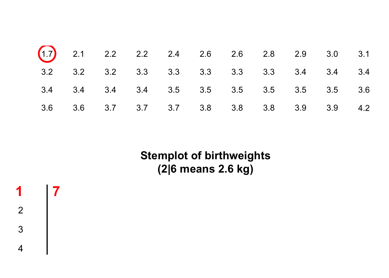
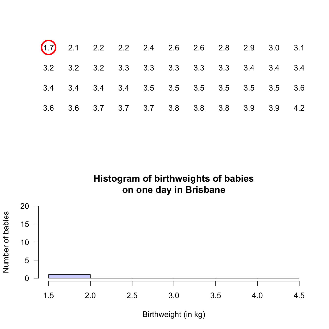
Stem-and-leaf plots (or stemplots) are best described and explained using an example, so consider the data in Fig. 12.1,

The data give the weights (in kg) of babies born in a Brisbane hospital on one day (Steele 1997; Dunn 1999).
The data set also includes the gender of each baby, and the number of minutes after midnight that each birth occurred.
The data are given in the order in which the births occurred.
FIGURE 12.1: The baby-births data
For these data, the weights (quantitative) are to one decimal place of a kilogram. In a stemplot, part of each number is placed to the left (the stem) of a vertical line, and the rest of each number to the right (the leaf). Here, the whole number of kilograms is placed to the left (as a stem), and the first decimal place is placed on the right (as a leaf). The animation below shows how the stemplot is constructed. From this plot, most birthweights are seen to be 3-point-something kilograms.
For stem-and-leaf plots:
- Place the larger unit (e.g., kilograms) on the left (stems).
- Place the next smallest unit (e.g., first decimal place of a kilogram) on the right (leaves).
- Some data do not work well with stem-and-leaf plots.
- Sometimes, data might need to be suitably rounded before creating the stem-and-leaf plot.
- The numbers in each row should be evenly spaced, so that the numbers in the columns are under each other. This allows patterns to be seen.
- Within each row, the observations are ordered on each stem so patterns can be seen.
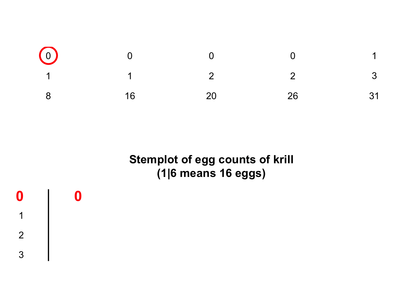
- Add an explanation for reading the stem-and-leaf plot. For example, the caption for the stem-and-leaf plot for the baby-birth data in Sect. 12.2.1 says ‘2 | 6 means 2.6kg,’ which explains what the stem plot means. For instance, ‘2 | 6’ could mean 26kg, or 0.26kg.
The animation below shows how the stemplot is constructed.
The following short video may help explain some of these concepts:
12.2.2 Dot charts
Dot charts show the original data on a single axis, with each observation represented by a dot.

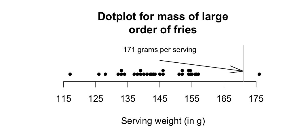
FIGURE 12.2: Mass measurements for large orders of french fries
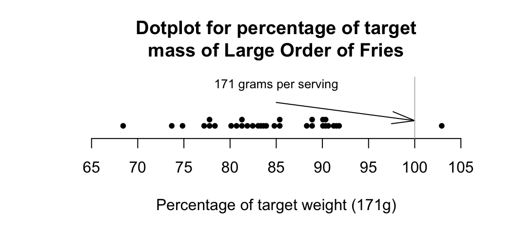
FIGURE 12.3: Percentage variation from target mass, for large orders of french fries
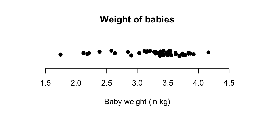
FIGURE 12.4: A dot chart of the baby-weight data
12.2.3 Histograms
Histograms are a series of boxes, where the width of the box represents a range of values of the variable being graphed, and the height of the box3 represents the number (or percentage) of observations within that range of values.
The animation below shows how the histogram is constructed.
Example 12.5 (Histograms) A study of ‘headache attributed to ingestion or inhalation of a cold stimulus’ (HICS), commonly known as a brain freeze from eating cold food (e.g., ice cream) or drinking a cold drink, measured the duration of the brain freeze (Mages et al. 2017).
A histogram of the data (Fig 12.5, based on Mages et al. (2017), Figure 2b), shows that 11 people experience HICS symptoms less than 5 seconds in length.
In addition, 9 people experienced symptoms for at least 5 but less than 10 seconds, and 1 person experienced symptoms for at least 35 seconds but under 40 seconds.FIGURE 12.5: Duration of HICS (brain freeze) after drinking ice water
12.2.4 Describing the distribution
Graphs are constructed to help us understand the data. After producing a graph for one quantitative variable, then, we need to summarise what we learn. For one quantitative variable, describe:
- Average: What is an “average” or typical value?
- Variation: How much variation is present in the bulk of the data?
- Shape: How are the values distributed? That is, are most of the values smaller values, or larger values, or about even distributed between smaller and larger values?
- Outliers (observations unusually large or small) or unusual features: Are there any unusual observations, or anything else of interest?
Describing the shape can be tricky, but terminology may help:
- Skewed right: the bulk of the data is smaller, but there are some larger values (to the right).
- Skewed left: the bulk of the data is larger, but there are some smaller values (to the left).
- Symmetric data (and perhaps bell-shaped): There are approximately equal numbers of values that are smaller and larger.
- Bimodal data: There are two peaks in the distribution.
Typical shapes are shown in the carousel below (click the left and right arrows to move through the example plots). Sometimes, no suitable short descriptions is suitable.
FIGURE 12.6: Some common shapes of the distribution of qualitative data
Example 12.6 (Bimodal data) The Old Faithful geyser in Yellowstone National Park (USA) erupts regularly (Härdle and others 1991).
The time between eruptions (Fig. 12.7) is clearly bimodal, with a peak near 55 minutes and another near 80 minutes.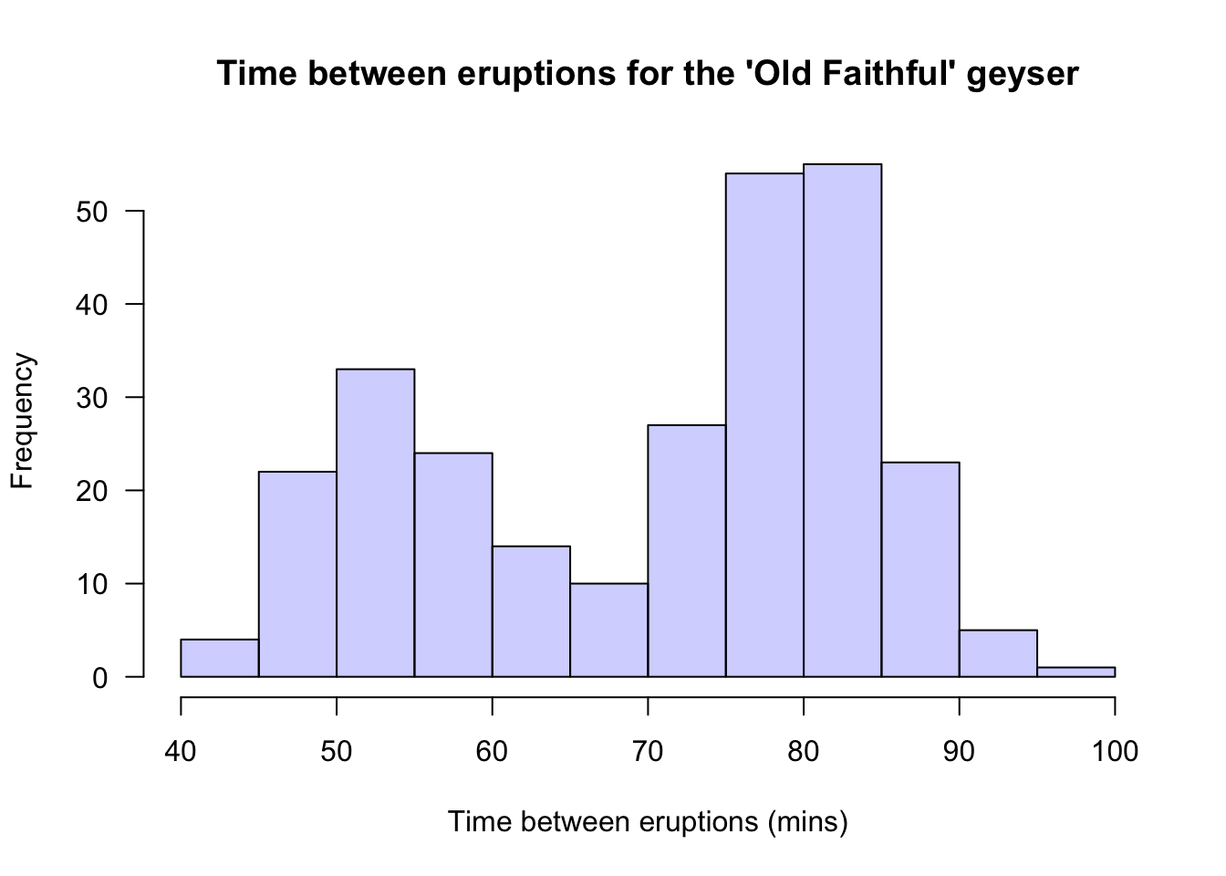
FIGURE 12.7: Histogram of the times between eruptions for the Old Faithful geyser
Example 12.7 (Describing quantitative data) For the baby-weight data displayed in, for example, Fig. 12.4:
- The average weight is somewhere between 2.5 to 3 kilograms.
- The variation in weights is between 1.5 and 4.5 kilograms approximately.
- The shape is slightly skewed to the left. That is, occasional small birth weights appear (probably premature babies).
- There doesn’t appear to be any outliers or anything unusual.
References
Technically, the area of the box is proportional to the number of observations. Since we only consider histograms where the bars are all the same width, this is equivalent.↩︎