12.8 Other types of graphs
Many types of graphs have been studied, for specific types of data. But sometimes, other plots are useful. Usually the best plot is one of those just described, but sometimes the best plot is something different, perhaps even unique. Always remember the driving principle:
The purpose of a graph is to display the information in the clearest, simplest possible way, to help us understand the data.
Importantly, a graphs needed that helps answer the research question. In this section, graphs for some other situations are discussed:
- Geographic plots: Useful when the RQ is about comparing geographical regions.
- Case-profile plots: Useful when the same units are measured over a small number of time points, or are otherwise connected.
- Histogram of differences: Useful when the same units are measured over two time points, or are otherwise connected.
- Time plots: Useful when the units are measured over a large number of time points.
12.8.1 Geographic plots
When data are summarised over a geographic area, plotting accordingly can be useful.
Example 12.18 (Geographics plots) A study examining lower-limb amputation incidence in Australia (based on Dillon et al. (2017)) produced the graphs in Figs. 12.28 and 12.29.
Clearly, the incidence of amputation is higher in the Northern Territory than other parts of Australia for both females and males; furthermore, males have higher incidence of amputation than females in every state/territory.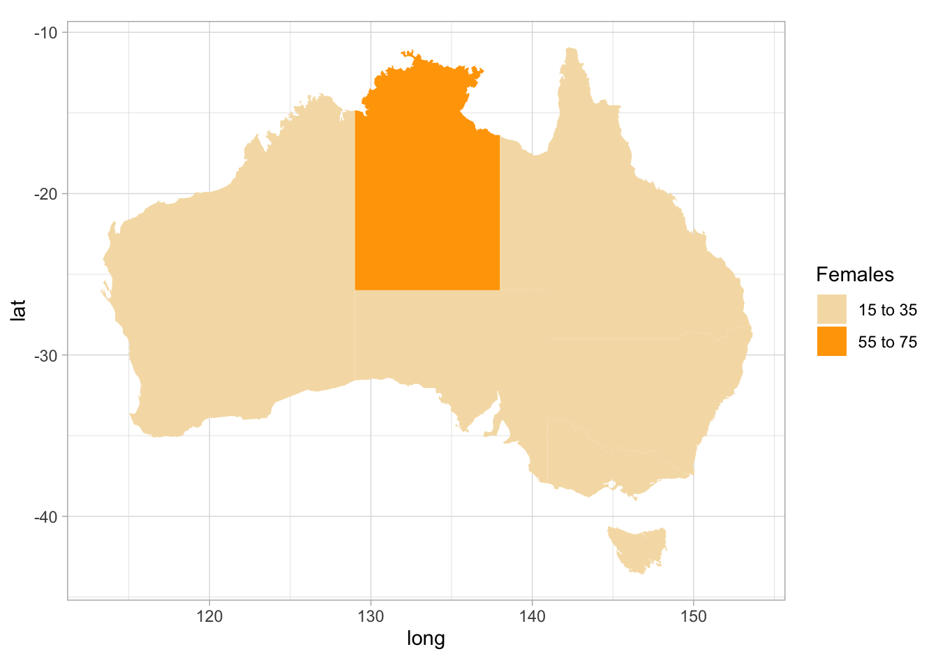
FIGURE 12.28: Age-adjusted incidence of lower limb amputations in Australia, from August 2007 to December 2011: females. Numbers are incidents per 100 000.
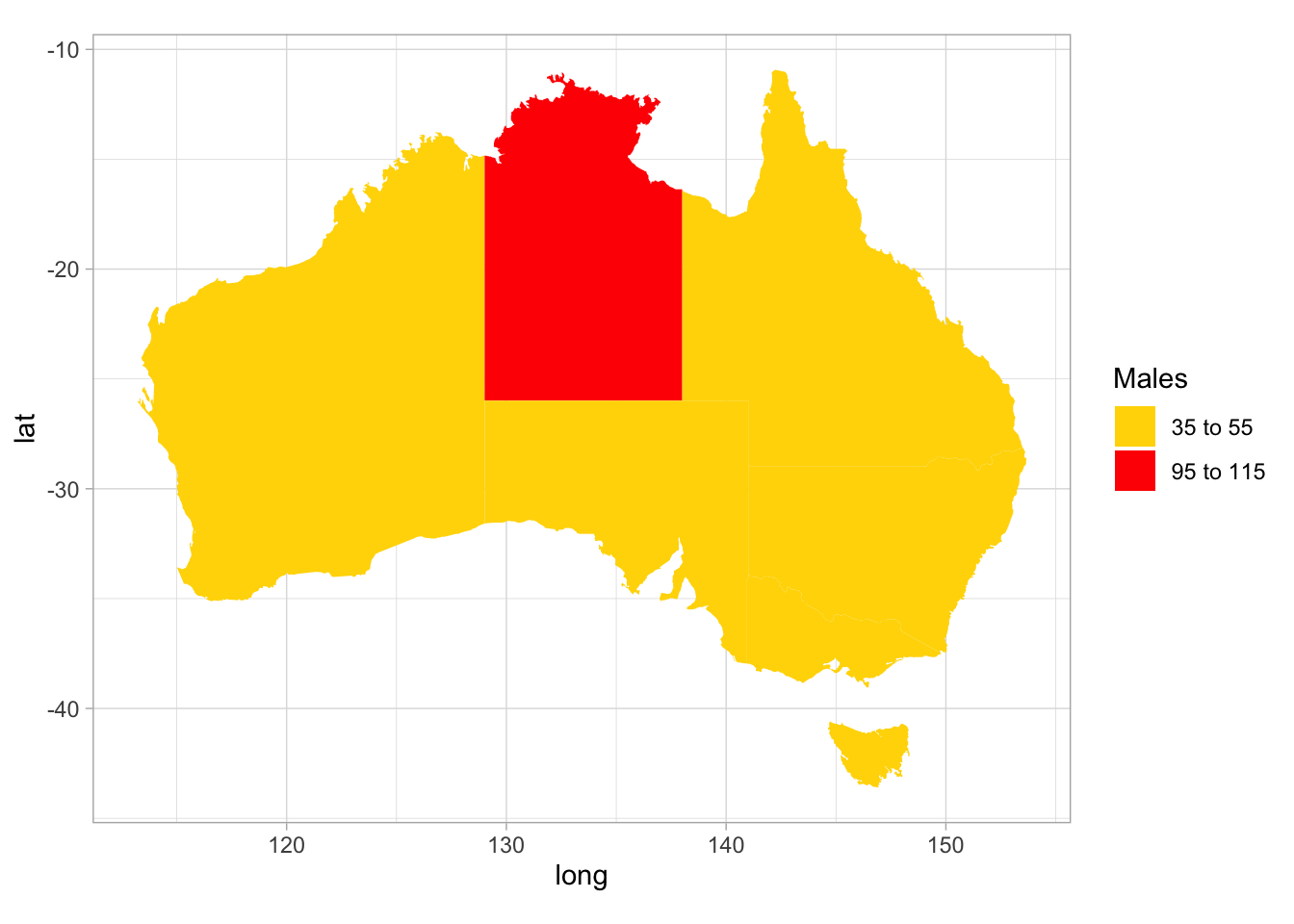
FIGURE 12.29: Age-adjusted incidence of lower limb amputations in Australia, from August 2007 to December 2011: males. Numbers are incidents per 100 000.
12.8.2 Case-profile plots
Sometimes the same variable is measured on each unit of analysis more than once (i.e. many observations per unit of analysis) but only a small number of times. Then a case-profile plots can be used: plots that show how the response variable changes for each unit of analysis. Examples of this type of data include:
- Measurements of household water consumption before and after installing water-saving devices, for many households.
- Blood pressure measurements taken from left arms and right arms, for many people.
In both cases, the data are paired (two observations per unit of analysis) as each unit of analysis gets a pair of similar measurements.
Example 12.19 (Case-profile plots) A study of children with atopic asthma (Lothian et al. 2006) included the graph in Fig. 12.30. Each line on the graph represents one person.
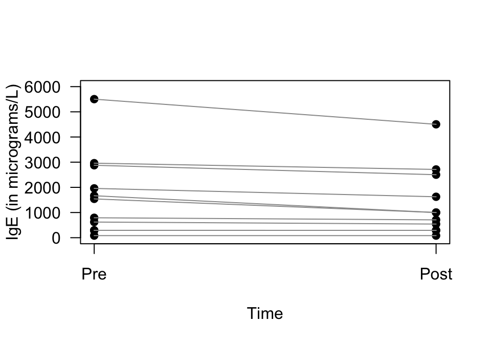
FIGURE 12.30: A case-profile plot. Each line represents one subject, joining that person’s pre-intervention score to their post-intervention score
12.8.3 Histogram of differences
An alternative way to present paired data (two observations made for each unit of analysis) is to produce a histogram of the changes for each individual. This may be easier to produce in software than a case-profile plot.
Consider the person in the case-profile plot whose line is at the top of the plot in Fig. 12.30. Their ‘pre’ IgE level is about 5500 micrograms/L, and their ‘post’ IgE level is about 4500 micrograms/L, which is a change (or more descriptively, a reduction) of about 1000 micrograms/L. These reductions could be computed for each person (Table 12.5).
| IgE (before) | IgE (after) | IgE reduction |
|---|---|---|
| 83 | 83 | 0 |
| 292 | 292 | 0 |
| 293 | 292 | 1 |
| 623 | 542 | 81 |
| 792 | 709 | 83 |
| 1543 | 1000 | 543 |
| 1668 | 1000 | 668 |
| 1960 | 1626 | 334 |
| 2877 | 2502 | 375 |
| 2961 | 2711 | 250 |
| 5504 | 4504 | 1000 |
Then a histogram can be constructed based on these reductions in IgE, with one reduction for each person (Fig. 12.31).
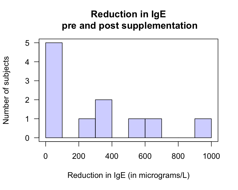
FIGURE 12.31: An alternative to a case-profile plot: A histogram of the differences
Example 12.20 (Graphing paired data) The Electricity Council in Bristol wanted to determine if a certain type of wall-cavity insulation was effective in reducing energy consumption in winter (The Open University 1983). Their RQ was:
Is there an average reduction in energy consumption due to adding insulation?
The data collected, shown below, can be graphed using a case-profile plot (Fig. 12.32, top panel): A dashed line has been used to show an increase in energy usage, and a solid line for houses where energy was saved after installing insulation. (Again, this is encoding extra information.)
For these data, finding the difference in energy consumption for each house seems sensible. The same unit of analysis is measured twice on the same variable: energy consumption before adding insulation and then after adding insulation. The difference in energy consumption (or the energy saving more specifically) for each house can be computed, then graphed using a histogram, bar chart, stemplot, or dot chart (Fig. 12.32, bottom panel).
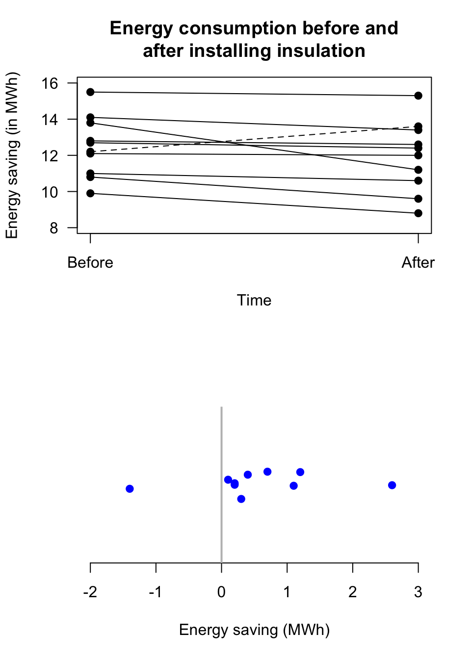
FIGURE 12.32: Two plots of the energy consumption data. The dotted line in the top panel shows the one home where energy consumption increased.

Example 12.21 (Graphing paired data) A study (Dawson et al. 2017) examined the average number of bacteria on birthday cakes before and after blowing out the candles.
This question could be studied by taking two measurements from each cake: before and after blowing out candles. The change in the number of bacteria could be computed for each cake, and a histogram of the differences plotted.12.8.4 Time plots
Sometimes, a variable is measured over many time points. A time plot can be used, which show how the variable changes over time.
FIGURE 12.33: The weight of babies born on 21 December 1997 at a Brisbane hospital, plotted over time
FIGURE 12.34: The number of lynx trapped in the Mackenzie River district of north-west Canada, from 1821 to 1934