33.3 Understanding scatterplots
The purpose of a graph is to help us understand the data (Sect. 12.1). To understand the data displayed in a scatterplot, the form, direction, and variation (or the strength) are described:
- Form: Identify the overall form or structure of the relationship (e.g., linear; curved upwards; etc.).
- Direction: Identify the direction of the relationship
(sometimes not relevant if the relationship is non-linear):
- The variables are positively associated if high values of one variable accompany high values of the other variable, in general.
- The variables are negatively associated if high values of one variable accompany low values of the other variable, in general.
- Variation: The amount of variation in the relationship. A small amount of variation in the response variable for given values of the explanatory variable means the relationship is strong; a lot of variation in the response variable for given values of the explanatory variable means the relationship is less strong.
Anything unusual or noteworthy should also be discussed. These three features help us understand the type of relationship (form and direction), and the strength of that relationship (variation).
To demonstrate the use of these descriptions, see the example scatterplots in the carousel below (click to move through the scatterplots).
Example 33.1 (Describing scatterplots) A study
(Tager et al. 1979; Kahn 2005)
examined the lung capacity of children in Boston
(measured using the forced expiratory volume (FEV)).
The scatterplot (Fig. 33.3) could be described as
curved (form),
where
older children have larger FEVs, in general (direction).
The variation gets larger for taller youth.
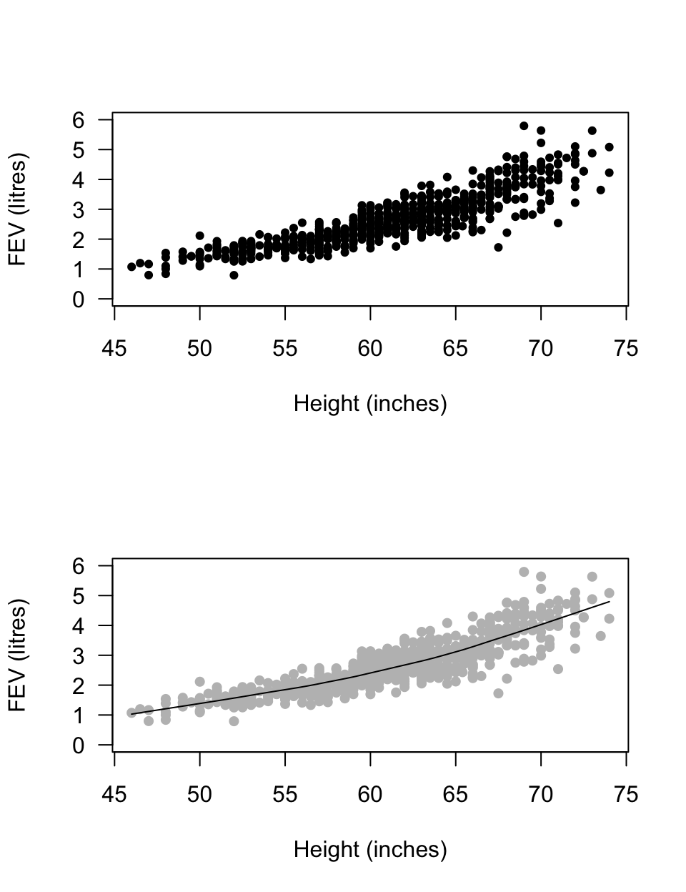
FIGURE 33.3: FEV plotted against height for children in Boston
Think 33.1 (Scatterplots) Describe the scatterplot of diastolic BP against age
(Fig. 33.4),
from the NHANES data.
Form: curved. Direction: not relevant (up, then down). Variation: large.
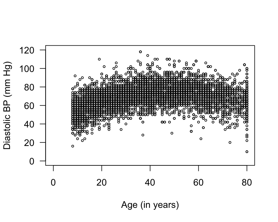
FIGURE 33.4: Diastolic blood pressure plotted against age for the NHANES data
Example 33.2 (Scatterplots) For the red deer data
(Fig. 33.2),
the scatterplot could be described as
approximately linear (form),
with a negative direction (older deer generally have less heavy teeth);
the variation is… perhaps moderate.
References
Kahn M. An exhalent problem for teaching statistics. Journal of Statistical Education. 2005;13(2).
Tager IB, Weiss ST, Rosner B, Speizer FE. Effect of parental cigarette smoking on the pulmonary function of children. American Journal of Epidemiology. 1979;110(1):15–26.