12.10 Case Study: The NHANES data

To demonstrate how graphs can help answer RQs, consider the following RQ:
Among Americans, is the average direct HDL cholesterol different for those who current smokers and non-smokers?
From the RQ, the Population is ‘Americans,’ the Outcome is the ‘average direct HDL cholesterol levels,’ and the Comparison is ‘Between those who currently do and do not smoke.’ There is no intervention; this is a relational RQ, that can be answered using an observational study.
Think 12.5 (Confounding variables) As with any study, managing confounding should be considered, by thinking about possible extraneous variables that could be measured or observed.
Can you think of any possible extraneous variables that have the potential to be confounding variables?In this study, clearly we cannot collect primary data. However, data to answer this (and many other) RQs are obtained from the American National Health and Nutrition Examination Survey (NHANES) (Centers for Disease Control and Prevention (CDC) 1988--1994; Center for Disease Control and Prevention 1996; Pruim 2015). From the NHANES webpage, this survey:
… examines a nationally representative sample of about 5,000 persons each year… located in counties across the country, 15 of which are visited each year.
— NHANES webpage (emphasis added)
The data available are equivalent to a “a simple random sample from the American population” (Pruim 2015). In total, 10,000 observations on scores of variables are available (from the 2009/2010 and the 2011/2012 surveys). Fig. 12.35 shows the first 5000 observations on the first 40 variables only.
FIGURE 12.35: The full NHANES data set
For any RQ, exploring and understanding the data is important, and using graphs is a great way to do so (especially with large data sets). Begin by graphing both the response and explanatory variables involved in the RQ.
For the NHANES data, the response variable is direct HDL cholesterol (quantitative continuous). The histogram (Fig. 12.36) shows that about 2200 people had a direct HDL cholesterol concentration between 1.25 and 1.50 mmol/L; and about 1200 had a concentration between 0.75 and 1,00 mmol/L. In general, the direct HDL cholesterol is usually around 1.5mmol/L, and varies between about 0.5 and 3 mmol/L. The data are slightly skewed right.
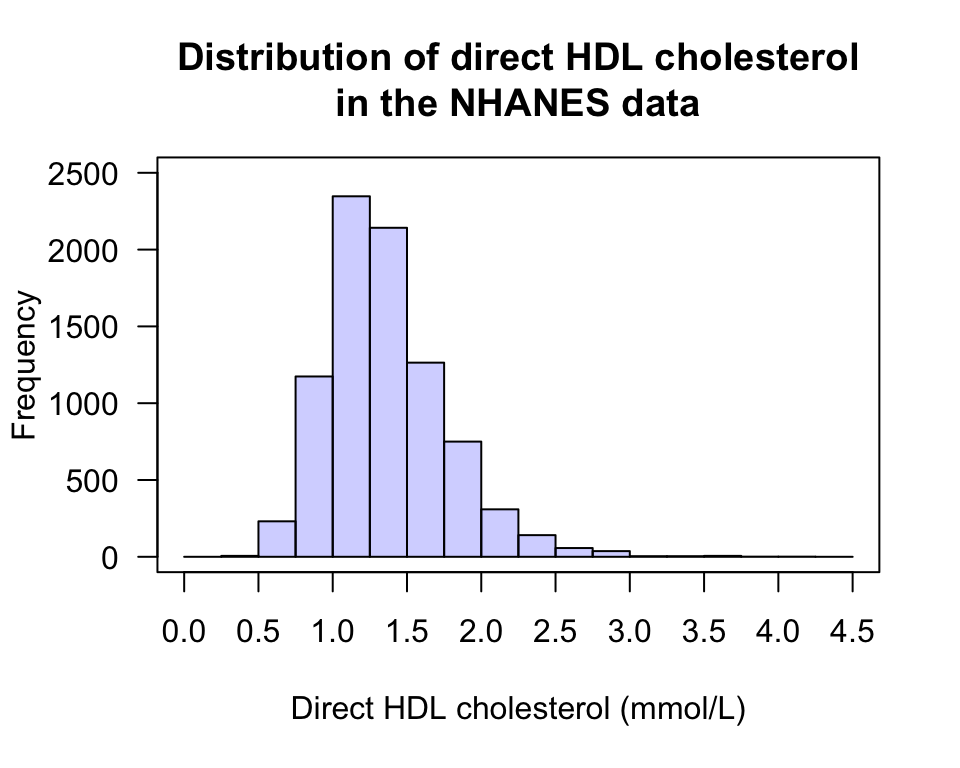
FIGURE 12.36: A histogram of the direct HDL cholesterol in the NHANES study
The explanatory variable is ‘current smoking status,’ which could be graphed using a bar chart (Fig. 12.37) or pie chart, for example. But only one piece of information is present, so a graph probably isn’t necessary): That 45.7% (just under half) of the respondents currently smoke.
The NHANES data contains 10,000 respondents, yet the bar chart clearly does not have 10,000 responses. Many respondents did not answer this question. A bar could be added to the bar chart to show the number of non-responses (though it probably isn’t necessary).
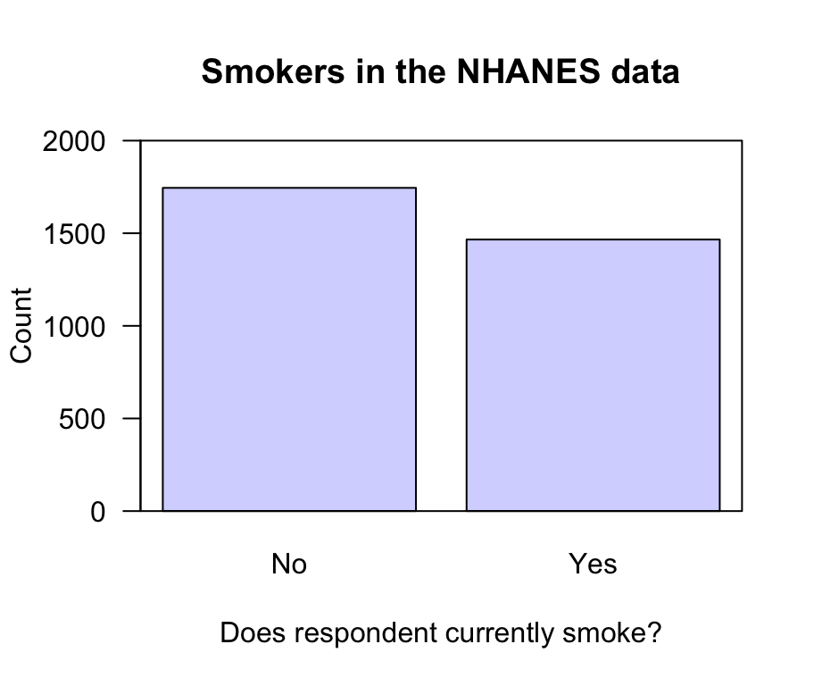
FIGURE 12.37: A bar chart of current smoking status for the NHANES data. No response was recorded for many subjects
The main RQ involves the relationship between average direct HDL cholesterol and current smoking status, so a graph displaying this relationship is needed, such as a boxplot (Fig. 12.38). From the plot, is there a difference in the average HDL cholesterol concentrations between the two smoking groups?
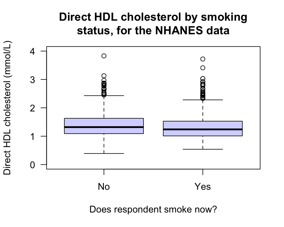
FIGURE 12.38: Boxplot of direct HDL cholesterol against current smoking status, for the NHANES data
The NHANES study is an observational study, where confounding is a potential problem (Sect. 6.3). To examine potential confounding, exploring the relationships between the response and extraneous variables, and between the explanatory and extraneous variables, is useful. Some useful plots are shown in Fig. 12.39; what do they suggest?
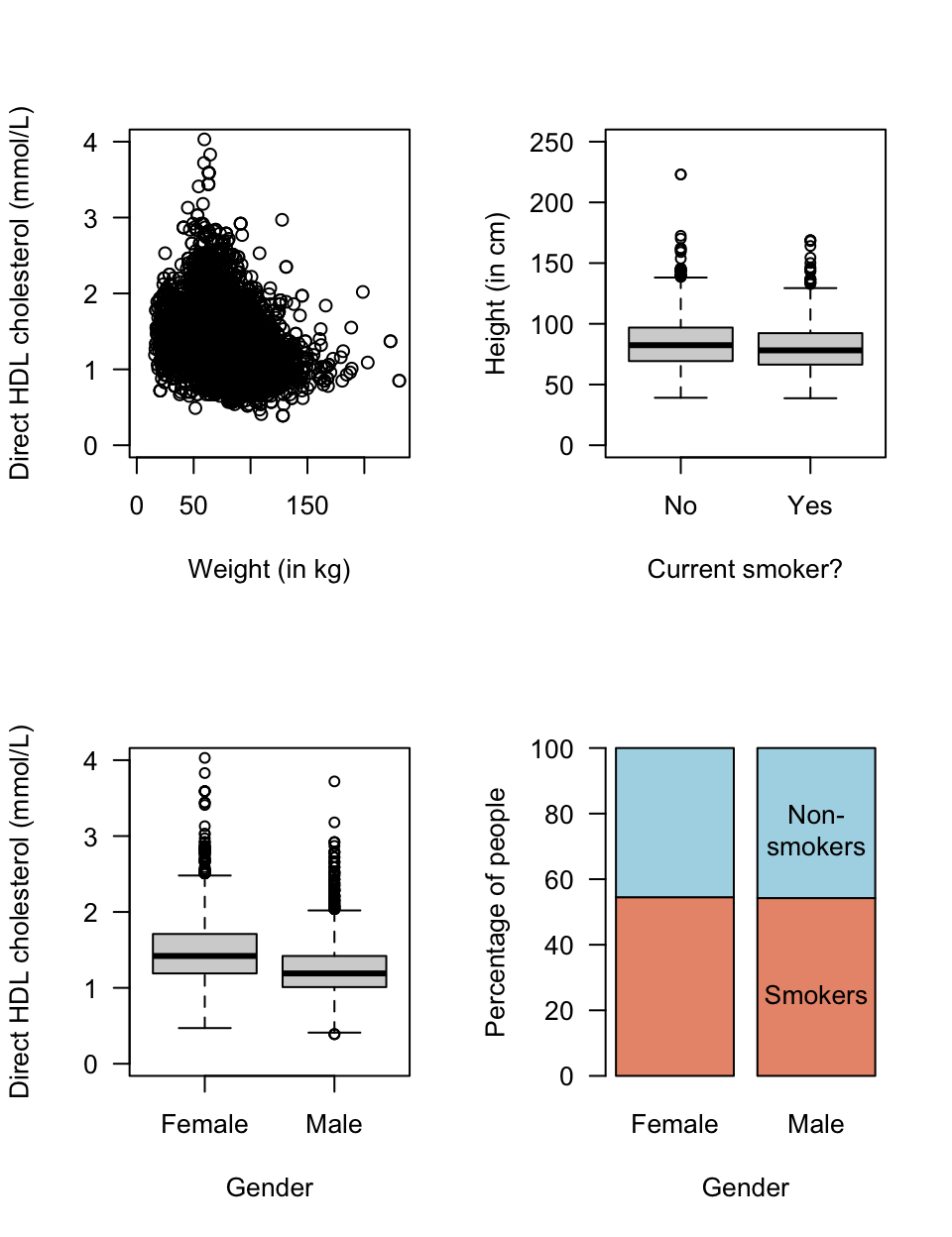
FIGURE 12.39: Some plots from the NHANES data