24.2 Graphical summary
To compare two quantitative variables, a suitable graphical summary may be a boxplot (Fig. 24.1) or (when samples sizes aren’t too large) a dot chart.
For the reaction-time data, the boxplot shows that the sample medians are a little different, but the IQR about the same; one large outlier is present for the phone-using group.
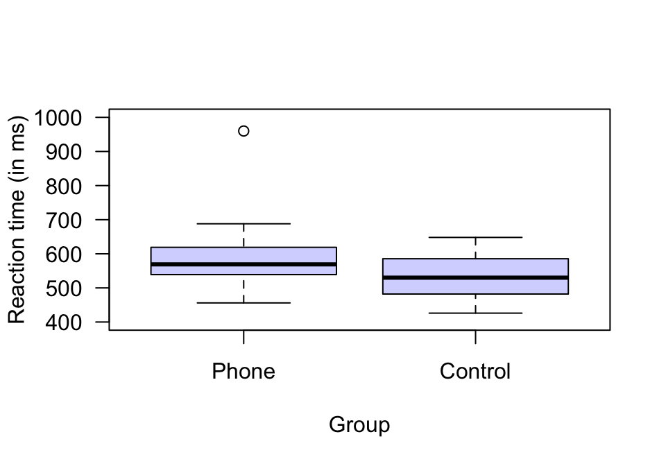
FIGURE 24.1: Plots of the reaction times (in milliseconds) for students using, and not using, mobile phones.