12.7 Comparing 2-D and 3-D graphs
Always remember the purpose of a graph:
The purpose of a graph is to display the information in the simplest and clearest possible way, to help us understand the data.
Instead of aiming to communicate information, sometimes graphs are prepared to look fancy or clever, or to show off the researchers computing skills.
One way that people try to be fancy is to use a third dimension when it is not needed. This is a bad idea: the resulting graphs can be misleading and hard to read (Siegrist 1996).
Think 12.4 (Graphs and tables) In the NHANES study (Centers for Disease Control and Prevention (CDC) 1988--1994), the age and sex of each participant were recorded.
Using Fig. 12.26, can you easily determine if more females or more males are in each age group?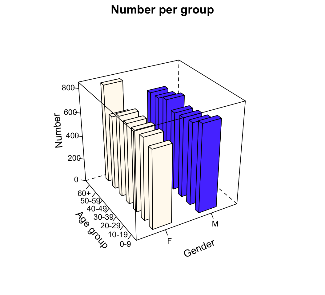
FIGURE 12.26: A three-dimensional bar chart of the NHANES data
The artificial third dimension makes quickly determining the heights of the bars hard. In contrast, a 2-D graph (a side-by-side bar graph; Fig. 12.26) makes it clear whether each age group has more females or more males.
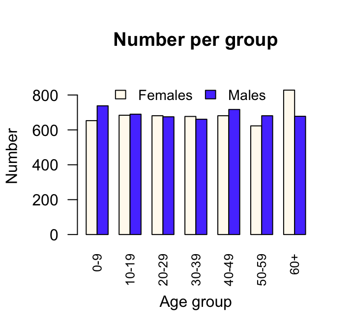
FIGURE 12.27: A side-by-side bar chart of treatment data