12.6 Graphing two qualitative variables
The relationship between two qualitative variables can be explored using:
Many variations of these graphs are possible.
As an example, a study of road kill (Russell et al. 2009) produced the data in Table 12.3. There are two qualitative variables: the season (ordinal, with four levels) and the sex (nominal, with three levels including ‘Unknown’).
| Unknown | M | F | |
|---|---|---|---|
| Autumn | 75 | 25 | 21 |
| Winter | 74 | 27 | 22 |
| Spring | 71 | 10 | 18 |
| Summer | 58 | 10 | 12 |
12.6.1 Stacked bar charts
The data can be graphed by using a bar for each season, stacking the bars by sex on top of each other, within each season (Fig. 12.22).
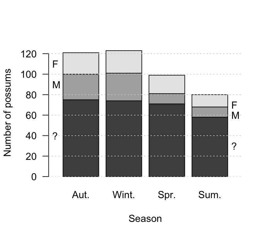
FIGURE 12.22: The number of possums found as road kill, by sex and season
12.6.2 Side-by-side bar charts
Instead of stacking the bars within each season on top of each other, the bars can be placed side-by-side within each season (Fig. 12.23).
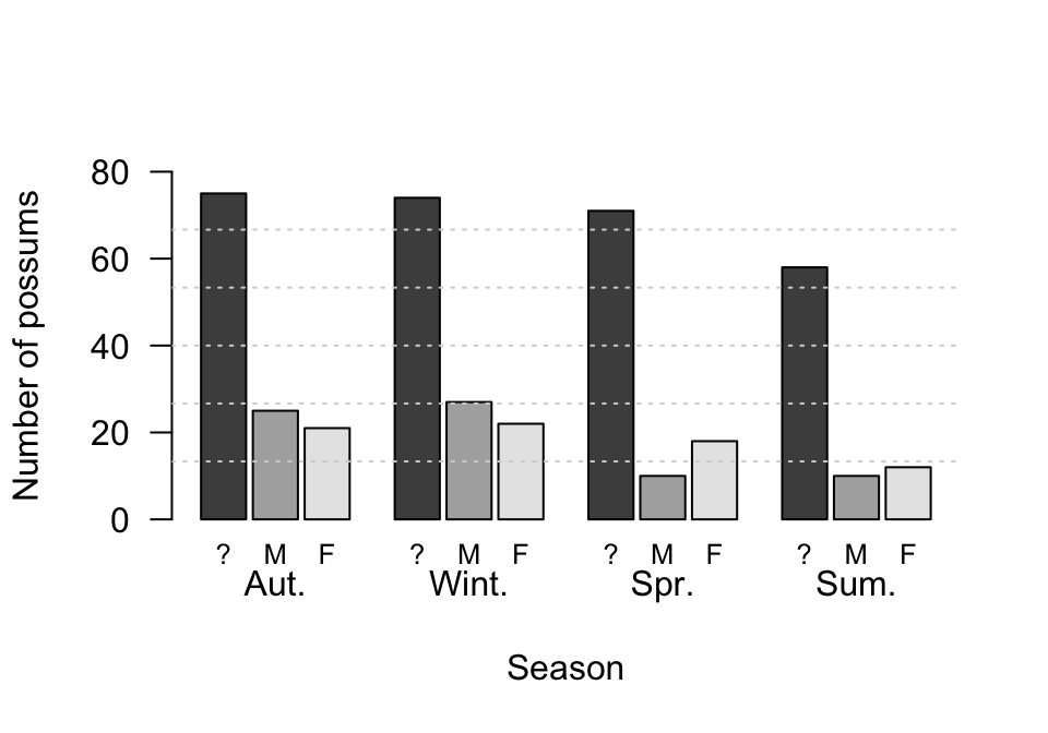
FIGURE 12.23: The number of possums found as road kill, by sex and season
12.6.3 Dot charts
Instead of bars, dots (or other symbols) can be used in place of a side-by-side bar chart (Fig. 12.24).
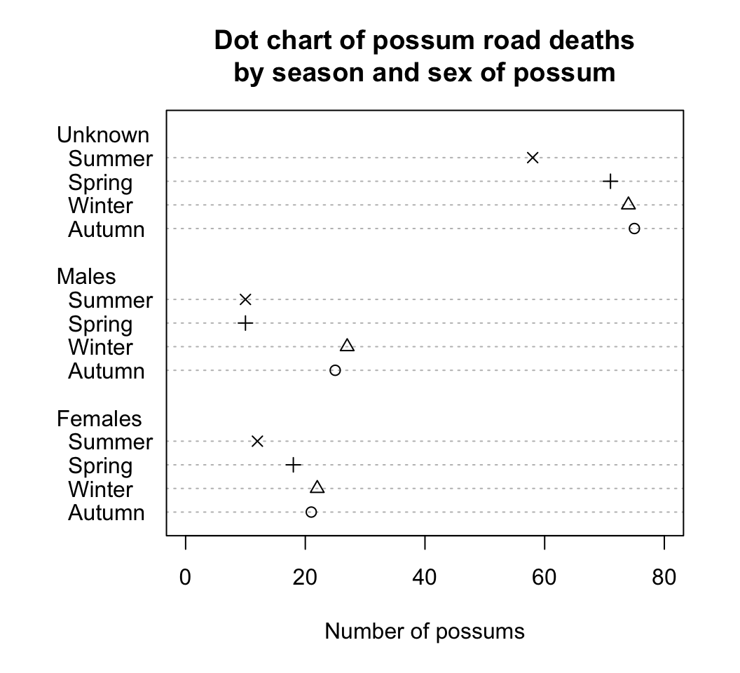
FIGURE 12.24: A dot chart of the number of possums found as road kill, by sex and season
12.6.4 Other variations
Many variations of these bar charts are possible. We can choose:
- horizontal or vertical bars;
- percentages or counts;
- stacked bar charts, side-by-side bar charts, or dot charts;
- either the sex of the possum or the season as the first division of the data.
Many variations exist; some are shown in Fig. 12.25. Another display is to construct a two-way table, of either counts (Table 12.3) or percentages (Table 12.4).
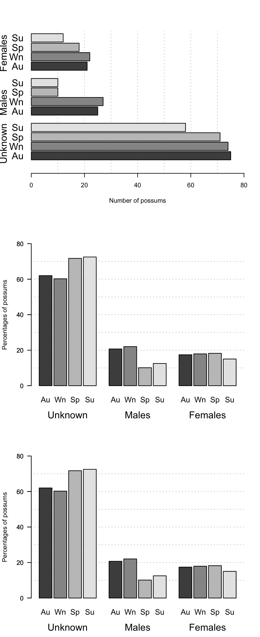
FIGURE 12.25: Three graphs: The number or percentage of possums found as road kill, by sex and season
| Unknown | M | F | |
|---|---|---|---|
| Aut. | 62.0 | 20.7 | 17.4 |
| Wint. | 60.2 | 22.0 | 17.9 |
| Spr. | 71.7 | 10.1 | 18.2 |
| Sum. | 72.5 | 12.5 | 15.0 |