12.4 Graphing one qualitative variable and one quantitative variable
Relationships between one qualitative variable and one quantitative variable can be displayed using:
- Back-to-back stem-and-leaf plot: Best for small amounts of data when the qualitative variable only has two levels;
- 2-D dot chart: Best choice for small to moderate amounts of data;
- Boxplot: Best choice, except for small amounts of data.
12.4.1 Back-to-back stem-and-leaf
Back-to-back stem-and-leaf plots are essentially two stem-and-leaf plots (Sect. 12.2.1) sharing the same stems; one group has the leaves going left-to-right from the stem, and the second group has the leaves going right-to-left from the stem. Back-to-back stem-and-leaf plots can only be used when two groups are being compared.
Example 12.12 (Back-to-back stem-and-leaf plots) A study of krill (Greenacre 2016) produced the observations shown in Table 12.2. A back-to-back stem-and-leaf plot of these data makes it easy to compare the two groups visually (Fig. 12.13).
The plot for the Treatment data goes from right-to-left, and the data for the Control group goes from left-to-right, sharing the same stems. The control group tends to produce more eggs, in general.| 0 | 18 | 0 | 2 |
| 0 | 21 | 0 | 3 |
| 1 | 26 | 0 | 8 |
| 1 | 30 | 0 | 16 |
| 3 | 35 | 1 | 20 |
| 8 | 48 | 1 | 26 |
| 8 | 50 | 1 | 31 |
| 12 | 2 |
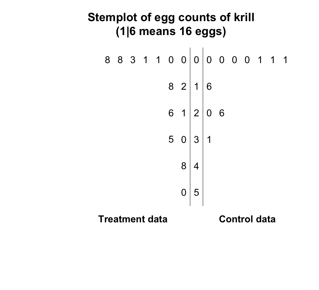
FIGURE 12.13: The number of eggs from krill, for control and treatment groups
12.4.2 2-D dot charts
A 2-D dot chart places a dot for each observation, but separated for each level of the qualitative variable (also see Sect. 12.3.1). For the same krill data used in Example 12.12, a dot chart is shown in Fig. 12.14.
Many observations are the same, so some points would be overplotted if points were not stacked (top panel). Another way to avoid overplotting is to add a bit of randomness (called a ‘jitter’) in the vertical direction to the points before plotting (bottom panel).
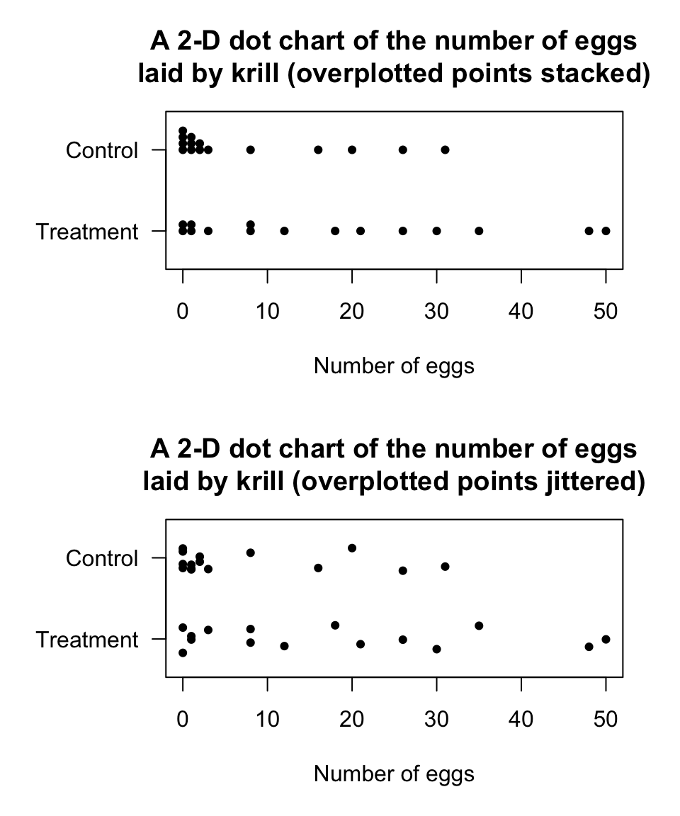
FIGURE 12.14: Two variations of a 2-D dot chart for the krill-egg data: stacking and jittering
12.4.3 Boxplots
Understanding boxplots takes some explanation, and so boxplots will be discussed again later (Sect. 13.3.3). For the same krill data used in Example 12.12, a boxplot is shown in Fig. 12.15.
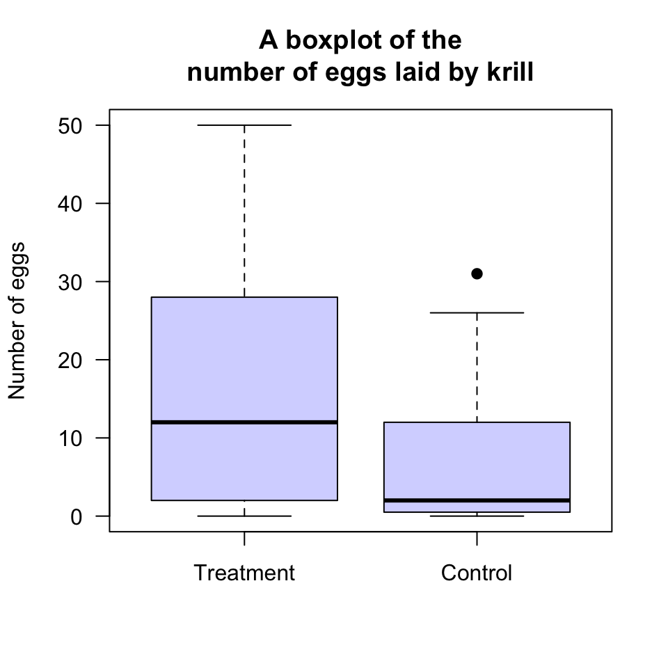
FIGURE 12.15: A boxplot for the krill-egg data
To explain boxplots, first focus on just one boxplot from Fig. 12.15: the boxplot for the Treatment group. Boxplots have five horizontal lines; from the top to the bottom of the plot (Fig. 12.16):
- Top line: The largest number of eggs is 50: This is the line at the top of the boxplot.
- Second line from the top: About 75% of the observations are smaller than about 28, and this is represented by the line at the top of the central box. This is called the third quartile, or \(Q_3\).
- Middle line: About 50% of the observations are smaller than about 12, and this is represented by the line in the centre of the central box. This is an ‘average’ value for the data, or the second quartile, or \(Q_2\).
- Second line from the bottom: About 25% of the observations are smaller than about 2, and this is represented by the line at the bottom of the central box. This is called the first quartile, or \(Q_1\).
- Bottom line: The smallest number of eggs is 0. This is the line at the bottom of the boxplot.
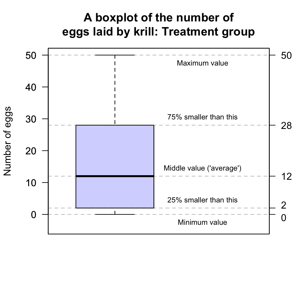
FIGURE 12.16: A boxplot for the krill-egg data; the boxplot just for the treatment group
However, the box for the krill in the Control group is slightly different (Fig. 12.15): One observation is identified with a point, above the top line. Computer software has identified this observation as potentially unusual (in this case, unusually large), and so has plotted this point separately. (Unusually large or small observations are called outliers.)
The values of the quantiles (\(Q_1\), \(Q_2\) and \(Q_3\)) are computed as usual.
So, for the Control data, the largest observation (31 eggs) is deemed unusually large (using arbitrary rules explained in Sect. 13.5.3). Then the boxplot is constructed like this:
The largest number of eggs (excluding the outlier of 31 eggs) is about 26: This is the line at the top of the boxplot.
75% of the observations (including the 31 eggs) are smaller than about 12, and this is represented by the line at the top of the central box. This is called the third quartile, or \(Q_3\).
50% of the observations (including the 31 eggs) are smaller than about 2, and this is represented by the line in the centre of the central box. This is an ‘average’ value for the data, the second quartile, or \(Q_2\).
25% of the observations (including the 31 eggs) are smaller than about 0.5, and this is represented by the line at the bottom of the central box. This is called the first quartile, or \(Q_1\).
Clearly we cannot have 0.5 eggs, but with 15 observations it is not possible to exactly determine the value for which 25% of observations are smaller. Software uses approximations to compute these values. (Different software may use different rules.)
The smallest number of eggs is 0. This is the line at the bottom of the boxplot.
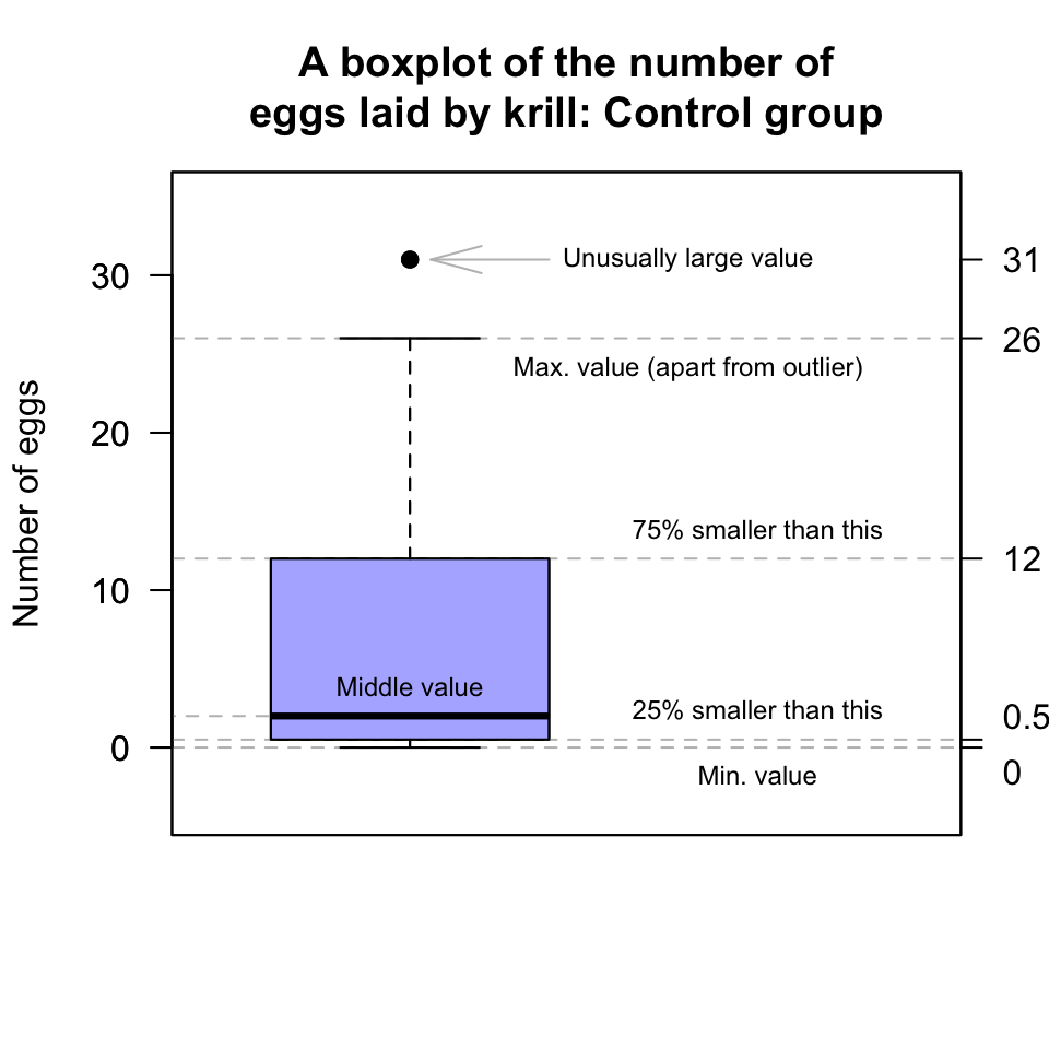
FIGURE 12.17: A boxplot for the krill-egg data; the boxplot just for the control group
The animation below shows how the boxplot of the age of the Americans in the sample is constructed. The “average” age of the subjects is about 38 years, and the ages range from almost zero to about 80 years of age.
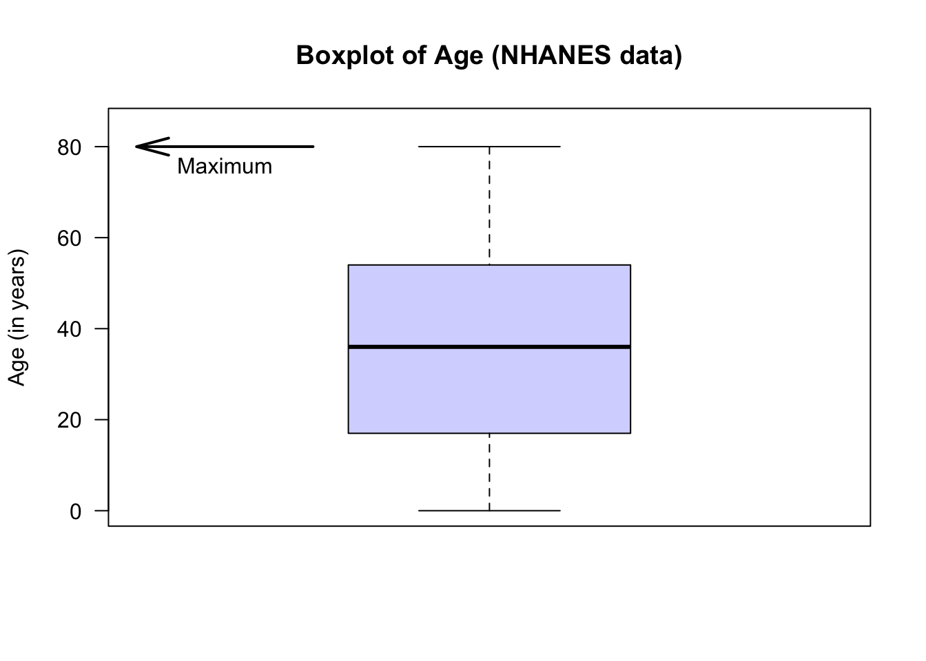
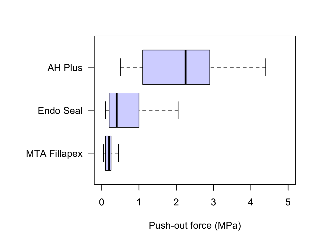
FIGURE 12.18: Comparing three push-out values for three cements
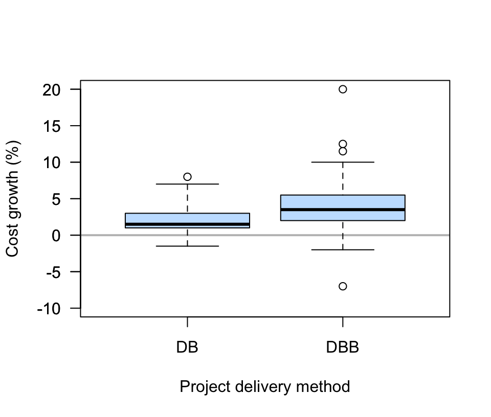
FIGURE 12.19: Comparing two engineering project delivery methods