D.12 Answers: Graphs
Answers to exercises in Sect. 12.13.
Answer to Exercise 12.1:
None of them are bad graphs.
I’d prefer the bar chart, but any are OK.
Answer to Exercise 12.2: A graph of the individual variables is always useful as a starting point: so a bar chart for the origin, and a histogram for the others.
But relationships are the main focus. Relationships between foliage biomass and tree origin: boxplot. Relationships between foliage biomass and the other variables: scatterplot. On the scatterplot, the different origins of the trees could be encoded by using different colours or plotting symbols.
Answer to Exercise 12.3:
Gender and GFMCS: both qualitative; the others are quantitative.
Relationships between two quantitative variables: use a scatterplot.
Relationships between two qualitative variables: (say) a side-by-side bar chart.
With one of each: boxplot.
See Fig. D.1 for some examples.
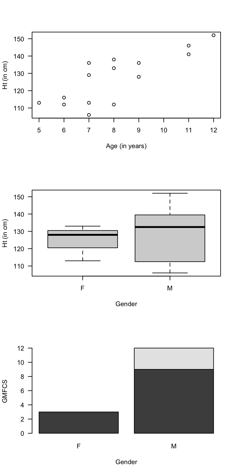
FIGURE D.1: Some graphs from the cerebral palsy data
Answer to Exercise 12.4:
Fertilizer (quantitative): histogram (response variable).
Soil nitrogen (quantitative): Histogram (explanatory variable).
Source (qualitative nominal): Barchart (explanatory variable).
Relationships: Between fertilizer dose and soil nitrogen: scatterplot.
Source could be encoded using different coloured points.
Answer to Exercise 12.5:
A bar chart (or dot chart).
A pie chart would not be appropriate,
as respondents could select more than one option.
Answer to Exercise 12.6:
In general,
female basketball players are taller than female netballer players
(the first, second and third quartiles are all greater for basketball players).
For the second and third quartiles,
the differences look quite substantial.
The minimum heights are similar.
Answer to Exercise 12.7:
What do the different plotting symbols mean?
The labels on the axes are not helpful.
The vertical axis goes up to 35, but could easily stop at 20.
See Fig. D.2.
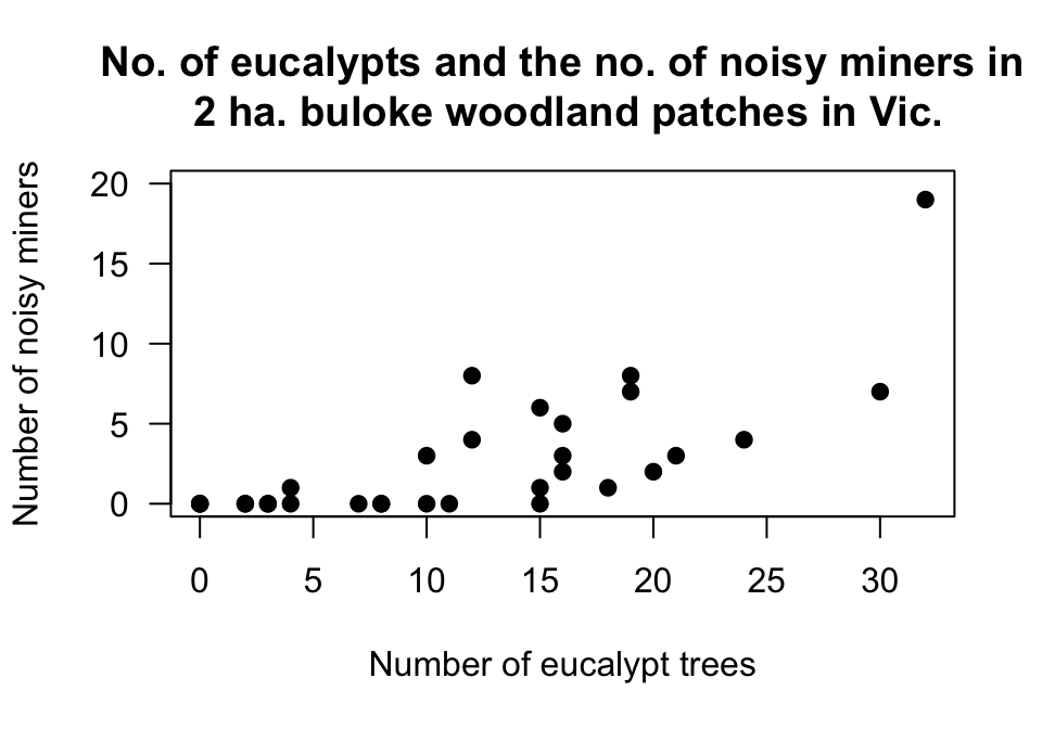
FIGURE D.2: The number of noisy miners and the number of eucalyptus trees
Answer to Exercise 12.8: The graph is inappropriate! Both variables are qualitative, but the graph is a scatterplot (used for two quantitative variables). What does that plot even tell you?
A stacked or side-by-side barchart should be used (Fig. D.3).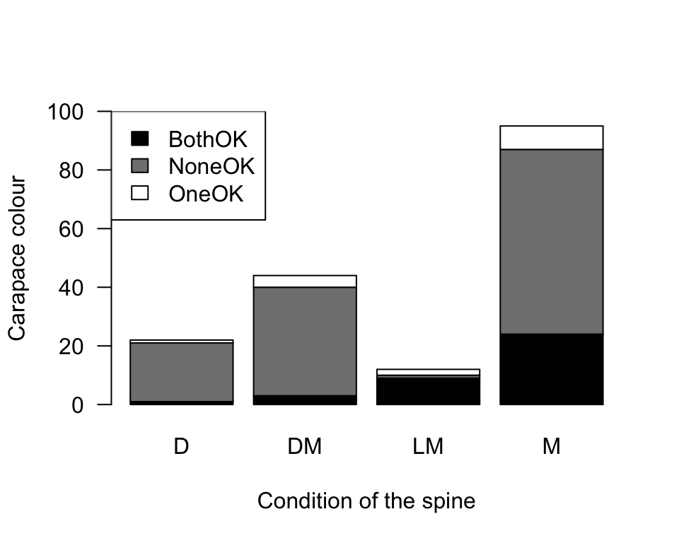
FIGURE D.3: The colour of female horseshoe crabs and the condition of their spines. There are no missing values.
Answer to Exercise 12.9:
1. Response variable: Change in MADRS (quantitative continuous).
2. Explanatory variable: treatment group (qualitative nominal with three levels).
3. Response variable: Histogram. Explanatory: bar chart. Relationship: boxplot.
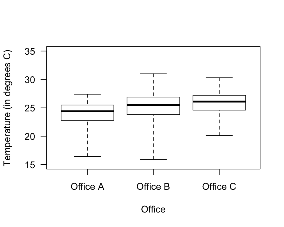
FIGURE D.4: Boxplot of the office temperatures
Answer to Exercise 12.11:
Variable is the ‘Sport’ (qualitative).
The bars can be ordered any way.
Skewness makes no sense:
It only makes sense to talk about skewness
for quantitative variables.