12.9 Notes on constructing graphs
Always remember:
The purpose of a graph is to display the information in the clearest, simplest possible way, to help us understand the data.
Helping readers to understand the data is the essense of producing a good graph:
Data graphics should draw the viewer’s attention to the sense and substance of the data, not to something else […] essentially statistical graphics are instruments to help people reason about quantitative information.
— Tufte et al. (1998), p. 91
You should be able to construct the graphics by hand, but we will generally use software (e.g., jamovi or SPSS). Importantly, given the purpose of a graph, what the graph communicates should be explained: Graphs need to be clear and well-labelled with captions.
Ensure that you:
- Do not add artificial third dimensions, or other ‘chart junk’ (Su 2008).
- Do not add optical illusions.
- Do not make any errors.
Ensure that you:
- Do add units of measurement or value labels where appropriate.
- Do add titles and axis labels.
- Do ensure the axis scales are appropriate.
- Do add any necessary explanations.
- Do make it easy for the reader to be able to consider the RQ (for example, to easily make the comparison of greatest interest).
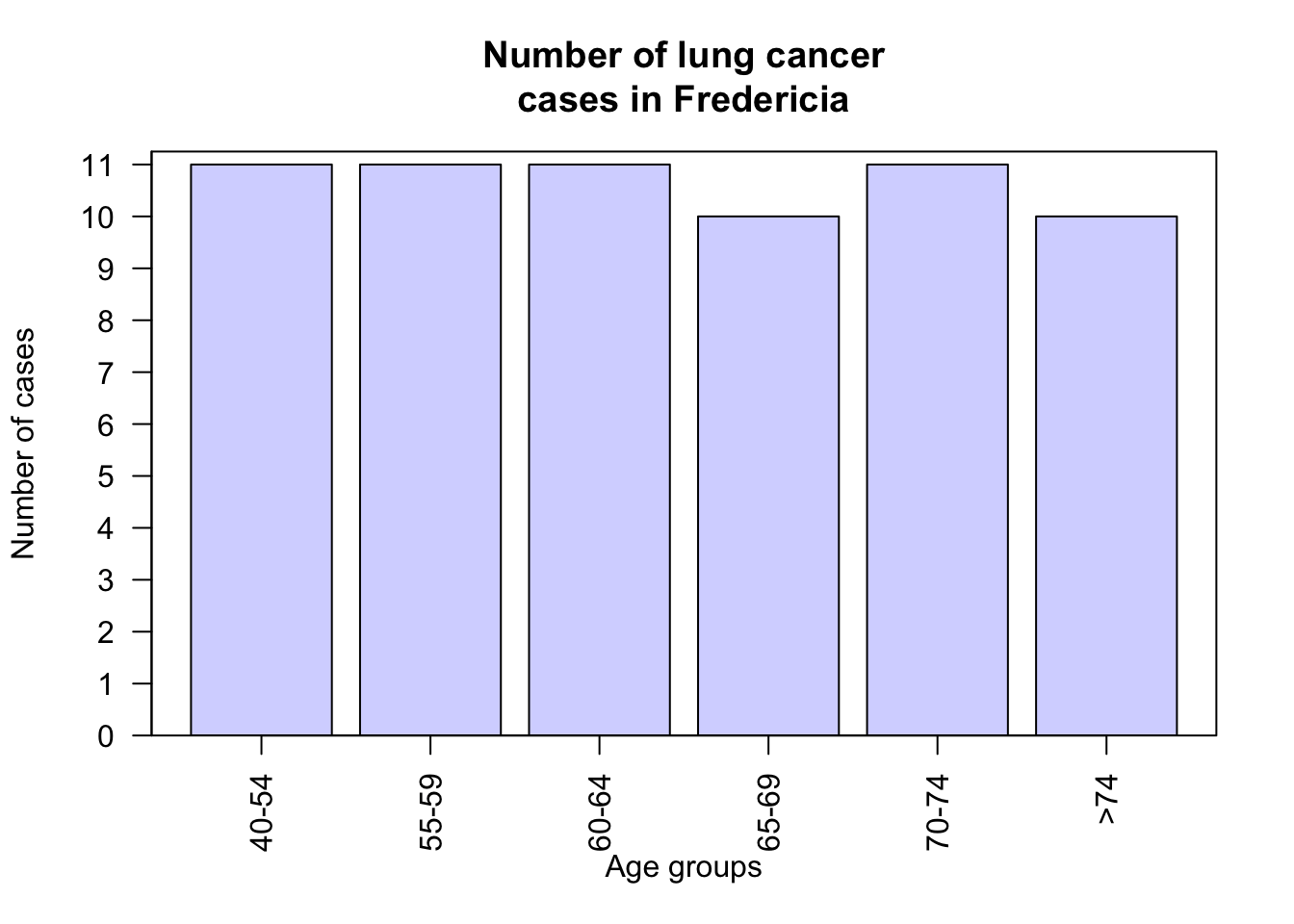
The animation below shows a bar chart with the count (vertical axis) starting at zero (when the counts in each age group look similar), and then gradually changing where the vertical axis starts… so that the final bar chart make the number of cases in each age groups look very different. The graph is misleading when the graph does not start at a count of zero.