24.9 Error bar charts
A useful way to display the CIs from two (or more) groups is with an error bar chart, which displays the CIs (or sometimes the standard errors) for each group being compared. (A boxplot displays the data.)
Error bars charts display the expected variation in the sample means from sample to sample, while boxplots display the variation in the individual observations and show the median.
For the reaction time data, the error bar chart (Fig. 24.7) shows the 95% CI for each group (the mean has been added as a dot).
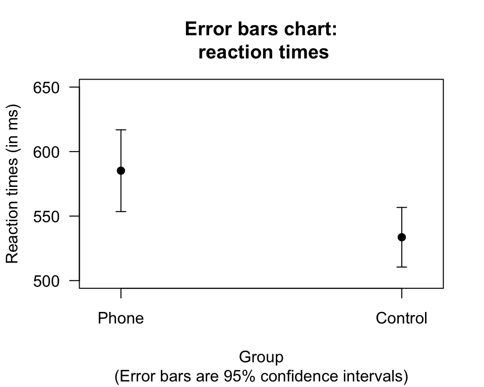
FIGURE 24.7: Error bar chart comparing the mean reaction time for students using a mobile phone and not using a mobile phone (control)

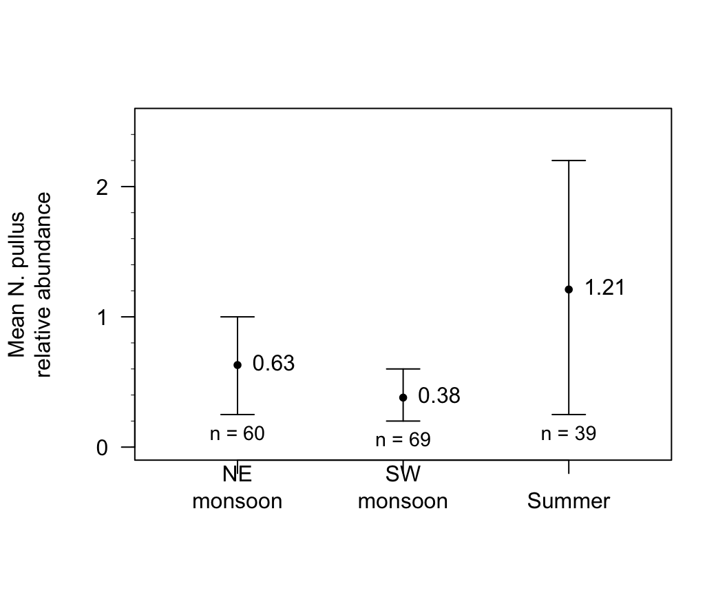
FIGURE 24.8: Relative abundance of a gastropod from random quadrat surveys conducted over prevalent monsoon types in all study areas in Talim Bay. Error bars represent 95% confidence intervals.

Example 24.3 (Error bar charts) A study (Schepaschenko et al. 2017) examined the foliage biomass of small-leaved lime trees from three sources were studied: coppices; natural; planted.
Two graphical summaries are shown in Fig. 24.9: a boxplot (showing the variation in individual trees) and an error bar chart (showing the variation in the sample means). Using a better scale for the error-bar plot is helpful (Fig. 24.10).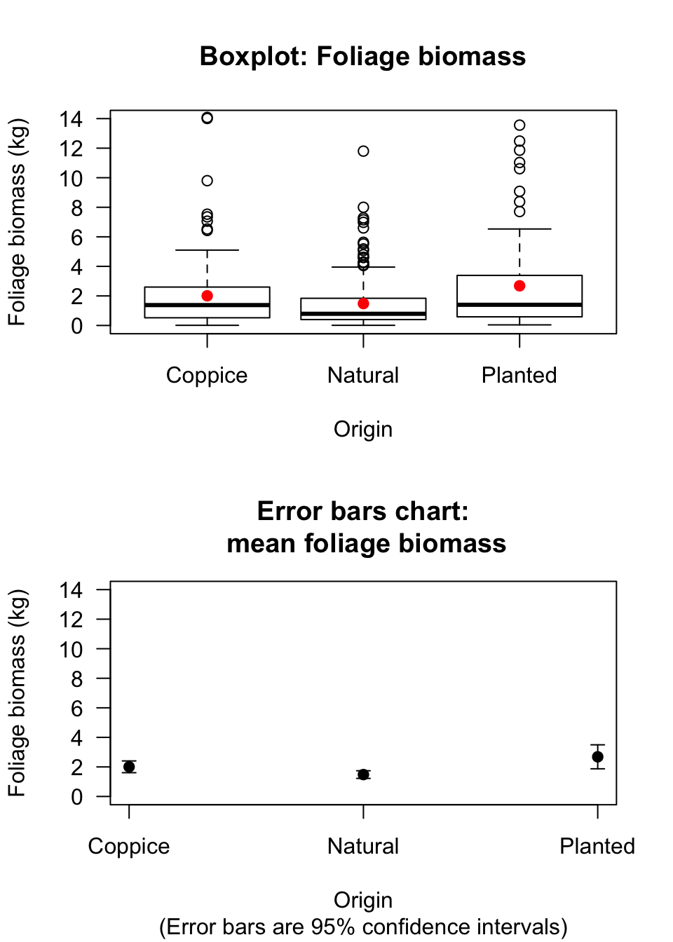
FIGURE 24.9: Boxplot and error bar chart comparing the mean foliage biomass for small-leaved lime trees from three sources, using the same vertical scale. The solid dots in the boxplot are shown the mean of the distributions
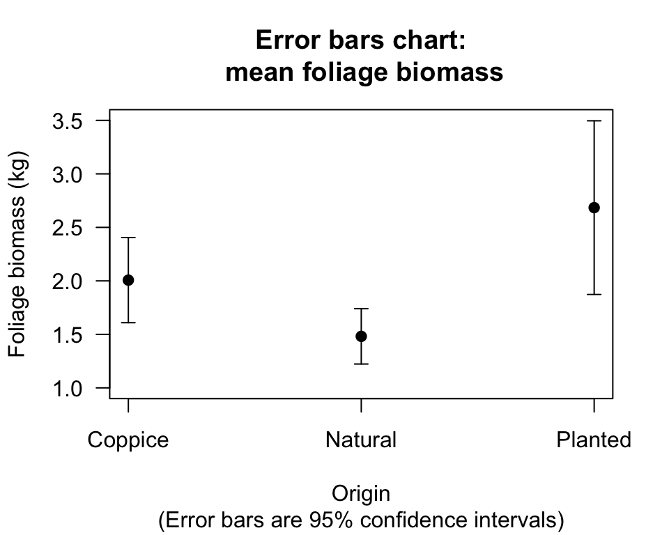
FIGURE 24.10: Error bar chart comparing the mean foliage biomass for small-leaved lime trees from three sources, but with a more sensible scale on the vertical axis