33.1 Varying various plots
There is a wide variety of plot types available (e.g., see Holtz (2018) or Schwabish (2021)). Each plot type can also be drawn in many different ways: varying size, aspect ratio, scales, colour, symbols, styles, whatever. A key message of this book is that drawing a variety of plots, and varying the plots drawn, can provide more insights than searching for a single ‘optimal’ display. Just as taking many photographs of a complicated object can help people appreciate its structure, so can drawing many graphics help viewers grasp the structure of a dataset.
Approaches vary too. Some like to study individual graphics thoroughly before moving on to other ones. Some like to flick through lots of graphics and then return to particular ones for a closer look. Being swamped by too many graphics can be as unsatisfactory as not having enough. As yet there is little guidance available on how to explore large datasets effectively.
Not all graphics are the same. There are different types of graphics—histograms, barcharts, scatterplots, and so on, there are different types of data displayed in graphics—individual cases, aggregates, statistics, parameter estimates, residuals, and so on, and there are different uses for graphics—exploration, explanation, and exposition (or presentation). Accordingly, the same display may be interpreted in different ways depending on its context and on what kind of data it represents.
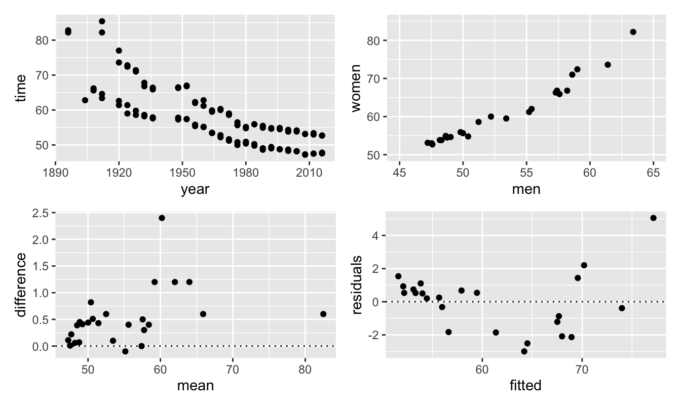
For illustration, consider the 100 m freestyle swimming event, one which has been swum by both men and women at all Olympics since 1912. Figure 33.1 shows four scatterplots of the data. Top left is a scatterplot of the times in seconds for the male and female gold and silver medal winners by Olympic year. Times improved relatively steadily after initial high values. It is likely that the females are the group of higher points and the males the group of lower ones (which could be confirmed by using colour). Differences in gold and silver performances at later Games can barely be seen. Top right is a scatterplot of gold medal times of women against those of men. The winning times are strongly correlated. Lower left is a Tukey mean-difference plot for the differences between gold and silver times for men. There are two extreme values, one to the right for the (relatively) slow times of 1896 and one up high in 1924 when Johnny Weissmuller won by a very large margin. Interestingly that hardly shows in the first plot. The most surprising point is the negative value—from 1960 at Rome. After much discussion Lance Larson was awarded the silver medal by the judges although the handtiming then used gave him a faster time than John Devitt to whom the judges awarded the gold medal. Lower right is a residual against fitted plot for a simple linear model of women’s gold medal times as a function of men’s gold medal times. The gold medal for women has been shared twice (in 1984 and 2016), so it was necessary to remove one gold medal record for each of those years. The plot shows that a curvilinear model would give a better fit.

Figure 33.1: Four different kinds of scatterplot of data for gold and silver medal performances by men and women in the Olympic freestyle 100 m
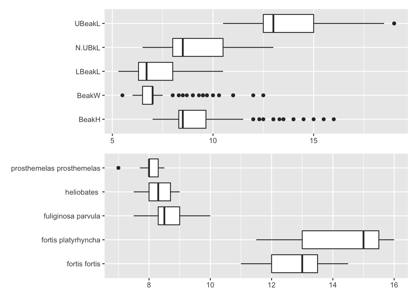
A set of boxplots in parallel could be plots of individual variables or plots of one variable conditioned on another. Figure 33.2 displays two groups of boxplots. Above, there are boxplots of the five beak measurements for Darwin’s finches in the Isabela Island dataset (Chapter 14). All are skewed to the right, especially beak height and width, doubtless due to the mix of species. Below, there are boxplots of beak height for the five species on Isabela Island. Two have clearly bigger beak heights than the other three. It is important to indicate what kind of plot each is. Titles and colour can help (intentionally left out here), as can using boxplot widths to show group sizes. Barring missing values (there are none here) the boxplots are based on equal numbers of cases in the first plot. In the second the numbers vary from 11 Fortis platyrhyncha to 81 Fuliginosa parvula.

Figure 33.2: Boxplots of beak measurements (above) and beak height by species (below) on Isabela Island
The individual graphics of Figures 33.1 and 33.2 have purposely been drawn similarly. In practice groups of graphics like this would be drawn distinctly. For instance, whatever else one might think of them, the four graphics standardly produced by plotting a model in R are. The danger lies more in glancing quickly at isolated, individual graphics and not checking what they display.