28.2 Data cleaning and transforming
28.2.1 Errors, typos, outliers, missing values
Some errors are obvious (e.g., impossible values like diamonds with zero dimensions in §11.2), some become visible thanks to graphics displays (such as the diamond outliers observed in Figure 11.6), some emerge after analyses. The Olympics dataset in Chapter 6 had different names for the same event at different Olympic Games, as uncovered by Figure 6.4. The human spaceflight dataset in Chapter 10 recorded different times for people on the same mission and had a few other data issues that are discussed in §10.3. Amongst the chess players with FIDE ratings in 2015 there were 15 supposedly born in 1900. These errors were doubtless due to a 00 coding used somewhere in the original data submission. The corresponding ages were marked as NA, a standard code for a missing value.
Often errors can be corrected. Sometimes they can be discarded as definitely wrong. Ideally there are not many of them. Whether whole cases should be excluded if some data are in error or missing depends on how the data are used. For small datasets it can be important to have exactly the same cases in each plot; for larger datasets this is less critical.
Missing values may be recorded with different codings. The Annenberg survey data in Chapter 9 used “998” for “Don’t know” and “999” for “Refused”. In the movie dataset in Chapter 3, some missing values were recorded as “\N”.
28.2.2 Transforming and combining variables
Variable transformations can help to pick out individual data features. Standardising variables makes distributional comparisons across variables possible. Combining variables can reveal more complex structures.
Variables may be transformed onto alternative scales or combined with other variables to form new ones. The boxplot of movie runtimes, Figure 3.1, is scaled in weeks instead of minutes to help viewers make sense of the extreme values. Who remembers that 50,000 minutes is around 5 weeks?
Several transformations were used in Chapter 16 about football leagues. The main ones were needed to convert game scores into tables of results and league tables. The wrangling was complicated by a number of changes over time: three points for a win instead of two, using goal difference instead of goal average, changes in divisional structure, and, most recently, an incomplete season for two divisions due to Covid. Other transformations included a square root transformation used in Figure 16.7 to emphasise higher league positions over lower ones. In the wormcharts of team performances across seasons (Figures 16.8 to 16.10), cumulative team points were transformed by subtracting the league average at the time to make it easier to compare teams’ performances.
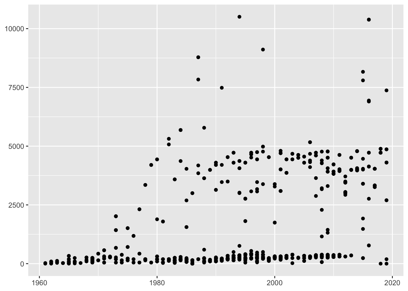
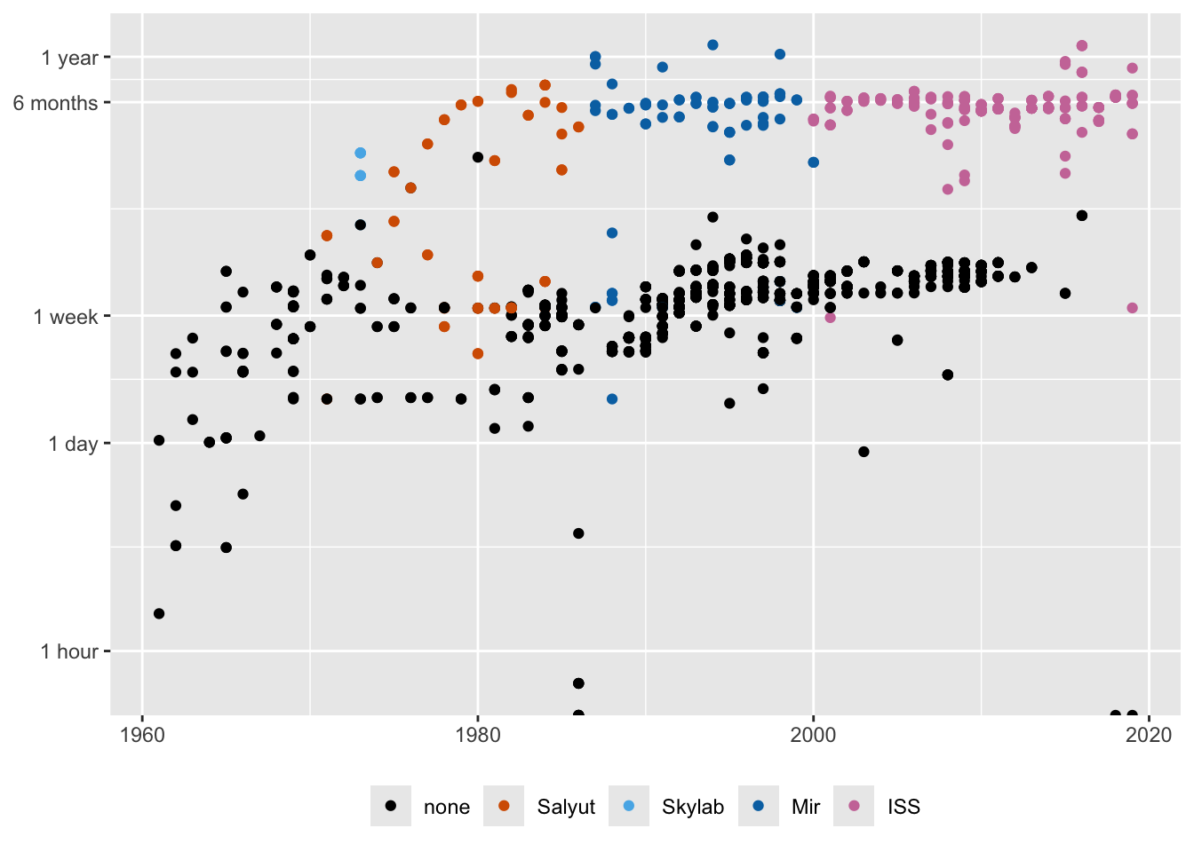
The mission times of individuals on spaceflights were initially plotted on a linear scale in Figure 10.4, shown again on the left of Figure 28.1. Plotting mission times on a log scale in Figure 10.6, repeated on the right of Figure 28.1, provided a better view. It also led to adding a more informative vertical scale.


Figure 28.1: Individual spaceflight mission times over the years, plotted on a linear scale (left) and a logged scale (right)
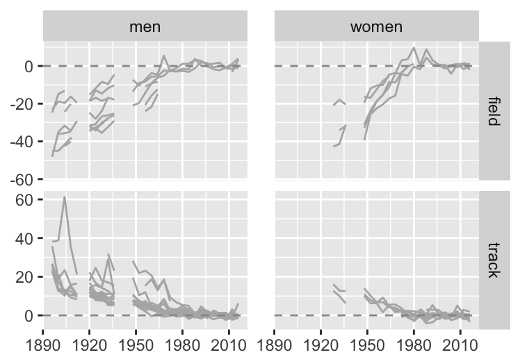
Transformations can be used to standardise data to make distributions for different groups or variables more comparable. In §6.2 performance improvements in athletics events at the Olympic were compared over the years. Figure 6.7, repeated in Figure 28.2, shows the percentage changes for track and field events for men and women. Baselines were taken to be the average of gold medal performances at the Olympics from 1996 to 2016. For field events gold medal performances tended higher as winning distances became longer and winning heights became higher. For track events gold medal performances tended lower, as winning times got faster. An inverse transformation of the track events data could have been used to make their gold medal performances tend higher too.

Figure 28.2: Percentage differences in gold medal performances in athletics events compared with averages over the last six Games
Variables in parallel coordinate plots almost always need to be standardised and there are several ways of doing it. Methods include putting variables individually onto [0,1] scales or normalising them by using the mean and standard deviation or by using robust statistics. There are examples in Chapter 14 for Darwin’s finches and in Chapter 18 for the Palmer penguins, where the transformations of the continuous variables are to [0,1] scales.
The decathlon provides an example where special transformations are used. The current scoring system, introduced in 1984, converts performances in the ten events to points using a different three-parameter formula for each event (IAAF (2001)). As equal points are intended to reflect equal performances, no further standardisation is needed in principle. Figure 31.9 shows how that can work in practice.
Categorical variables may be reported as numbers instead of text and it is worth making the effort to convert them to meaningful labels. Transforming the order of levels of a categorical variable from a default such as alphabetic is always sensible (and is discussed in Chapter 31). Occasionally numeric variables are assumed by software to be character variables, usually because the data file has a text error, and they have to be converted to numeric after fixing the text error. Software can often make good guesses about data characteristics, but you need to check.
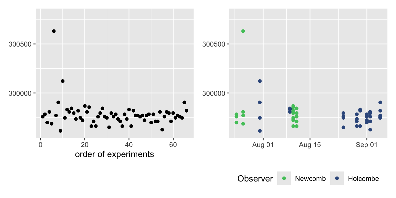
Date and time information need special handling in software and almost certainly have to be transformed first. Newcomb’s estimates of the speed of light are displayed by experimental order in Figure 5.6 and by date in Figure 5.7. The differences are important for understanding the data. The two plots are shown again in Figure 28.3 below. The dates taken as text are from Newcomb’s paper (Newcomb (1891)) and were transformed to a special date format so that the R software could scale them appropriately.

Figure 28.3: Newcomb’s estimates of the speed of light, plotted in order (left) and by date (right)
In Chapter 24 two datasets of half-hourly data over 10 years were analysed. Investigating patterns across days, months, and years required combining the textual date and time information and converting it into dates and times R could deal with.
Spatial datasets also require special treatment. They may be reported in any one of a large number of possible coordinate reference systems and it is essential in any study to convert all the spatial data to the same system. Much work has gone into transforming between these systems and the current state of play is summarised in Bivand (2020). One example here involved adding city locations to the maps of France in Figures 7.1 and 7.4. A further complication in Chapter 7 was converting a modern shape file of the departments of France to one matching the form in 1954. Finally cartograms may be used to take account of differences between areas as in Figures 7.5 and 9.7. The spatial transformations applied require complex iterative methods.