32.1 Attention
“Can you describe her?”
“It's a bit difficult. She was sort of middle-aged and ordinary.”
“What was she wearing?”
“Tweeds, oatmeal flecked with brown, a three-quarter coat with patch pockets… a scarf, felt hat, brown shoes, a tussle shirt… and a small blue handkerchief in her breast pocket. l can't remember any more.”
“You couldn't have been paying attention.”
Graphics texts generally consider perception and interpretation, including optical illusions, but do not pay as much attention to attention. There is an implicit assumption that viewers who look at a graphic are giving it their full attention. That seems as unrealistic as assuming that all the students attending a lecture are giving it their undivided attention.
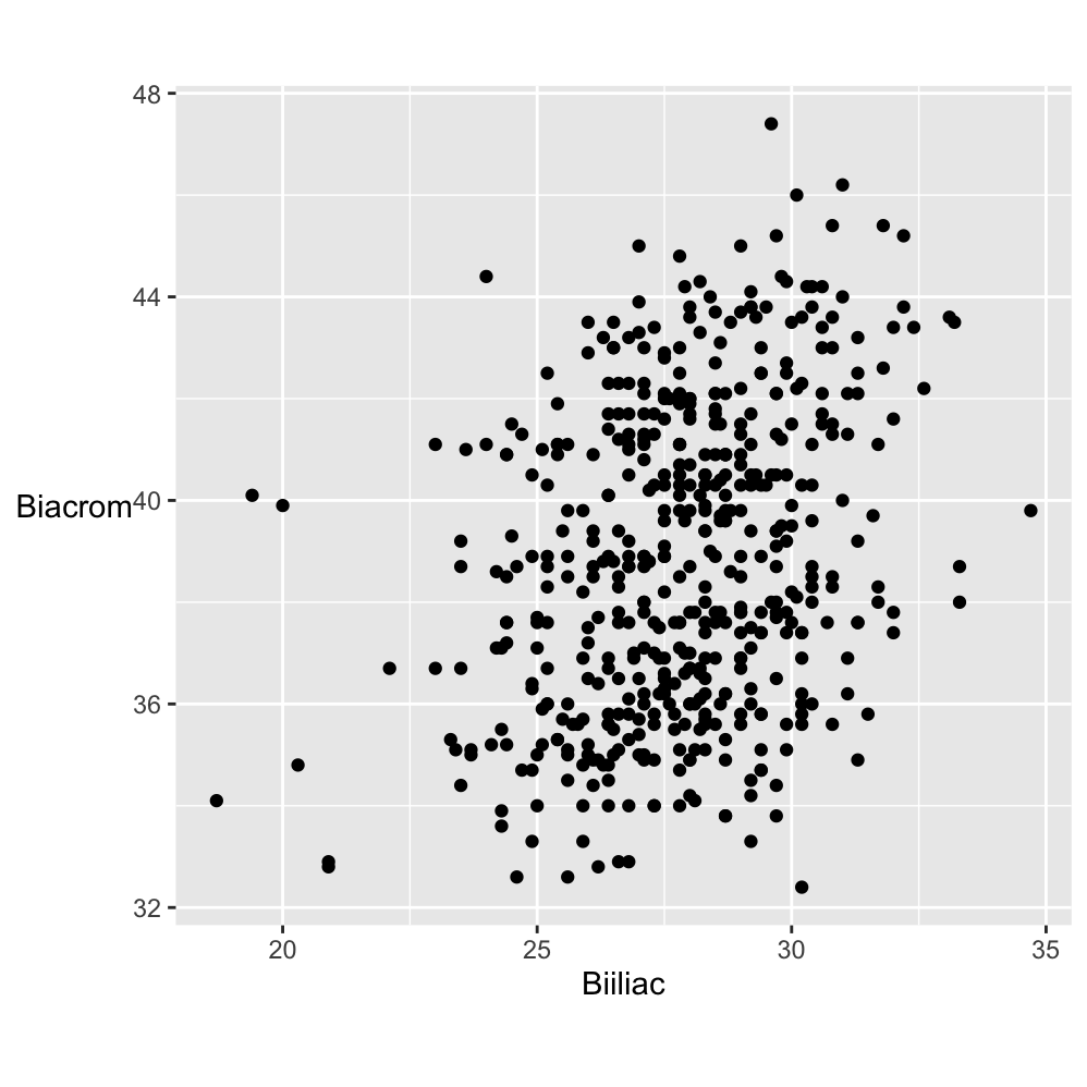
Figure 32.1: Scatterplot of Biacromial diameter against pelvic breadth (Biiliac) for 507 adults.
Does Figure 32.1 demand attention? Someone might glance at it and decide the scatterplot did not look interesting. Perhaps the measurements did not mean anything to them or perhaps they did, but the topic did not attract them. They might have been distracted by the cup of coffee they had just made, by an email or by a noise in the street. They might have been tired or bored. Or, perhaps, they devoted sustained and concentrated attention to Figure 32.1. Graphics are often discussed objectively and yet there are many subjective factors affecting how they are viewed.
Biacromial diameter is a technical term for a measurement of the width between the shoulders and Biiliac may be described as “pelvic breadth”. Knowing that might make someone look at the graphic more closely and think that is is surprising the two measurements are not more correlated. Many body measurements are. There are a few Biiliac values that appear lower than the rest. It is curious that the highest pelvic breadth value and two of the three lowest have about the same middling shoulder width.
A graphic without structure can be interesting because it was expected to have structure and did not or because there is more to it when additional information is included. Figure 32.2 colours the points of the plot by sex.
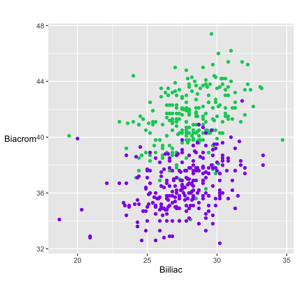
Figure 32.2: Scatterplot of Biacromial diameter (shoulder width) against Biiliac (pelvic breadth) for 247 men (in green) and 260 women (in purple).
Generally, women have about the same pelvic breath as men but narrower shoulder widths. The displays in Figures 32.1 and 32.2 use data collected around twenty years ago (Heinz et al. (2003)). There are not many datasets of multivariate measurements of individuals and in working with this one, the authors’ proviso should be remembered that “the sample is not a representative sample from a well-defined population”. The R help file says it was men and women who were primarily in their twenties and thirties and who all exercised several hours a week, hardly typical of the general population.
If information is to be gained from a graphic, it has to be paid some attention. How much attention is paid and how that attention is paid are important. A quick scan of a display can suggest the type of graphic and what the overall structure could be. More focused and concentrated attention may be needed to confirm first impressions, to pick out additional features, and to consider what further information might be useful. Background knowledge of what the variables mean and of how the data were collected are needed, as is information about the quality of the data.
Inspecting a graphic once is rarely sufficient The source should be checked and any text associated with the graphic reviewed. Sometimes a graphic can be compared with related graphics, sometimes there are other questions that need to be investigated before returning to the graphic itself. If a graphic is worth drawing, then it should be worth careful and thorough study. This involves not just the graphic itself, but also any relevant associated information.
Initial impressions can be deceptive. There may be several features that can be seen in a graphic and rather than fixating on one, it is more effective to consciously look for others. Like brainstorming, it is helpful to generate a number of ideas before being too critical of any of them. As always, varying the shape and size of the display may help.
Expectations influence what is seen, either negatively or positively. If there are strong expectations of what a graphic will show, viewers may only look for corroborating evidence. On the other hand, if there are no expectations then they may simply accept what they see and lose the capacity to be surprised. It is best to think in advance of what is likely to appear and to look more closely—even if expectations are met.
32.1.1 Types of attention
Before paying full attention, there is what is referred to as preattentive processing (although attention does play a role, Healey & Enns (2012)). People can pick out 2 red dots in a cloud of blue dots without even trying. They might then use focused attention to concentrate on those points and their neighbourhoods or they might distribute their attention over the whole display looking for other features.
Sometimes something may catch a viewer’s eye when they are not looking directly at it, thanks to their peripheral vision. Potter et al. (2014) concludes that in certain circumstances people can see meaning in a photograph within 13 ms. Perhaps that ability encourages them to only glance at graphics, and not try to see more in them. Even if graphics are studied more closely, there is the effect that Barbara Tversky calls the fourth law of cognition (Tversky (2019)): The mind can override perception. She writes: “We don’t always look, even when the answer is right in front of our eyes. Memory overrides perception.” Both effects contribute to explaining why graphics are often poorly interpreted. The fourth law of cognition may also underlie why some graphics are poorly described by their own authors. They may be writing about what they wanted to present and not what can be seen in the graphic.
What attention is paid to may be goal-driven (top-down), stimulus-driven (bottom-up) or history-based (depending on the viewer’s experience). The goal of drawing the map of German election results in Figure 26.16, repeated here in Figure 32.3, was to see if there were geographical patterns. The main ones for the CDU, CSU, SPD, and AfD stand out (goal-driven). The smaller constituencies where the Greens did well imply that they did well in urban areas and the fact that Die Linke party are in the legend means they must have won seats somewhere (stimulus-driven). Political maps give poor representations of party support because they display areas and not populations (history-based).
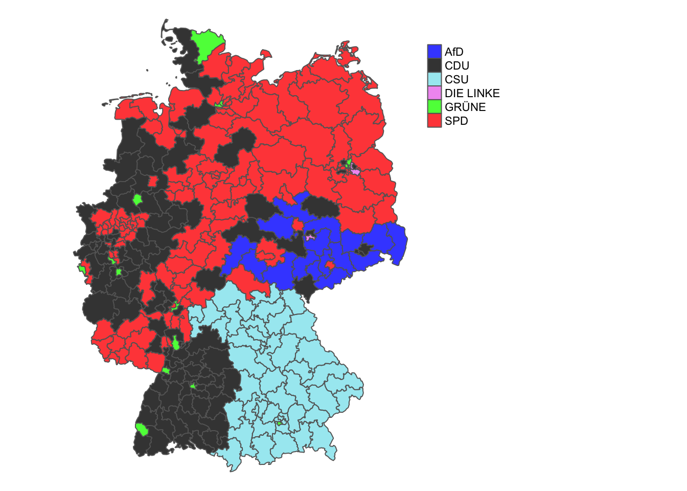
Figure 32.3: Winners of Erststimmen seats by political party in Germany 2021
Theeuwes (2018) claims that stimulus-driven and history-based attention selection are effortless, while goal-driven requires effort. His research is related to dynamic situations, such as driving, but is still relevant. It is easier to respond to a strong feature or recognise a familiar pattern than to identify a feature that may or may not be associated with a particular goal. Having experience of what types of feature a graphic can show is valuable.
Studying a graphic display closely may reveal a number of features, yet frequently a later inspection of the same graphic can reveal other features. It is useful to look at graphics afresh, to break the train of thought. A graphic you have drawn yourself or is on the web can be varied by changing the size, the aspect ratio or the position on screen. You can change the colours, the symbols and the scales in your own graphics. You could zoom out to see where the data lie on some grander scale or you could zoom in to investigate a small sector in detail. The more complex the plot, the more options there are. Multivariate displays like parallel coordinate plots and mosaicplots have a particularly large number of alternative options, especially the numbers of possible orderings. Different graphics can be used for the same data, e.g., boxplots or density estimates instead of histograms for single continuous variables. Graphics for related variables in the same dataset can be drawn. The essential principle is to regard graphics as doorways to information, not as static pictures.
Presentation graphics are sometimes designed to attract attention to make them memorable, sometimes to direct attention to a feature in them. It is easy to make a display memorable by adding an outlandish touch, overly dramatic colours or exotic background pictures. Whether the graphic’s information is then also memorable is another question.
32.1.2 Cognitive load
Complex graphics can be difficult to study and understand. Sometimes graphics in scientific articles are complex and tightly packed with information because space is limited. Sometimes a complex graphic is just a good summary of complex data, as with Figure 13.7 or Figure 18.8, shown again in Figure 32.4.
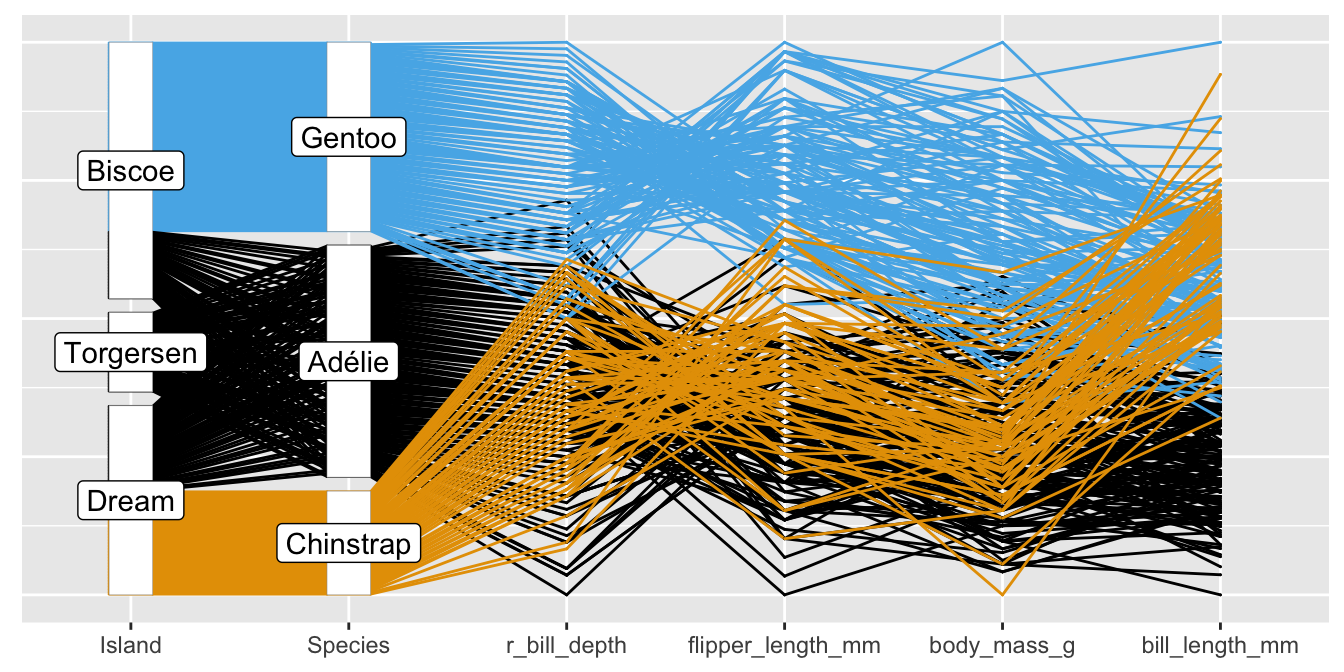
Figure 32.4: Reordered parallel coordinate plot of the Palmer Penguin data
Muddled graphics can be difficult to understand for other reasons. Anything that increases the cognitive load or mental effort required to look at a graphic should be avoided. Having graphics and accompanying text on different pages demands extra effort. Poor labelling and awkward scales make work. A poorly ordered and positioned legend does not help. Overlapping text and confusing colours need to be disentangled. Data points that are too close to axes or borders can be difficult to distinguish. Comparisons are made more difficult if scales that should be the same are not or if graphics to be compared are not aligned as they should be.
32.1.3 Rewards for paying attention
Paying close attention to graphics can reveal much more information. The Gapminder life expectancy graphic of Figure 2.1 and Figure 3.9 for movie ratings, both shown again in Figure 32.5, are striking examples. Figure 4.6 for the 1912 Democratic choice of candidate is another.
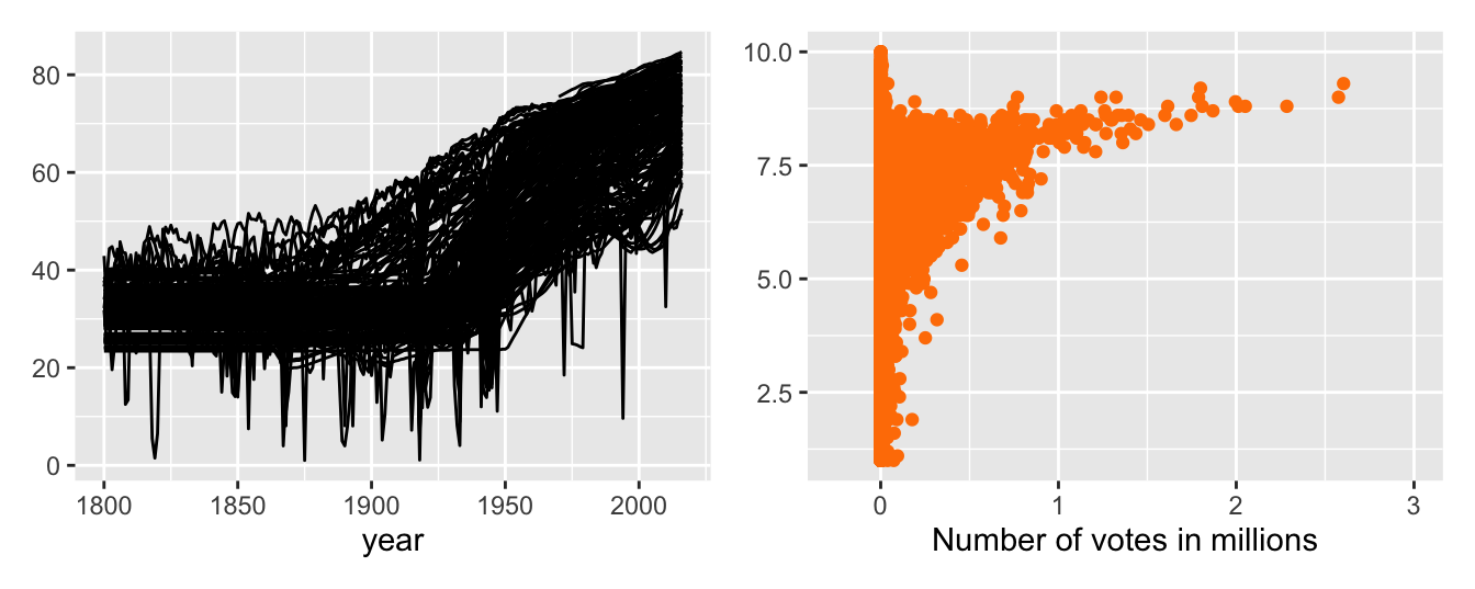
Figure 32.5: Gapminder life expectancy data (left) and movie ratings (right)
Accepting the title of a graphic or what other accompanying text says may not tell the full story. It is worth paying graphics detailed attention. However, relying on graphics alone will not be sufficient. Graphics have a background and context and need to be understood within that framework. A closer look at the data underlying a graphic is warranted too.