21.7 How do individual runners perform over the years?
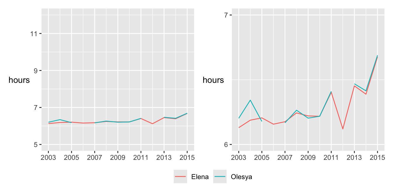
Two of the best female runners are particularly interesting, the identical twins Elena and Olesya Nurgalieva. Elena ran every year from 2003 to 2015, while Olesya missed the 2006 and 2012 races. Their performances are compared in Figure 21.13. The plot on the left has the same vertical scale as in Figures 21.4 and 21.14, while the plot on the right has been magnified to show more detail.

Figure 21.13: Performances of the Nurgalieva identical twins
The sisters ran very similar times over the years, with mostly less than two minutes between them. Elena’s best performance was in 2012 when Olesya did not run. Elena had the best overall time for females eight times and Olesya twice. There are a number of good photos of the sisters in action on the web (just search for “Nurgalieva”).
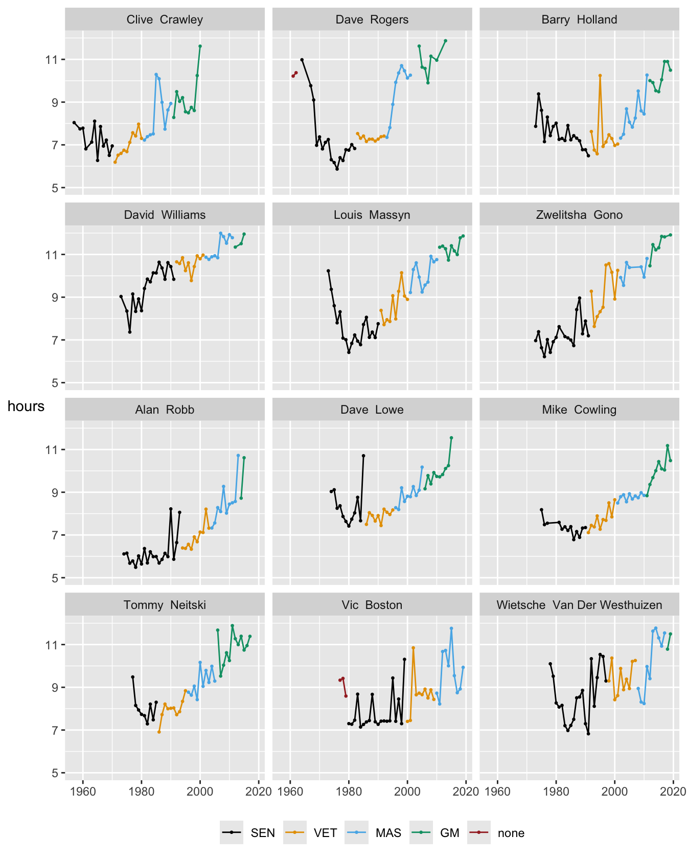
Some runners have participated very often and Figure 21.14 shows the times achieved by the 12 runners with more than 40 appearances. The points and lines are coloured according to the runner’s age category at the time. You might expect a hockey-stick shape: an initial slower run followed by swift improvement to a best time and then a gradual decline in performance with increasing age. To some extent this is true, but with a lot of individual variation.

Figure 21.14: Runners who have finished more than 40 times, ordered by the first time they ran the race
Some runners have isolated poor performances compared with their other results (e.g., Barry Holland in 1995, Dave Lowe in 1985). Some show more variability in performance (e.g., Vic Boston and Wietsche Van Der Westhuizen). Most show a decline in performance as they get older.
Answers Numbers of participants have increased enormously since the early years. Since the race has been made open to all, many women now run. The proportion of older runners has increased. International participation has also grown. The fastest time to complete the race has dropped, but not noticeably so in the last 20 years. Median times have tended to increase as more runners participate. Men’s best times are quicker than women’s best times, but there are far more male runners. The difference is currently about 45 minutes. Overall the best times for the “up” race are generally slightly higher than the best times for the “down” race.
Further questions Birthyears of runners are available on the Marathon’s website, but were not scraped. How are age and performance related? Other marathons are newer and shorter. Do the results for them differ substantially from what has been found for the Comrades Marathon?
Graphical takeaways
- Boxplots by year provide a great deal of information. (Figure 21.4)
- Scales do not always have to start at 0. (e.g., Figures 21.6, 21.11, and 21.14)
- Combining a time series of statistics with a barchart of numbers over time works well when the time scales are aligned. (Figures 21.5 and 21.8)
- Scaling of related data may vary across plots to get the most information from them. (Figures 21.9 and 21.13)