30.4 Layout
“Life is like a 10-speed bike. Most of us have gears we never use.”
Layout of graphics is essential for presentation and important for exploration. Drawing a graphic includes choosing the size and aspect ratio and deciding where to place it in text or in relation to other graphics. In Exploratory Data Analysis graphics need to be resized and moved around to get a better look at them. Varying graphics changes the point of view, giving fresh impressions and drawing attention to other features. Single, fixed points of view are limiting. There are sound recommendations for drawing graphics, but other views suggest additional insights.
If two variables are measured the same way with the same limits, then scatterplots should be square. Figure 9.12 comparing percentage support for two statements on Gay Rights is an example. If default scales are used and the plot is drawn wider but less tall, then more individual states can be picked out. One state, which turned out to be Maine, had a relatively low support at state level given its level of opposition to a constitutional amendment. The two plots are shown together in Figure 30.8. The square plot on the left with equally scaled axes shows the different levels of support for the two opinions and the close association between them. The plot on the right emphasises individual states more and the overall structure less.
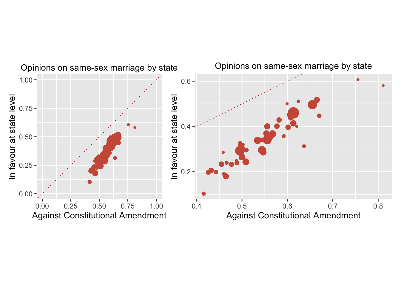
Figure 30.8: Scatterplot of responses to the two same-sex marriage questions by state with equal and default scales (point areas are proportional to the number of respondents in that state)
The plots in Figure 30.8 could be drawn with the variables switched and this would give another view of the data. When one of the two variables in a scatterplot is dependent on the other, then the convention is to put it on the vertical axis. Examples can be found in Figures 5.2, 8.17, and 26.8.
If two bars in a chart are close in height or if a bar is barely visible, then it helps to stretch the graphic to see which bar is bigger or how big the barely visible bar is (as in Figure 10.3). The same applies to histograms, particularly with possibly empty bins in the middle (as in Figure 11.5). Empty ranges near the extremes can be checked with boxplots (as in Figure 11.2 following Figure 11.1).
Barcharts are often better horizontally, making use of page width and allowing longer text labels for the bars. Figure 30.9 compares the horizontal version in Figure 8.11 with a vertical version. The left barchart emphasises the countries with most registered chess players. The right barchart emphasises how many players there are in countries not in the top thirty.
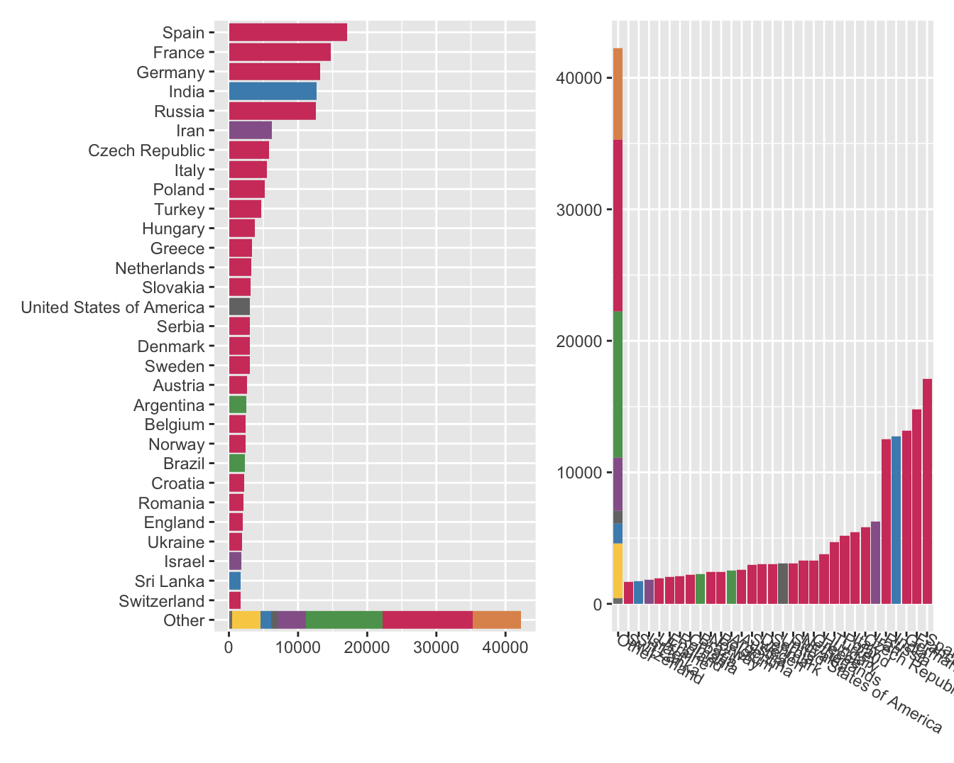
Figure 30.9: Barchart of numbers of chess players by country and region plotted horizontally and vertically
Boxplots and scatterplots can be transposed to give alternative views. Boxplot examples include Figures 3.1, 8.2, 8.6, 10.8, 17.3, and 20.4. In Figure 14.2, repeated here as Figure 30.10, the boxplots were rotated to make the labels more legible and to ensure only one set of labels was needed.
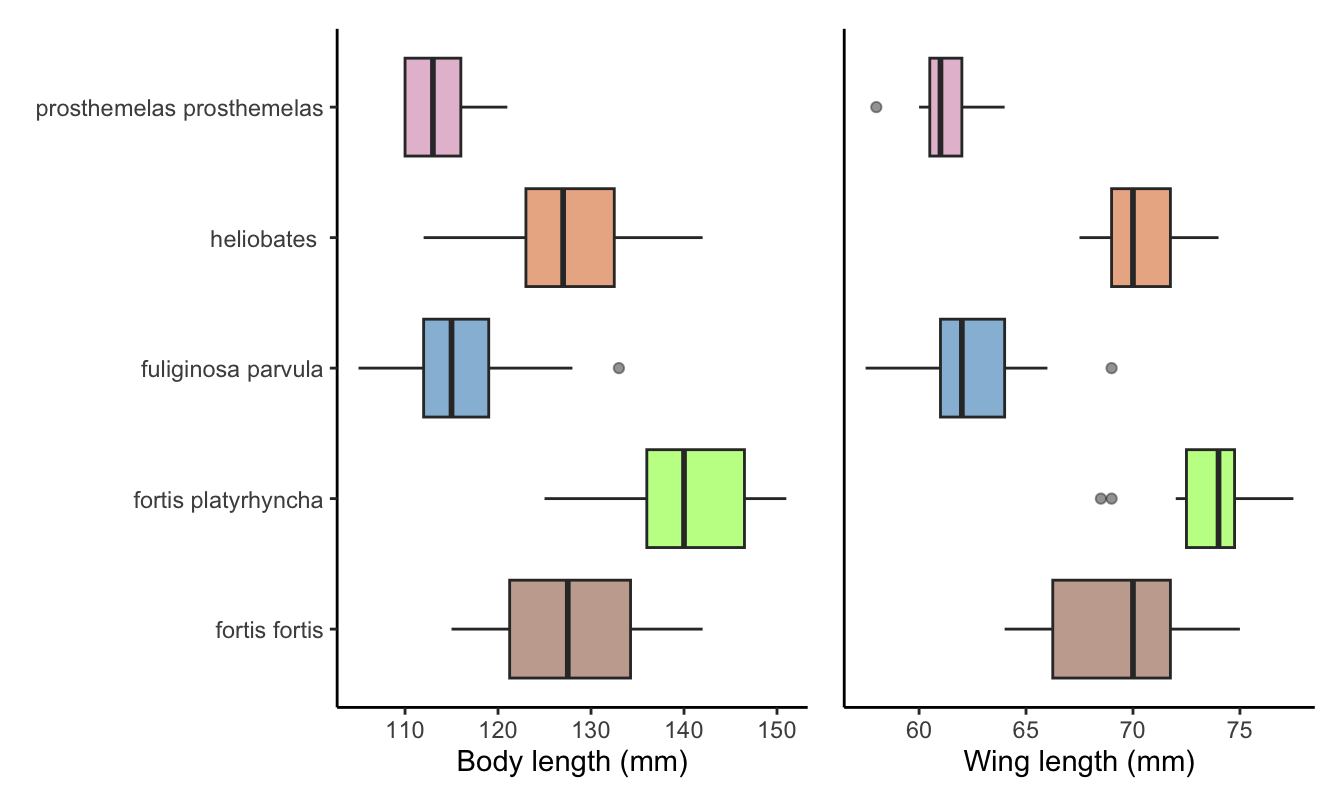
Figure 30.10: Body and wing lengths for the five species from Isabela Island
The scatterplots of associations between the numbers in the three sectors of the French workforce in Chapter 7 could be looked at the other way round. Figure 30.11 shows the first plot from Figure 7.3 on the left and a transposed version on the right. The first plot may emphasise the relatively low levels of the Industry numbers in most departments more, while the second may emphasise the two extreme Industry values more.
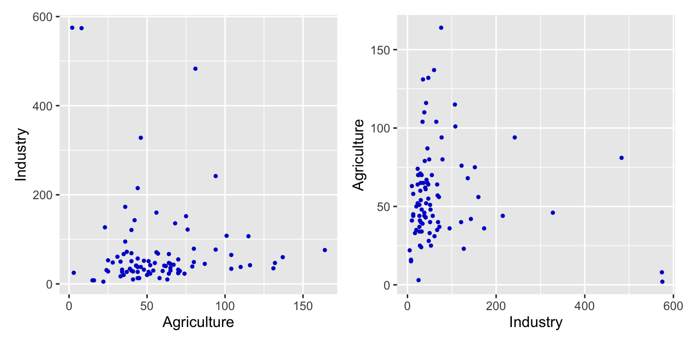
Figure 30.11: Scatterplot of numbers of Agriculture and Industry workers in France in 1954 plotted two ways
Another example can be seen in Figure 30.12 which shows Figure 9.12 on the left and a transposed version on the right. The greater support in all states for opposing a Constitutional Amendment looks more obvious in the plot on the right. Different people may respond to different shapes of features. There is no display that will be optimal for all. Best practice is to look at more than one.
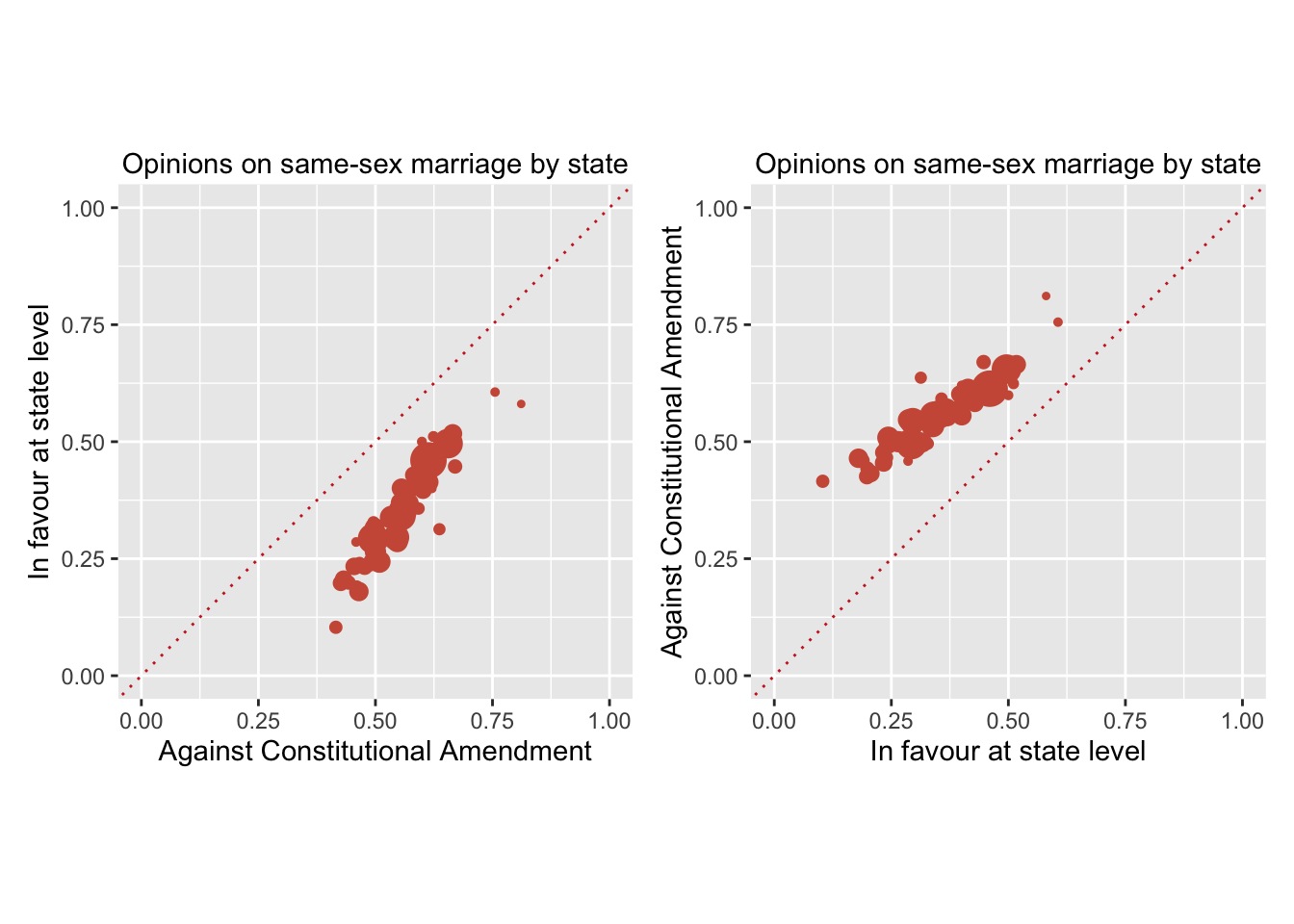
Figure 30.12: Scatterplot of responses to the two same-sex marriage questions by state plotted two ways (point areas are proportional to the number of respondents in that state)
Trying different layouts for single graphics is simple. Laying out several differently shaped graphics in an ensemble for presentation is harder (Unwin & Valero-Mora (2018)). Optimal sizes for individual plots may not be optimal for the ensemble as a whole. Other factors include aligning axes and using common scaling.