7.4 Are there other geographic patterns?
There are a number of possible geographic patterns that might be found in mapped data, for example local clusters of related values, trends from North to South, similarities along coasts or borders. This means that any pattern identified should be treated with caution, as it is almost certain that something will be found. Nevertheless, geographic patterns discovered in the data may be useful in summarising information and in suggesting new ideas. It may be possible to find supporting evidence elsewhere, once it is known what should be looked for.

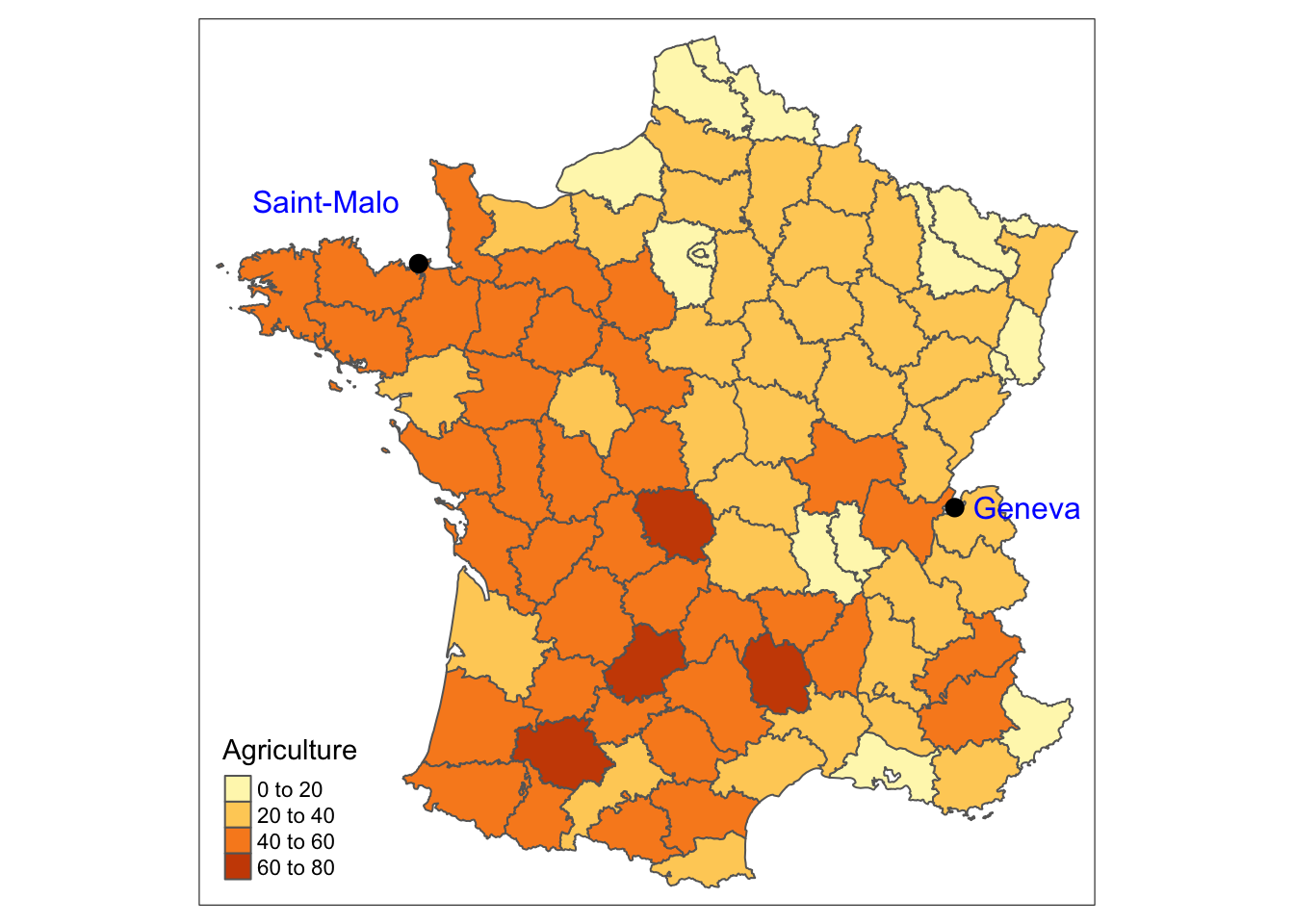
Figure 7.4: Choropleth map of percentage of agricultural workers in France in 1954
In Friendly’s revisiting of Guerry’s work (Friendly (2007)), he refers to a line across France from Saint-Malo in the North-West to the Swiss border at Geneva in the South-East, which divided France into ‘France obscure’ (the uneducated South-West) and ‘France éclairée’ (the educated North-East). This is a famous line in French historical geography, first suggested by Dupin in 1828. Judging by the results of a recent Google query, it still attracts attention, although for different reasons. Looking at Figure 7.4, there seems to be some evidence for a similar geographic division in the 1950s.
Apparently, there is a further region called the Blue Banana, a European corridor of urbanisation, running from Northern Italy through Switzerland, Germany, the North Eastern departments of France, Belgium and Holland, finishing in a broad path across the South East and Midlands of England (Wikipedia (2020c)). That would imply lower levels of agricultural workers as in the plot.
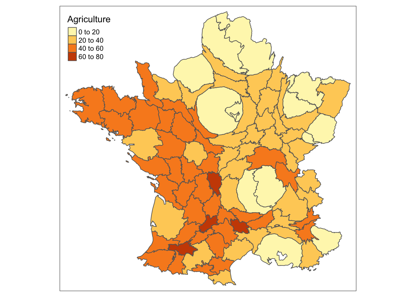
As the areas with the highest workforces in and around Paris can barely be seen in the maps, a cartogram might be drawn. A cartogram redraws regions to match population size or another quantitative measure instead of geographic area. The regions are drawn to minimise distortion, but this is difficult, especially when regions of large area have small populations and vice versa. A number of algorithms have been proposed. Figure 7.5 has been drawn using a rubber sheet distortion algorithm and is based on the total working population for each department.

Figure 7.5: Cartogram of working population size shaded by the percentage of agricultural workers in France in 1954
The major industrial and commercial areas, where there is little agriculture, dominate the eastern half of the country. The Rhône and Loire departments almost touch the departments around Paris. Many different cartograms might be drawn, but they will all convey roughly the same message.