30.3 Making space
“The notes I handle no better than many pianists. But the pauses between the notes - ah, that is where the art resides.”
It is easier to pick out features if a display is uncluttered, with plenty of space around so that there are few distractions. As mentioned at the end of Chapter 29, pictures in art galleries and exhibitions were often hung closely together in the past, so that as many as possible could be shown. That made it awkward to inspect individual pictures, depending on how high or low they were hung, while neighbouring pictures would distract and interfere with the artist’s intentions. There is a story that Manet submitted pictures to the Salon, the premier art exhibition in Paris in the 19th century, that would stand out and be noticed under these conditions. Nowadays pictures are usually hung individually in their own space in galleries. It is similar for graphics, unless they are part of a coordinated ensemble. It is better that there is space around them, not just space around the overall graphic but space within the graphic around the main content as well.
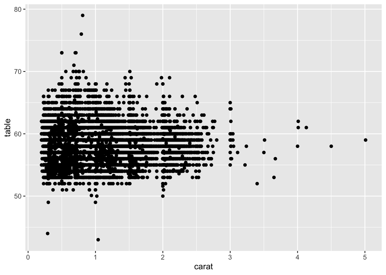
A scatterplot matrix gives an overview of associations between several variables. If one of the scatterplots looks interesting, it is useful to be able to zoom in and check. In Figure 11.7 of diamond measurements several of the plots could be worth more attention, for instance the scatterplot table and carat shown enlarged in Figure 30.6. Two features already noted in other plots are visible here. Most of the table values are integers and there is heaping in the carat distribution that consequently has a slight sawtooth pattern (which is easier to see in the earlier histogram). Additionally, there are a few outliers that are probably errors, and there is no relationship between the two variables.

Figure 30.6: A scatterplot from the diamonds dataset of carat and table
Space is needed for distinguishing shapes and forms, and for studying features in combination. Empty space surrounding content is needed to discern what is there. There are trade-offs. The plot on the right of Figure 30.8 shrinks space around the point cloud to make more space between the points.
More space is needed for exploration than for presentation just as more space is needed for making a jigsaw than for displaying the finished picture. Jigsaw pieces need to be moved around, sorted, compared with others. Using graphics to explore data is similar (if without the certainty that a complete picture involving all the pieces will be possible).
Sometimes unrelated graphics are packed together. Sometimes axis limits are chosen that are too tight, so that a display seems cramped in its boundaries. Different text elements, whether titles, legends, labels, variables names or annotations, can be drawn too close to other display elements or even overlapping on top of them and affect perception detrimentally. Making a graphic bigger is a quick and simple way of counteracting or at least reducing any overlapping of points and labels.
Values drawn above bars can have the effect of artificially lengthening them, hindering proper comparisons. Borders may be drawn around graphics to separate them from text. This can also have the effect of appearing to constrain them. If a vertical axis is drawn at the left of a plot then a border to the right may be interpreted as a boundary of some kind.
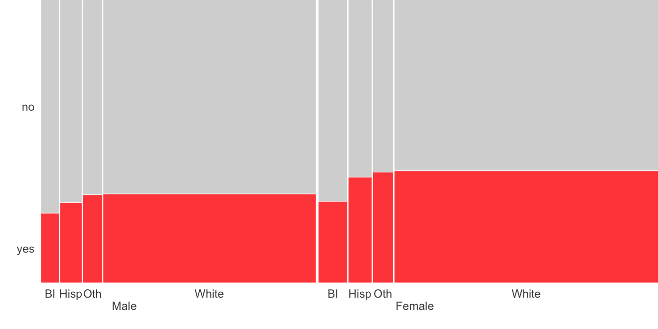
An example of using internal spacing can be seen in doubledecker plots such as Figures 22.3 and 22.4 in Chapter 22 on checking Facial Recognition software. Another example from Chapter 9, Figure 9.3, is redrawn here as Figure 30.7.

Figure 30.7: Support for same-sex marriage at state level by sex and race
Gaps between groups at the top level, in this case male and female, should be bigger than gaps between the individual groups at the next level down. If there is a further level down, then those gaps should be even smaller. The same goes for other forms of mosaicplots. The eye is good at picking out blocks of information when the separation between the blocks is supportive. It is similar for displays of small multiples or faceting. You need to be able to distinguish the individual plots while at the same time being able to make comparisons between them. This is a matter of fine judgement and experience, as with all effective displaying and interpreting of graphics.