11.3 Intriguing features
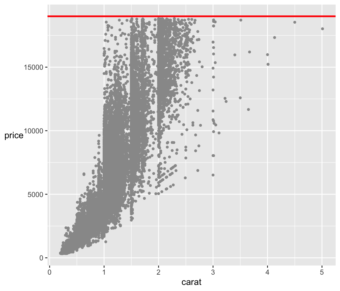
The scatterplots of price in Figure 11.7 look as if they have been flattened or bounded at the top. Figure 11.10 shows an enlarged version of the price-carat scatterplot with the implied boundary line added.

Figure 11.10: A scatterplot of price against carat with a red line at $19000, just above the maximum reported price.
Given that the data were scraped from a website selling diamonds, it could be that the scraping of the dataset was in the order of carat size and was stopped at some point. It seems more likely that very expensive gems were just not included. Those kinds of diamonds are probably sold in personal transactions. One of the effects of the boundary is that there are few larger diamonds in the dataset, as can be seen in Figure 11.10. Smaller diamonds of very high quality are doubtless not included either. This kind of bias should be taken into account when modelling the data.
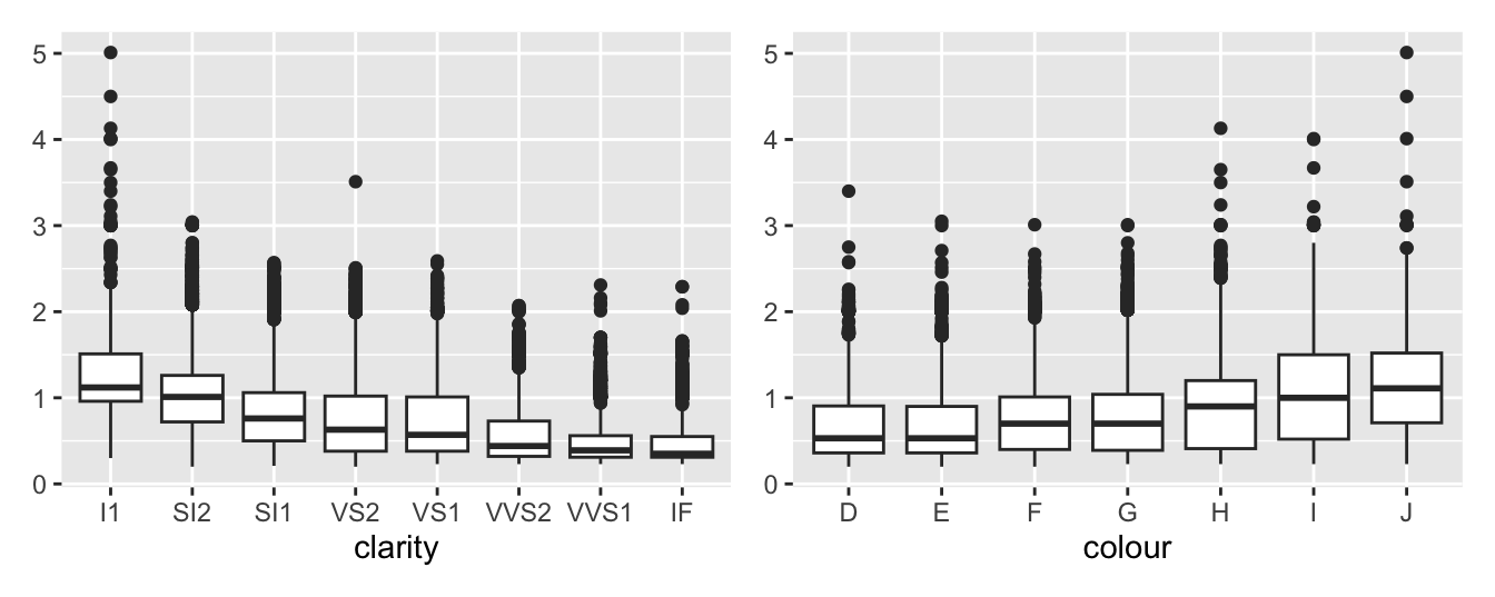
Until now the three categorical variables in the dataset, cut, color, and clarity have been ignored. It is worth looking at their association with carat (i.e., the size of the diamond). Figure 11.11 suggests that there is a decline in the median carat size as clarity improves and an increase in the median carat size as colour quality decreases. The colour classification refers to how colourless a diamond is on a scale from D (best) down to Z. There are no examples of the poorer categories in the dataset.

Figure 11.11: Boxplots of carat by clarity and by colour
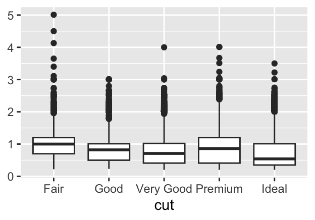
One part of the explanation could be that bigger diamonds can be sold with poorer clarity or poorer colour. Another could be the effect of the price boundary so that bigger diamonds with better clarity or better colour would be too expensive to be included in the dataset. A similar effect, if not so strong, can be seen plotting carat by cut.

Figure 11.12: Boxplots of carat by cut
Answers There are a number of data cleaning issues such as impossible zero values, outliers, and missing price data. The distribution of carat values with one-sided peaks at rounded numbers is an unusual feature. The apparent upper limit on price will affect modelling.
Further questions What are the distributions of colour, cut and clarity? What influence do colour and cut have on price?
Graphical takeaways
- For large datasets choosing the narrowest histogram binwidth can reveal otherwise hidden information. (Figures 11.4 and 11.5)
- Individual outliers on one dimension affect higher dimensional plots as well. It is worth drawing new plots without them. (Figures 11.6, 11.7, and 11.9)
- Surprising plot shapes usually mean there is structure to be uncovered in the data. (Figure 11.7)
- Parallel boxplots are a quick and informative way of comparing groups. (Figure 11.11)