28.5 Wrangling for layered graphics
Wickham (2016) emphasised the advantages of thinking of data graphics as being built up of layers, one on top of the other, an idea that has been used in cartography for a long time. Sometimes the layers are all drawn using the same dataset, sometimes each layer is drawn with a different dataset. In the latter case, the datasets may be subsets, aggregations, or even models derived from one main dataset. Constructing them is part of data wrangling. A simple example plotting the distribution of bill lengths for the Adélie penguins shows the idea in Figure 28.5.
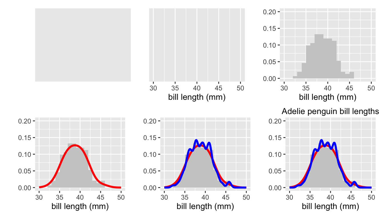
Figure 28.5: Layers building up to a histogram of the bill lengths of Adelie penguins with two superimposed density estimates.
The first layer top left is the background colour. The second adds a scale and x-axis label for the variable to be plotted. A histogram layer is added top right with the corresponding vertical axis scale (a density, not a count, so estimates can be overlaid). The first two plots of the lower row add a first and then a second density estimate. The final plot adds the plot title.
The advantages of a layered structure are that it is straightforward to add and remove layers to see what impact they have. It is clear where formatting options should be defined (such as binwidths for histograms or colours for points and lines). An additional advantage lies in being able to use different datasets in different layers. You might want to only use a subset in one layer, you might want to use data from a different year in another layer, you might want to use quite different, but related datasets. The only condition is that all fit in the scale limits of the plot. Layered structures offer flexible and explicit support.
Decoding graphics is easier when layers are clearly and separately defined. You can examine each in turn to study how it might be interpreted and what it contributes to the plot. It might emphasise information already present or add additional information. Reading code for plots made by others is simpler, as the code can be deciphered one layer at a time.
28.5.1 Types of layers
A plot’s layers are of different types and the order the layers are drawn makes a difference to how a plot looks. Generally, the background layers are drawn first, then the data and summarising layers, and finally the guide and text layers. Filled areas, for instance with a histogram or a boxplot, should be drawn before points and lines to avoid hiding them. Using transparency can help. The effects of drawing colours on top of one another, when objects in one layer are directly above objects in another, has to be checked.
In Figure 28.5 the two density estimates cover up the histogram details in the final plot (which suggests that they are a fairly good fit). Similarly, the second, rougher estimate covers up the first, although the differences can still be seen. A bigger version of the plot would be better, as in Figure 28.6. Now all the details can be seen. Graphics need to be large enough to display the information in them.
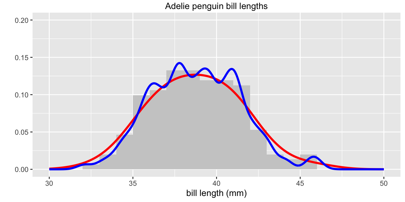
Figure 28.6: Histogram of the bill lengths of Adelie penguins with two superimposed density estimates
Background layers
The background colour of graphics in the past was usually white, as if they were drawn on a blank page. Nowadays background shadings of your own choice can be used or even a mixture by drawing layers on top of one another. Combinations of colours, transparency, and shapes can produce distinctive and unique patterns—if that is what is wanted. One muted background layer may suffice.
Axes, scales and gridlines frame the data. Axes and scales are almost always needed for data graphics (the main exception being network displays). When variables are specified, axes and their scales are drawn on top of any background colours and may include major and minor gridlines.
Data layers
Data layers are drawn on top of the background layers. They may use points or symbols, lines, bars or other area shapes. There are many variants and any software should offer a wide range. Amongst other options there are horizontal lines, vertical lines, lines connecting points directly, using a step or in a path. There can be multiple layers of data types. Figure 4.7 and many others use separate layers of points and lines for the same data.
There can also be multiple layers of data using different datasets. Figure 16.2, repeated here as Figure 28.7, uses data from three different leagues over three overlapping but different time ranges. The scale limits must be set in the first data layer to ensure that all data are shown.
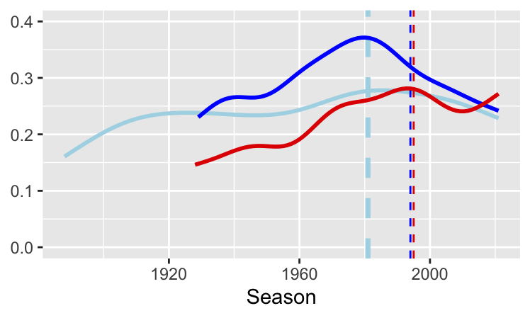
Figure 28.7: Rates of draws for the top tiers in Italy (dark blue) since 1934, England (light blue) since 1888, and Spain (red) since 1928
Summarising, modelling, and uncertainty layers
Data may be summarised using statistics or models. There could be several layers of such displays. On top of point data there might be a layer of group means and layers for linear fit and smoothed models. Data may be recorded as estimates with measures of variability. The corresponding uncertainty can be represented by error bars. Model uncertainty may be represented in a graphic by ribbons or bands around the model. Examples include chess ratings by age (Figure 8.21), age by year of mission of astronauts (Figure 10.2, redrawn here as Figure 28.8), and Titanic survival rates (Figure 25.12).
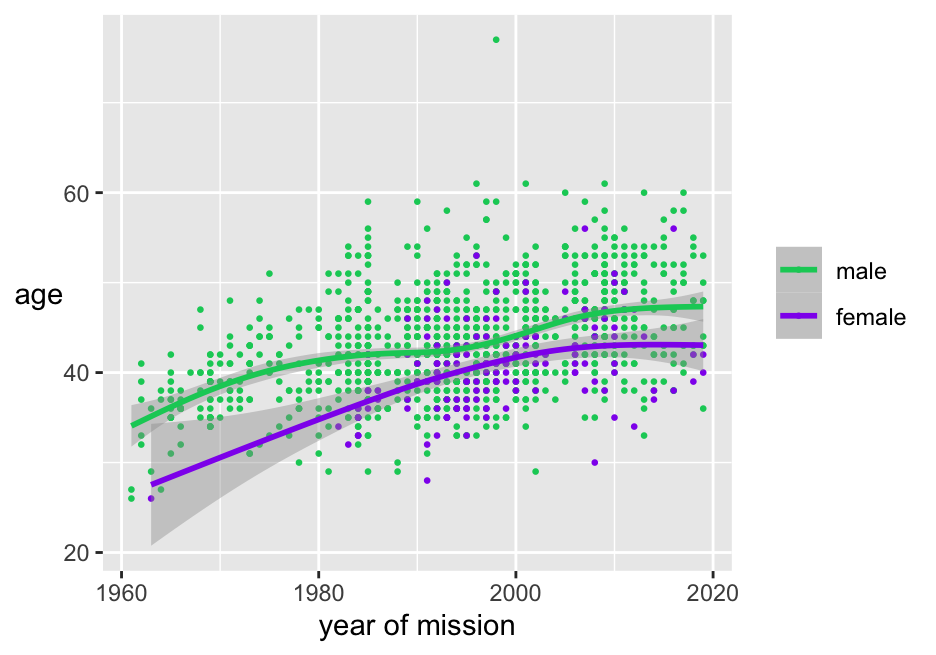
Figure 28.8: Scatterplot of age by year of space flight coloured by sex, with smooths and their confidence intervals
Data layers and summarising layers overlap to some extent. Histograms and boxplots summarise data, but are best thought of as data layers.
Guide and text layers
Guides can be added in additional layers: boundary lines, borders separating groups, plot areas coloured to differentiate them (Figure 4.7), arrows to point to particular features. Text layers can be drawn to add titles, legends, annotations, labels for points or lines.
Layering is effective for faceted data when the whole dataset is drawn in a muted colour in each facet first and each facet’s subset is drawn on top in colour, ghostplotting. Figure 10.7 is an example, redrawn here as Figure 28.9:
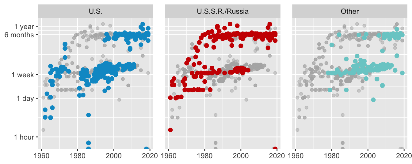
Figure 28.9: Logged spaceflight mission times of individuals by year of flight by nationality
28.5.2 The layers of a league wormchart
Figure 28.10 is a wormchart for the English League Championship of 1954-55, similar to the plots for other seasons in §16.6. There were 22 teams, each playing 42 games. There were just 2 points for a win and only two teams were relegated. Chelsea won with the low total of 54 points. At the half-way mark of 21 games, Chelsea were level on points with Cardiff City, who finished 20th. The bottom club, Sheffield Wednesday, had an appalling run in mid-season and would have finished much further adrift had they not surprisingly won three of their last four games.
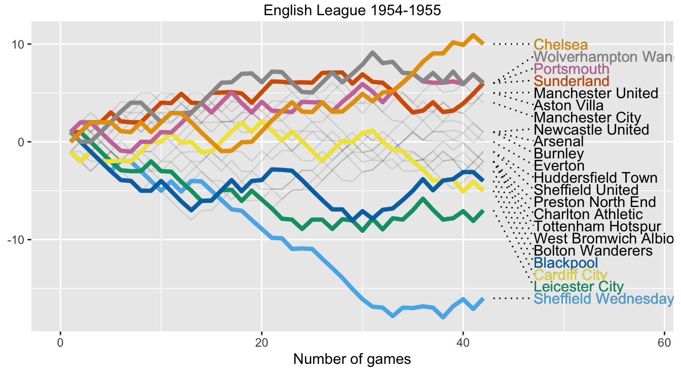
Figure 28.10: Wormchart for season 1954-55
Figure 28.10 has eight layers and uses four datasets. Figure 28.11 shows the build-up. There are background layers of colour and axes; a line layer of team performances drawn lightly (using a dataset of all teams); a layer of coloured, thicker lines for the top four and bottom four teams (using the subset of those eight teams); a text layer with the names of all teams (using a subset based on the last day of the season to get the order right); a segment layer connecting each team’s name to the end of its line with dots; a coloured text layer for the top four and bottom four teams (using the relevant subset of the previous dataset); a title layer.
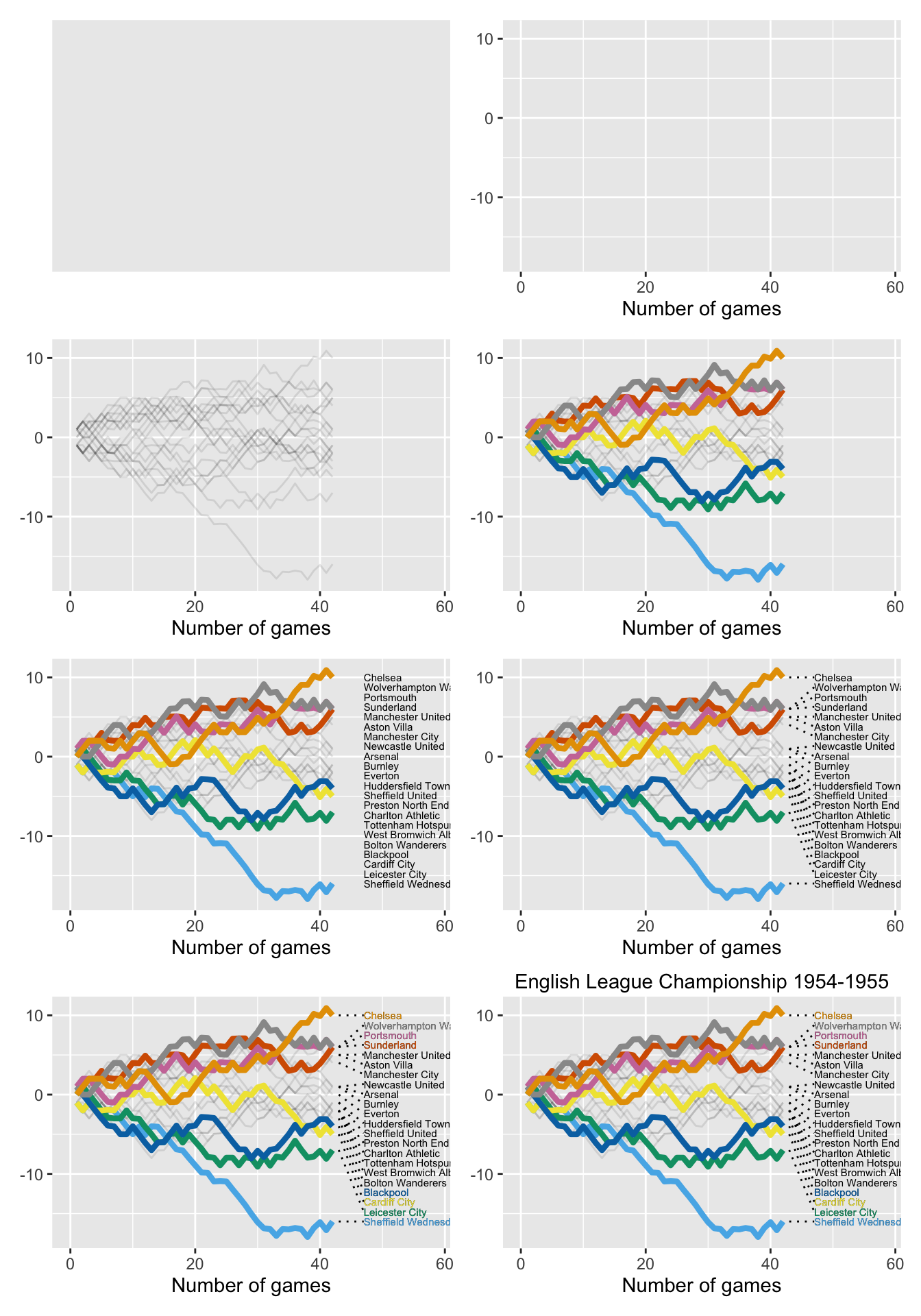
Figure 28.11: Layers building up to a wormchart for the 1954-55 English League Championship.