10.2 Mission times in space
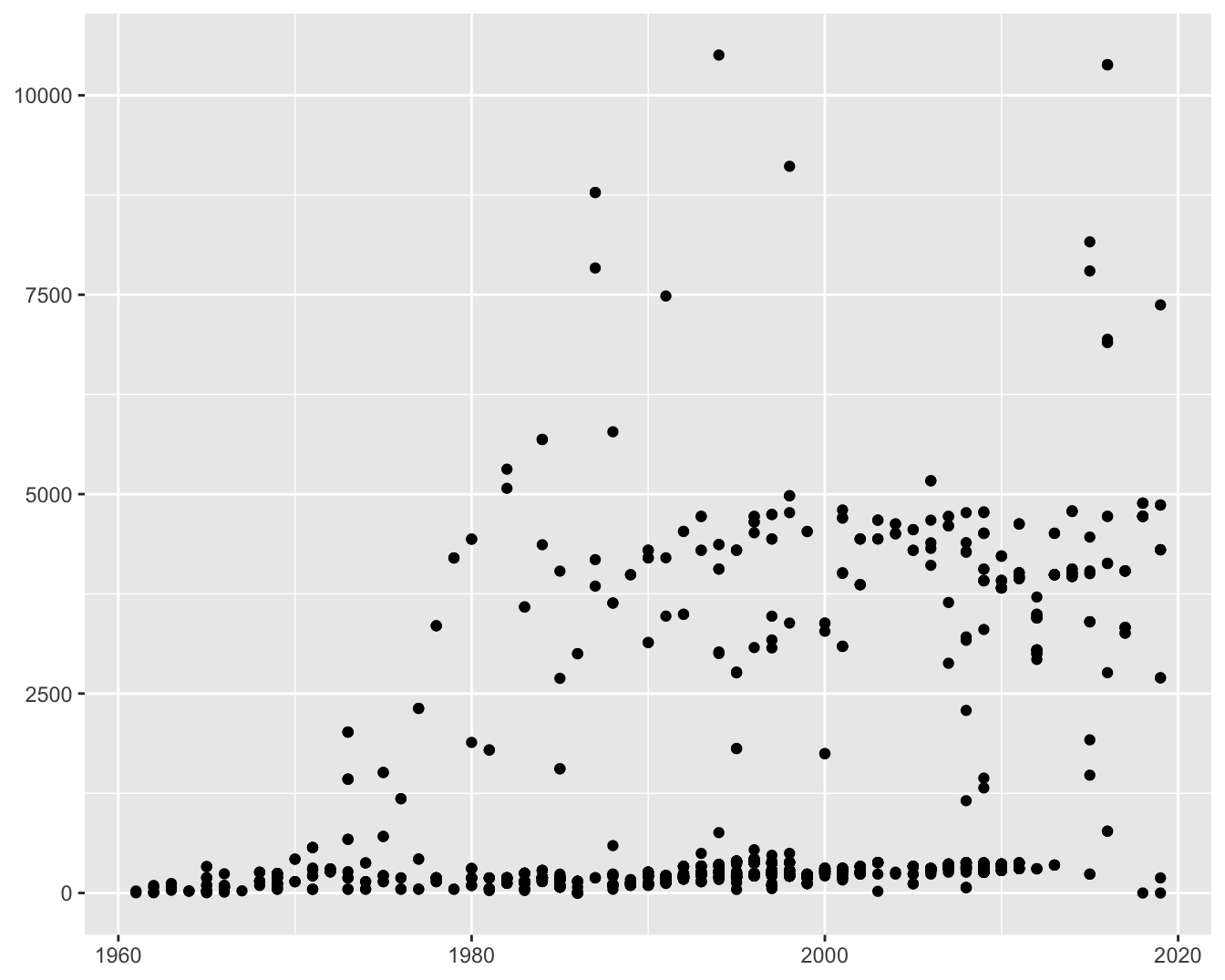
One important piece of information is the length of each mission, the time from launch until return to earth. Figure 10.4 shows a scatterplot of this time against flight year. Most flights were relatively short, especially in the 1960s and later on there were still many short flights of up to a few weeks, but also a group of longer ones, closer to six months, and a few very long ones of up to a year or more. Missions with more than one person are only plotted once if all those on the mission are recorded as having the same time, so this is not a plot of individual mission times. Missions with differing individual times are discussed later.

Figure 10.4: Scatterplot of mission time in hours by year of flight
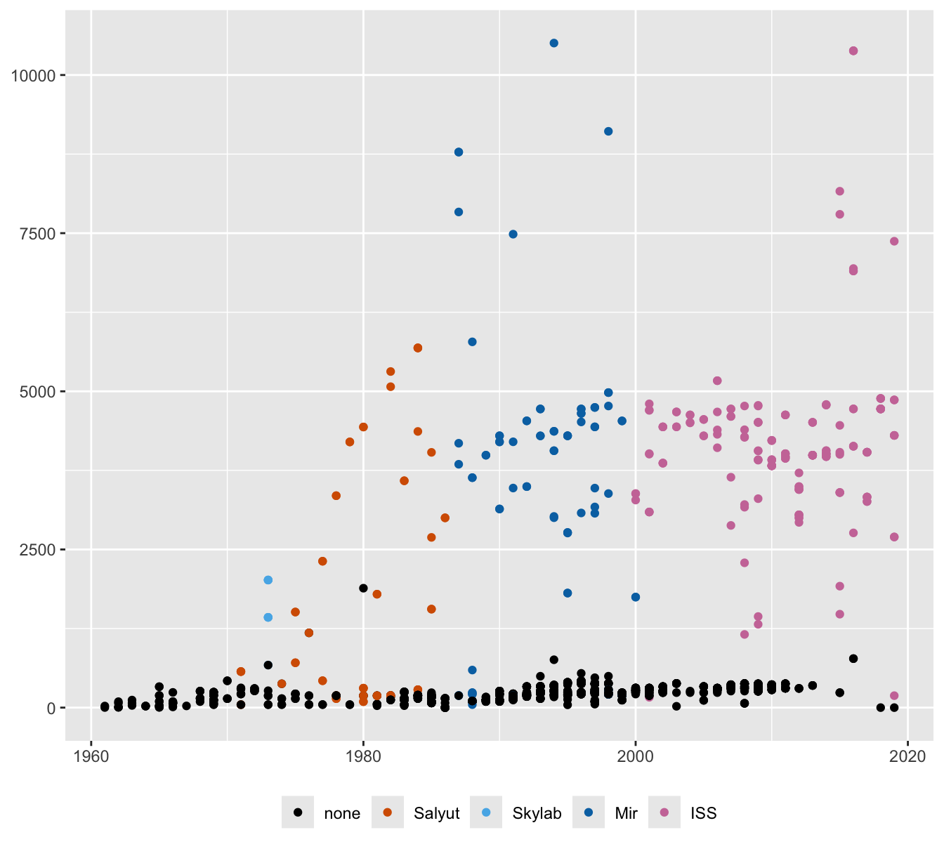
There is some information that might explain why flights are either short or longer, in particular whether the mission involved a visit to a space station. That is the reason as can be seen in Figure 10.5. A new variable has been created that records if a space station was visited and which programme it was part of: the initial U.S.S.R. Salyut programme, the US Skylab programme, the intermediate U.S.S.R. Mir programme or the ISS (International Space Station) programme. All the long flights are part of space station missions. The flight in 1980 marked as “none” was in fact a space station flight by the Cuban Arnaldo Mèndez. This is a curious error as his mission time was also incorrectly reported, multiplied by 10 in the dataset. The case only stands out because both errors were made, otherwise it would not have been noticed.

Figure 10.5: Mission time in hours by year of flight coloured by space station programme
The code for this plot converted two values of the variable in_orbit to “Salyut”, those with “Salyut” in them and those with the misspelling “Saluyt”. Minor typos like this can be irritating or seriously misleading. The problem was discovered when colouring the display.
10.2.1 Logging mission times
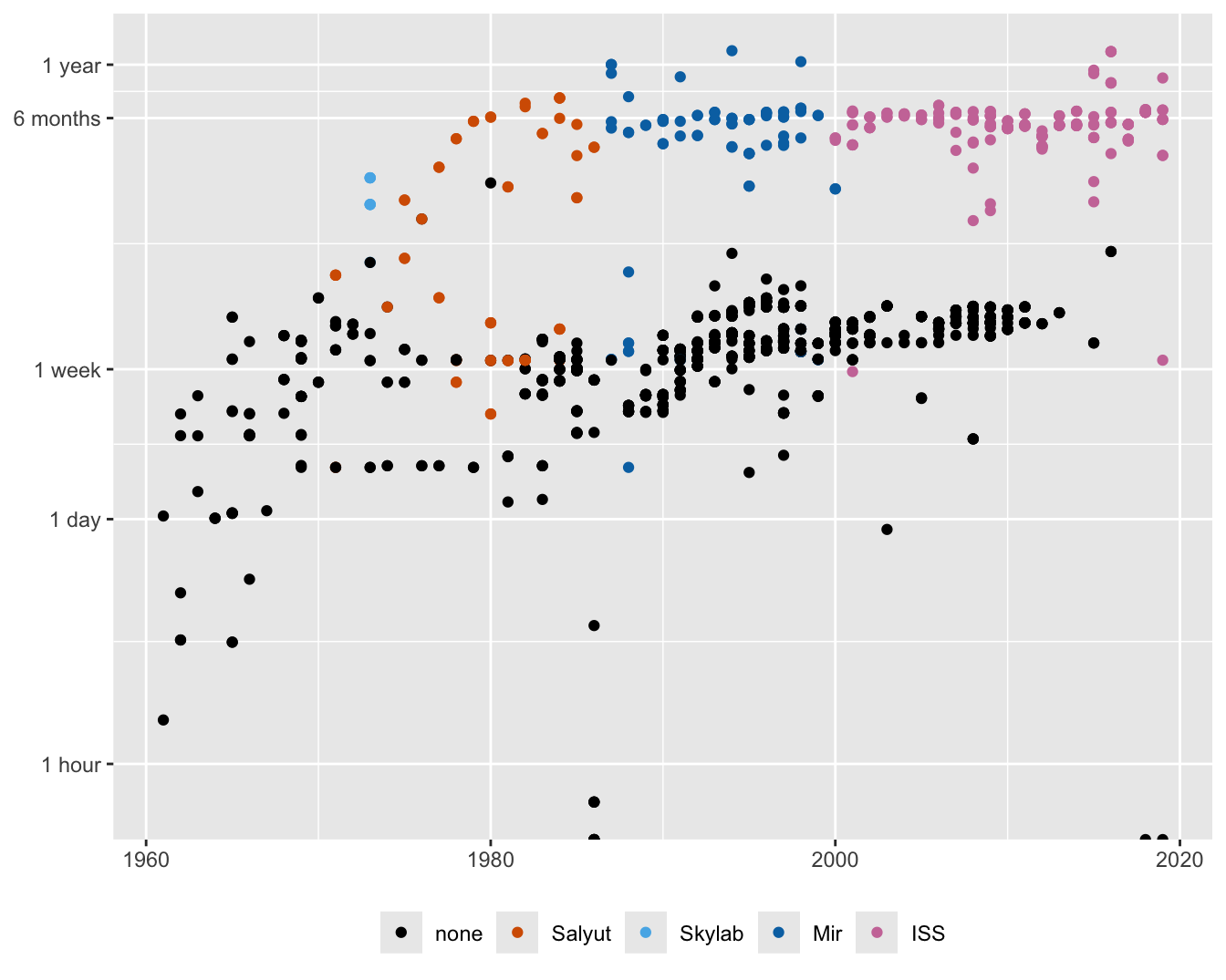
As there are so many short mission times that cannot be distinguished, logarithms of the times could be used. Figure 10.6 shows the result. The vertical scale has been manually constructed to offer interpretable tickmarks.

Figure 10.6: Scatterplot of log mission time by year of flight coloured by space station programme
There are several striking features. The two groups of short and long missions look less variable than in Figure 10.4 and the number of shorter missions declines after 2010. The latter is a useful piece of information, as an earlier analysis concluded that mission times had increased in recent years without explaining why. The average time certainly increased, but the reason was the decline in flights that did not visit a space station.
There are a few unexpected half points at the foot of the plot. These are mission times recorded as zero and hence logarithms of \(-\infty\). Rather than just offering a warning message that they cannot be plotted (which ggplot2 does in other circumstances), the semi-circles are drawn. The 1986 value is from the Challenger disaster and the 2018 and 2019 values are for the two on an aborted 2018 mission. For one of them, Ovchinin, the year of mission is incorrectly recorded as 2019.
There are some low outliers. The lowest one in 1986, just above one of the semi-circles, can be found by ordering the dataset in ascending order of times. It turns out that four of the seven people who died in the Challenger disaster were given times of 0 and the other three times of about 35 minutes. It seems particularly unfortunate when the data for such tragedies are inconsistent.
Sadly, Challenger was not the only disaster. The Space Shuttle Columbia disintegrated on re-entering the atmosphere in early 2003. The dataset ascribes (almost) the same time to the seven on board, but the variable in_orbit is recorded as “Exploded” for only three of them.
The other lowish value in 1986 was for Bill Nelson, who was on Columbia’s STS-61-C mission. He was given a time of 6.03 hours, whereas five other crew members were given times of 146 hours, and one of 74 hours. Bill Nelson’s Wikipedia page (Wikipedia (2020a)) said he was in space for 6d 02h 03m, so perhaps the error was a result of inaccurate webscraping. There are also three lowish values in 2005 and 2008. These were the first Chinese flights. Wikipedia records the first as having taken place in 2003.
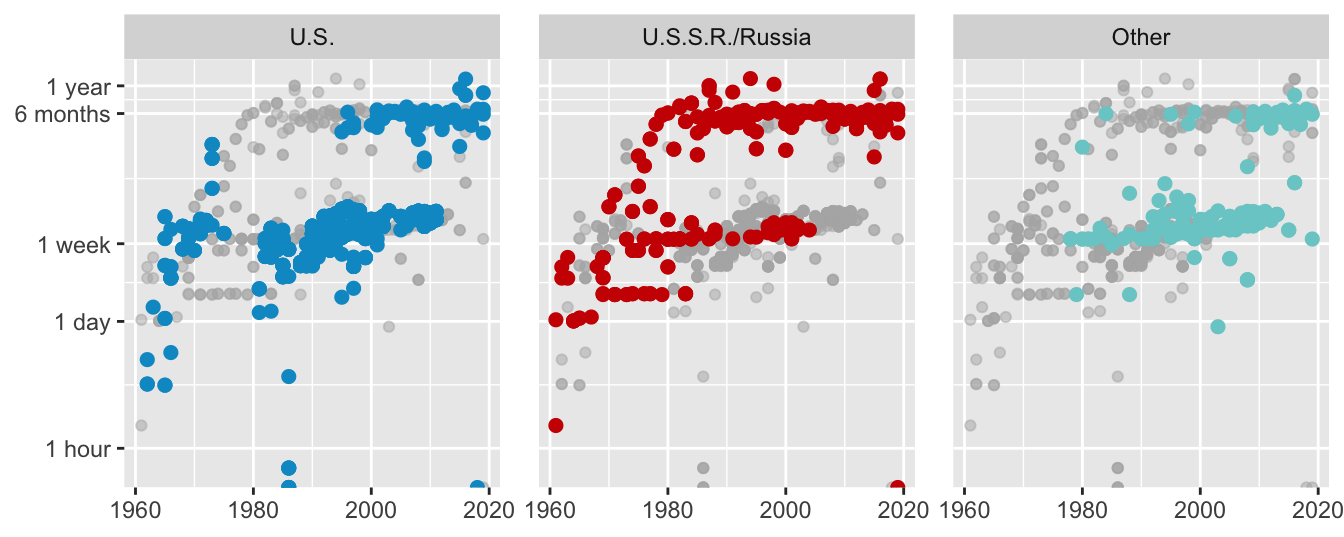
Nationality is another factor to consider. Forty nationalities are included in all, but U.S. and U.S.S.R./Russia nationalities account for 88% of participants, so a new variable has been created for these two with the rest categorised as ‘Other’. Plotting all the cases coloured by the new variable leads to some overplotting, so faceting has been used in Figure 10.7. The whole dataset has been plotted first in grey and the groups coloured and plotted on top (ghostplotting). The Russians were first with longer flights, while the Americans took part in many more shorter flights in the 1980s and 1990s. Other nationalities flew for the first time at the tail end of the 1970s and had more short flights.

Figure 10.7: Scatterplots of log mission time by year of flight by nationality