29.4 Choice of colour
There is a huge range of colours and colour palettes to chose from, and plenty of advice on which to use. That does not make choosing any easier. Similarly, there is a great deal of advice on fashion and on what to wear, but not everyone is well dressed.
29.4.1 Colour blind palettes help
Colour blind people are more the exception than the rule, but that is no excuse for ignoring their needs, particularly as graphics are being increasingly used. Various sources offer colour palettes that are readable for the colour blind and using these or subsets of them is worthwhile. Free software is available that enables designers to check how their graphics would look to viewers with different kinds of colour blindness.
The same colour blind palette has been used in several figures in the book for datasets as diverse as a gay rights survey, electric car charging, penguin species, swimmers’ nationalities, and groups of marathon runners. Three examples, Figures 9.11, 18.8, and 21.2, are shown together in Figure 29.10.
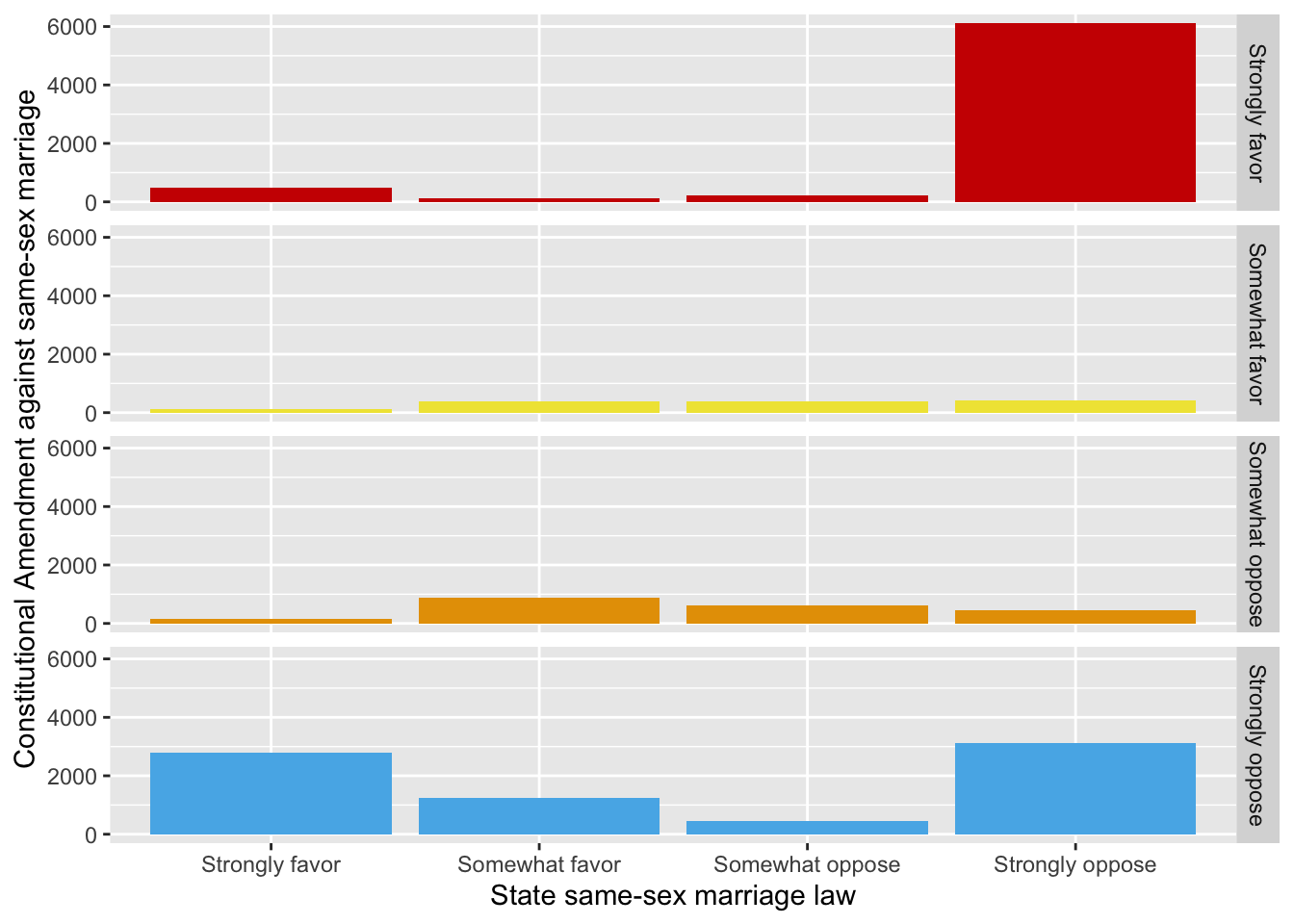
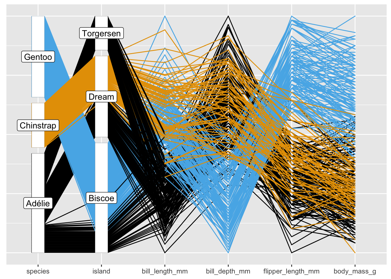
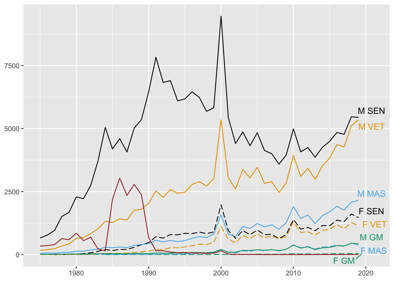
Figure 29.10: Three uses of a colour blind palette
29.4.2 Palette order counts
In §10.1 spaceflights are coloured by the space station program they joined, if any (Figure 10.5, redrawn as Figure 29.11). The default ordering of the colour blind palette from the R package ggthemes was changed to make the Skylab station that was only used briefly in 1973-4 more visible and to keep similar colours apart.
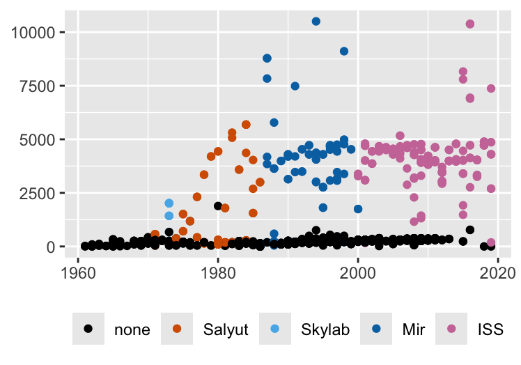
Figure 29.11: Spaceflight mission times coloured by space station programme
29.4.3 There may not be enough colours
Sometimes there are too many groups. Gapminder countries, football shirts of teams playing at Euro2020, nationalities of passengers on the Titanic are all too numerous to be assigned different, distinguishable colours.
Sometimes there are too many different groupings. In Chapter 2 colours are used for three Scandinavian countries, for four world regions, and for the six most populous countries. In Chapter 10 colours are used for sex, space station programmes, and nationalities.
29.4.4 Avoid using the same colours for different datasets
Colour schemes stand out. If the same palettes are used for different examples, readers may mistakenly assume they are looking at the same dataset. Figure 29.2 shows an example.
29.4.5 Avoid overlapping colours, use faceting
A display with several groups or time series may be hard to disentangle and decode. An alternative is to plot each subset individually in its own facet, together with the rest of the data underneath in a light grey (ghostplotting). At the end of §14.1 there is a faceted parallel coordinate plot, Figure 14.5, redrawn here as Figure 29.12. If it was drawn as a single plot with all 9 species, it would be much more difficult to read.
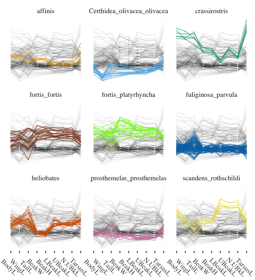
Figure 29.12: Nine measurements of 9 species on Isabela Island
29.4.6 Backgrounds matter
Finally, take the colour scheme of background and surroundings into account. Individual media outlets usually have a house style, as do firms and organisations. A particular display may be perceived quite differently, if presented otherwise unchanged.
In this book the default ggplot2 background has often been used. This does not work well for maps, mosaicplots, and parallel coordinate plots, where scales and gridlines are not appropriate. Figures 7.1, 25.8, and 14.4 have been drawn with plain backgrounds. Other plots might benefit from a change of background too.
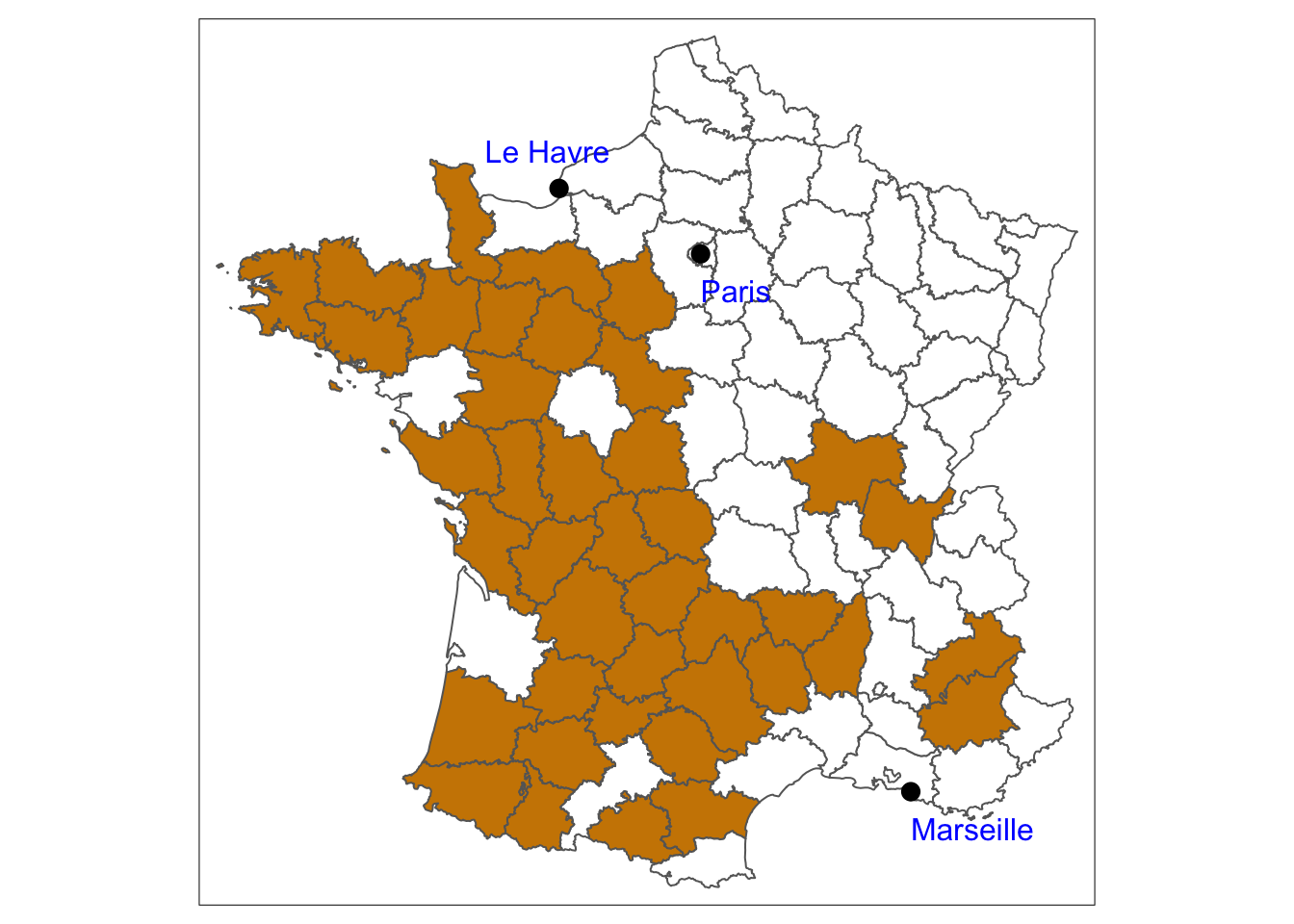
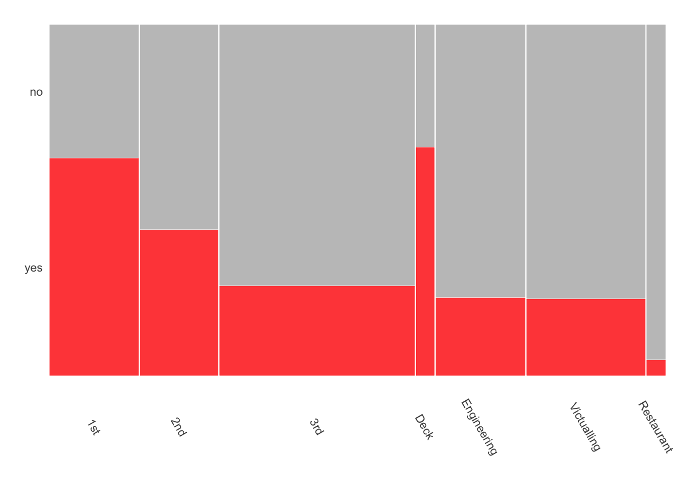
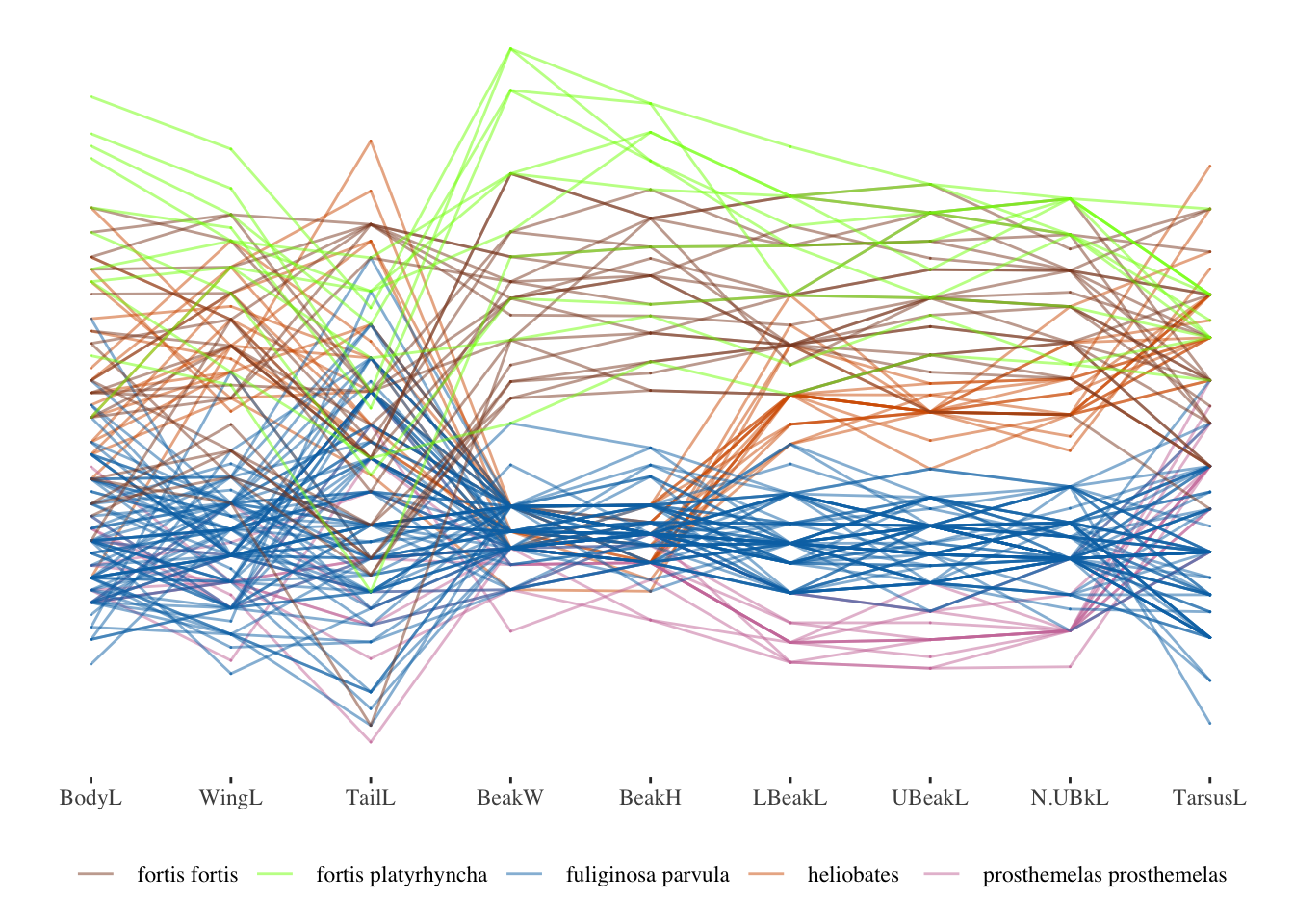
Figure 29.13: Graphics drawn with plain backgrounds
At art exhibitions in the past the walls were covered with paintings. There are etchings showing this by Pietro Antonio Martini of the French Academy’s Salon exhibitions of 1785 and 1787 at the Louvre and of the English Royal Academy’s exhibition of 1788. Reproductions can be found on the web. In the nineteenth century. Manet thought about how his pictures might stand out in such collections, if they were accepted by the annual Salon. Drawers of graphics should think about the likely surroundings of their plots too.