2.2 What else can be seen in Gapminder’s plots?
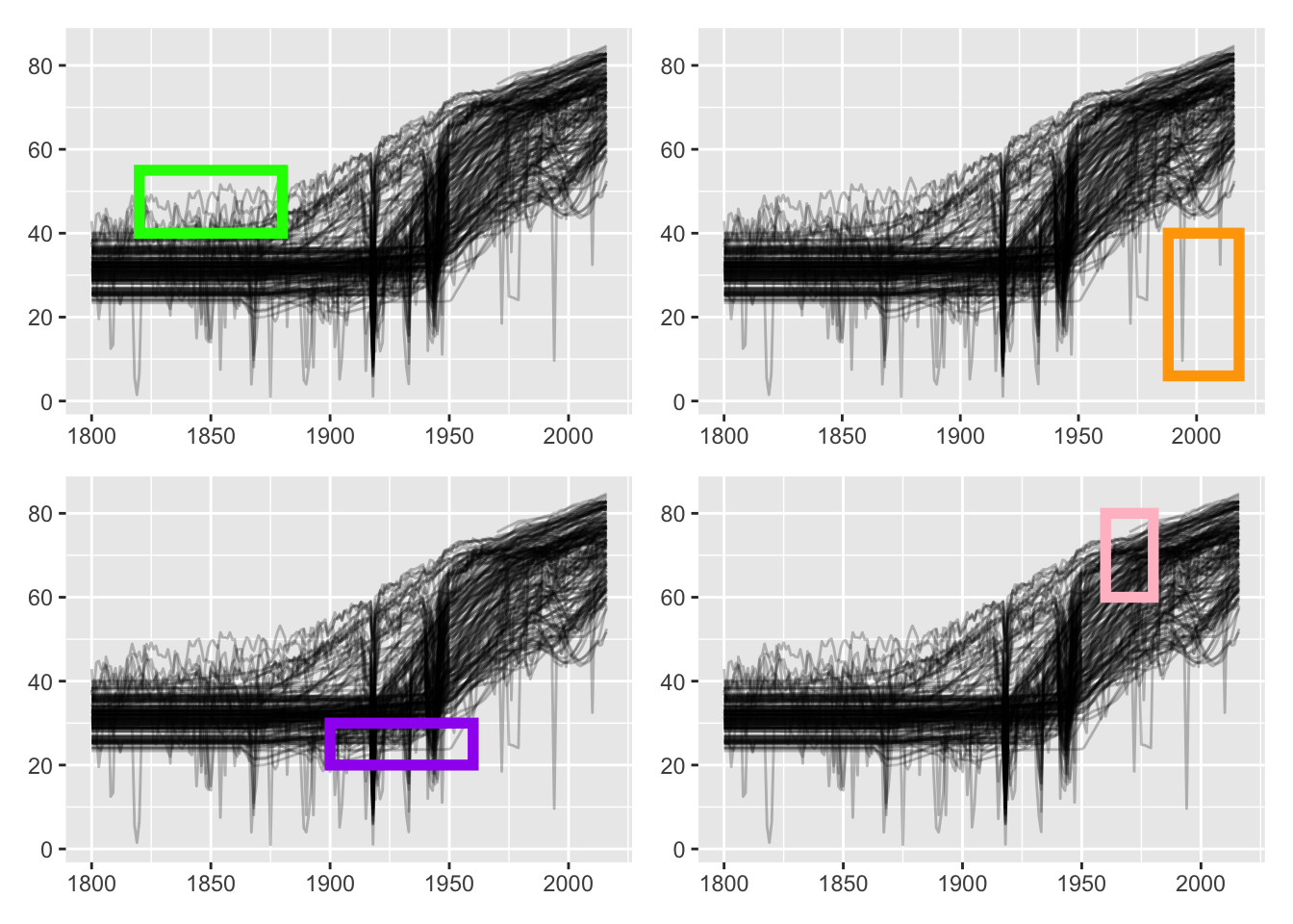
Several further features can be noticed. Figure 2.3 highlights them. Which countries had higher life expectancy in the 19th century (upper left)? Which countries had the most dramatic falls most recently (upper right)? Which country had consistently lower levels in the first half of the 20th century (lower left)? Which country’s data began or continued after a gap around 1970 (lower right)?

Figure 2.3: Further features in the life expectancy graphic
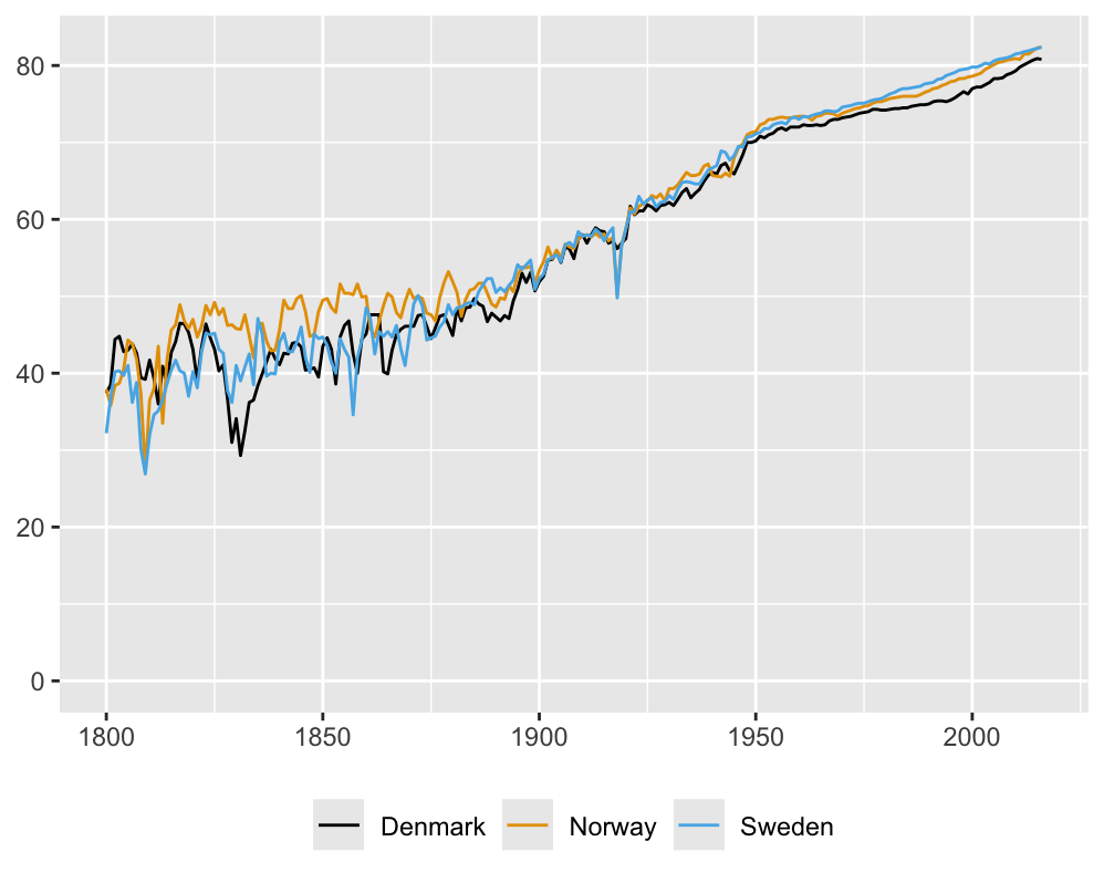
Countries with highest values in the nineteenth century can be found by looking at the maximum values by year. Norway had the highest value for \(68\) of the hundred years and Sweden came second with the highest value for \(11\) years. Norway and Sweden were in a political union for most of the nineteenth century, but they kept their own institutions and presumably reported their own statistics. At the very beginning of the century Norway was in a union with Denmark. Figure 2.4 shows the life expectancy time series of the three countries and they are very similar. The only noticeable differences are that Denmark was less affected by Spanish Flu at the end of World War I and consistently reported slightly lower levels more recently.

Figure 2.4: Life expectancy for Denmark, Norway and Sweden
The two countries with recent serious falls (the upper right graphic in Figure 2.3) were Rwanda in 1994 (the civil war) and Haiti in 2010 (an earthquake). They can be identified by selecting countries with life expectancies less than \(40\) after 1990.
The country with lower levels of life expectancy in the first half of the 20th century (the lower left graphic in Figure 2.3) can be found by looking at the data for 1950, when it had the lowest value of all countries, just before it started to improve. This was Yemen, a country whose recent history of civil war will have made conditions worse again.
The country whose data appear to begin around 1970 (the lower right plot in Figure 2.3) can be found from having the highest life expectancy in 1975. This was Andorra, one of three small countries with values reported only from 1970 on that were excluded from further analyses in this chapter. Another ten small countries with little data, e.g., the Holy See (Vatican City State), were excluded as well.
Not all features are equally important and individual ones may be of more interest to some people than to others. There is much to be seen in graphics and looking closely will prove rewarding.