33.2 Ensembles of plots
Thanks to trellis plots (Becker et al. (1996)), lattice plots (Sarkar (2008)), and faceting (Wilkinson (1999) and Wickham (2016)), displays of small multiples are well understood. Each of the component plots is of the same type and is conditioned on other dataset variables. By comparison, ensembles made up of different types of plots have been less discussed. Unwin & Valero-Mora (2018) suggest that the key element is coherence: having a coherent theme, a coherent alignment, coherent look, consistent scales and formatting. Examples include Figures 3.4 and 15.1, and the set of four Figures 18.1 to 18.4. Another example is Figure 21.8, repeated here as Figure 33.3.
Figure 33.3: Median times for men and women for “up” (orange) and “down” (black) races of the Comrades Marathon since 1980 and the numbers finishing
The graphics are aligned horizontally and vertically, as are the scales. The colours above refer to the “up” and “down” races, while the colours below refer to the sex of the runners.
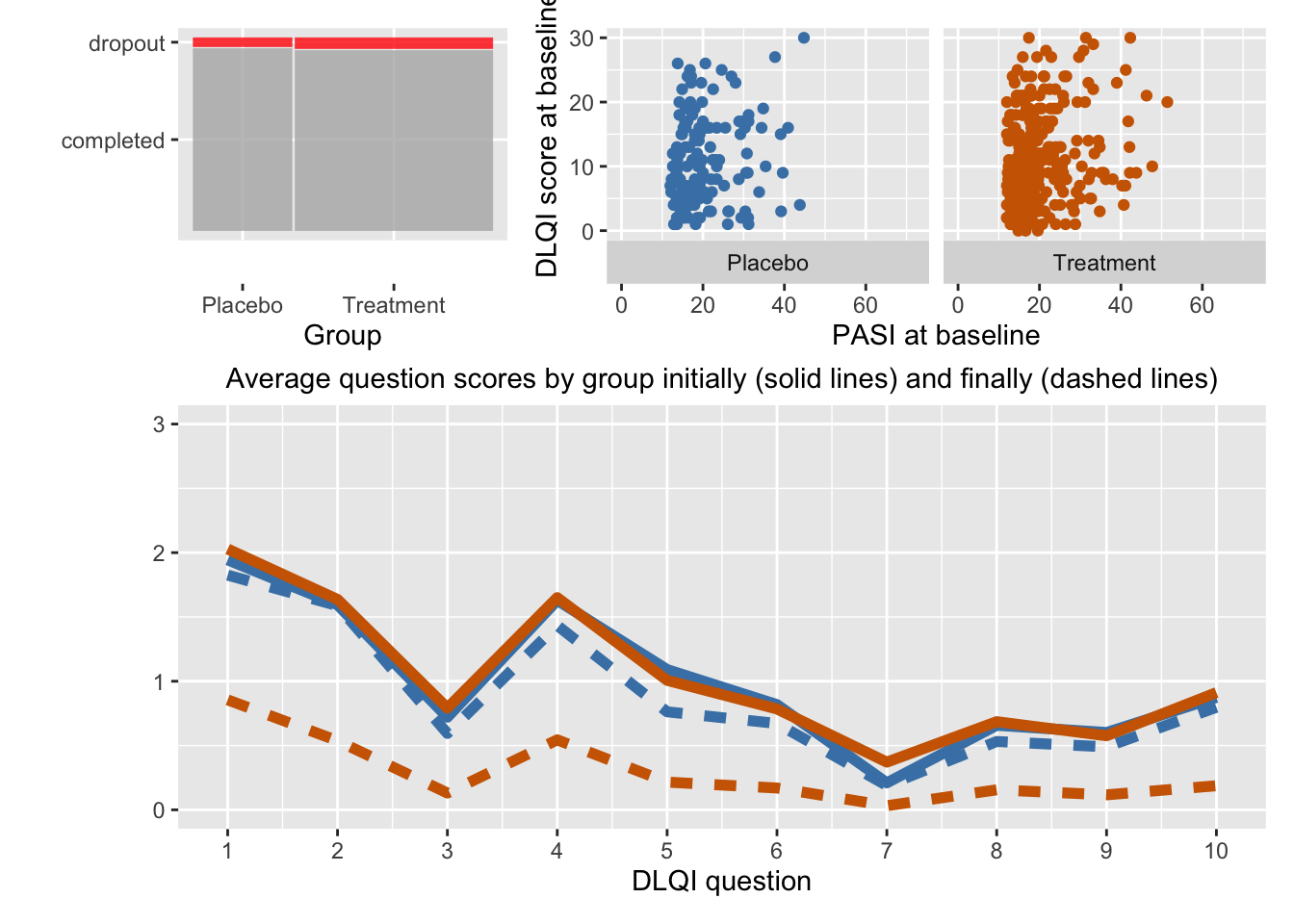
A more complex ensemble is shown in Figure 12.1 reproduced here as Figure 33.4. Three separate pieces of information are compared for the two groups with three different sets of graphics: proportions of dropouts in a barchart, two initial measurements in scatterplots, ten life quality index question means with line charts. There is no need for common scaling as the variable scales all differ. The groups are coloured alike in the scatterplots and the line charts, but not in the barchart, where the dropouts are coloured to emphasise how few there were and how similar the proportions were. The lines are drawn differently according to whether the responses were at the start or end of the study.

Figure 33.4: The spineplot top left shows that the treatment group was much bigger than the placebo group and that the dropout rate was small, about the same for both groups. The scatterplots of PASI scores and DLQI scores at the start of the study top right show that the two groups had similar initial distributions. The bottom plot shows that the average initial scores on each of the 10 questions were similar for the two groups (solid lines) and mostly slightly lower for the placebo group after 16 weeks (blue dashed line). For the treatment group the average scores were substantially less on all questions (dark orange dashed line)