2.3 Analysis by regions of the world
Colouring countries by Gapminder’s classification of the world into four regions gives Figure 2.5.
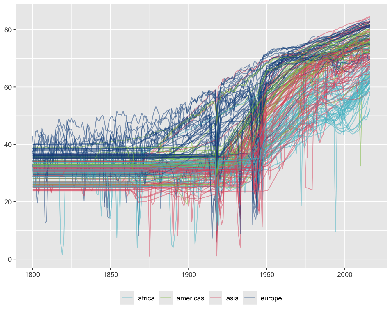
Figure 2.5: Life expectancy time series coloured by the four regions classification
European countries have had the highest life expectancies over the last two hundred years and African countries have had most of the lowest in recent years. There were two sharp falls for European countries in the first half of the 20th century. The first was due to a combination of World War I and the Spanish flu, while the second was due to World War II.
It is difficult to see much more and any colour scheme would have problems with overplotting. A better approach with so many series is to use faceting, splitting the data into subsets and plotting them in a grid. Figure 2.6 shows the same series by each region separately.
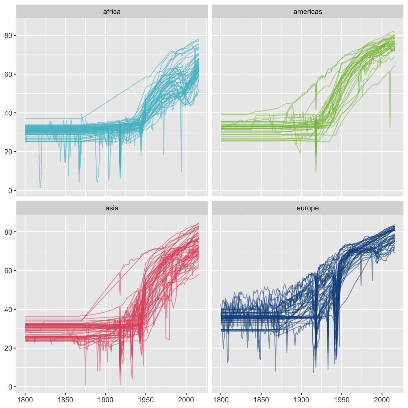
Figure 2.6: Life expectancy time series drawn separately for the four regions classification
Features now stand out that were not visible before. A few countries in all three regions other than Europe had much higher life expectancies between 1880 and 1950 than most countries in their regions. There is a country in Europe that had lower values from 1950 to 1990 than other European countries.
Finding the countries with the top values in each of the three other regions in 1900 picks out Australia and New Zealand in Asia (so it is not surprising that they have very different patterns), Seychelles in Africa, and, again unsurprisingly, the USA and Canada in the Americas. The European country with lowest values for many years after 1950 was Turkey.
It would be useful to know how big and comparable the regions are. The numbers of countries in each region in 2016 are shown in Figure 2.7.
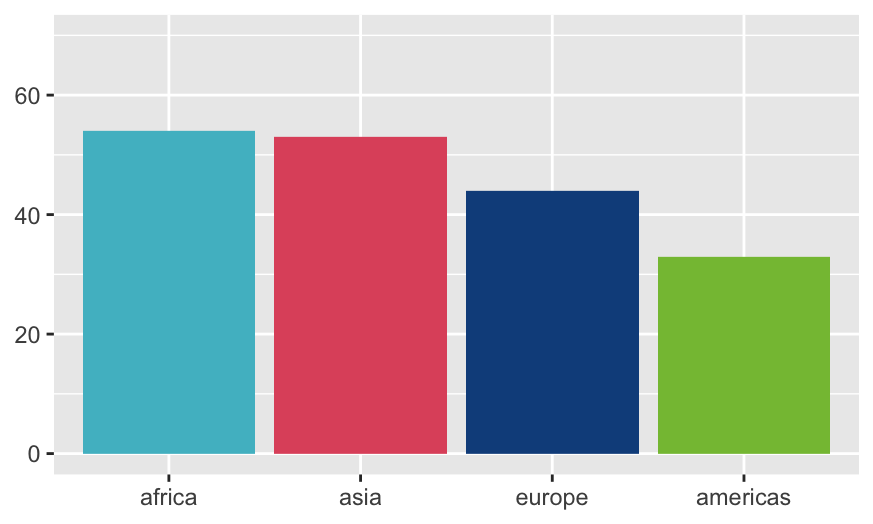
Figure 2.7: Numbers of countries in each of the four regions, ordered by the numbers
The numbers are not too far apart, but population data would provide more information on size. This is covered next.
2.3.1 Taking account of country size
Population data are also available from the Gapminder website and these have been downloaded and merged with the life expectancy data. The sizes of the four regions by total population in 2016 are shown in Figure 2.8. The regions are ordered by population. This paints a different picture. Asia had more population in 2016 than the other three regions combined.
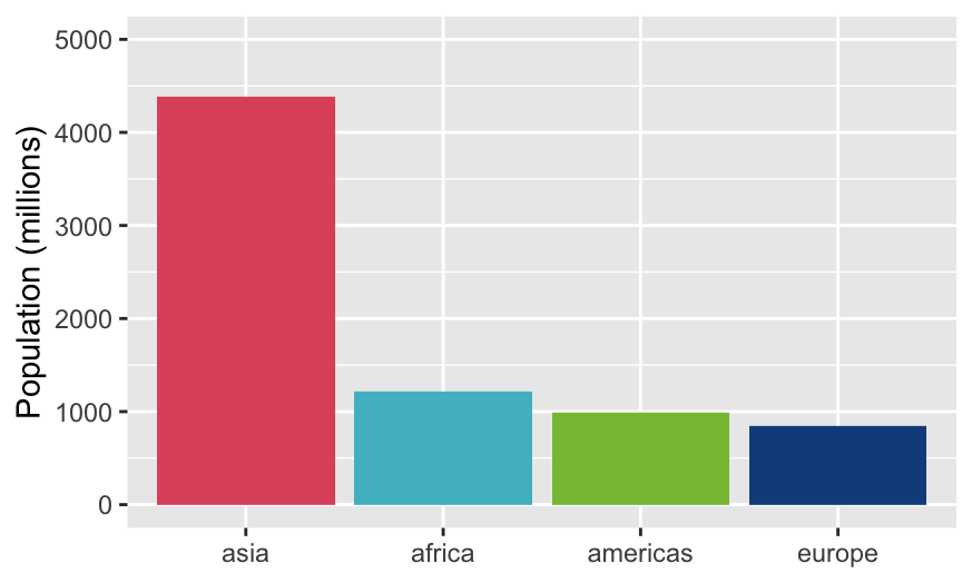
Figure 2.8: Total populations for each of the four regions
Up till now the time series graphics in this chapter have treated each country displayed equally. Gapminder itself (Rosling (2013)) makes much use of bubble charts to additionally show the sizes of countries in its scatterplots. That would not work well for time series, which is why Gapminder uses animation. Two other approaches are possible. Countries could be selected by population size or the data could be aggregated across regions using population data by year as weights.
The first approach is shown in Figure 2.9. Life expectancies for the six countries with a population of over \(200\) million in 2016 are shown.
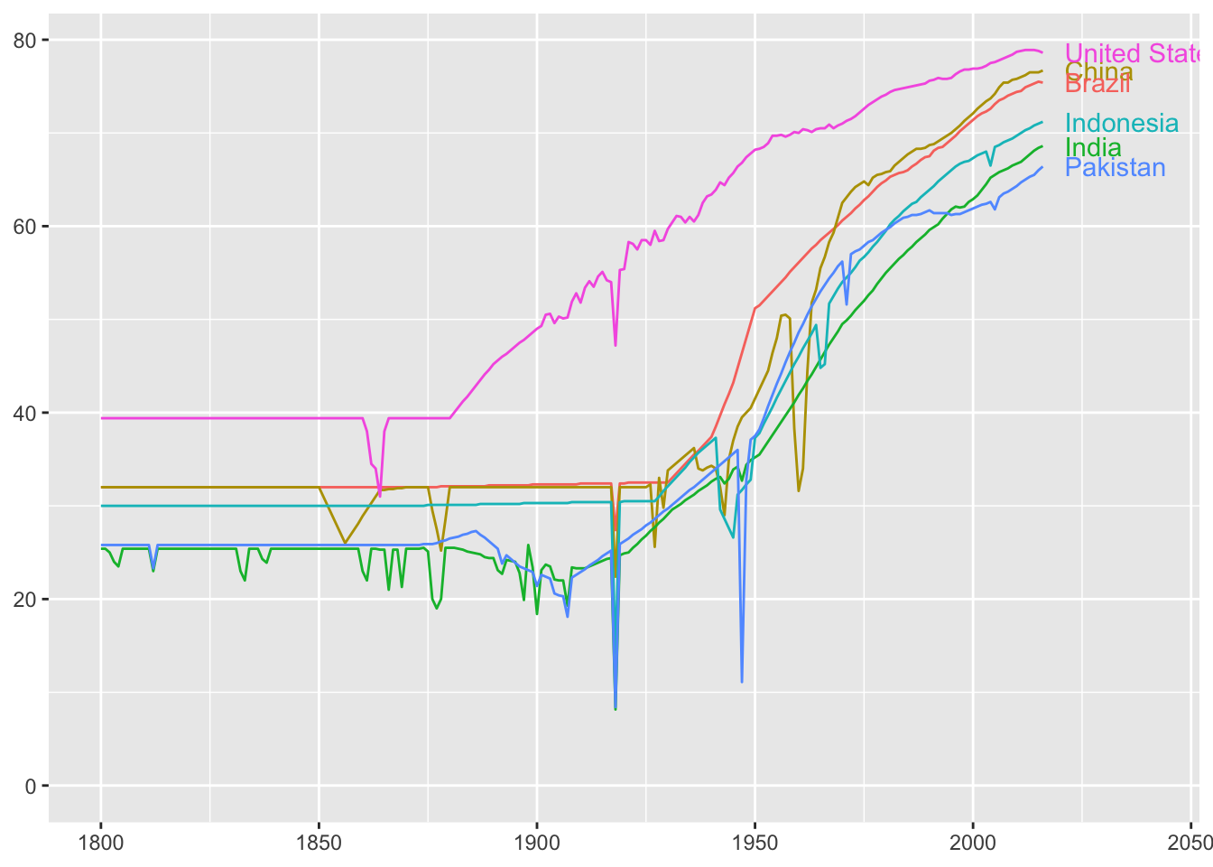
Figure 2.9: Life expectancy time series for the six biggest countries in 2016
As with earlier graphics, the overall trend of rising life expectancies can be seen, mainly during the second half of the 20th century, and the effects of wars and other disasters on individual countries. These would be more visible if each series was drawn separately. That has the further advantage of being able to use the width of the line to represent the population in 2016 (Figure 2.10).
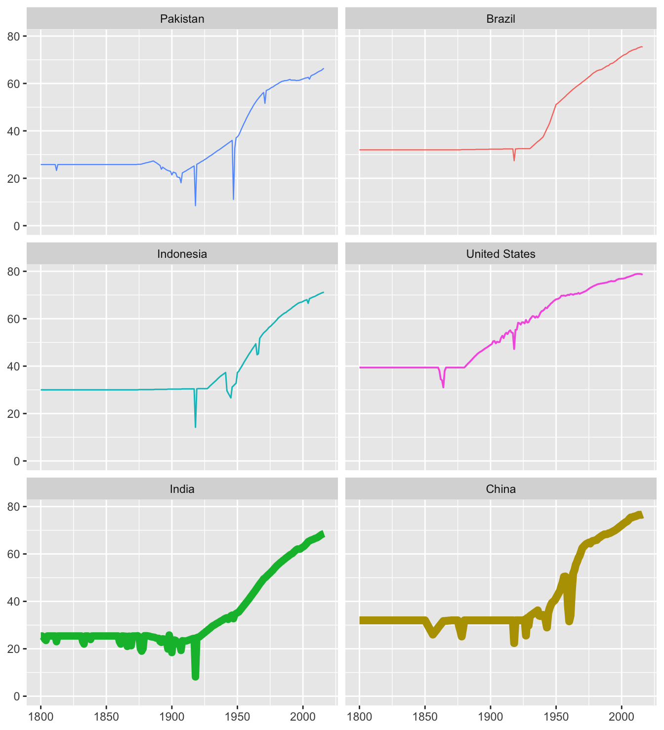
Figure 2.10: Life expectancies for the six biggest countries with line widths scaled by their 2016 populations
There is a disadvantage of incorporating population size. China and India are so much bigger that the finer details of their series are lost, although six major falls in Chinese life expectancy stand out. All six countries suffered from the Spanish flu in 1918, Brazil least of all. Pakistan suffered dramatically in 1947 after they gained independence from Britain. Their border conflict with India after partition had a much greater relative effect on them than on India.
These six countries actually accounted for 50.2% of the total world population in 2016. It is interesting to see how that changed over time, cf. Figure 2.11. If the nineteenth century population figures for China are to be believed, if indeed any of the population figures from that period are to be believed, China used to be relatively far bigger!
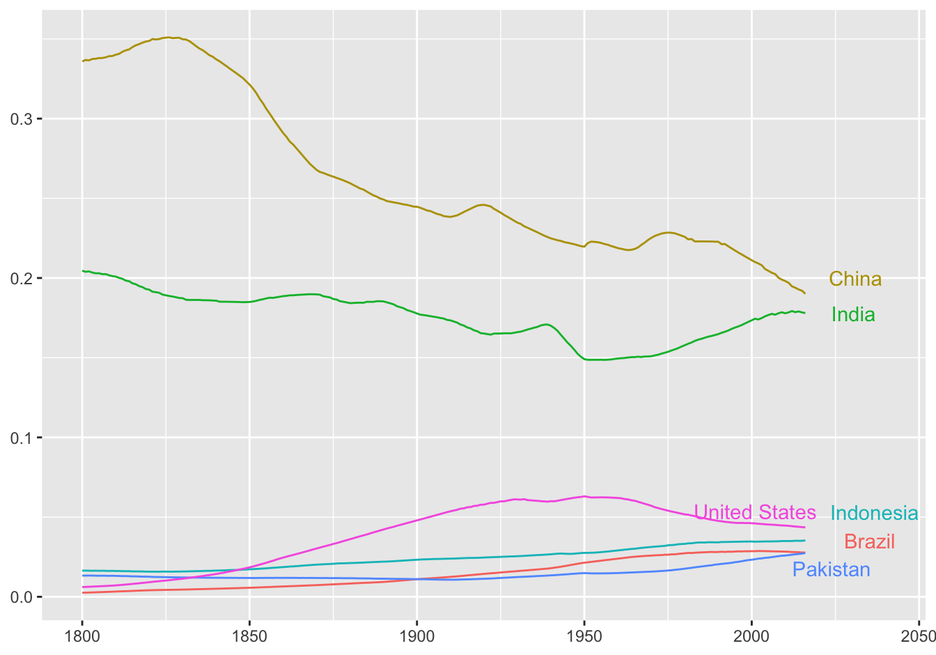
Figure 2.11: Proportion of the world population over time made up by the six biggest countries in 2016