32.3 Checking
“Aristotle maintained that women have fewer teeth than men; although he was twice married, it never occurred to him to verify this statement by examining his wives’ mouths.”
Published graphics may appear polished, attractive, and convincing. Photographs prepared by estate agents for houses they are selling may also be described that way. Many graphics were drawn first and discarded just as many more photographs were taken than are used. Scepticism and thorough checking are called for. Popper’s concept of falsification suggests that it is better to search for evidence to refute your impressions than to look for supporting evidence. As xkcd has pointed out (xkcd (2012)), with enough options you have a good chance of finding something that looks significant that is not. Checking develops your own trust in your conclusions and should help to convince others. There are several independent ways of checking features detected in graphics.
32.3.1 Provenance
Are the data from a reliable source? Is it known how they were collected, edited, and summarised? Are they precise measurements or uncertain estimates? Do the variables mean what you think they do or have they been defined or collected differently? All this and more is discussed in Chapter 27.
32.3.2 Looking at the numbers
Do the scales look sensible? Perhaps the minima or maxima look too extreme (Figure 2.2 (left) or Figure 3.1). Do the data appear to be complete? Perhaps there are gaps in the data (Figures 3.6, 6.8 or 11.5) or missing categories (Figures 6.4 to 6.6). Categories that are missing altogether can be difficult to spot. Political opinion polls show party support, but not always how many who were asked did not respond. Maybe the data just look wrong, as in Figure 10.8 for differences in spaceflight mission times.
Sometimes there is heaping at particular values, usually due to rounding (Figure 3.2), sometimes particular values are never recorded (Figure 11.5). Sometimes all the data have been rounded, so that a continuous measurement appears to be discrete. If you ask people what their height is they will report a rounded, possibly inaccurate number. Better data would be obtained by measuring heights in a uniform way under identical conditions for all (Student (1931)).
32.3.3 Varying plots
Graphics redrawn in different ways leave different impressions, emphasising different information. Size, aspect ratio, and position can strongly influence what can be seen. Graphics can be resized, moved, and zoomed in or out. Plot options can be changed: maxima and minima of scales, origin location, histogram binwidths, point sizes, colours, …. Whether some variations are better than others is neither here nor there: the important principle is to check several. Figure 30.12 shows an example for the gay rights data. Figure 32.10 displays a default histogram for the movie runtimes and the one used in the chapter, Figure 3.2, including only films of 3 hours or under and using a binwidth of 1 minute. Far more graphics were drawn for each case study than are included in the book.
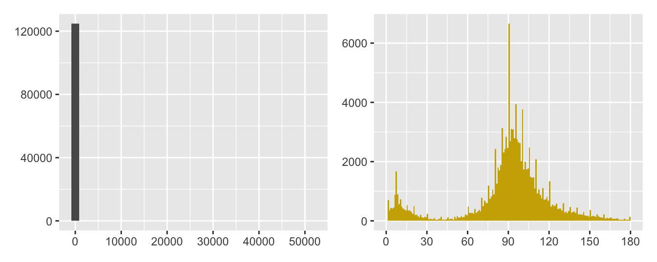
Figure 32.10: Histograms of movie runtimes, the default on the left and a varied one on the right (note the different scales)
32.3.4 Varying plot forms
Drawing different kinds of plots of the same variable(s) provides new insights: a boxplot or density estimate instead of a histogram (Figures 5.3 to 5.5 or Figures 8.1 and 8.2), scatterplots by group (faceting) instead of a single scatterplot (Figures 2.5 and 2.6), a doubledecker plot instead of stacked barcharts (Figure 9.3).
32.3.5 Statistical checks
Statistical models and graphics complement and augment one another, although it is an unbalanced relationship. There are almost always graphical ways of visually assessing the results of statistical models, but there are not always statistical models that can evaluate ideas derived from graphics. If there are, they should be used. If it looks as if there is a nonlinear relationship between two variables in a scatterplot, then a spline model could be fit. This was used for modelling trend in Figure 8.22 for ratings of Chess players and Figure 16.2 for proportions of draws in different football leagues. Both are drawn here again in Figure 32.11.
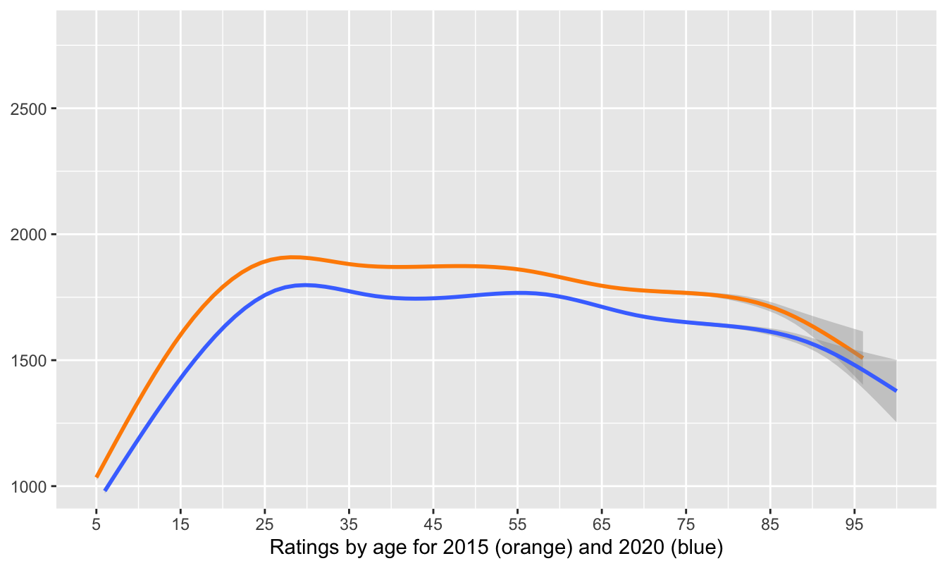
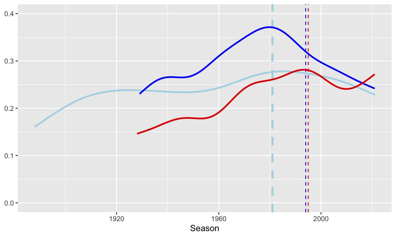
Figure 32.11: Smooths of chess ratings (left) and football league draws (right)
If a spineplot suggests two categorical variables are not independent, a chi-squared test could be used. More complicated data, such as the survival rates on the Titanic in Figure 31.7, could be examined using logistic regression.
Examples where statistical models are not so readily available include assessing possible outliers in a scatterplot and whether there are multiple modes in a histogram.
32.3.6 Checking consequences
- Internal checking
Are patterns across the whole dataset also found in subgroups? The surprising peak in the chess ratings at 2000 shown in Figure 8.1 was explained by comparing ratings for active and inactive players in Figure 8.3, shown here again as Figure 32.12.

Figure 32.12: Ratings of active and inactive chess players in 2020
The decline in survival rate across the Titanic’s three passenger classes applied to women, but not to men (Figures 25.8 and 25.9). Conclusions might have implications for other variables and it is useful to see if patterns are consistent across a dataset.
- External checking
If relevant data can be found, compare results with other related datasets (§4.2, §8.4 or Figure 26.18, drawn again here as Figure 32.13).
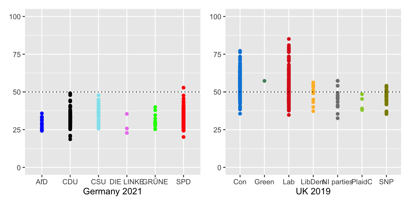
Figure 32.13: Seat-winning percentages by party in Germany 2021 and in the UK 2019
32.3.7 Context
Results have to make sense and be interpreted in context. A pattern of points in a scatterplot will be judged in different ways for different datasets or different variables (Figure 33.1). Errors like negative heights or zero dimensions (Figure 11.1) are obvious. Weekly patterns in sightings by birdwatchers or in disease reporting may need to be checked. More birdwatchers may be out and about at weekends and reporting of diseases may be influenced by media attention. Differences in mortality rates between countries or over time may be due to definitions, conditions or treatments as Covid pandemic statistics have illustrated.
In comparing opinions on same-sex marriage from Figure 9.9, redrawn here as Figure 32.14, it is well to remember that the questions were about different situations, that they were framed differently, and that only a third of the sample were asked the state question.
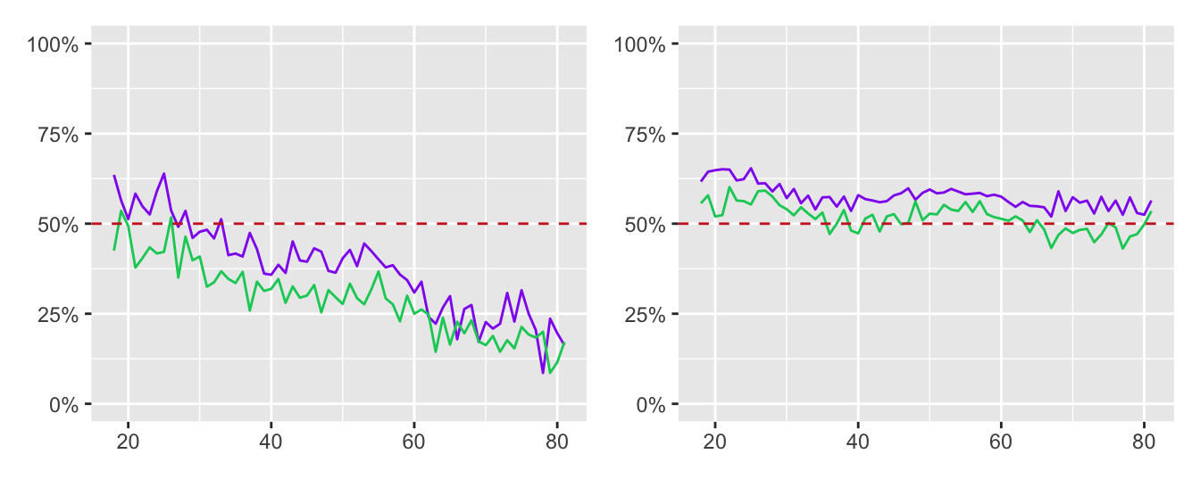
Figure 32.14: Line plots of support for same-sex marriage at federal level (left) and opposition to a Constitutional Amendment (right) by age of respondent by males (green) and females (purple)
32.3.8 Discussing with others, especially domain experts
What one person sees when they look at a graphic may not be what another person sees. Combining opinions is more effective than relying on one person’s views—provided that the opinions are independent. Graphics analysts will not have the subject knowledge of experts in the field and they should be consulted. Amongst other topics expertise was sought on chess ratings (Chapter 8), ornithology (Chapters 14, 18, and 23), swimming (Chapter 20), and German elections (Chapter 26). The role of Ausgleichsmandate in making the German parliament much larger than intended was important information gained. This was shown in Figure 26.1, repeated in Figure 32.15.
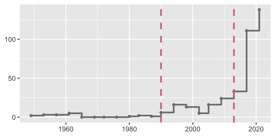
Figure 32.15: Extra seats in German elections since 1949. Each point marks the date of an election. The left dashed line marks the first election after reunification in October 1990. The right dashed line marks the first election with Ausgleichsmandate.
32.3.9 Replicate
All of the checks listed so far can be carried out relatively quickly. The ideal would be to attempt to independently replicate results. Replication should be possible for scientific studies by having different researchers carry out fresh studies in different environments. This may be impractical for reasons of time, organisation, and finance, but is the ideal to aim for. Examples include estimating the speed of light (Chapter 5), evaluating treatment of psoriasis (Chapter 12), and distinguishing shearwaters (Chapter 23).
If datasets are large, a partial replication can be achieved by splitting the dataset into independent groups by sampling. This was suggested in connection with fitting a smooth to the chess ratings data in Figure 8.18.
Some datasets are regularly updated, e.g., movies (Chapter 3), fuel efficiency (Chapter 17), and elections (Chapter 26). Results can then be checked for consistency over time.
32.3.10 Example of checking
The best times for swimming events were studied in Chapter 20. The form observed in the first plot for the 100 m freestyle for men, Figure 20.1, was checked by looking at other strokes and other distances. The possibility of an overlap in times between female butterfly and freestyle swimmers in Figure 20.3 was checked by drawing a different display, multiple boxplots, in Figure 20.4. This display was also drawn horizontally rather than vertically, to make better use of space and to provide an alternative point of view. The data behind the outlier in Figure 20.5 was checked and a classification error was uncovered: it was a time for that swimmer at that competition, but in a different event.
The displays for 50 m races and 200 m for men and women, Figures 20.3 and 20.5, were different in one important respect: the backstroke swimmers caught up on the butterfly swimmers. Checking with swimming experts revealed the reason, the different rules on turning between lengths for the events. The figures are shown again in Figure 32.16. Note the different vertical scales of the left and right plots.
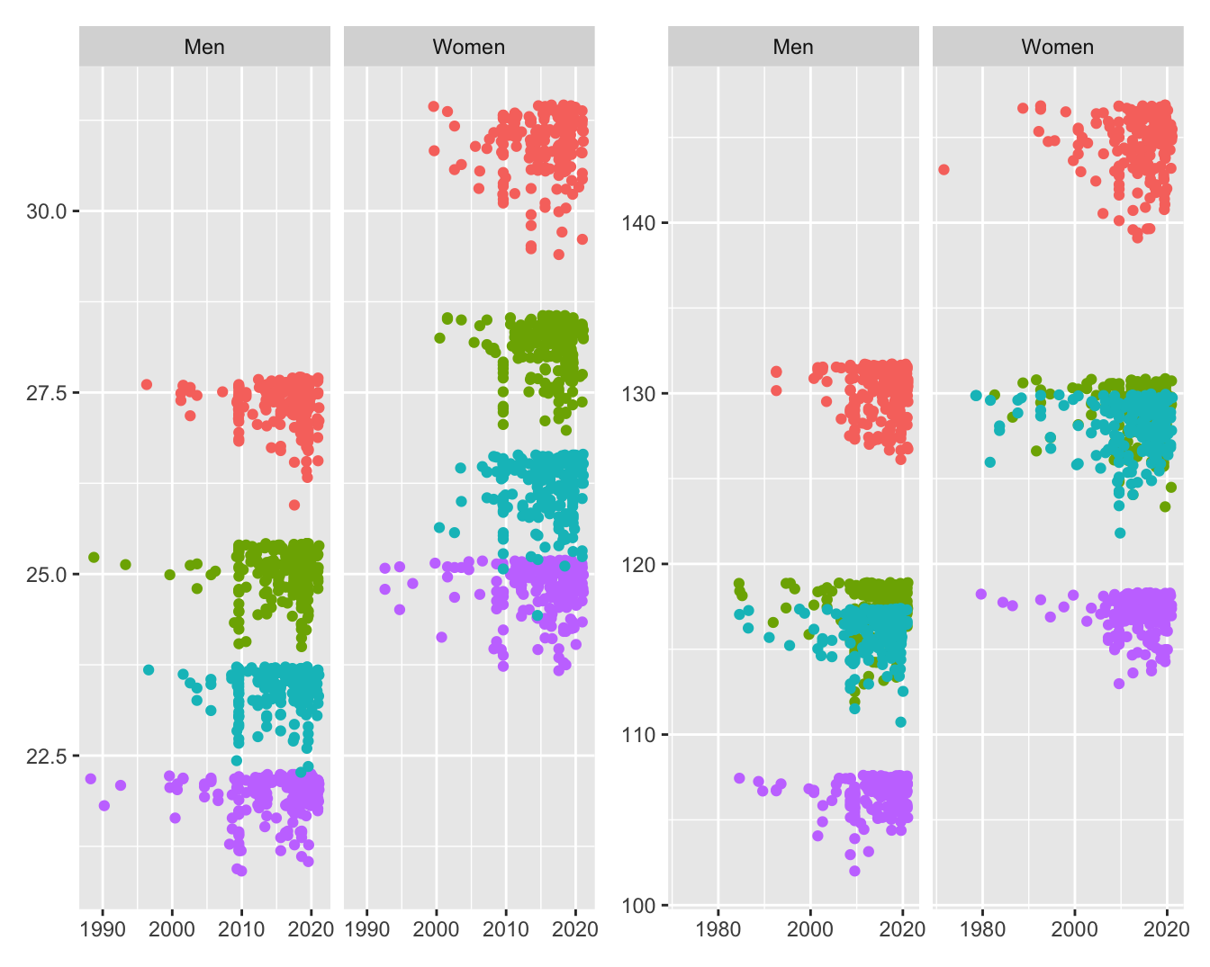
Figure 32.16: Best times in seconds for the four 50 m (left) and four 200 m (right) swimming events achieved by men and women in the order breaststroke, backstroke, butterfly, freestyle from the top