32.2 Understanding
“The more I practise, the luckier I get.”
32.2.1 Knowledge
Knowledge of what graphic forms represent is necessary to understand what information features might convey. Individual graphics have a general structure with local details that suggest additional information. Combined with other graphics they provide an overall picture of the data whose interpretation will depend on the context and background. Familiarity with what features may arise, and why, makes it easier to understand what is being shown by the graphics for a new dataset.
Some of the graphics literature is concerned with new, innovative graphics, emphasising novelty over familiarity. The advantage is the novelty itself, the attraction to viewers of something unknown, possibly striking. The disadvantage is viewers’ lack of experience with the form. While new developments are welcome, viewers will see more with graphics they are familiar with.
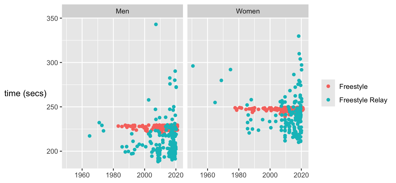
Background knowledge is also indispensable, whether your own or that of collaborating domain experts. With data by country over time it was necessary to know how countries have changed (e.g., Chapters 2, 8, Chapters 6, and 15). With swimming, information on the rules for different strokes, on full body swimsuits, and on the introduction of the butterfly was valuable (Chapter 20). Another swimming example, Figure 20.11, repeated here as Figure 32.6, concerned the reasons why the best 200 times for individuals and relay teams were so different.

Figure 32.6: Best times for the 400 m freestyle events for men and women, individual (red) and relay (blue)
Much can be found out about the Olympics on the web, such as stories surrounding particular events, how times were measured, when rules were changed (Chapter 6), but you have to look. The web is not always helpful. Going back to original documentation can be, as with the articles by Michelson and Newcomb on their attempts to measure the speed of light (Chapter 5), and with getting the full survey from Annenberg that included the gay rights questions (Chapter 9). Often dataset owners/maintainers are very helpful as happened with Chapters 17 and 21.
32.2.2 Experience
What do people pay attention to when they visit a famous building? Architects will study the building. Historians may study the symbolism, and locals will have their own ideas about what stands out. What can be seen happening during a sporting event? Coaches will view it differently than fans, and with team games, different sets of fans will see the same game very differently (Hastorf & Cantril (1954)). In these situations it comes down to motives, interest and background knowledge, education, and experience. The same goes for looking at graphics. Motives may vary between viewers, interest and background knowledge can hopefully be assumed, but education and experience can not. It is helpful to study how to look at graphics and to look at a lot of graphics to learn how to recognise what might be seen in them. Just looking is not enough. Or as Spear put it: “there is quite a difference between simply looking at a chart and seeing it.” (Spear (1969)).
And what should be looked at in a graphic? If researchers have no experience, it is hard for them to know what to look for. De Groot showed that international master chess players chose better moves than club players because they recognised the structure of positions (Groot (1978), a second edition in English of his Dutch thesis from 1946). The same doubtless applies to viewers studying graphics. If they are familiar with data graphics and understanding and interpreting them, they will find it easier to understand and interpret graphics from a new dataset.
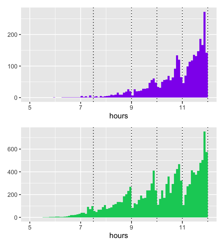
The peaks in the finishing times for the Comrades marathon in Figure 21.9, drawn again in Figure 32.7, are an example. Others have seen similar patterns in other marathon races (marastats (2019)).

Figure 32.7: Finishing times in the 2019 race for females (above) and males (below), dotted lines mark limits for awarding medals other than gold
32.2.3 Possible cognitive biases
Even if you pay proper attention there may be influences hindering your making proper use of what you see. Examples of forms of cognitive bias include
- Confirmation bias: look for information supporting prior beliefs
- Hindsight bias: past events seem more likely than they were
- Recency bias: recent events are more important than historic ones
- Anchoring bias: overemphasise the effect of some reference point. It can mean anchoring any thoughts about a graphic to what is seen first. It is always sensible to look at the data in different ways, developing alternative perspectives.
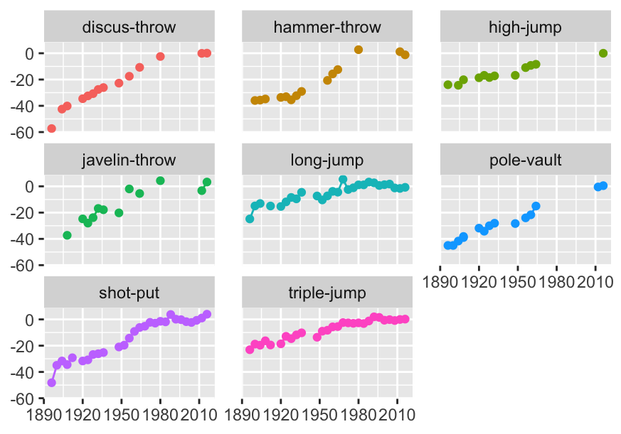
- Availability bias: rely too much on examples to hand. Data are available on the web for Olympic results that were missing in Figure 6.8, shown again here as Figure 32.8, but discussing the problems is more instructive (and less effort) than solving them in this case.

Figure 32.8: Athletics field events for men: percentage differences in gold medal performances compared with averages over the last six Games
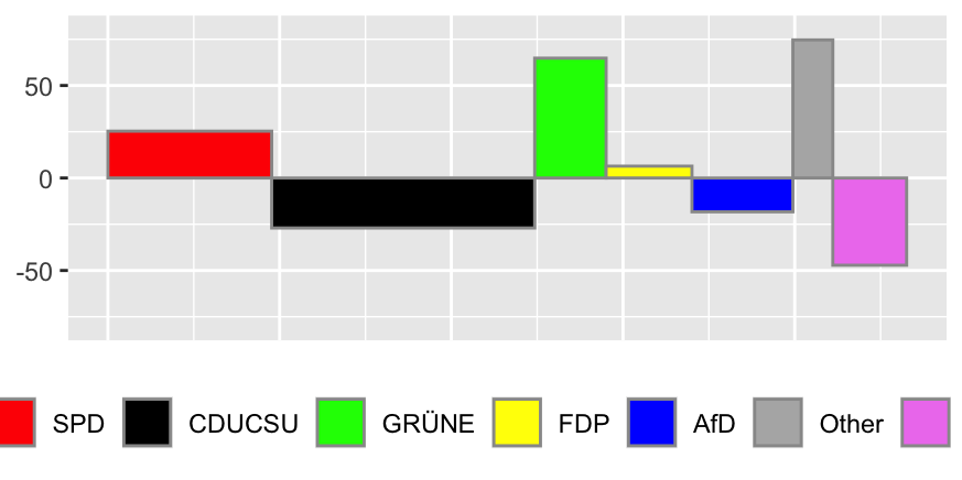
- Representativeness bias: use particular examples without taking account of sample size and base rates. Avoid by using spineplots for comparing rates (e.g., in Figure 9.3) and UpAndDown plots for comparing changes, as in Figure 26.4, drawn again in Figure 32.9.

Figure 32.9: An UpAndDown plot showing absolute changes in party support between the last two German elections as area and relative changes as height
- Perceptual bias: we see what we want to see