20.3 Comparing events graphically
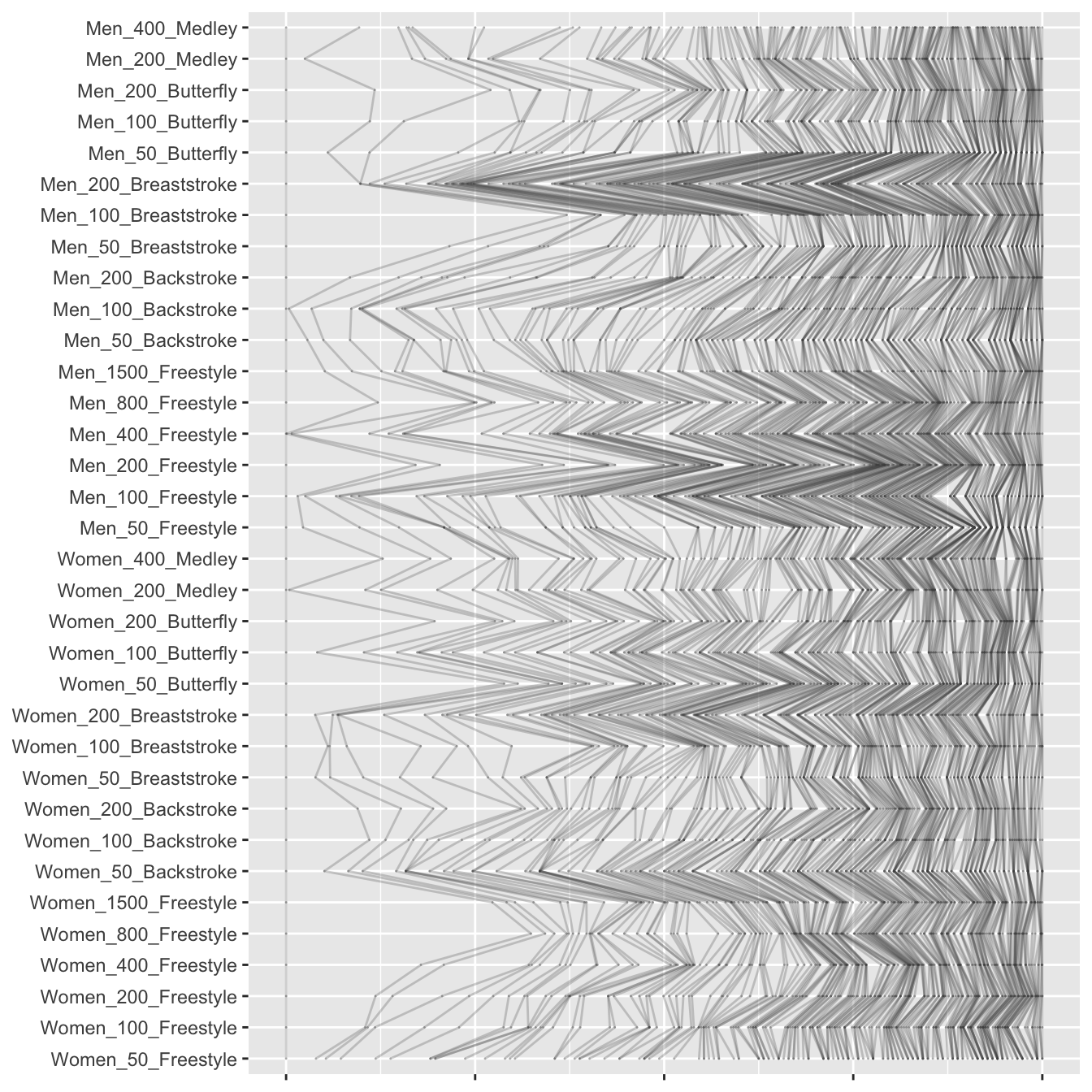
Another way of comparing events is to plot the times standardised by event by rank in a parallel coordinate plot. Figure 20.9 shows this for the 34 individual events, where the 200 times for each event have been standardised on a [0,1] scale.

Figure 20.9: A parallel coordinate plot of the ranked times standardised by event across the individual events
The vertical line on the left represents the rescaled fastest times, i.e. the times of the top ranked swimmer in each event and the vertical line on the right represents the rescaled 200th time for each event. The variation to the left of the plot might be expected. Some world record performances are much faster than the second best performances. The order statistics only seem to become relatively equal near rank 200 at the right of the plot.
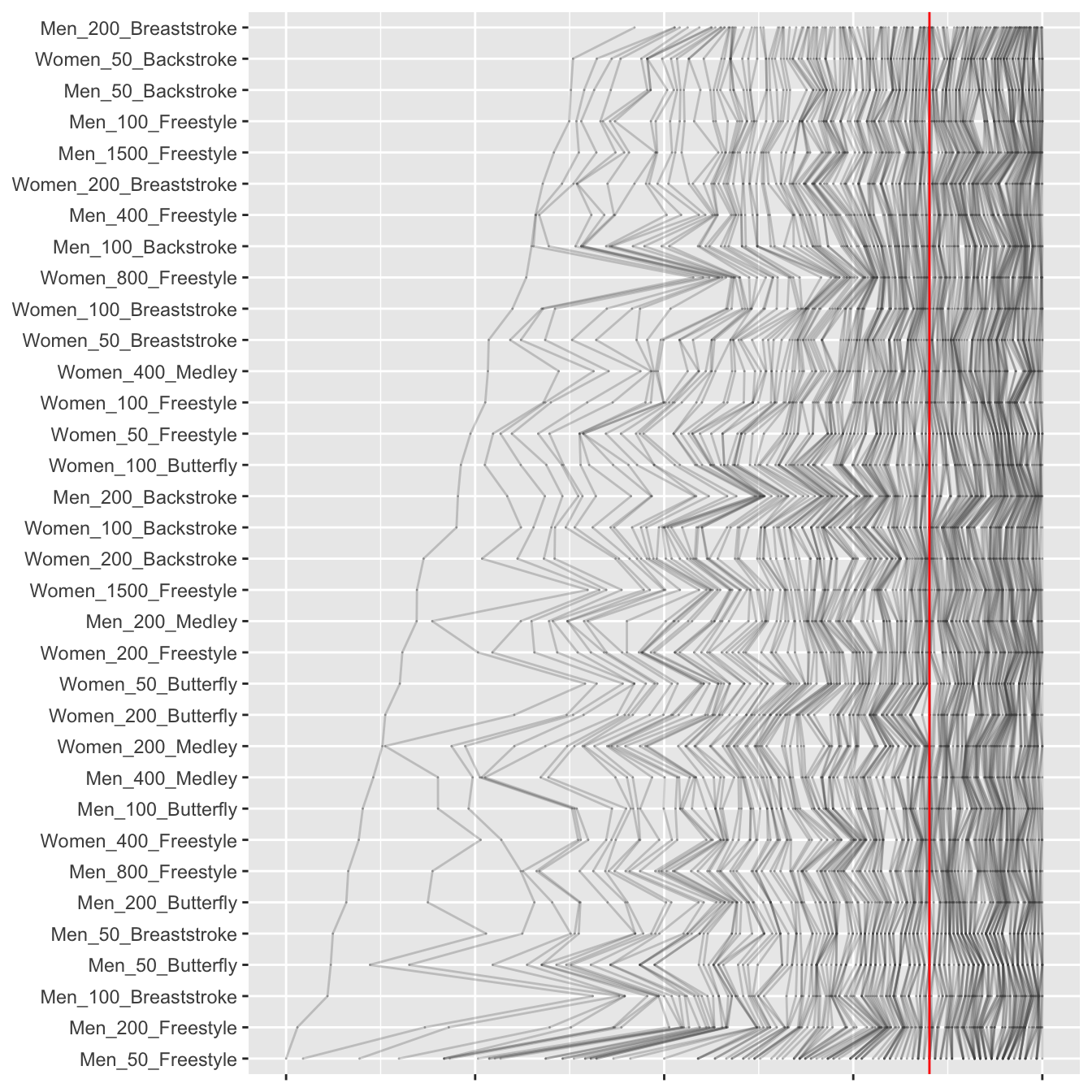
Possibly choosing a different common scaling and sorting the events by stroke and ordering by distance would be more informative. Sorting by the relative difference between the best two performances smooths the plot out a little, while confirming that the distribution of times for the men’s 200 m breaststroke is a bit different.

Figure 20.10: A parallel coordinate plot of the ranked times aligning the 100th ranks (the red line) across the individual events, sorted by relative fastest times
Another approach tried was to align the 100th rank performances for all events, scaling accordingly (the 200th rank performances remain aligned), and sorting events by the relative fastest times. This is shown in Figure 20.10. The 200 m breaststroke for men stands out as the relatively most compressed of the event time distributions. Wave-like patterns are apparent around events where the (relatively) biggest differences between the best and second-best times occur. A good example is the 100 m breaststroke for men, due to Adam Peaty’s performance, the third from the bottom of the plot. It is almost as far away from the 200 m breaststroke for men as it could be.