29.3 Value of colour
Colour can make images more effective, if you know what effect you want to achieve. There are several ways colour works, and colour schemes accentuate (or play down) particular features. There are many aspects to the use of colour and care must be exercised, default palettes may not work well. Sometimes graphics drawn in colour will be reproduced without colour, another factor to have to take into account.
29.3.1 Colours distinguish
The colour scheme in Figure 20.2, repeated here in a smaller form as Figure 29.1, emphasises the four different strokes in swimming. The colours work because there is no overlapping. If there was overlapping, facets with ghostplotting could be used.
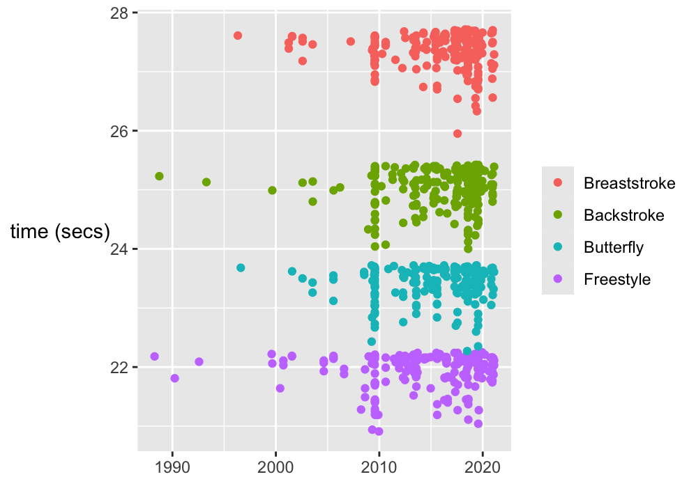
Figure 29.1: Male swimmer best times for four different strokes
In Chapter 5 there are three separate scatterplots using colour, each with different aims, each coloured differently. Figure 29.2 shows them: Stigler’s division of Michelson’s data into five groups (Figure 5.1); Michelson’s grouping the data by three times of day (Figure 5.2); Newcomb’s data including the responsible observers (Figure 5.7). In the first plot the colours show the arbitrariness of the division into groups. In the second plot the morning and afternoon cases are obvious, but the single night-time observation is not (the legend was ordered to help with this). Colour is effective in the third plot, because Holcombe and Newcomb observed on different days. Different colour schemes were used to discourage viewers assuming colours meant the same thing in all plots.
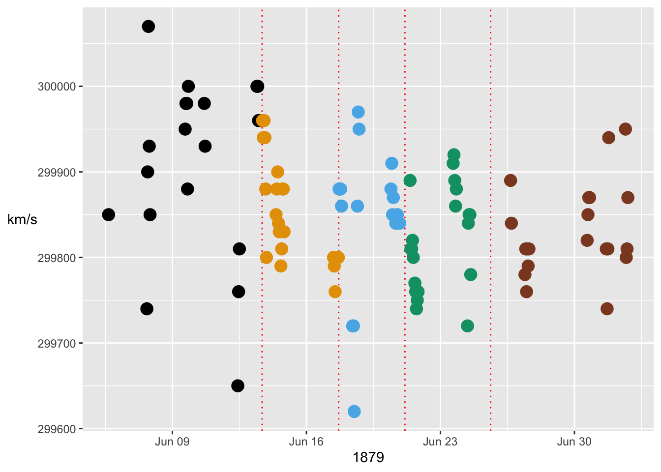
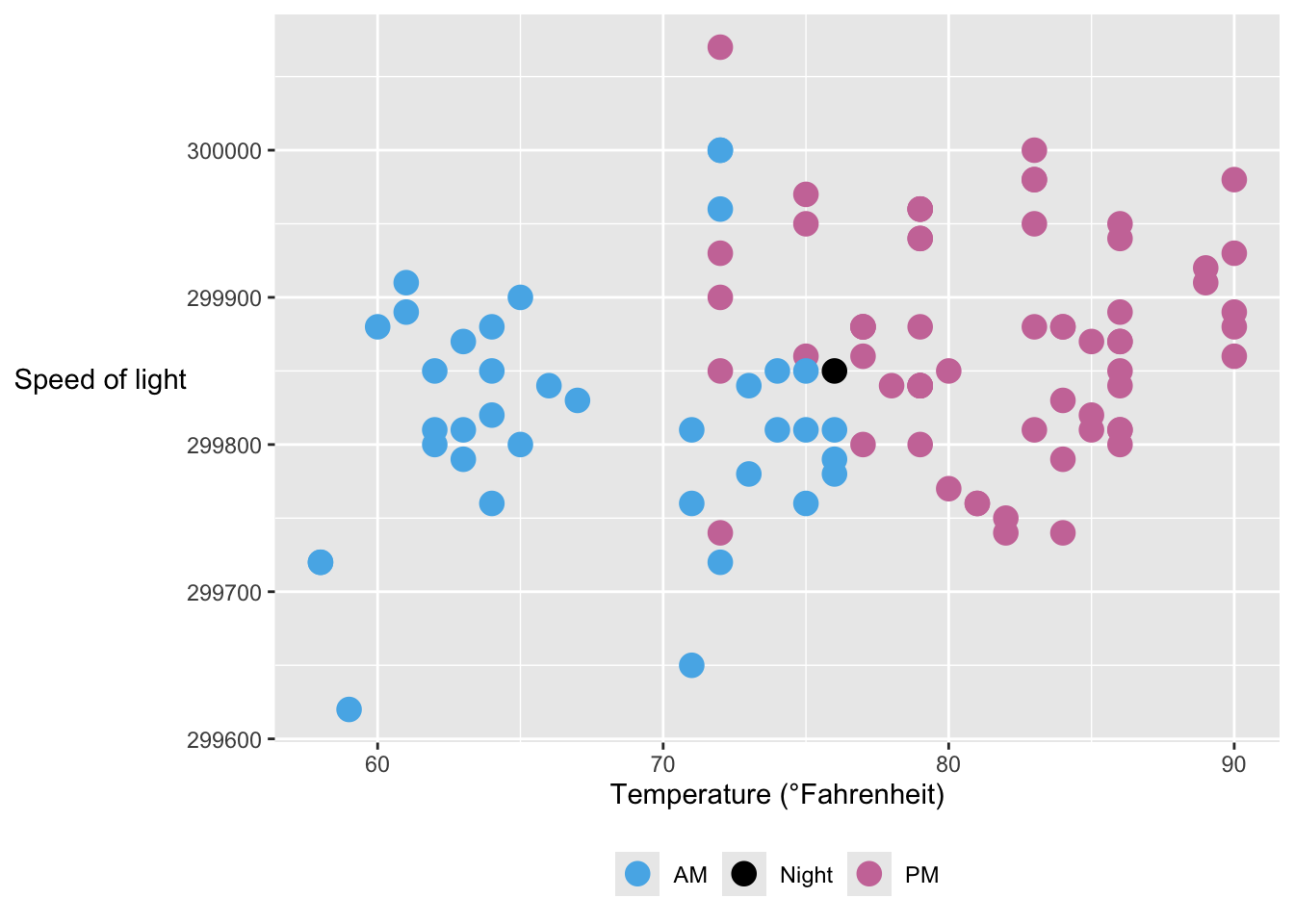
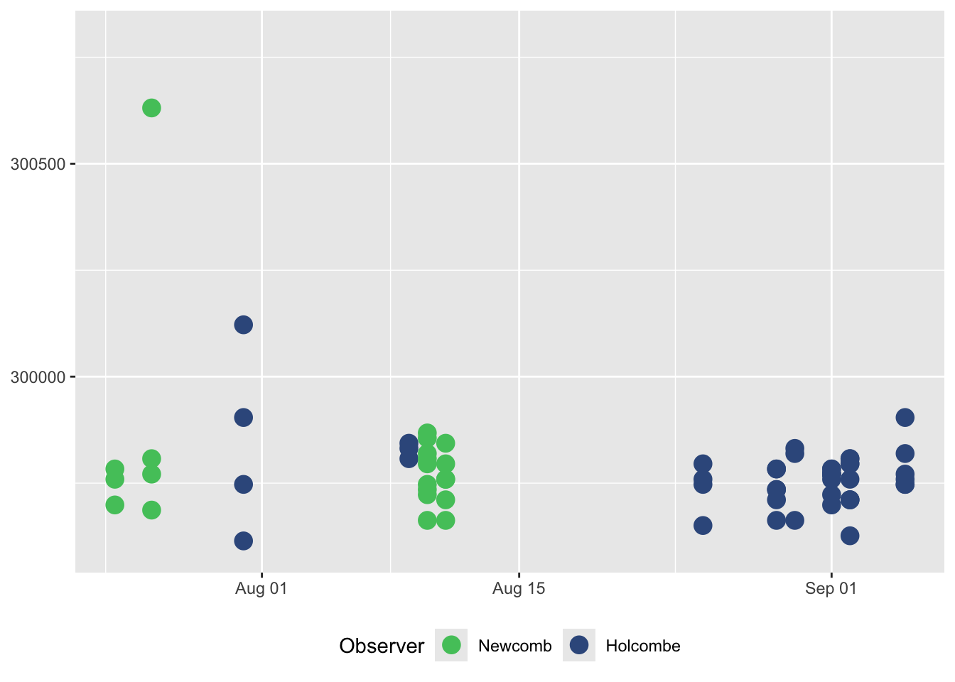
Figure 29.2: Three speed of light plots with three different colour schemes because they represent three different situations
29.3.2 Colours highlight
Colouring individual outlying points draws more attention to them, whether they are boxplot outliers or unusual values in scatterplots. The boxplot of Newcomb’s measurements of the speed of light in §5.2 is one example of highlighting outliers (Figure 5.4).

Figure 29.3: Speed of light measurements by Newcomb
The boxplots of chess players’ ratings by age in §8.4 is another example, (Figure 8.19 repeated as Figure 29.4).
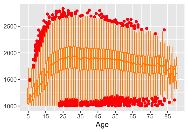
Figure 29.4: Boxplots of ratings for each age for active chess players in 2015
The scatterplot of chess ratings by age in Figure 8.17, repeated as Figure 29.5, uses red to pick out the players with the highest ratings and alpha transparency to downplay the others.
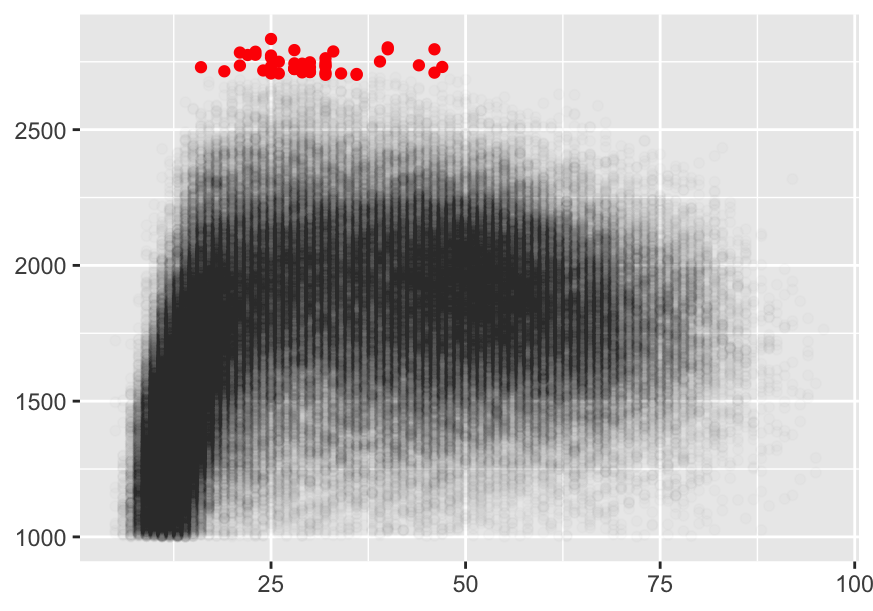
Figure 29.5: Rating by age for active players in 2015. Players with ratings over 2700 have been coloured red. An alpha value of 0.01 has been used for the other players.
In Figure 16.4, redrawn in Figure 29.6, colour is used to pick out English football teams with extreme proportions of points won at home in their leagues. Those 10 points are also drawn slightly bigger than the other 9545 points.
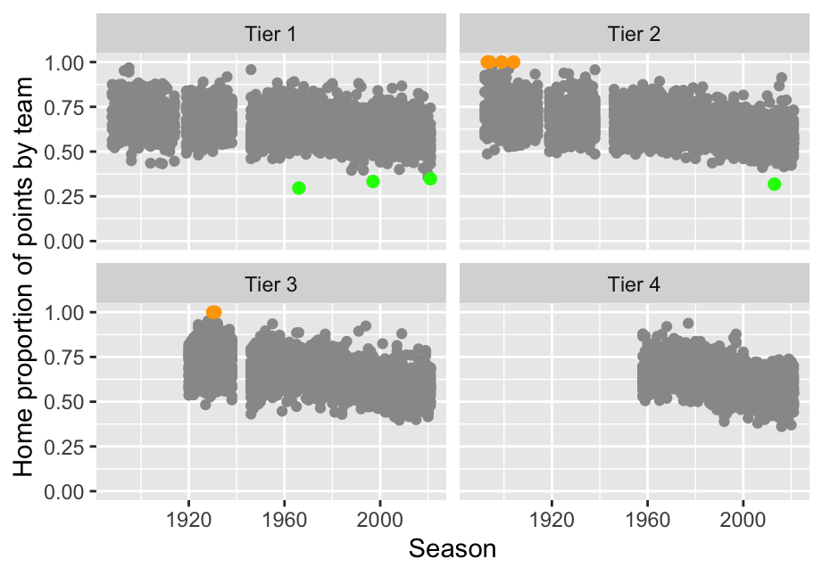
Figure 29.6: Individual home away points ratios for every English football team for every season
Highlighting some aspects can be achieved by playing down others. Some faceted plots have been drawn in the book with the complete dataset in the background of each facet drawn in a discreet grey rather than a default black, ghostplotting, to give context. Examples include Figures 10.7, 14.5, and 18.10.
29.3.3 Colours connect
Using the same colours consistently for the same dataset underscores connections. If there are several displays involving the same data, then colouring by a grouping should be the same for all. In §14.1 five species of Darwin’s finches are displayed in a barchart, two boxplots, a scatterplot, and a parallel coordinate plot. The first four plots are redrawn in miniature here (Figure 29.7).
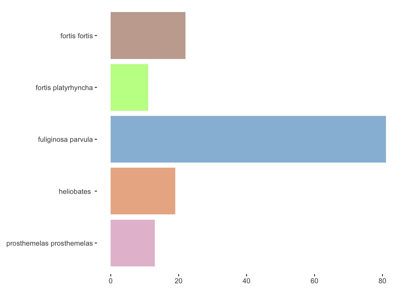
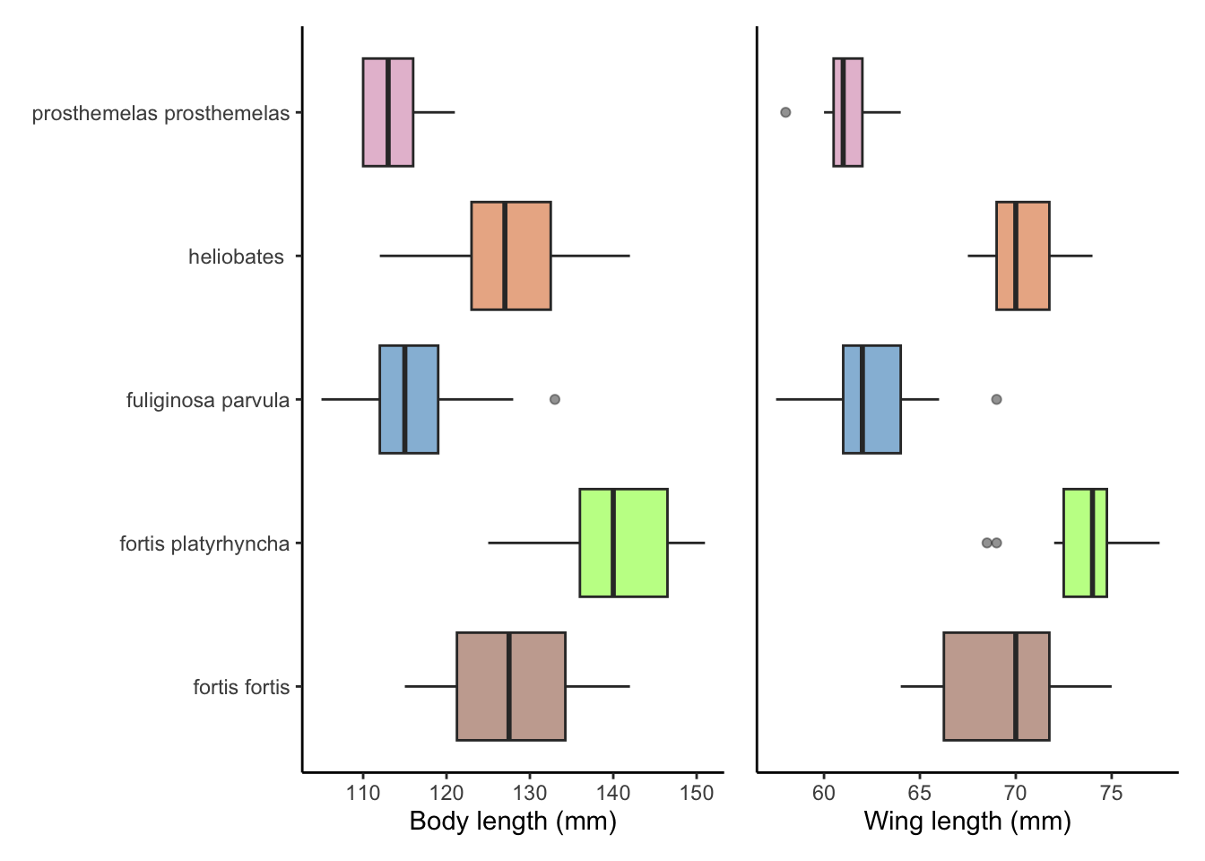
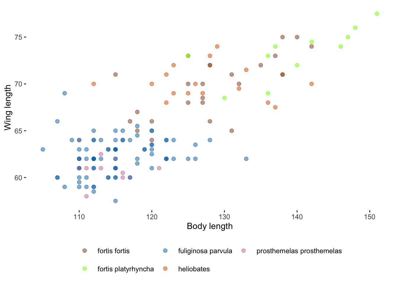
Figure 29.7: Plots of five species of Darwin’s finches
Consistent use of colours in the same circumstances can be useful too. Throughout the book there are many datasets grouped by sex: Olympic sports, chess players, survey respondents, spaceflights, marathon runners, Titanic passengers. A purple colour has been used for females and a green for males.
29.3.4 Colours separate
Different groupings should use different colours. In §18.1 three plot ensembles have the same form, but with different subgroups selected, so different colours are employed (Figures 18.2, 18.3, and 18.4).
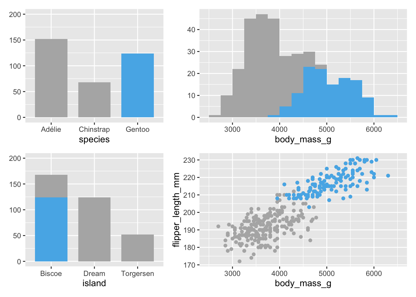
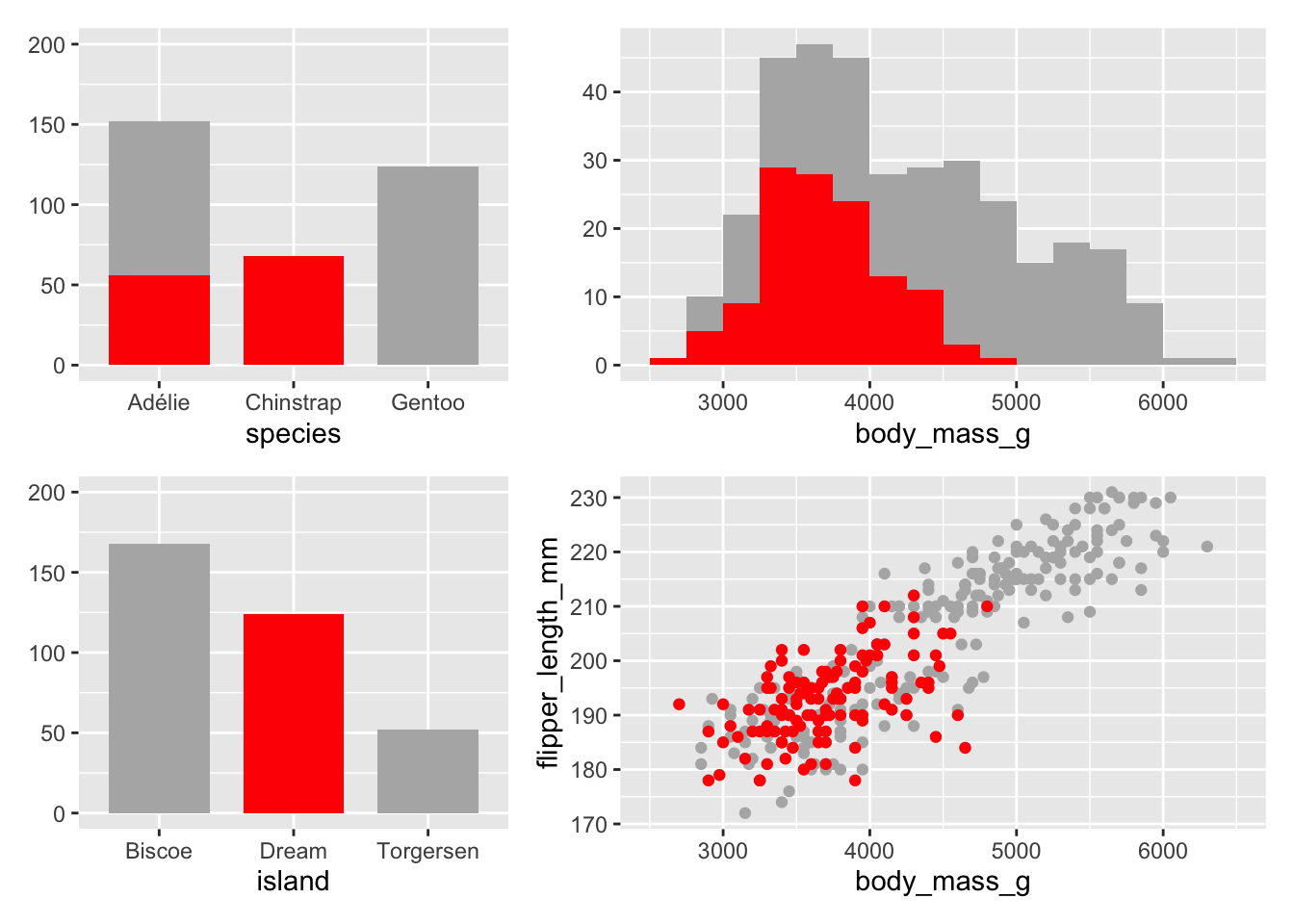
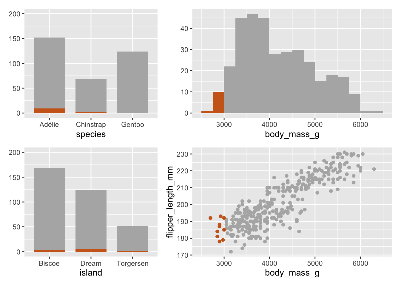
Figure 29.8: Plot ensembles for different groups of Penguins (using different colours for the selections)
With interactive graphics the same highlighting colour is always used for selected cases, because selection is temporary. The chosen colour defines the current interactive selection. Colours that separate are needed for static presentation graphics.
29.3.5 Colours signify
Colours should match known associations. If certain colours are associated with political parties, countries or international football teams, then consider using those colours in statistical displays.
In Chapter 26 the German political parties have been represented by their own colours, as in Figure 26.16, shown here as Figure 29.9.
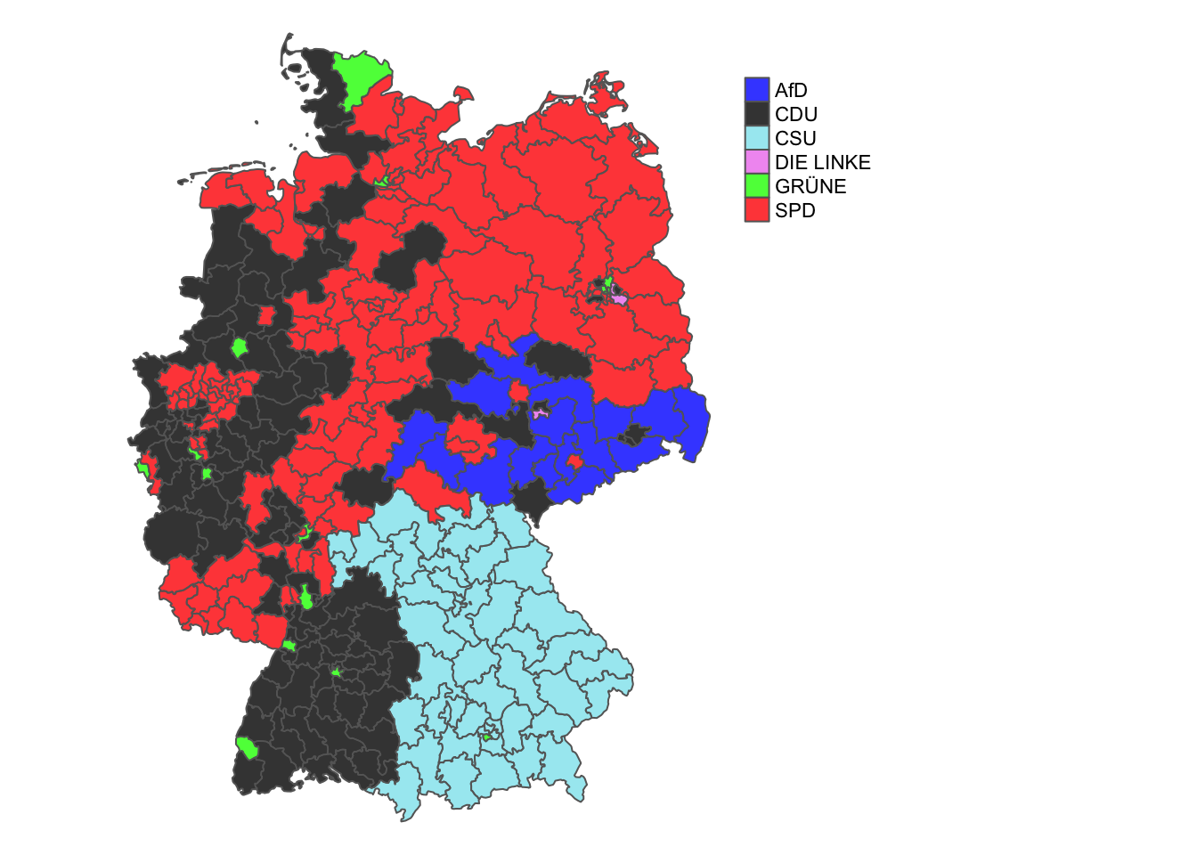
Figure 29.9: Winners of seats by political party in Germany
Whether this is effective or not may depend on the type of plot. The Gapminder dataset discussed in Chapter 2 splits the world into four regions and colours those regions consistently. Using that colour scheme for the time series in Figure 2.5 is not effective, although it is fine for the associated faceted plot and barcharts.
This may not always work as expected. In the 2022 FA Cup Final at Wembley, Chelsea played in yellow against Liverpool instead of their normal blue, possibly because they had lost the 2022 Carabao Cup Final against the same opponents wearing blue earlier in the year. It was striking to see their fans wearing blue when the team were wearing yellow (and did not need to). Chelsea lost again.
Different countries have different associations with different colours, as can be seen in the Colours in Culture poster that looks at colour associations for 84 concepts in 10 populations around the world (McCandless (2022)). It is too difficult to cope with all possible associations in an international context, but it is worth bearing in mind. There are many stories and traditions linked to colours, as is entertainingly described in St Clair (2016). Amongst other thought-provoking comments, she points out that the colours pink for a girl and blue for a boy are a mid twentieth-century development. Formerly, it was common to associate pink with boys and blue with girls.
29.3.6 Colours attract
Well chosen colours can turn a mundane, grey graphic into an attractive and pleasing picture that is a pleasure to work with. Studying a succession of similar, dry graphics can be disheartening and discouraging. A restrained use of colour is an advantage. Not all plots of the same type have to look the same. As Bertin writes of colour (Bertin (2010) Chapter II.C.2): “It captures and holds attention, multiplies the number of readers, assures better retention of the information, and, in short, increases the scope of the message.”