30.2 Formatting
“Accuracy is a duty, not a virtue.”
There are many formatting tools. Some affect content directly, some indirectly by changing the scene. It is easy enough to find advice on how to achieve particular effects, it is more relevant to think about why they are wanted. As Wilson et al. (2014) recommend in “Best Practices for Scientific Computing”: Document design and purpose, not mechanics.
Objects are made bigger to draw attention and made smaller to be less obvious. The overall effect depends on which objects are resized and by how much. Enlarging too much can lead to objects overlapping with loss of clarity. Shrinking too much can make some objects almost invisible. Space is increased between objects to make them more distinct.
Objects are coloured for several reasons (§29.3). Highlighting, colouring one group strongly, emphasises that group against the rest of the dataset. Alpha transparency plays down the impact of objects as in ghostplotting. It is also helpful for displaying point density in scatterplots of large datasets. Using colour and size consistently emphasises links and connections across displays. Common scaling, using the same scale for a variable in all plots in which it appears, ensures consistency of displays. Alignment of axes aids comparisons.
Text plays a major role in presentation graphics. There may be a caption, a title, a subtitle, variable labels, axis labels, legends, annotations (including case labels, line labels, numeric values). All these may be formatted, spaced, and positioned in a variety of ways. Few are needed for exploratory graphics and any formatting would be discreet and low-key.
There are so many formatting options for graphics that it can be difficult to see the wood for the trees. In 2006 the coffee chain Starbucks claimed that, including all variations, it offered 87,000 different drinks (this has not been independently verified (Bialik (2008))). Looking through long lists of graphics options that you have to decide on is not dissimilar. It is more important to know the effect you want to achieve and how the options are structured.
Objects representing the content of a graphic, like points or bars, and components that are part of the setting of a graphic, like axes or legends, can both be reformatted. Rather than content and setting, Wickham (2022) uses the terms data and non-data parts of a plot. Formatting can be structured in a number of ways. The approach described here works up from details of data to an overall view: Points, Plot, Position. Colour and ordering are especially important and are treated in detail in separate chapters.
30.2.1 Points, areas, lines, …
There are different levels of data that can be displayed: values for individual cases (e.g., as in scatterplots), aggregates (e.g., by category as in barcharts or by value as in histograms) or statistics (e.g., as in rates with confidence intervals by group). As always, boxplots are a mixture. They show individual outlying cases (if there are any), an aggregate (if the boxwidth is drawn proportional to group size), and five statistics.
Representations of cases may be formatted by colour, transparency level, shape, and size, either dependent on a variable or by direct assignment (when they are all the same colour). Edges may be coloured differently to the areas they border (this may also apply to points if they are drawn large enough). Edges and lines may be drawn in different forms (solid, dashed, dotted, …) and thicknesses. Multivariate glyphs may be defined as radar charts, rose diagrams, Chernoff faces or some other form.
The type of graphic chosen will determine how values are shown. Each case may be represented by a point in a scatterplot, by an area in a bar, by some other form of area, by a time series curve in a plot over time, by a polyline in a parallel coordinate plot, by a multivariate glyph. A variable may be weighted by another (numeric) variable.
The regions in Figure 2.7 could be weighted by population, as in Figure 2.8. Both plots are shown again in Figure 30.3. The rankings are quite different. Africa has the most countries, while Asia has the biggest population by far.
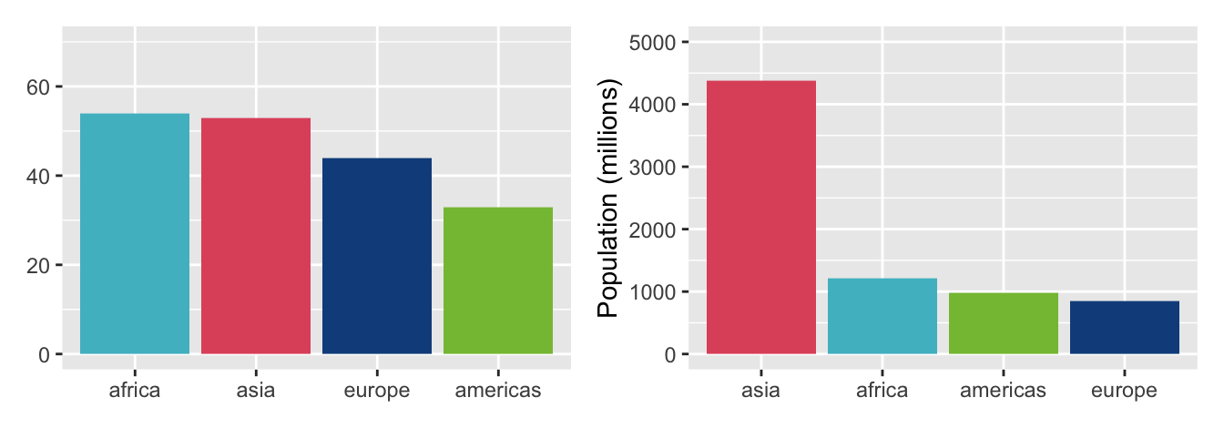
Figure 30.3: Barcharts of numbers of countries by region and populations in millions in 2016
The assignment of variables to axes will also affect a plot’s appearance, especially in multivariate plots such as parallel coordinate plots and mosaicplots. This also applies to faceted plots where each faceting variable may work either horizontally or vertically and the order of the faceting within the horizontal and vertical groupings matters.
Variables may be represented as given or may be transformed. Logarithms of positive skewed variables and model residuals are both transformations of data, if of very different kinds. Others include cumulative versions of variables, first differences or ranking, and there are many more. It may be productive to create new variables that are combinations of more than one of the original variables, such as differences, ratios, and sums.
Figure 30.4 shows barcharts of the change in population of regions by amount on the left and by percentage on the right. The changes in population over the 60 years from 1956 to 2016 are striking. Asia had the biggest increase in numbers, but Africa by far the biggest in percentage terms. Europe’s population increase is the lowest in absolute and percentage terms.
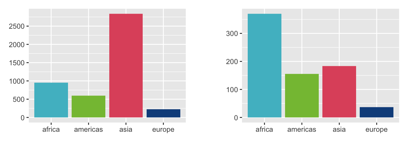
Figure 30.4: Barcharts of population changes by region between 1956 and 2016, absolute numbers in millions on the left, percentages on the right.
With point plots there can be multiple cases with the same values for the plot variables causing overplotting. This can occur with lines in a parallel coordinate plot or with multiple time series too. The order in which the cases (or lines) are plotted will affect how the display looks. Faceting can counteract overplotting, as in Figure 2.6.
The formatting alternatives in this section are predominantly about content and are relevant to both exploration and presentation.
30.2.2 Plot
There may be frames around a plot to clearly delineate its borders. How the frames are drawn, how much space there is between the plot and the frame, how much space there is between the frame and the total area allotted, all influence the look of a graphic. Needless to say, all these areas can be coloured differently, although that is seldom advisable. A soft, light colour for the area within the frame including the plot background is best.
Plots require axes and are mostly better with axis labels giving names to what is being shown. The axes should have appropriate limits and generally meet at the origin. How many tickmarks are drawn on an axis, where they are drawn, and how they are labelled must also be considered. Major and minor gridlines can be helpful in making comparisons, if drawn lightly on the background.
If bars or rectangles are drawn for categorical variables as in barcharts and mosaicplots, then their width, their individual aspect ratios, and the space between them matter. For mosaicplots it is common practice to increase the space from the lowest level to the highest.
If a plot is composed of different layers, as described in §28.5, then the order in which the layers are drawn will affect how the graphic looks. Alternative views can be offered by including or not including particular layers.
Individual plots can be given titles and subtitles. If colours, shapes, or sizes vary, then legends are necessary to describe the options shown. Special features in a plot can be annotated. All these texts should be in the same typeface, but the font and size may differ to reflect the importance of the texts. Too much text may divert attention from the graphics themselves. Legends, labels, annotations can be like subtitles in a film: having them can be helpful, reading them may be distracting.
These choices are part of a graphic’s setting, non-data formatting. They are incorporated in themes in the ggplot2 R package. It is relatively easy to ensure a common standard across plots by specifying the same theme for all.
Four examples of well-known themes are shown in the next figure. They are distinctive and different, imitations of actual styles offered in the ggthemes R package. Corresponding default colour palettes from the same package have been used. Experts from the organisations whose themes have been imitated would produce better displays using their own software.
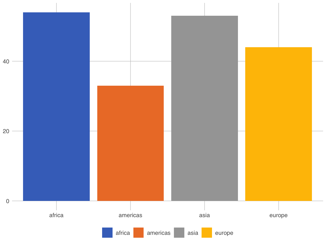

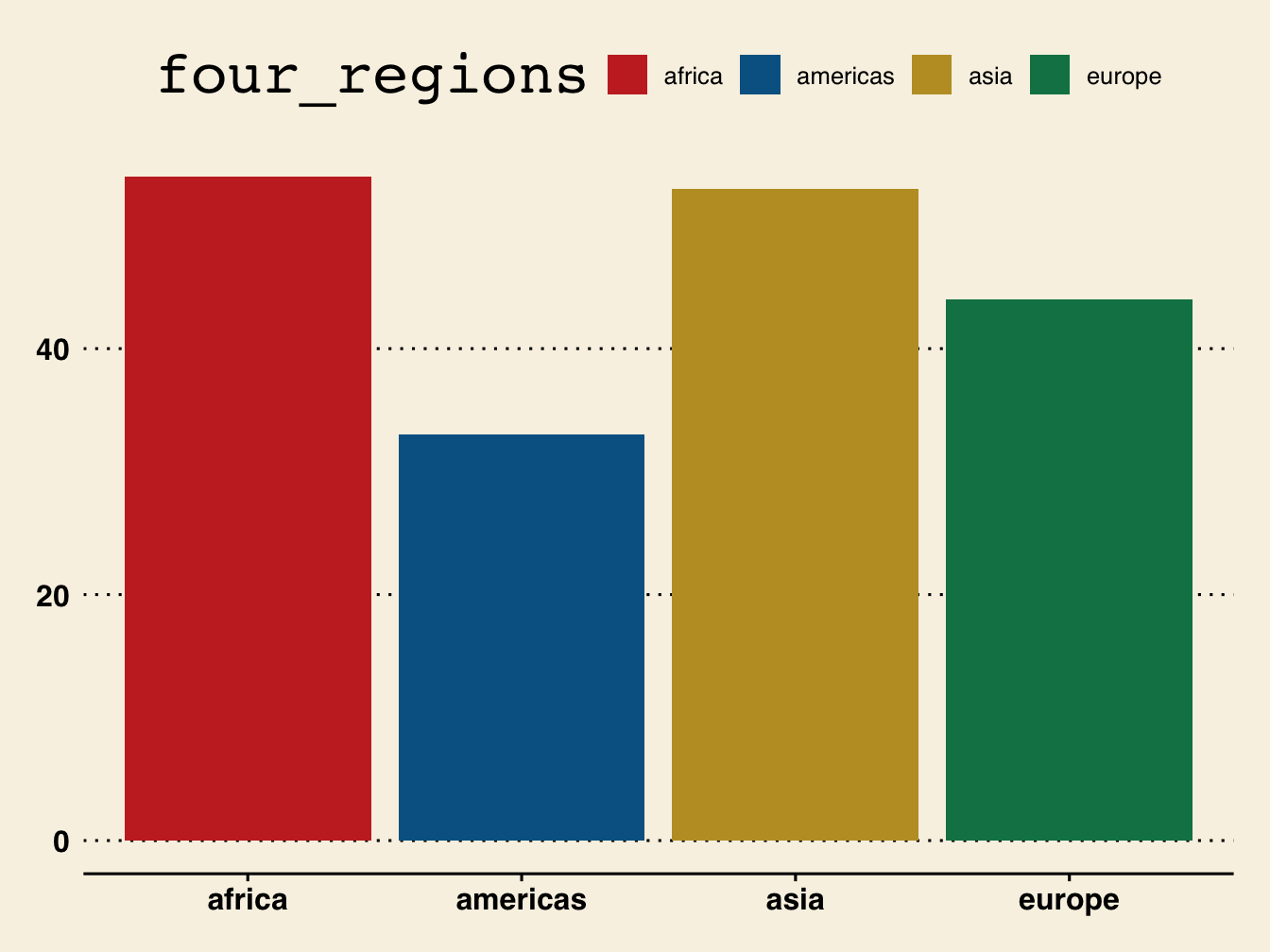
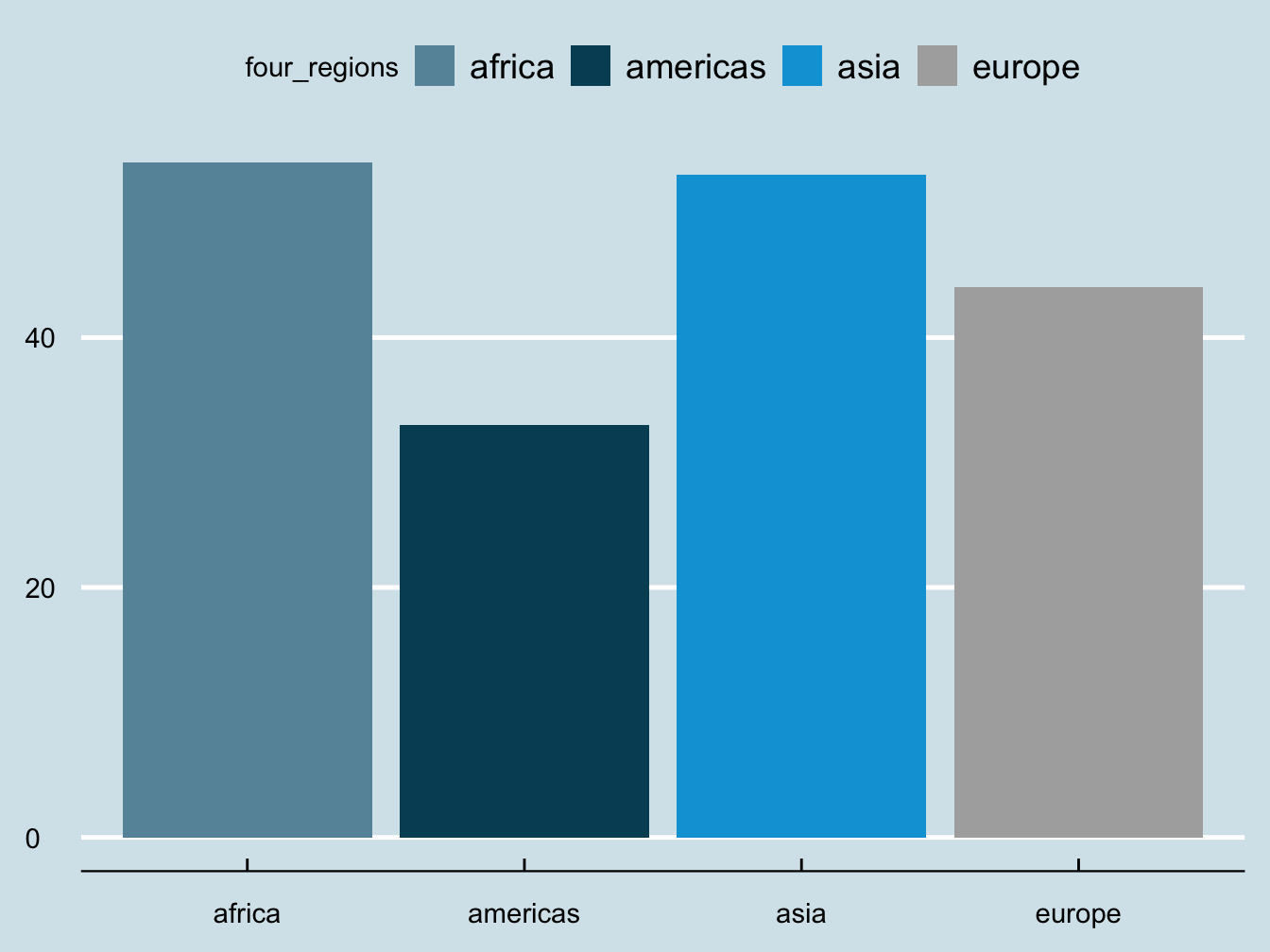
Figure 30.5: Barchart of population by region 2016 using four themes, Excel and Google docs (above), Wall Street Journal and Economist (below)
30.2.3 Position
A graphic or group of graphics can be placed at the top of a page, at the foot of a page, in the middle of text. A helpful rule for printed graphics is that the display is on the same page or on the facing page of the text accompanying it. Flicking between pages requires extra effort, increasing the cognitive load on readers (Ware (2020) and Munzner (2014)). They have to recall what was in the text when they look at the graphic, and remember what was in the graphic when they read the text.
HTML versions on electronic devices do not have an issue with paging. Instead the problem is more that different devices may have quite different screen sizes and shapes. Just because a plot looks good at one size says little about how good it may look at another size. Associated material, text or graphics, may or may not be visible.
When several graphics are drawn together in an ensemble it is necessary to arrange them and set the sizes of the individual graphics so that the information in them can be seen and the graphics fit together. This is automatically carried out for a group of graphics of the same size and shape by software offering faceting. Displaying a number of differently sized graphics is not unlike hanging paintings: horizontal and vertical axes should generally be aligned. Variables appearing in more than one graphic should have axes with identical scales (common scaling), as in Figures 18.1 to 18.4. This eases cognitive load when a viewer’s gaze moves from one graphic to another.