31.2 Ordering and sorting within graphics
31.2.1 Boxplots
Boxplots by group are a space-efficient way of comparing distributions. The group ordering is sometimes given (e.g., in Figure 11.11 of carat by clarity from the diamonds dataset). If not, it is useful to look at different orderings, possibly by a statistic of the individual boxplots (e.g., median or maximum) or by using another dataset statistic associated with the group variable. In Figure 8.13 the rankings of chess players were displayed in boxplots for the countries with the most rated players, and the countries were ordered by their median player rating. As with bars in barcharts, the ordering of the boxplots will facilitate some paired comparisons more than others. The median ordering makes comparison of the medians easy by definition. An ordering by, say, maxima, would favour that comparison.
Boxplots are handy for summarising decathlon data. Each competitor competes in ten track and field events. The results are converted to a points system to make them comparable and the winner is the person with the most points. Figure 31.5 shows the points scores for the 116 top-ranked decathletes in April 2021 (Salmistu (2021)).
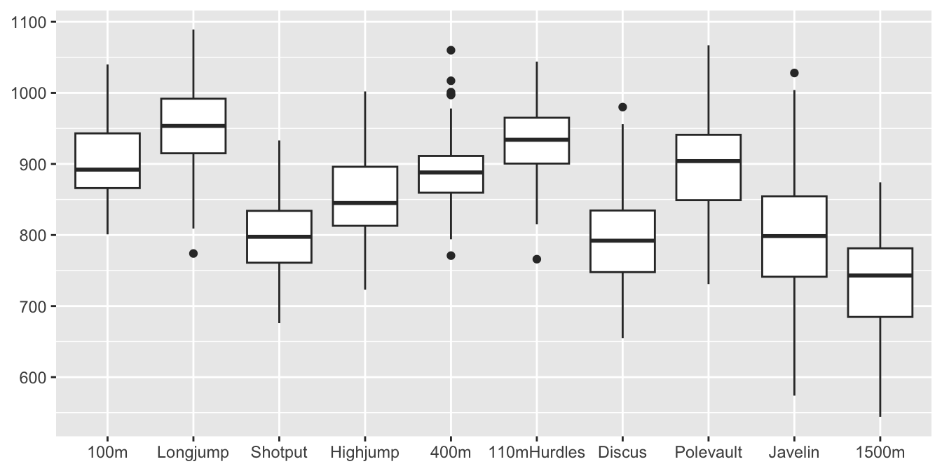
Figure 31.5: Boxplots for the points in the 10 decathlon events in the order they take place for the top 116 decathletes in April 2021
It is striking that, although the points are supposed to be comparable, more are awarded for some events than others. Long jump performances get the most points and performances in the 1500 metres the least. The javelin appears to have the most variability and the 400 metres stands out in including three high outliers. The 1500 metres is a special event for a number of reasons: it is a longer run than the other three running events, requiring different abilities; it is the last event at the end of the second day, so the athletes will be tired; the top decathletes in the competition after nine events run the 1500 metres together, so tactics may be more important than a fast time.
31.2.2 Sorting into groups and faceting plots
Faceting displays data subgroups in the same graphical form, e.g., Figures 3.6 and 6.4. The subgroups are defined by combinations of variables. If the graphical form can be internally ordered (e.g., the bars in a barchart, the boxplots in a group of boxplots or the dotplots in Figure 6.4) then you have what might be called zero order faceting.
Sorting cases into groups is often carried out to display statistics, as was done in Figure 9.5 grouping cases by states (and grouping the states by region), or to draw summary plots as in Figure 17.1 grouping cars by class, drive type, and petrol.
Sorting into groups was used in Chapter 2 to draw countries in the same region together (Figure 2.5), in Chapter 13 to keep charging stations at the same location together and to colour locations by type, in Chapter 17 to put what were thought to be similarly sized cars together, in Figure 20.7, shown again here as Figure 31.6, to place events for the same swimming stroke together, and in Chapter 26 to keep constituencies in the same Bundesland together and to display the spatial distributions of seat wins for the individual parties.
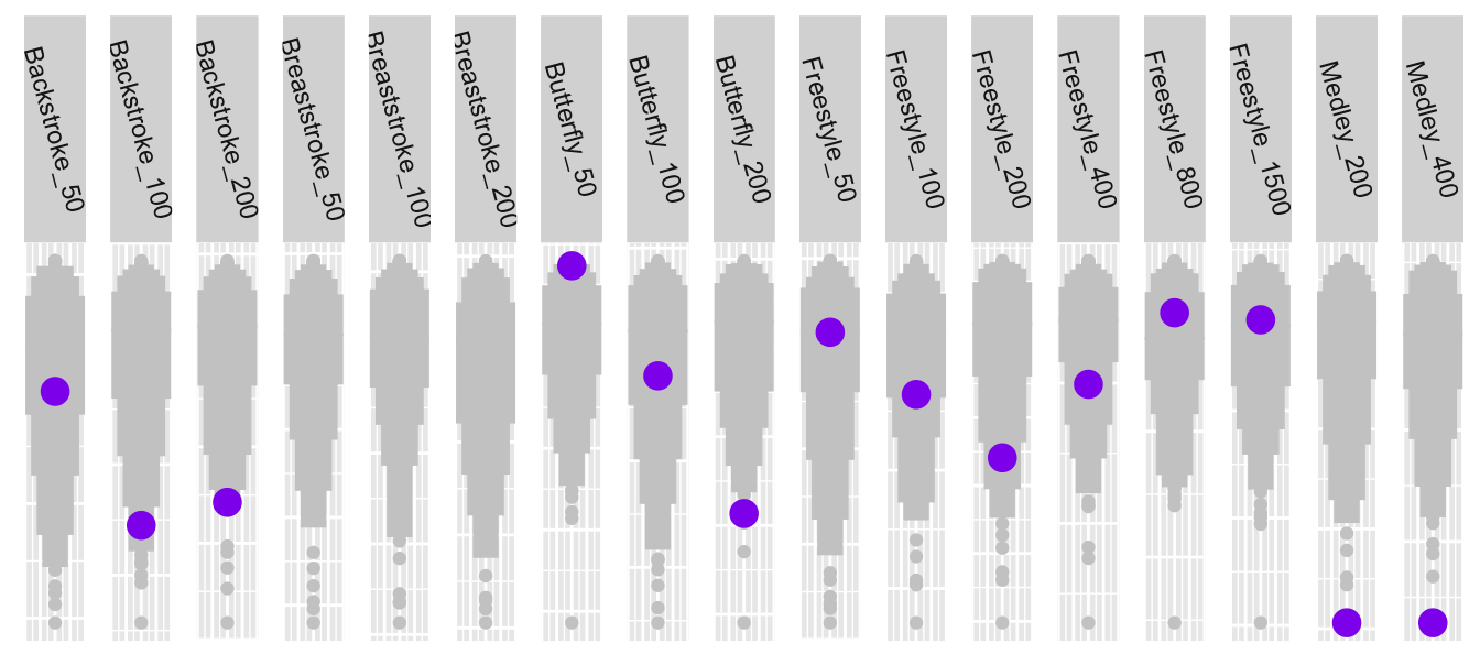
Figure 31.6: Katinka Hosszu’s best times by event (in purple) compared with the 200 best in each event, with events sorted by stroke and distance
Figure 15.7 displays 24 barcharts, each with 17 bars. The facets are ordered by the percentage of squad players playing in their own country. The bars themselves are ordered by the numbers of players from a country’s league playing in EURO2020, except for the ‘Other’ category, which has been placed last. The aims are to put countries close together that are similar in home percentage value and to put leagues close together that have similar numbers at the tournament.
Another example of arranging facets is shown in Figure 6.13 where the countries are put in order of the first time they hosted the Olympic Games. This matches the aim of the graphic better than a default alphabetic order.
Sorting into groups gets complicated when there are several grouping variables. Variables may be nested in a hierarchy, such as constituencies within regions or they may have no such structure, such as type of car, manufacturer, type of fuel. Groupings need to be found that reflect the aims of the study.
31.2.3 Mosaicplots
Mosaicplots offer a variety of ways of displaying multivariate categorical data. Both the order of the variables and the orders of the levels of the individual variables can have a big influence, as can the choice of mosaicplot form and whether variables are plotted horizontally or vertically (Hofmann (2008)).
There are two mosaicplots in Chapter 25 about the sinking of the Titanic, Figures 25.8 and 25.9, shown again in Figure 31.7. In the plot on the left the passenger classes have been drawn first in the natural order of first, second, third (alphabetic in English, but not in all languages), followed by the crew departments ordered by survival rates. This shows that survival rates declined by class and that the rates were lowest for the crew—excepting the small group of deck crew who would have manned the lifeboats. In the second plot on the right of only the passengers, sex has been drawn first with females to the left and males to the right, and class has been ordered within sex. Placing females first and then males means that there is a general decline in survival rate from left to right—apart from the low rate for males travelling second class.
In both plots the numbers in each group are shown by the widths of the bars. This information can be seen in many other plots. Here in the first plot it shows how small the two groups with differing survival rates amongst the crew are. In the second one it reminds readers that there were more male than female passengers and that the largest group was third class males.
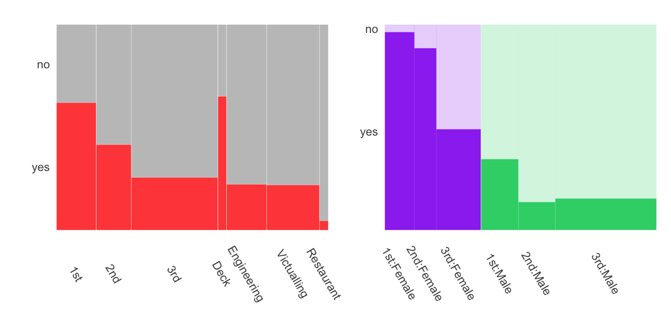
Figure 31.7: Mosaicplots of Titanic survival rates
In the analysis of software for facial recognition in Chapter 22 the plots are all drawn with males first and then females to emphasise the general error increase from left to right.
31.2.4 Parallel coordinate plots
Parallel coordinate plots are drawn with one horizontal axis and many vertical axes, one for each variable drawn. The ordering of the axes makes a major difference to what information can be seen. Orderings can be based on a variety of variable statistics.
Returning to the effect of decathlon events not being scored comparably, consider the differences in scores between competitors. Giving each competitor 50 points more in an event will not change overall rankings at all. Figure 31.8 is a parallel coordinate plot of points given to the top 79 ranked performances in the individual events with points for the 40th highest subtracted. Here the ranked values are joined by lines, not the individual competitors.
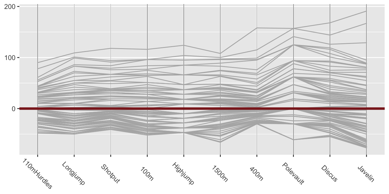
Figure 31.8: Parallel coordinate plot of the top 79 ranked scores for each decathlon event in April 2021
The nth highest polyline connects the nth best performance in each event. Subtracting the same statistic from the points score for each event makes the levels comparable while keeping the differences on the same scale. The zero line equivalent to the 40th best performance has been coloured brown. There is bigger variability above than below as the distributions are, of course, skewed. The events are not in the same order as in Figure 31.5. They have been ordered by increasing range. The lines are close to parallel for the first few events, implying similar distributions, including for the long jump and the 1500 metres, the two most different events in terms of points awarded. The javelin has greater variability, as observed already. The discrete nature of the high jump and pole vault points is because the bars are set at certain fixed heights that competitors either clear or fail to clear.
Parallel coordinates are excellent for studying the data from individual decathlon performances too. Now the polylines link performances of the same individual. The scales of the vertical axes are the same for each event and the same as in Figure 31.5. The difference in Figure 31.9 is that the events are ordered by increasing median event points.
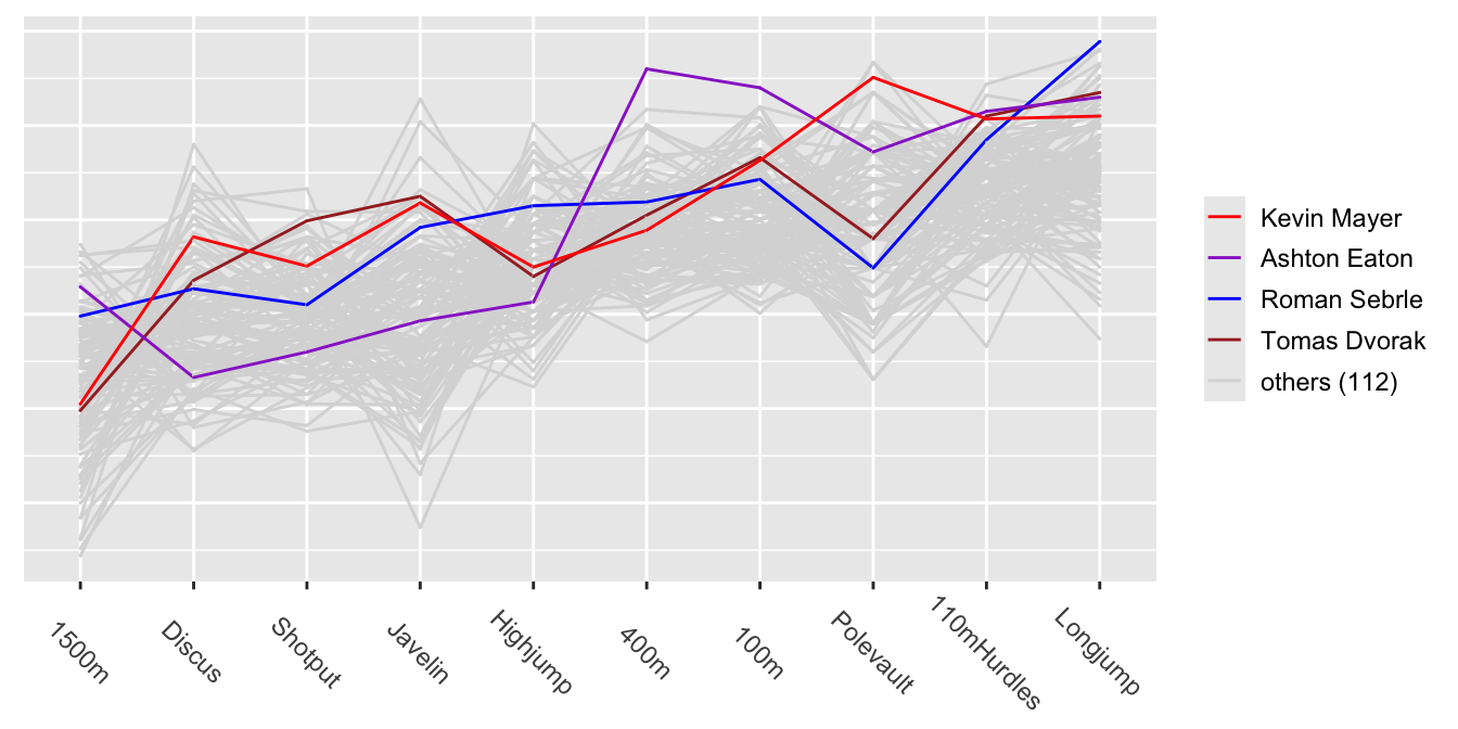
Figure 31.9: Parallel coordinate plot of the 10 decathlon events
The four best decathletes are listed in the legend in order of their total point scores. They have been highlighted in different colours and drawn last so that their lines appear on top. Mayer, the world record holder, is clearly better at the pole vault than the others highlighted. Eaton is strong in the four running events, particularly the 100 and 400 metres, where he is best of all the decathletes in the dataset. His weaknesses are the three throwing events.
So ordering is not only relevant for the variables in a parallel coordinate plot, it is advantageous for ordering the cases when they are coloured by groups (cf. Figure 31.9). The cases of most interest should always be drawn last, so that their polylines appear on top of the others. There are many other options influencing how parallel coordinate displays are drawn and all have to be considered together to get effective displays. Using more displays reveals more information.
At a more complex level, generalised parallel coordinate plots that can handle both numeric and categorical variables, are affected by several orderings: the order of the variable axes across the plot, the orders of the levels of categorical variables, the orders of the cases within category levels, and the order of the cases in the dataset (as this determines the order the lines are drawn). The ggpcp package offers tools for including categorical variables in parallel coordinate plots (Hofmann et al. (2022)). Its key innovations are to draw each case individually and to order the cases within categories. These reduce the numbers of line crossings, make the display more readable, and make it possible to follow individual cases across the display.
Figure 31.10 shows Figures 18.7 and 18.8 from §18.2. The reordered version on the right is easier to decode.
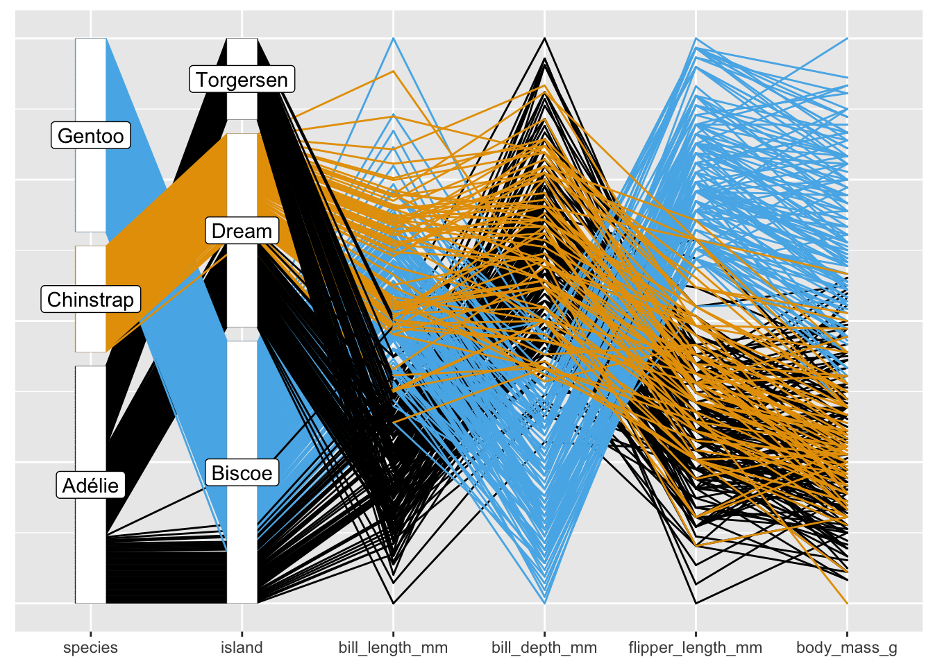
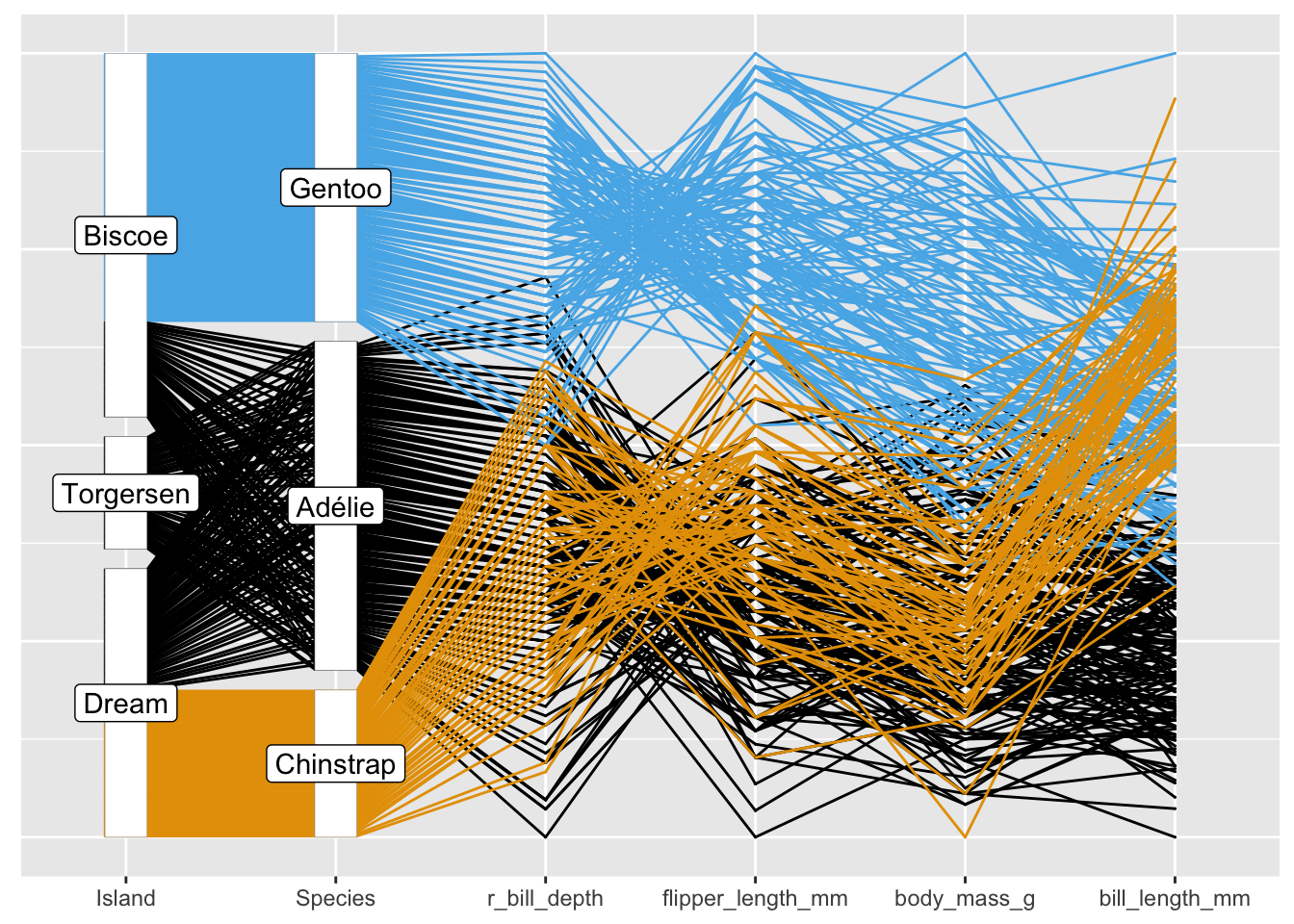
Figure 31.10: Parallel coordinate plots of the Palmer Penguin data (initial and reordered)