7.3 Viewing the data today
Bertin was a cartographer and geographer and was concerned with the individual values for the departments. The first eleven maps on pp. 116-117 are maps of France for each of the four variables (the three sectors and totals) in terms of the absolute values, the densities per unit area, and the sector percentages, with the department boundaries marked and the values written in. Presenting individual department values is important, especially as French readers would want to know the value for their own department, but it does not show us how those individual values stand in relation to the distributions of all values. For instance, Gironde had \(115000\) working in Agriculture, \(107000\) working in Industry, and \(170000\) working in Commerce. It was 6th biggest in Agriculture with \(70\%\) of the highest value, 16th biggest in Industry with \(19\%\) of the highest value, and 8th biggest in Commerce with \(18\%\) of the highest value.
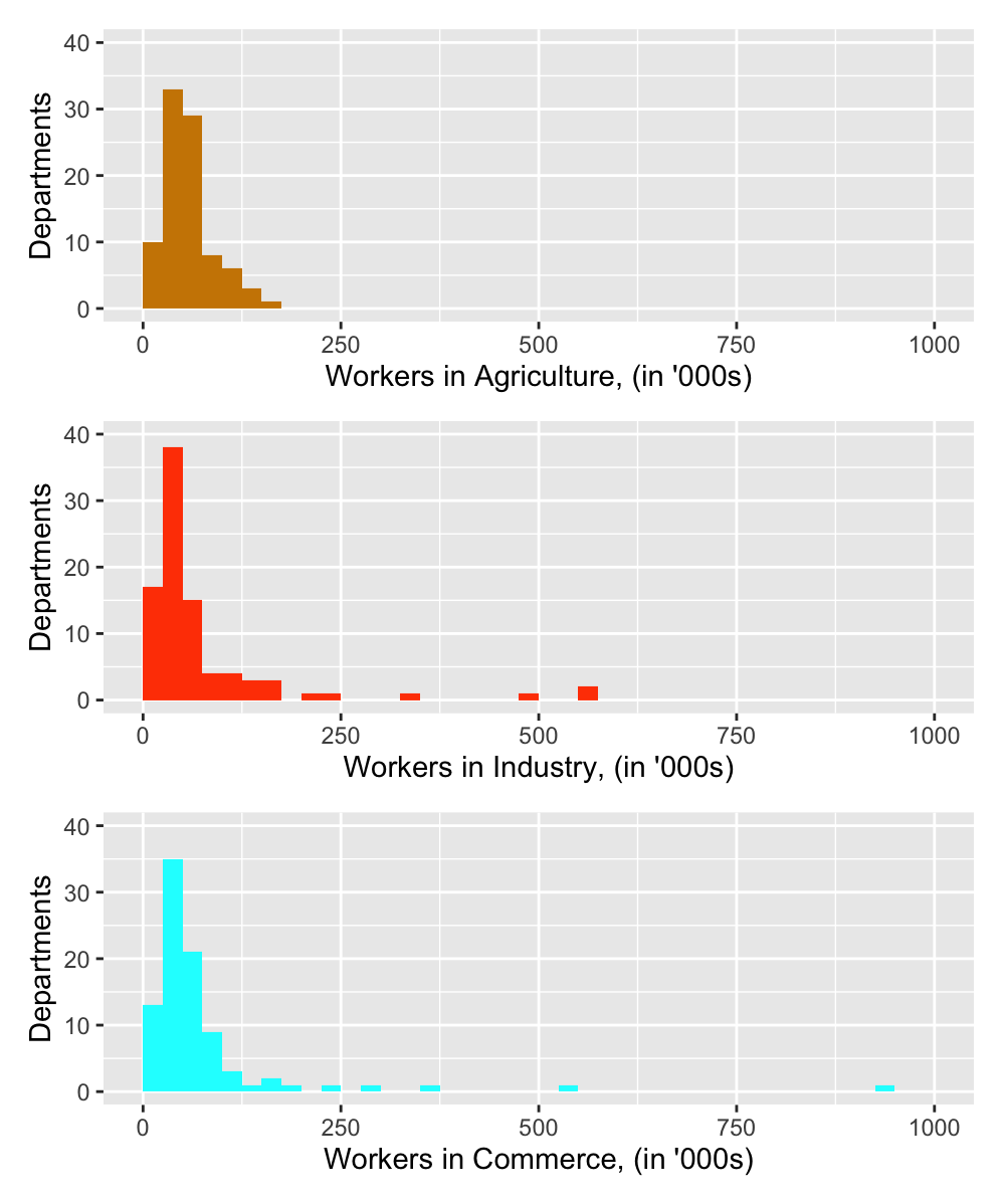
The sorted barcharts drawn by Bertin provide some distributional information in terms of rankings, although histograms are better for studying distributions and that is what statisticians would draw, as in Figure 7.2. The three plots have been drawn with common scales to make them directly comparable.

Figure 7.2: Histograms of the numbers working in the three sectors in 1954
The total numbers of workers in the three sectors are of the same order (Commerce 6.9 million, Industry 6.7 million, Agriculture 5.2 million). The distributions for both Industry and Commerce are highly skewed due to a handful of big values in both, primarily Paris and Seine. The distribution of agricultural workers is less skewed. No department has more than the 164000 agricultural workers of Finistère in the furthest North West of France.
Histograms of percentage shares of the sectors by department or of logged values of the sectors (to counteract the skewness) can provide some additional information, but scatterplots are more informative. Figure 7.3 shows scatterplots for the three pairs of sector variables. Each variable has been scaled individually. In particular, the agricultural numbers are much smaller than the numbers in the other sectors.

Figure 7.3: Pairwise scatterplots of the numbers in thousands working in the three sectors in France in 1954
Bertin’s conclusion that Industry and Commerce values are strongly related is immediately clear, as is the lack of relationship between Agriculture and the other two sectors. Identifying the highest values reveals that Paris has most workers in both Industry and Commerce and is out of line with the general Industry/Commerce relationship, having relatively more workers in Commerce. One department, Nord, manages to have a high value for Industry and a relatively high value for Agriculture.
There may be a little more information in the data alone, but what makes this dataset interesting is its geographic basis. That is surely why Bertin drew so many maps of the French workforce data.