16.6 Wormcharts show league progress over a season
League tables give a snapshot of the current positions in a league competition. Wormcharts show how the positions of the teams changed over time and, if drawn for a full season, show the paths by which the top and bottom teams reached their final positions. The wormcharts drawn here use the number of games played as the time axis. An alternative would be to use the actual dates games were played. The advantage would be historical accuracy. The disadvantage would be making it harder to standardise over time, as teams have often played slightly different numbers of games by different stages of a season. The vertical axis measures the difference between the number of points a team has achieved in that number of games and the average number of points across all teams.
16.6.1 Leicester City are Champions for the first time!
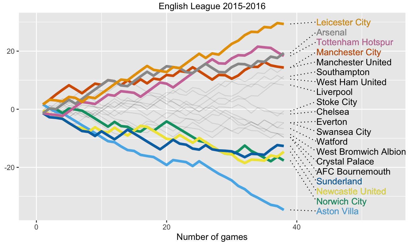
Figure 16.8 shows the how teams fared in the Premier League in season 2015-2016. The winners, to everyone’s surprise, were Leicester City. It was the first time they had won the league title since they were elected to the Football League in 1894 and they were the first new team to win the top division since Nottingham Forest in 1977-78.

Figure 16.8: Team performances in points above/below the average in 2015-16
The chart shows that Leicester finished well clear at the end, ten points in front of second-placed Arsenal, and they led from the front for the last third of the season. At the other end of the table there was an even larger gap, with Aston Villa finishing bottom on 17 points, another 17 points behind the next team Norwich City.
For each round of games of a season (in the Premier League there are currently 20 teams and hence 38 rounds) the cumulative points up to then are recorded. The mean number of cumulative points across the teams is subtracted from each team’s total. A line of the chart shows a team’s cumulative performance relative to the average performance. If some kind of adjustment like this (the median could have been used) is not done, all the teams’ lines increase in steps, making a fanned-out diagonal up the page. A lot of plotting space is then not used and comparisons are more difficult. The assumption is made that all games of a round take place at the same time, which is not always true in the Premier League.
Only the four teams finishing at the top of the table and the four finishing at the foot of the table are coloured to make the display more readable. These numbers can, of course, be changed. In principle the line colours should match the colours of the teams. That would not work so well if, say, four teams playing in blue were all at the top—or bottom.
16.6.2 The 1982-83 season had a few surprises
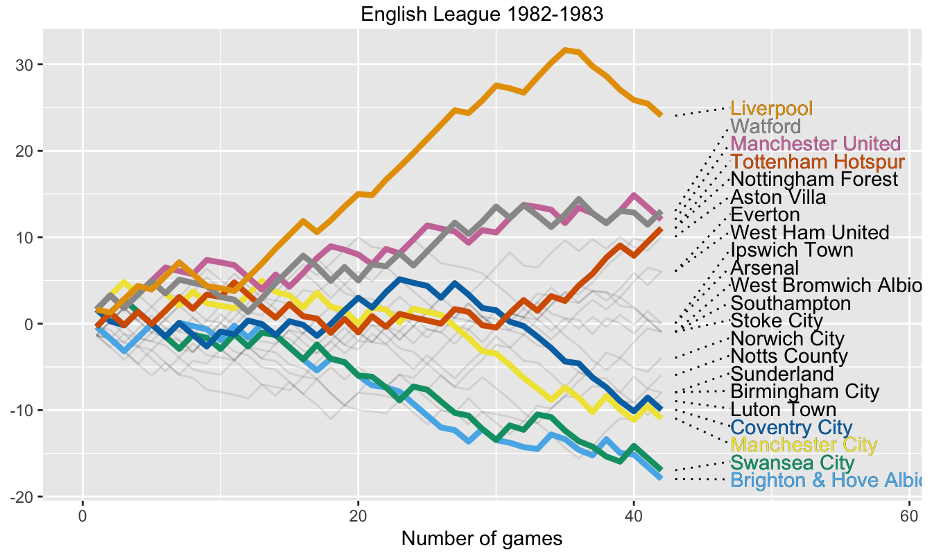
The main story was that Liverpool won the league easily. What can also be seen in Figure 16.9 is that they did very poorly in their last seven games, losing five and drawing two. When the league has already been won, the final games do not matter as much.

Figure 16.9: Team performances in points above/below the average in season 1982-83). There were 22 teams and each played 42 games.
Other stories include Coventry City’s disastrous run for the last third of the season. Checking the results reveals that they had one win, three draws, and eleven losses. One of the draws was with Liverpool after they were certain of winning the league. If you follow each of the eight teams picked out, then the performance of Manchester City, who were relegated, is unusual. They won their first three games and were top of the league at that stage. Almost halfway through the season, after 20 games, none of the three sides who were relegated at the end of the season were in the bottom three.
16.6.3 The most equal and unequal seasons
Individual default scales have been used for the vertical axes in Figures 16.8 and 16.9. To draw scales suitable for all years in which 22 teams competed for the Championship with two points for a win, the scale would have to cover from +26 (i.e. 68 points, Liverpool in 1978-79) down to \(-24\) (i.e. 18 points, Leeds United in 1946-47 and Queens Park Rangers in 1968-69). Curiously, Leeds United won the league in 1968-69 with 67 points, so they were involved in both of the low point seasons, albeit at different ends of the table.
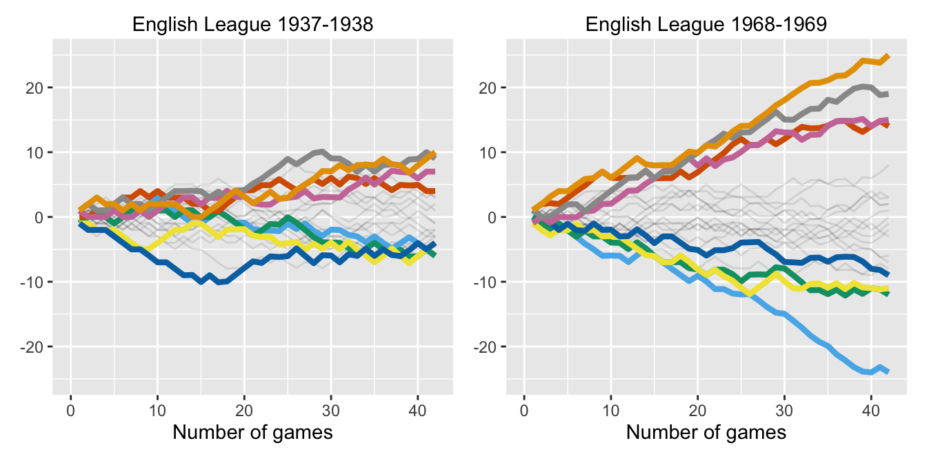
It is interesting to look at how much of a common scale might be used in different seasons. The biggest range was 49 points in 1968-69, from QPR with 18 to Leeds with 67. The smallest range was 16 points in 1927-28 (from Middlesborough with 37 to Everton with 53) and in 1937-38 (from West Bromwich Albion and Manchester City with 36 to Arsenal with 52). Season 1937-38 had other unusual features. Manchester City scored 80 goals, more than any other team, and had been Champions the year before. All teams in 1937-38 won more points than the bottom four teams in 1968-69 and less points than the top four teams in 1968-69.

Figure 16.10: Wormcharts for the two seasons with extreme point ranges for the English 1st Division Championship with 22 teams and two points for a win between 1919-20 and 1980-81
Answers The proportion of drawn games has increased from the low initial rates, but not changed much on average over the past 40 years. Home advantage has declined, particularly for the lower tiers of the league. The numbers of goals scored has remained steady for the last 50 years. Wormcharts give an overview of how teams’ league positions change over a season.
Further questions Would using goal difference rather than goal average before 1976 ever have made a difference (and vice versa)? Which teams have spent the longest in each tier? Which teams have moved between tiers most often?
Graphical takeaways
- Graphics of time series should mark when the rules or context changes. Guidelines help. (Figures 16.1, 16.2, and 16.5)
- Drawing cases of interest bigger, in colour, and on top of other points makes for effective highlighting. (Figure 16.4)
- Transformations can be used to emphasise different parts of a scale. (Figure 16.7)
- Wormcharts are an illuminating way of displaying how a league progresses over a season. (Figures 16.8 to 16.10)