5.2 Newcomb, self-educated polymath, and his data
Simon Newcomb carried out three series of experiments from 1880 to 1882 and the results are all in his report (Newcomb (1891)). His conclusion there on p. 201 is that “The preceding investigations and discussions seem to show that our results should depend entirely on the measures of 1882 [i.e. the third series].”
The results from Newcomb’s third series of experiments from 1882 have also been used many times, sometimes in the order of the experiments, sometimes not. As the experimental setup and conditions changed over time, it is worth respecting the order and, where possible, the actual dates and times. There were 66 measurements made of the time taken in millionths of a second for light to travel a distance of 7.44242 kilometres in air. Stigler suggested in his article that the ‘true’ value would have been 24.83302 millionths of a second after taking account of Newcomb’s adjustments for mirror curvature and refraction.
Figure 5.3 shows a histogram of the data suggesting that there are two suspicious values, one at over 300600 km/s that is far away from the rest of the data and one at over 300100 km/s that is moderately away from the rest. Stigler writes that Newcomb excluded the higher of these two, but not the other one.
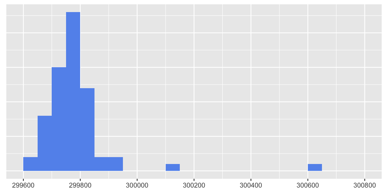
Figure 5.3: Histogram of measurements of the speed of light by Newcomb
Looking at data in simple graphics directly is an effective way of spotting obvious problems (like the case over 300600) and potential problems (like the case over 300100). Some statisticians may prefer to use a statistical test to see if there are outlying points, but there is not general agreement on which test or tests would be best. A boxplot is one possibility, as in Figure 5.4. This suggests that both cases are outliers.

Figure 5.4: Boxplot of measurements of the speed of light by Newcomb
Figure 5.5 shows a further alternative, a kernel density estimate of the data, excluding the most extreme case. It does look as if the other outlier should be dropped as well.
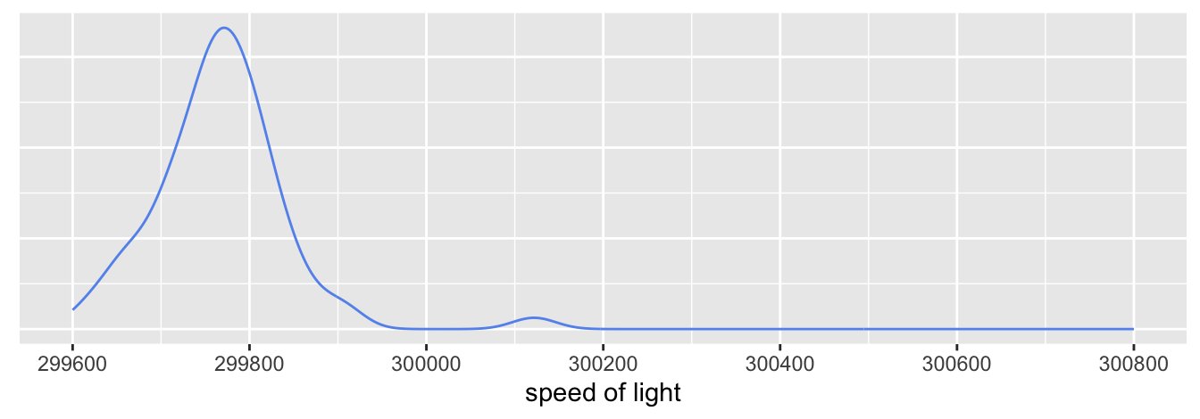
Figure 5.5: Density estimate of measurements of the speed of light by Newcomb excluding an outlier.
Newcomb’s paper provides details of each experiment and this information can be used too. Figure 5.6 plots the data in the order given in the paper. Stigler (1977) uses Newcomb’s order (not all republishers of the dataset do).
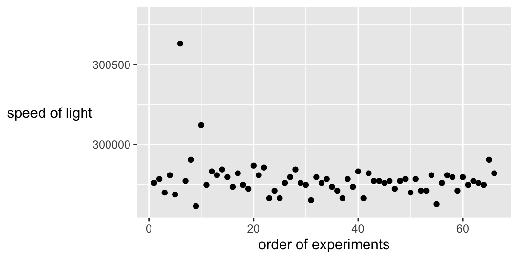
Figure 5.6: Measurements of the speed of light by Newcomb displayed in the order the experiments were carried out
Viewing the data this way does make the potential outlier with the value of over 300100 look out of sync with the main part of the dataset. However, there is more information in Newcomb’s paper. There are the actual dates and order of the experiments and the names of the observers on those days. More than half of the observations in this series were made by Ensign Holcombe of the U.S. Navy, who joined Newcomb after Michelson became Professor in Cleveland in September 1880.
Figure 5.7 displays the estimates by the date they were made and coloured by who made them.
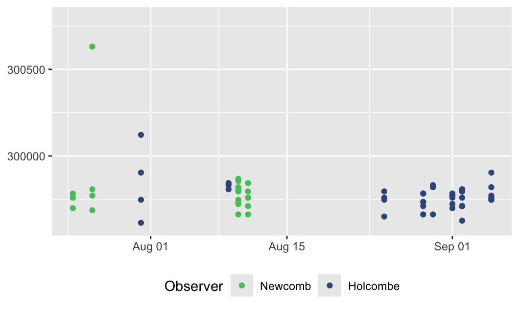
Figure 5.7: Measurements of the speed of light by Newcomb in 1882 displayed by date, coloured by observer
The second outlier of over 300100 does not look so outlying in the context of the four experiments by Holcomb on 31 July (the four dark blue dots in a vertical line to the left of 1 August). It is notable that the lowest data value was also amongst the four observations that day.
Analyses of these data generally assume that the observations can be treated as if they were independent and (mostly) identically distributed. The detailed descriptions in Newcomb’s paper of problems with individual experiments and of adjustments to experimental settings as they proceeded suggest this assumption should be looked at more closely. In addition, Newcomb attempted to assess the quality of the observations. He reported three weights for them, two for the quality of the images and one overall weight to be given to an observation (p. 170, Newcomb (1891)). Figure 5.8 gives the distribution of overall weights.
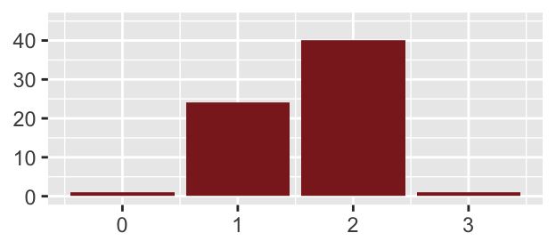
Figure 5.8: Weights assigned to each observation by Newcomb.
Only one case was assigned a weight of 0 (the extreme outlier) and only one the top weight of 3, the last measurement by Holcombe on 31st July, the second lowest value of the four observations that day. The weights for image quality bear little relationship to the overall weight. Newcomb wrote “Only a small range is assigned to the weights, because from the very nature of the case it is impossible to determine them with actual precision.”