12.2 Examining responses to individual questions
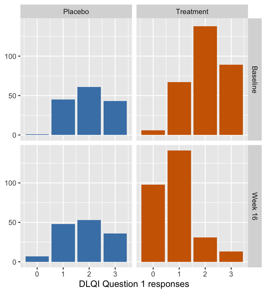
Treatment led to improvements in the averages for all the individual questions. Averaging ordered categorical data is an approximation, so it is worthwhile looking at the separate questions in more detail. Figure 12.2 shows the barcharts of responses to question 1 (how itchy, painful, sore or stinging the patient’s skin was over the previous week) for the two groups at the end of the trial, and compares them with how they were at the start. The placebo group distributions look pretty much identical, whereas the treatment group distribution moved from right to left over the trial, showing improvement for almost all patients.

Figure 12.2: Distributions of answers to question 1 at the start of the trial (top) and at the end (bottom): quality of life declines to the right
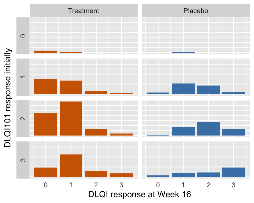
Of course, Figure 12.2 does not show the changes for individual participants, just the changes in the group distributions. Figure 12.3 does show the individual changes.
The bottom row of Figure 12.3 shows how respondents who answered 3 to question 1 initially responded to the same question at the end of the trial. Most of the treatment group answered 1 or 0, evidence of a lot of improvement. Most of the placebo group answered 3 or 2, evidence of little or no improvement. The biggest bars for each of the initial responses of 1, 2, or 3 in the placebo group are the no change bars, supporting evidence that there was little effect in the placebo group.
Figures 12.2 and 12.3 have a similar form but a different meaning, so they have to be interpreted with care.

Figure 12.3: Answers to question 1 at the start of the trial (rows) and at the end (columns within the groups).
Answers The treatment group reported better quality of life on all criteria on average. Deeper analysis of question 1 showed that most individuals reported improvements in their quality of life.
Further questions Do the answers to the other questions display similar patterns to the answers to question 1?