11.1 Data on diamonds for sale
Experts talk of the four c’s of diamonds: carat, cut, colour, and clarity. These are the first four variables in the dataset. Carat is the weight of the stone (1 carat is 200 mg), while the other three c’s are ordered grades with 5, 7, and 8 levels respectively (in this dataset). Three measurements are included: length (x), width (y), and depth (z). Confusingly there is another variable actually called depth that is defined as total depth percentage and will be referred to as depthp here.
Diamonds may have one of ten shapes, either round or one of the nine fancy shapes. Only round diamonds are considered here.
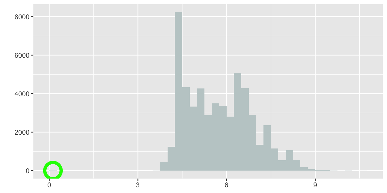
A histogram of the lengths is shown in Figure 11.1. The green circle is to indicate that with a sharp eye a bar might be seen at zero. Histograms of large datasets like this are not good at representing bars with only a few points. There must be at least one point with a length much above 9 too. Boxplots, as in Figure 11.2, are better for displaying possible outliers. The default scaling of a histogram is to include enough of the axis to include all the data, so whether a bar at zero was visible or not, there had to be data somewhere out to the left (and to the right) and the boxplot shows where.

Figure 11.1: Histogram of diamond lengths (the bar at zero has been circled in green)

Figure 11.2: Boxplot of diamond lengths (outliers coloured red)
The lowest length values were checked and there were \(8\) diamonds of zero length. There were also some zero values reported for width and depth. The simplest solution was to remove these diamonds (unless the original data source could have been checked to find out the actual values). The scale of the vertical axis in Figure 11.1 goes up to over \(8000\), so a bar of height \(8\) will have a very small height in the plot, perhaps too small to be shown, depending on how big or small the plot is drawn.
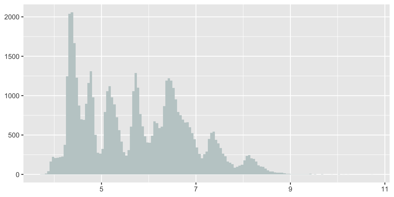
Boxplots can be good for identifying possible outliers. Histograms are good for showing distributional shape—provided that informative binwidths are chosen. Redrawing Figure 11.1 after removing the diamonds of zero length and choosing a binwidth of \(0.05\) gives Figure 11.3.

Figure 11.3: Histogram of diamond lengths (without the zero-length diamonds)
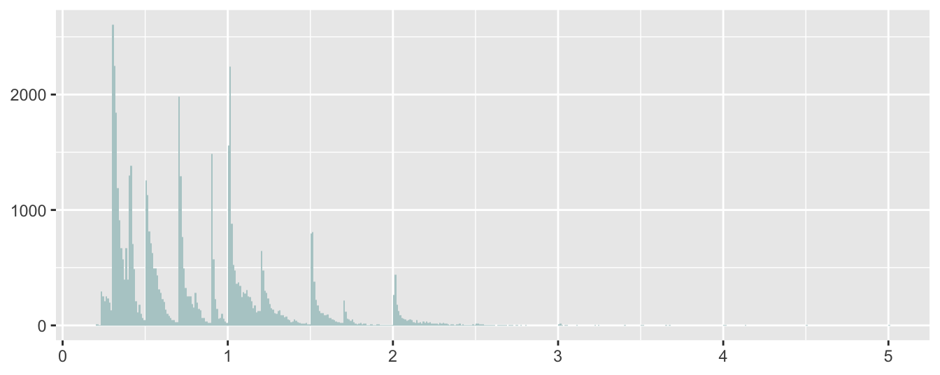
It looks as if there is a mixture of groups of diamonds. Similar patterns can be found for the widths and depths while a related, but different, pattern is apparent for the distribution of carats. The one-sided peaks in the display suggest that far more diamonds of a rounded number of carats are offered for sale than diamonds of just under a rounded number. Two round diamonds of the same number of carats will have similar lengths, widths, and depths and this is likely to be the explanation for the shapes of their distributions.

Figure 11.4: Histogram of diamond carats
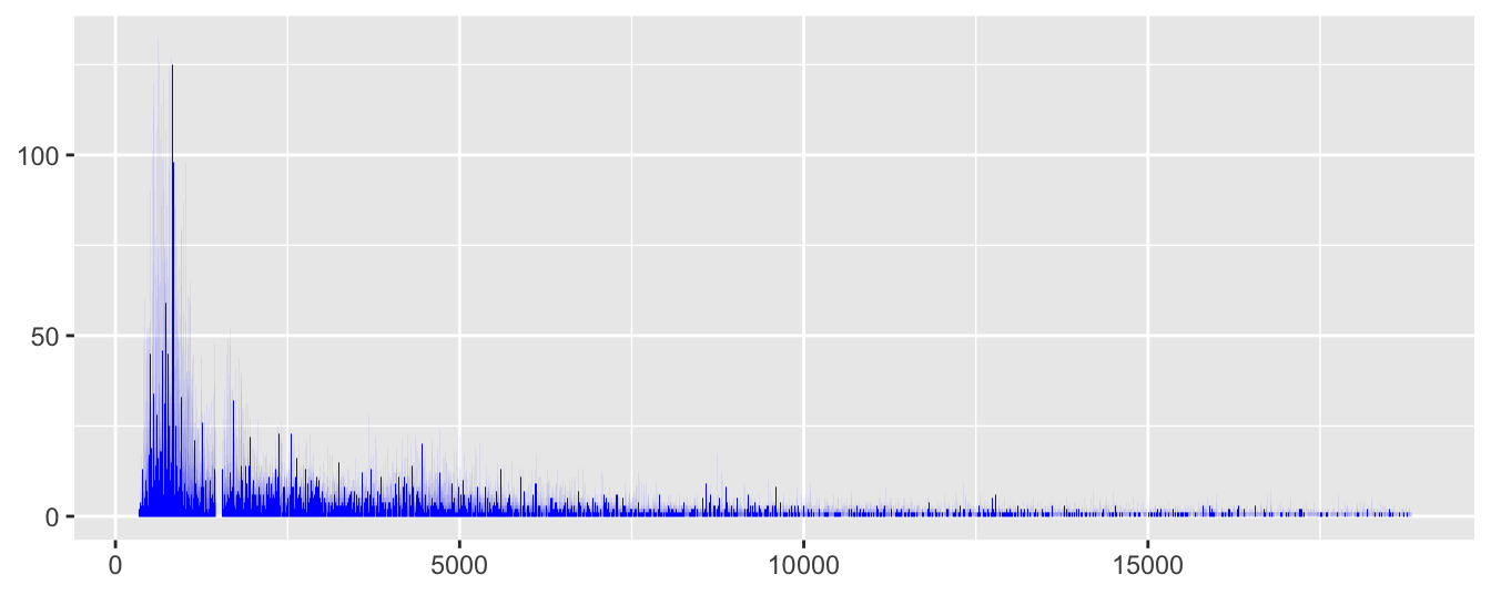
The histogram binwidth was chosen to be the smallest possible, i.e. the same as the resolution of the data. If there is any pattern to be found in a large dataset, it will be shown at this level—provided the plot is big enough for the bars to be seen at that resolution. This just about works for price in Figure 11.5 and there is enough detail to see something else, an unexpected gap around $\(1500\).

Figure 11.5: Histogram of diamond prices
Apparently there was a problem with scraping the data from the web that was not noticed early enough. There are no prices between $\(1455\) and $\(1545\), inclusive, in the dataset. The adjective `unexpected’ is important when talking about the gap. Features stand out that surprise us and they surprise us because they do not match expectations. You have to have expectations to be surprised.