33.3 Differences between early drafts and later graphics
Quickly drawn default graphics can reveal valuable information. Taking the time to improve them can make it easier to see this information by making it stand out and can uncover further information. It is instructive to compare pairs of initial and better graphics to study what changes might be made and how effective they are. Readers will have different opinions on what might be done and how. They are welcome to experiment with the data themselves.
The term “initial” here usually means that the graphic has been drawn after some data cleaning. Quite often the first graphics drawn indicate further data problems of one kind or another that require data wrangling to fix. So there can be many early graphics, just as there can be many later graphics that are amended in a range of ways. What there cannot be is a final graphic; there are always potential alternatives. And whatever improvements can be made to individual graphics, most information will be gathered by looking at more than one data display—however good an individual graphic is.
33.3.1 1912 Democratic Convention
Chapter 4 studied the selection of the Democratic candidate for President at the 1912 Convention. The voting was initially shown in Figure 4.1 and later, with changes, in Figure 4.6. The two plots are shown here in Figures 33.5 and 33.6. The changes made are listed below.
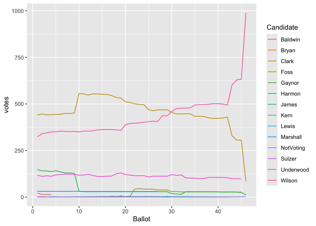
Figure 33.5: Voting at the 1912 Democratic convention shown in the initial plot
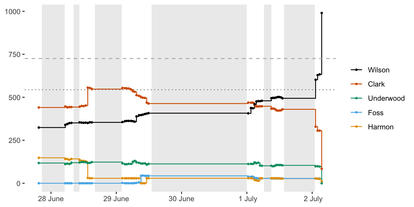
Figure 33.6: Voting at the 1912 Democratic convention shown in the final plot
The main features seen in the first plot were that there were many candidates, but only a few serious ones; that Clark was ahead initially, particularly after the 10th ballot; that Wilson gained steadily and made the decisive breakthrough around the 43rd ballot. The second plot emphasises the key changes and shows that the breakthrough for Wilson took place on the ballot after the last adjournment.
Changes include:
- The simple order of ballots on the horizontal scale has been replaced by estimated ballot times.
- Only candidates who received over 35 votes in at least one ballot have been included. This was to concentrate on the main candidates and reduce the clutter due to minor candidates who never had much support. The legend in Figure 33.5 listed 13 candidates and the category “Notvoting”. Figure 33.6 displays the voting for only 5 candidates.
- The plot background has been coloured white when the convention was in session and grey when it was not.
- The aspect ratio of the plot has been changed to 0.5. Time series are generally better wider than tall, not square or taller than wide.
- The dataset has been expanded to include ballots in which the candidates got zero votes. Otherwise the lines for candidates who withdrew were left hanging and the connecting lines for candidates who had no support for some intermediate ballots were not correctly drawn (as happened in Figure 33.5 for Harmon).
- Vote changes have been shown by vertical lines when the ballot occurred, not as a sloping line between consecutive ballots. This reflects what actually happened. A disadvantage is where lines are drawn on top of one another, as at the last ballot.
- Points have been drawn for each ballot to emphasise when and how often they took place, especially when very little changed between ballots.
- Horizontal lines have been added at two-thirds support (needed to win the nomination) and at 50% support. Both levels played important parts in the convention. (At the Republican convention a simple majority sufficed.)
- A colour blind scale has been used instead of the default colour scale. Colour blind scales assist in distinguishing the candidates.
- Candidates have been plotted in reverse order of their votes in the penultimate ballot so that if two candidates overlap the colour of the candidate with more votes is on top.
- The legend order has been changed to match the order in the last few ballots. This makes it easier to identify the lines for each candidate.
- The legend title and the vertical axis label have been removed. These texts are not necessary and take up space and attention.
33.3.2 Gapminder Life Expectancies
The first plot in Chapter 2, Figure 2.1 showed how life expectancy changed for many countries round the world over the past 200 years. Several insights could be derived, but the display was overcrowded and there might have been more information in the data. Figure 2.6 was an alternative version with the countries faceted and coloured by region. Figure 33.7 displays both figures.
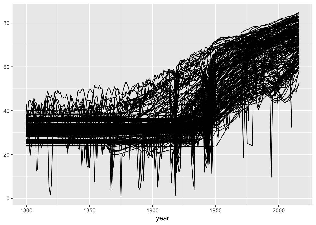
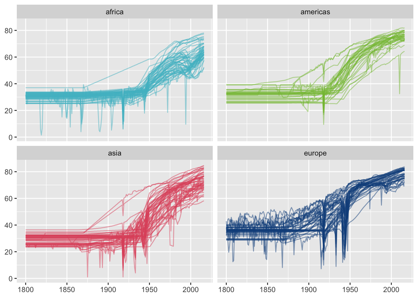
Figure 33.7: Gapminder life expectancy data drawn for all countries (left) and with countries grouped by region (right)
The initial plot shows the steady increase in life expectancy in the 20th century, the surprisingly constant values for many countries in the 19th century, and occasional sharp falls and rises for individual countries. The later plot shows that life expectancy was generally higher in Europe than elsewhere in the 19th century, that the overall patterns, if not the levels, were similar in all four regions, and that there were countries whose life expectancy graphs differed strikingly from others in their region.
Changes include:
- The countries have been coloured by region to provide some information on geographic location.
- Each region has been plotted separately so that regional differences and local outliers can be seen.
- Some 13 small countries with incomplete data were excluded as they provided little information.
33.3.3 Electric car charging
Chapter 13 included two graphics of the use of charging stations over time, Figure 13.5 and Figure 13.7. They are drawn here as side by side in smaller form in Figure 33.8.
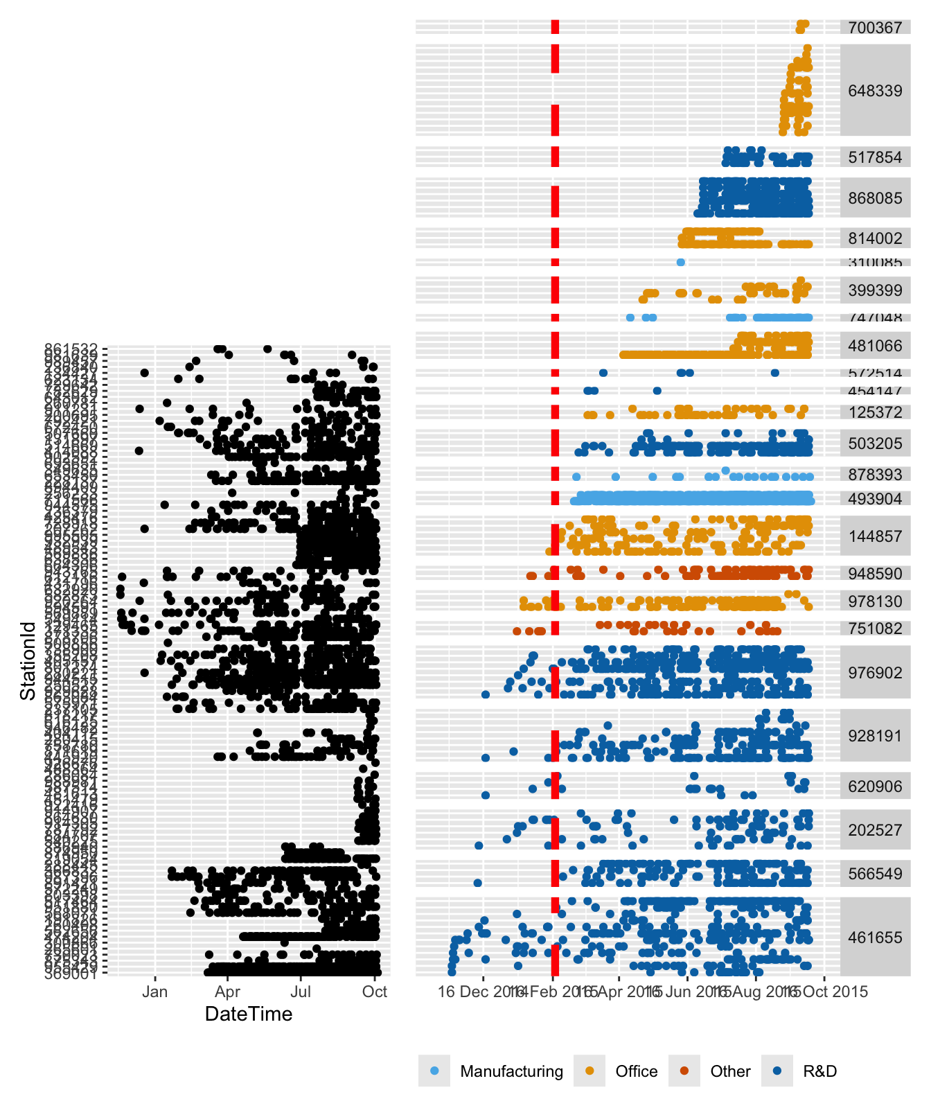
Figure 33.8: When charging stations were used
From the first plot it is apparent that a number of charging stations only started to be used late on in the study, and that some charging stations were used relatively little. The second plot highlights when the testing phase stopped. It shows that some charging locations were little used, that office locations came later than R&D locations, that there were differences worth investigating further in patterns of use of charging stations at the same location.
Changes include:
- Using a high aspect ratio for the amended plot in Figure 13.7 to show the points for the individual charging stations better.
- Sorting charging stations by location to be able to see how usage of neighbouring stations compares.
- Ordering locations by first use to put them in an order matching the development of the study.
- Ordering charging stations within location to show how the installations developed.
- Colouring facility types to highlight group differences.
- Drawing a dashed red line at the time the study switched from the test phase to the analysis phase. This emphasises how many locations were not used (not available?) during the test phase.
- Dropping the vertical axis label and the individual Station IDs. The caption makes clear what is shown vertically and the Station IDs are just codes that provide little information.
- Adding Location ID labels. Although the labels are uninterpretable codes, they do emphasise that the locations are different. Should someone have access to which locations those codes relate to, they could look up the details.
- The date formatting in the default plot is does not include the year and does not explain where in a month the month’s name is placed. Detailed dates provide better context. The horizontal axis label was dropped as the name was uninformative and it is obvious from the more detailed labelling that time is being plotted.
Additionally a much fuller caption was used in the amended plot in Chapter 13.
33.3.4 Gay rights
The choropleth map in Chapter 9, Figure 9.4 gave an overview of the geographic distribution of support for same-sex marriage at state level. Individual states have very different population sizes and the survey design reflected that. A default plot of confidence intervals for the state estimates is shown here with the amended plot drawn in the chapter, Figure 9.5, in Figure 33.9.
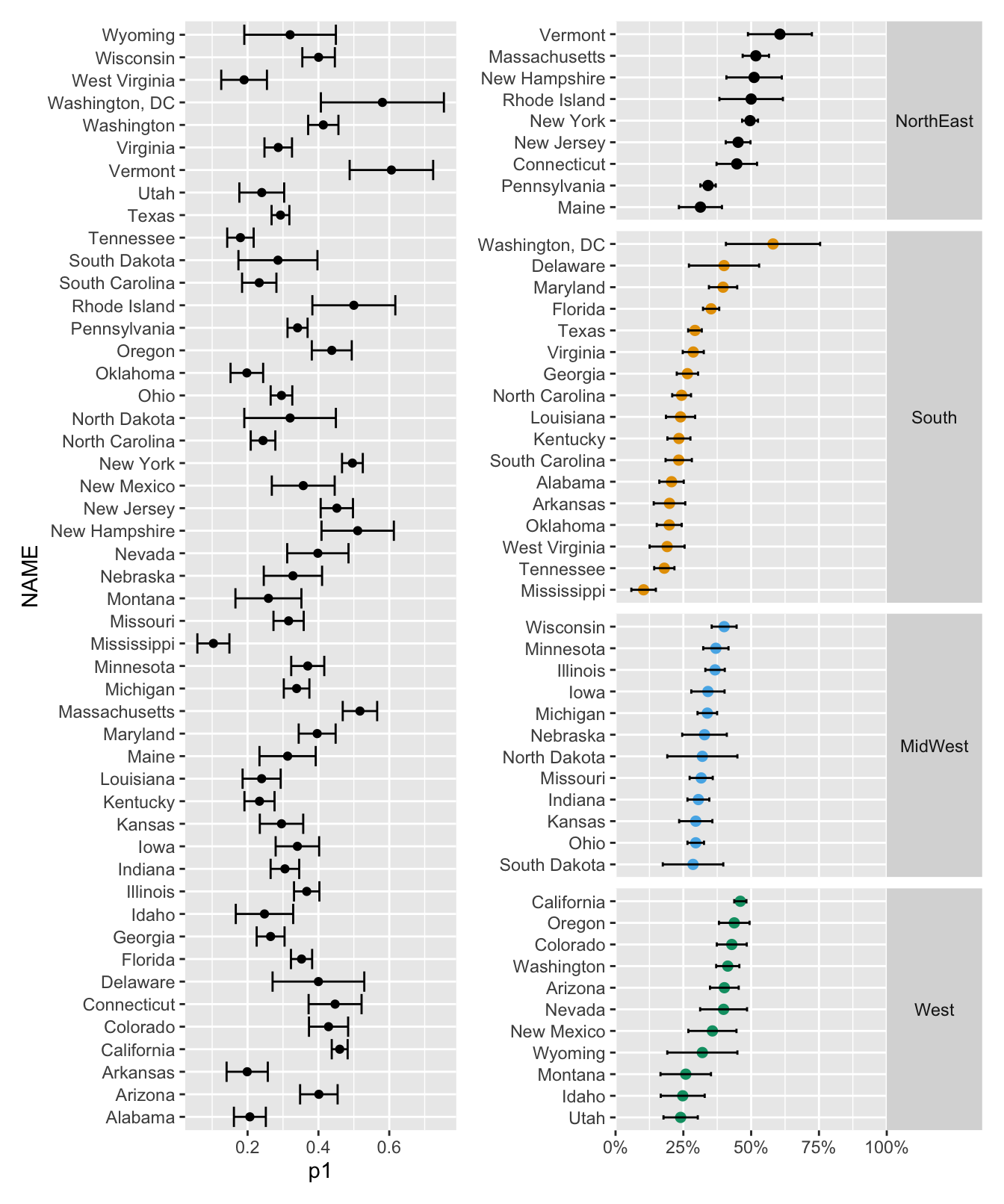
Figure 33.9: Support for same-sex marriage by state with 95% confidence intervals
The first plot shows that states have different rates and different confidence interval lengths. Many pairs of confidence intervals do not overlap. The second plot shows that: the few states with over 50% support are in the North East; Washington DC and Delaware have rates more like the North East than the South; MidWest states have similar rates to each other; the Dakotas have broader intervals (i.e. smaller survey samples matching smaller populations).
Changes include:
- The states have been sorted by Census Bureau region so that local comparisons are easier.
- States have been ordered by estimate within region, again to facilitate comparisons.
- Estimates have been coloured by region to differentiate the groups.
- Points have been drawn bigger to make the estimates themselves stand out more.
- Intervals have been drawn as straight lines without end bars to reduce clutter and give less emphasis to the smaller states.
- Horizontal scaling has been changed to percentages instead of proportions to better match the data.
- Horizontal limits have been set to [0,100%] to avoid false impressions of the amount of support.
- Breakpoints on the horizontal axis have been chosen to include the critical 50% value, so that it is easy to see which intervals do not even reach majority support.
- Axis name labels have been dropped to leave more space for the graphic.
33.3.5 Human space flight
Figure 10.4 in Chapter 10 shows the mission time of space flights by year of flight. If the flights went to a space station, they were coloured accordingly in Figure 10.5. The final version after taking logarithms was given in Figure 10.6. Figures 10.4 and Figure 10.6 are redrawn here as Figure 33.10.
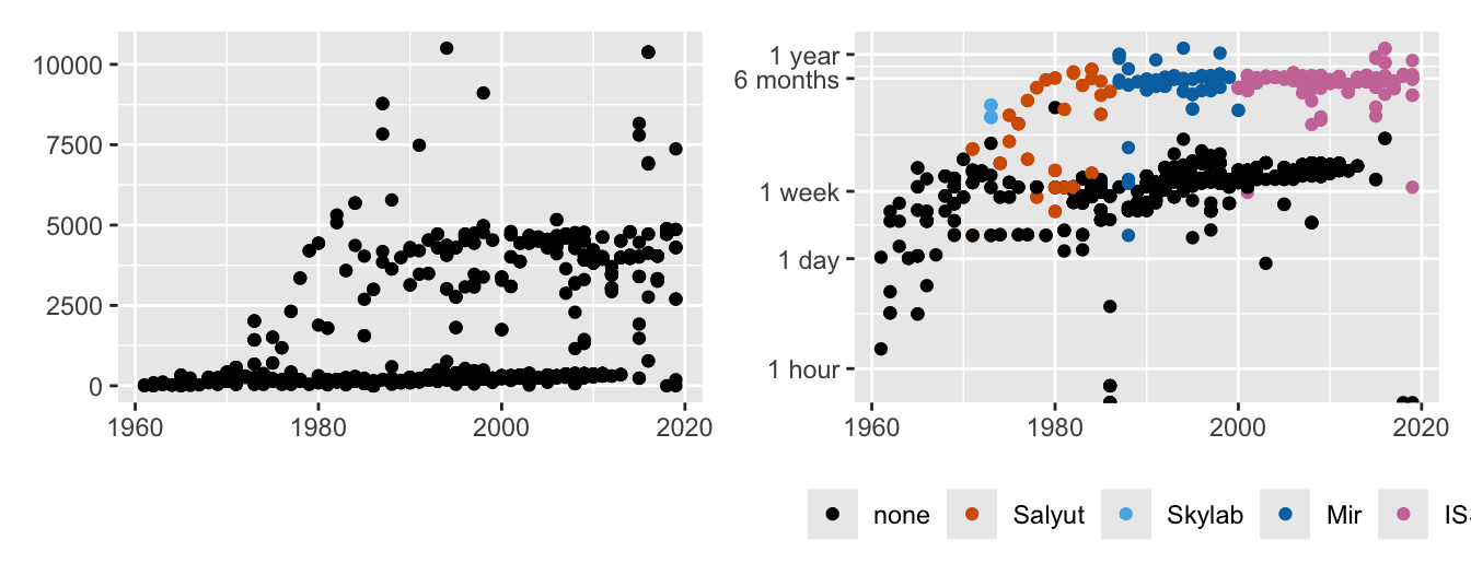
Figure 33.10: Mission times by year (left) and log mission times by year coloured by space station programme (right)
The plot on the left shows that most mission times were short, especially before 1980, that there were a few very long missions, and that there was a group of missions between about 4000 and 5000 minutes. The plot on the right show that mostly the missions split into short ones of a week or so, that there were longer ones of several months as part of space station programmes, that there were some low mission times that required further investigation.
Changes include:
- The logarithms of mission times have been used instead of the mission times as the plot then shows more structure. (Figure 10.5 revealed that it primarily splits the missions into whether they were to a space station or not.)
- The breaks on the vertical axis scale were not set equally but chosen to reflect familiar time periods to make the times readily understandable.
- The display was coloured by space station programme to explore the differences between the shorter and longer missions.
33.3.6 Euro 2020
For each team taking part in the Euro 2020 soccer competition, Figure 15.7 showed in which countries the players in the squad played. A default plot for this example is shown in Figure 33.11. The figure from Chapter 15 is replotted below.
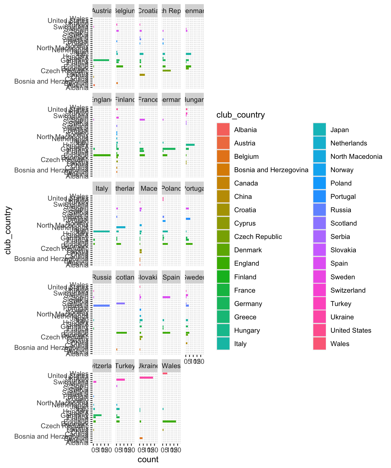
Figure 33.11: Default plot of numbers of Euro 2020 players of each team playing in other countries’ leagues
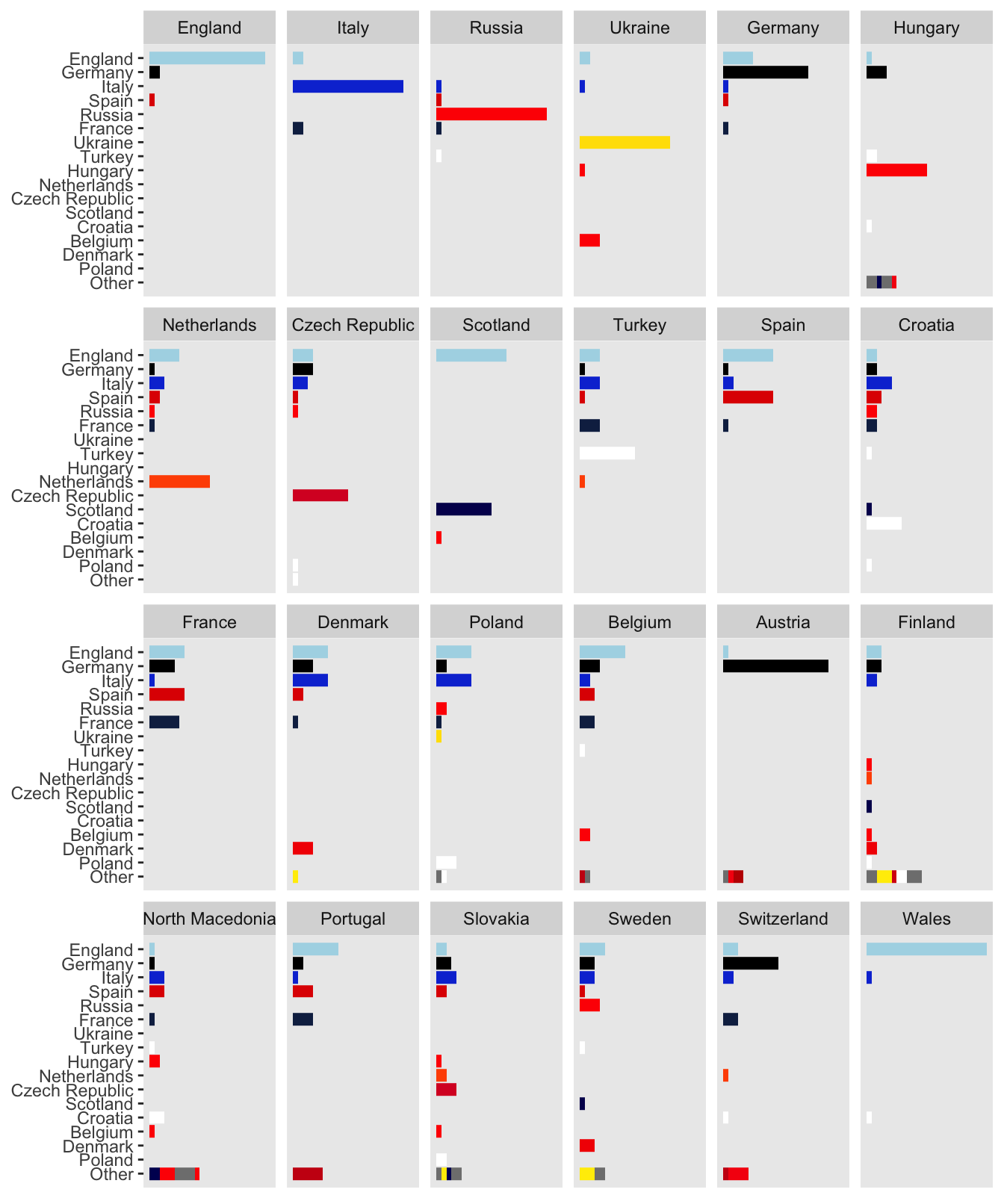
Figure 33.12: Amended plot of numbers of Euro 2020 players of each team playing in other countries’ leagues
The first plot shows that some teams’ players are from only a few countries’ leagues and some from several. In the second plot the teams and leagues can be seen and individual patterns identified (e.g., England, Italy, Russia, Spain, Austria, Wales).
Changes include:
- The teams have been ordered by the percentage of players playing in their own national league.
- The bars have been ordered by the total number of players from that league playing in Euro 2020. Countries with less than 9 players have been grouped into “Other”. This emphasises the more important leagues and makes the labels readable.
- Colours close to country colours have been used instead of default colours.
- The legend has been dropped as it takes up a lot of room (even with fewer countries) and the labels show what the colours mean.
- The number of rows has been set to 4 to get a better balanced display and give more vertical space for the country labels of the leagues.
- Axis title labels have been dropped leaving more space for the display.
- The horizontal axis scale has been dropped as exact counts are not important. Extra space has been added to the ends of the scale to improve readability.
- Gridlines have been removed to reduce clutter.
33.3.7 Characteristic changes
- Grouping information supports understanding. It is easier to work with chunks of information than with all the individual components. Grouping may be achieved by spatial separation (Figure 33.8), by faceting (Figures 33.7 and 33.9), by colour (Figures 33.8 and 33.10).
- Plot aspect ratios are important (Figures 33.6 and 33.8).
- Ordering is an effective way of emphasising patterns (Figures 33.9 and 33.12).
- Colour is a powerful tool and should be chosen with care (Figures 33.6, 33.7, and 33.10).
- Reducing clutter and making space by reformatting or by excluding less important cases is always worth considering (Figure 33.7 and Figure 33.12).
- Scaling and labelling should be sufficient but not excessive (Figures 33.9 and 33.12).
- Time scaling and labelling should be chosen carefully (Figures 33.6 and 33.10).
- Adding guidelines for critical values is useful (Figures 33.6 and 33.8).