9.2 Mapping the survey results
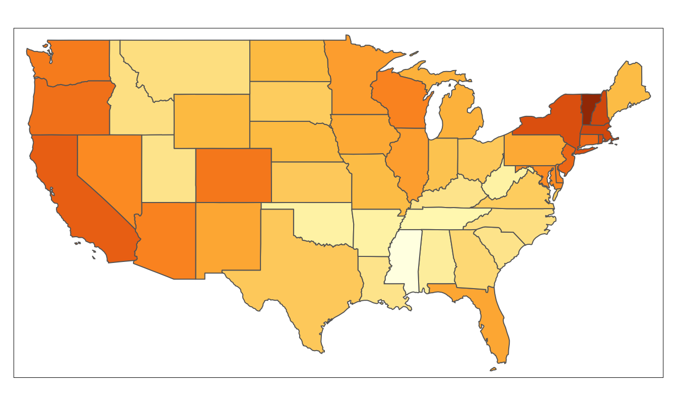
It is possible to look at how rates of support vary by state and, unsurprisingly, there are substantial differences. Figure 9.4 is a choropleth map of the support for a state law permitting same-sex marriage in each state. (Except that there is no information for Alaska and Hawaii as the survey was restricted to the 48 continental states and Washington D.C.)

Figure 9.4: Support for same-sex marriage at state level on a continuous colour scale from 10% to 70%
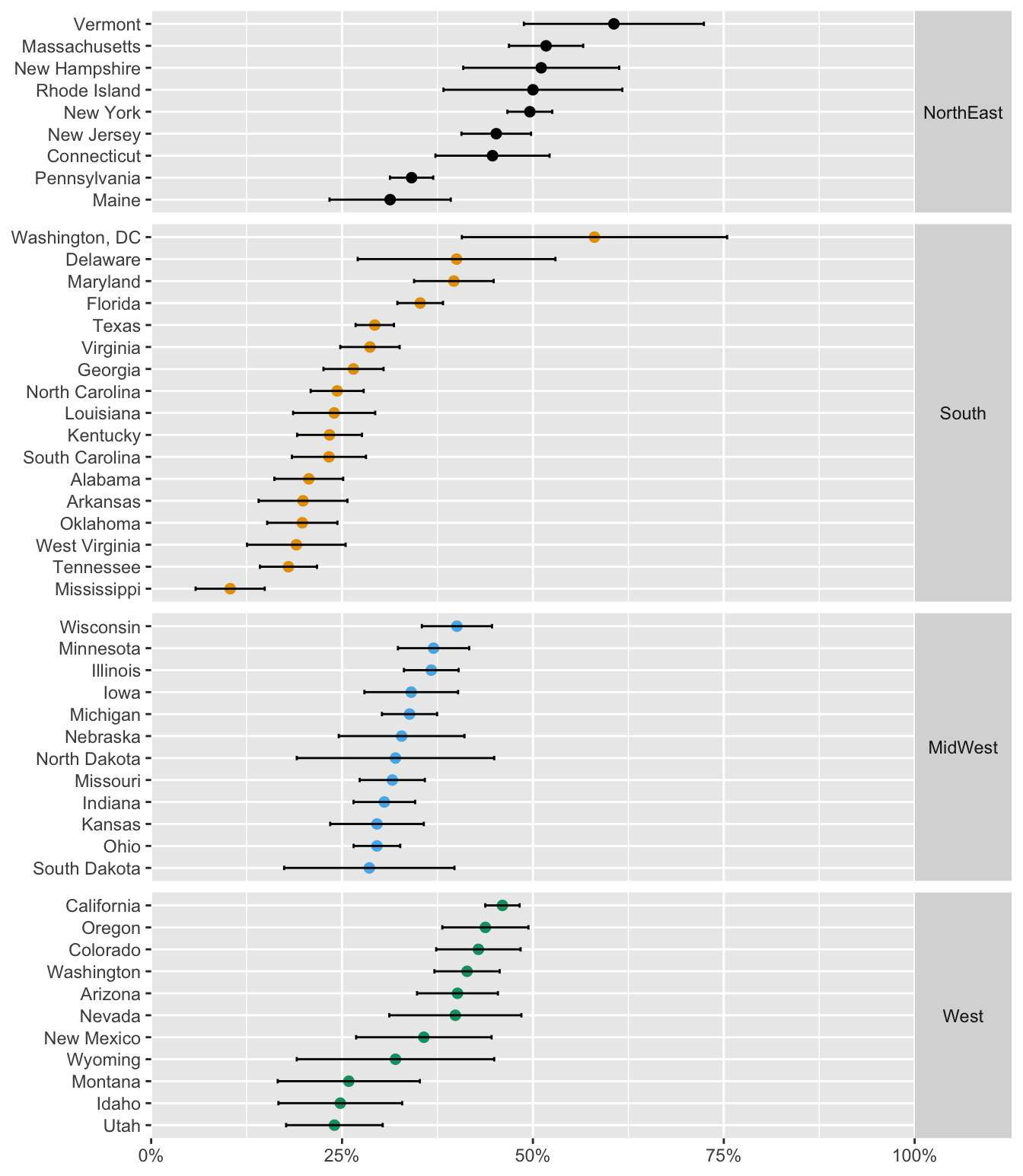
Some regional patterns are apparent, such as the higher support in New England and on the West Coast. As always with choropleth maps, area does not reflect population. There are several larger states with small populations and smaller states with larger populations. This is also reflected in the numbers asked in each state. Figure 9.5 shows the estimates of proportions supporting a same-sex marriage law with 95% confidence intervals. The longest interval is for Washington, DC, with only 31 asked and the shortest interval is for California with 1891 asked. The states have been grouped by Census Bureau regions and ordered within region by percentage in favour. The NorthEast states split into two groups with Pennsylvania and Maine having much lower levels of support. The South also splits into two groups with Florida and the three small most northerly states having higher levels of support. The MidWest states have fairly similar values. Overall, very few states show a majority for same-sex marriage.

Figure 9.5: Support for same-sex marriage by state with 95% confidence intervals, states grouped by region and ordered within region by estimated population proportion in favour
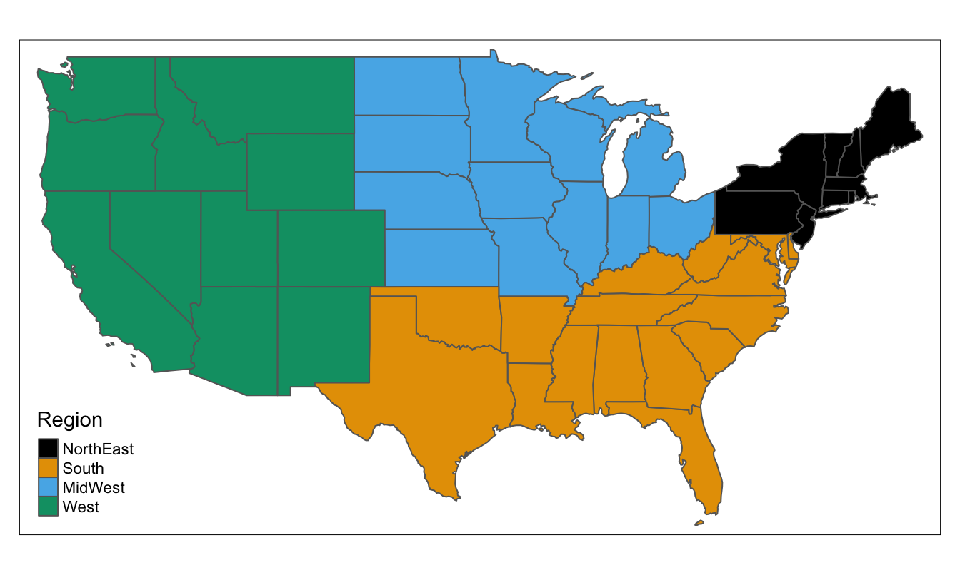
Figure 9.6 shows a map of the regions.

Figure 9.6: The four US regions defined by the Census Bureau

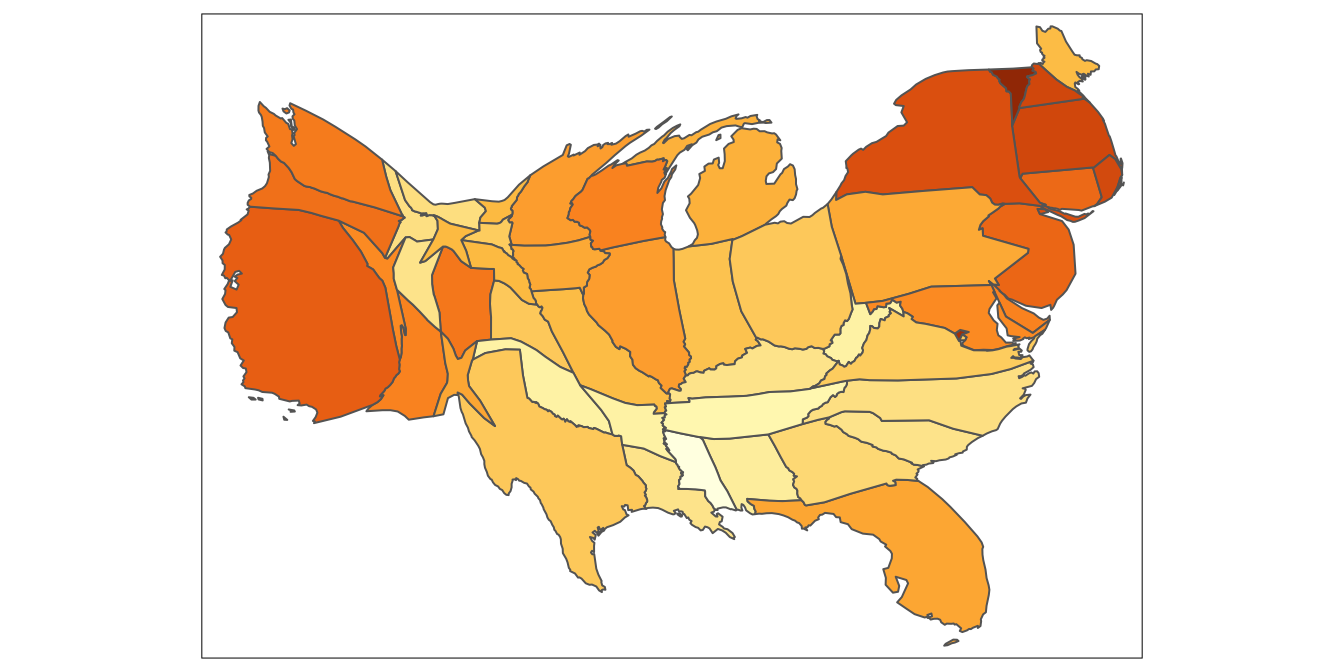
Figure 9.7: Support for same-sex marriage at state level using a population cartogram
Cartograms can be effective in getting round the population issue and Figure 9.7 uses the number of respondents as a substitute for the state population. It suggests the states separate into three main groups, the East, the West, and the centre.