2.1 Gapminder and Hans Rosling
The Gapminder Foundation that Hans Rosling and colleagues set up continues to collect and monitor global patterns of health. Anyone who has seen a film of one of Rosling’s talks (Rosling (2009)), or was lucky enough to attend one, will remember his scatterplots animated over time. One he used was of life expectancy at birth plotted against fertility rate. The main patterns he described are clear and informative, emphasising the overall increases in life expectancy across all countries. If life expectancy is examined over time on its own, there are additional features that Rosling did not have time to discuss, including some dramatic sharp drops and rises.

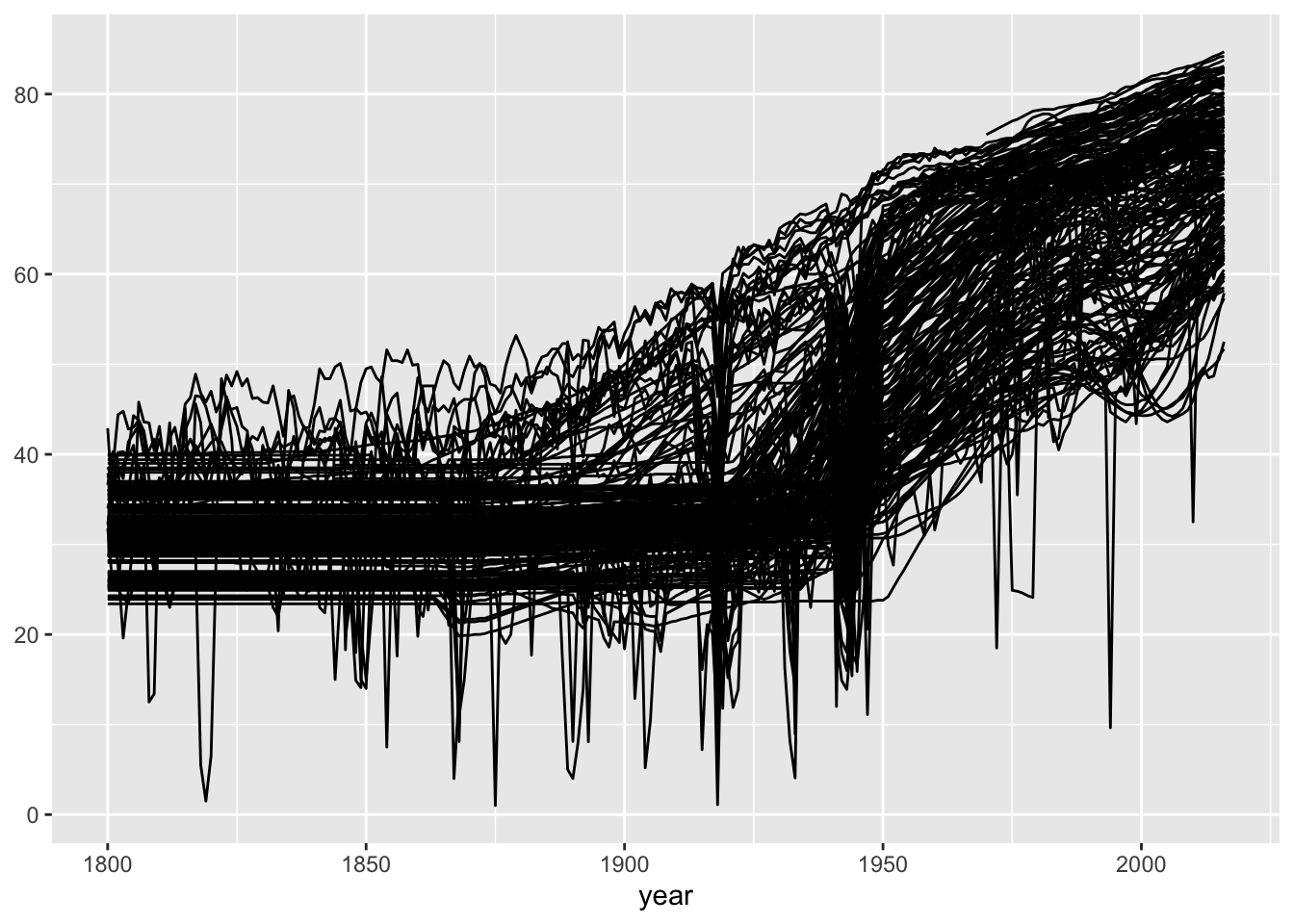
Figure 2.1: Life expectancy at birth in years for 187 countries over the years 1800 to 2016
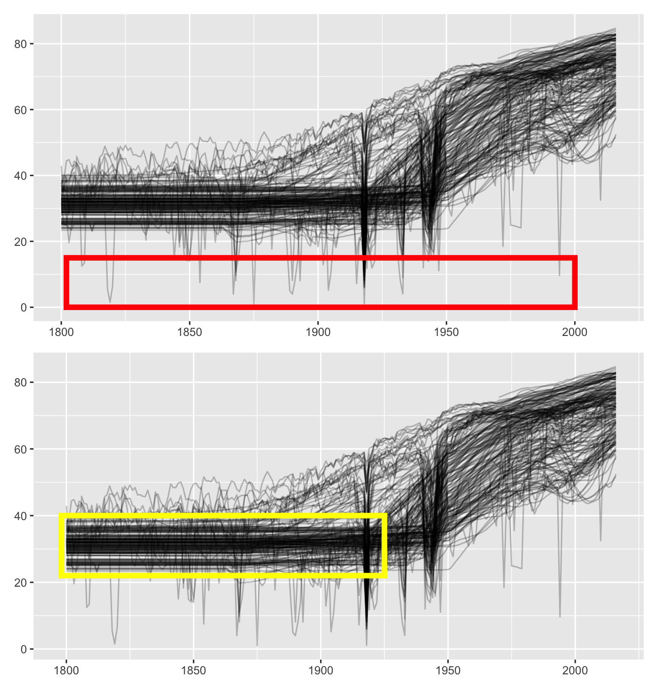
The life expectancy data for each country has been plotted against time in Figure 2.1. This is a default plot and could be improved in many ways. Nevertheless much can be seen in it. Two striking features were not mentioned in Rosling’s talks: the sharp falls and rises just mentioned, and the unchanging levels (horizontal lines) during the nineteenth century. Figure 2.2 picks out these two features.

Figure 2.2: Life expectancy graphics: some sharp falls and rises marked (above), straight lines marked (below)
The plot above picks out some of the falls and rises. For certain countries in certain years it is well known that there were population disasters: the famine in Ukraine in 1932-33 and the Irish potato famine in the second half of the 1840s. The Gapminder researchers endeavoured to estimate data for these and other catastrophic years using modelling techniques described in a paper published on their website (Lindgren (2014)). It is impressive that they went to so much trouble to deal with this issue, although, as they write themselves, they can only provide guesstimates. It is important that they draw attention to catastrophes, it would be wrong to simply ignore them. European readers may have heard of the Ukrainian famine in 1932-33 and the Irish famine in the late 1840s, but few will know of the plague in Tunisia in 1891 or of the measles epidemic in Fiji in 1875.
The straight lines highlighted in the lower plot imply that life expectancies for many countries were constant over the period. That is highly unlikely! What has happened is that a single value was estimated to cover many years, where no other information was available. Although Rosling did not talk about this, the information is available in the Gapminder display under a button labelled “Data Doubts” at the foot of the plot to the right.