第 23 章 ggplot2之标度
用 ggplot2 画图,有种恋爱的感觉: “你懂我的图谋不轨,我懂你的故作矜持”
这一章我们一起学习ggplot2中的scales语法,推荐大家阅读Hadley Wickham最新版的《ggplot2: Elegant Graphics for Data Analysis》,但如果需要详细了解标度参数体系,还是要看ggplot2官方文档
ggplot2图层语法框架
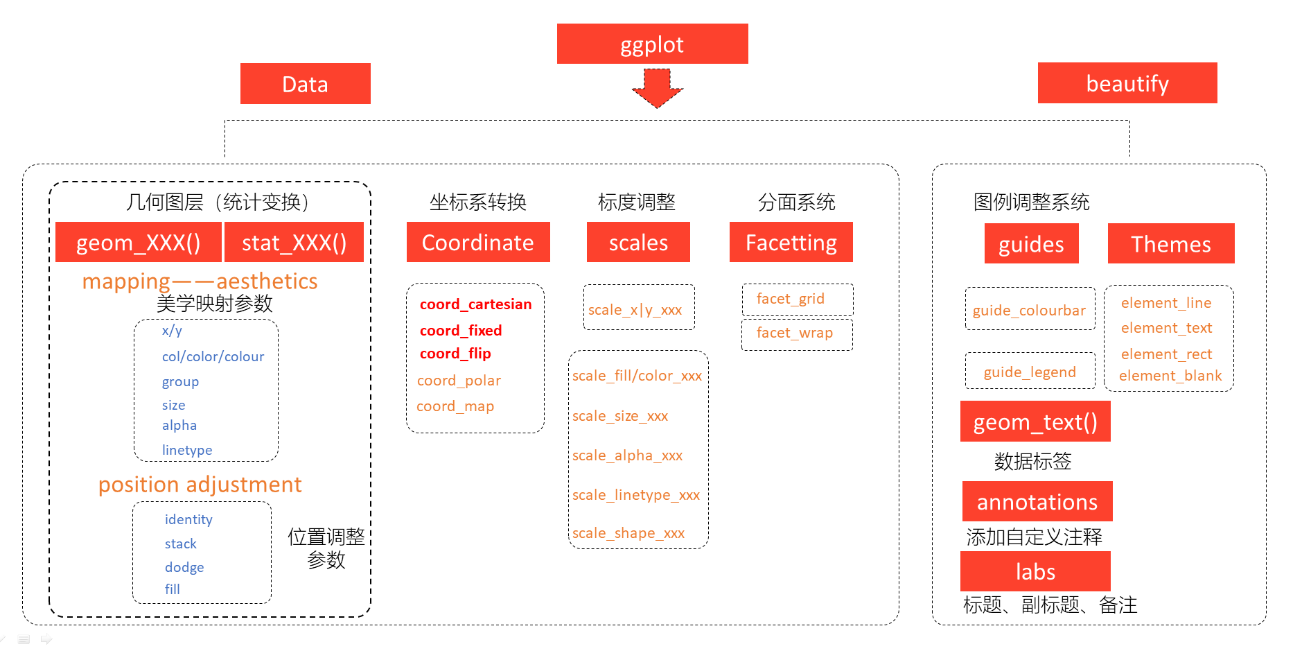
图 22.1: ggplot2图层语法框架
23.1 标度
在 22章,我们了解到ggplot2中,映射是数据转化到图形属性,这里的图形属性是指视觉可以感知的东西,比如大小,形状,颜色和位置等。我们今天讨论的标度(scale)是控制着数据到图形属性映射的函数,每一种标度都是从数据空间的某个区域(标度的定义域)到图形属性空间的某个区域(标度的值域)的一个函数。
简单点来说,标度是用于调整数据映射的图形属性。
在ggplot2中,每一种图形属性都拥有一个默认的标度,也许你对这个默认的标度不满意,可以就需要学习如何修改默认的标度。比如,
系统默认"a"对应红色,"b"对应蓝色,我们想让"a"对应紫色,"b"对应橙色。
23.2 图形属性和变量类型
还是用我们熟悉的ggplot2::mpg,可能有同学说,我画图没接触到scale啊,比如
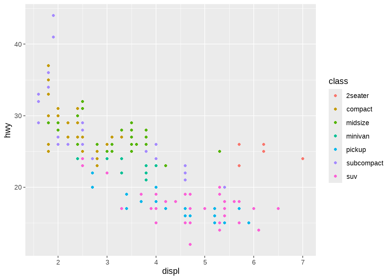
能画个很漂亮的图,那是因为ggplot2默认缺省条件下,已经很美观了。(据说Hadley Wickham很后悔使用了这么漂亮的缺省值,因为很漂亮了大家都不认真学画图了。马云好像也说后悔创立了阿里巴巴?)
事实上,根据映射关系和变量名,我们将标度写完整,应该是这样的
ggplot(mpg, aes(x = displ, y = hwy)) +
  geom_point(aes(colour = class)) +

  scale_x_continuous() +
  scale_y_continuous() +
  scale_colour_discrete()
如果每次都要手动设置一次标度函数,那将是比较繁琐的事情。因此ggplot2使用了默认了设置,如果不满意ggplot2的默认值,可以手动调整或者改写标度,比如
ggplot(mpg, aes(x = displ, y = hwy)) +
  geom_point(aes(colour = class)) +

  scale_x_continuous(name = "This is my x axis") +
  scale_y_continuous(name = "This is my y axis") +
  scale_colour_brewer()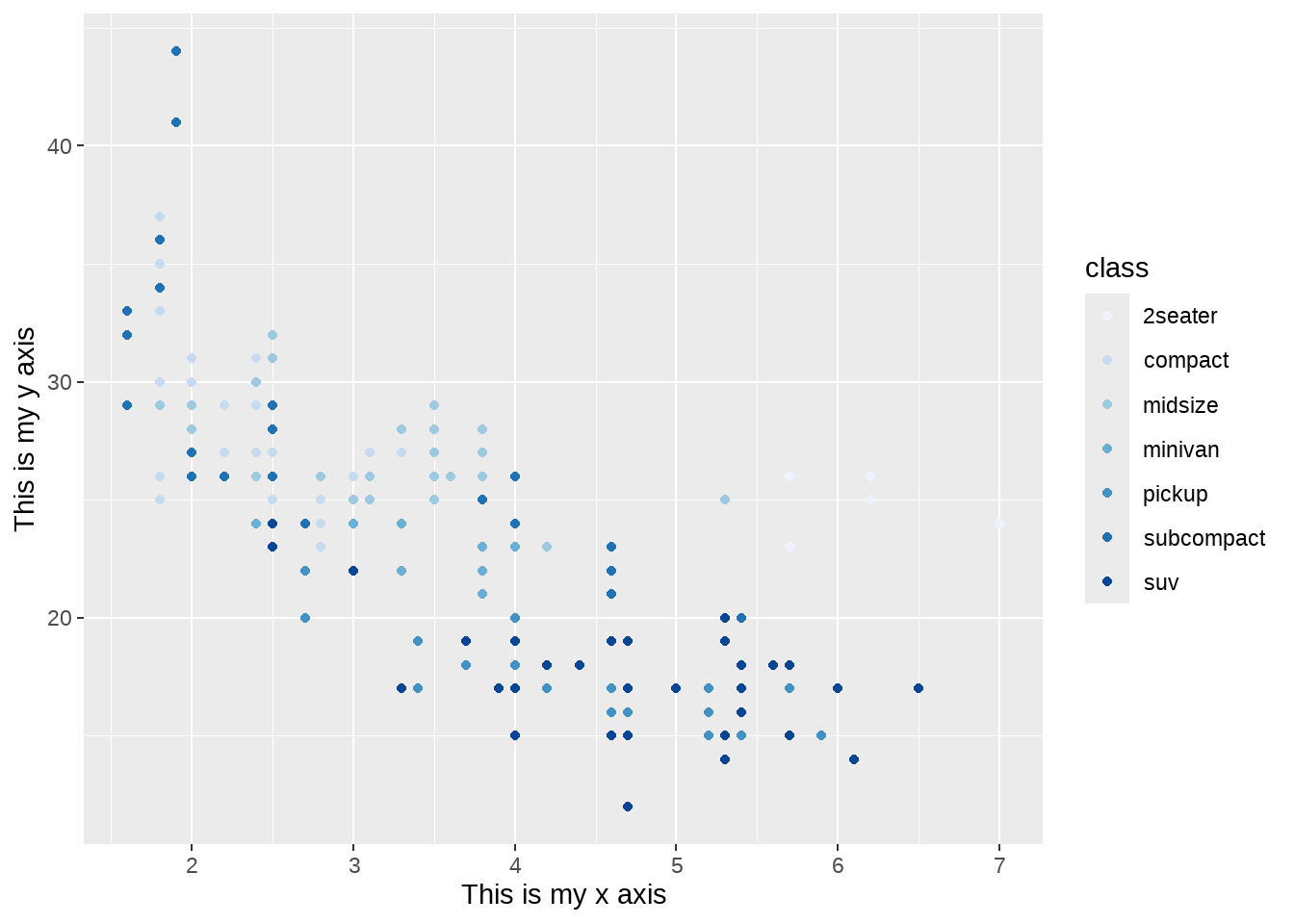
23.4 丰富的标度体系
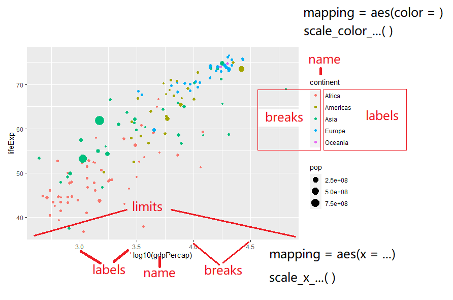
注意到,标度函数是由”_“分割的三个部分构成的 - scale - 视觉属性名 (e.g., colour, shape or x) - 标度名 (e.g., continuous, discrete, brewer).
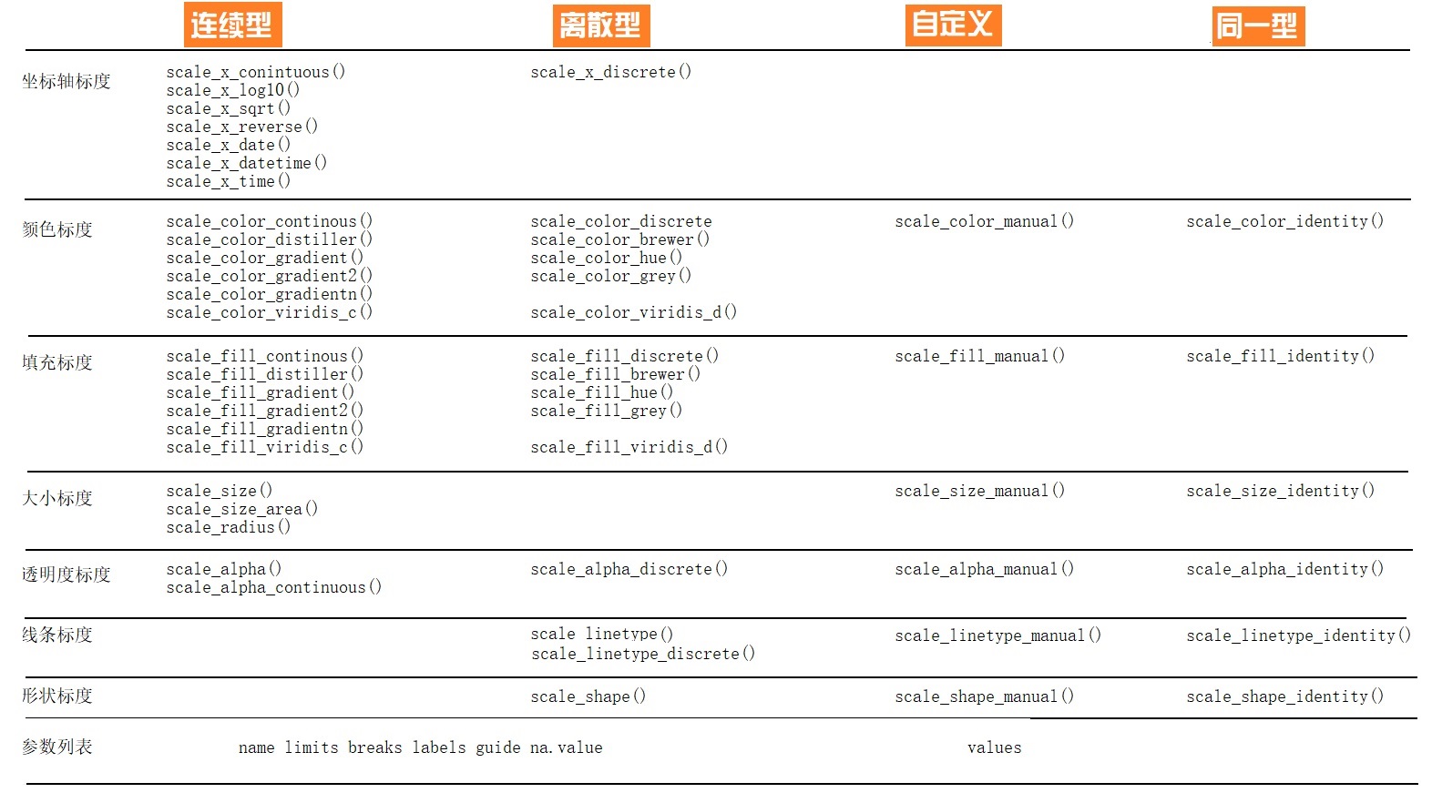
每个标度函数内部都有丰富的参数系统
scale_colour_manual(
  palette = function(),
  limits = NULL,
  name = waiver(),
  labels = waiver(),
  breaks = waiver(),
  minor_breaks = waiver(),
  values = waiver(),
  ...
)
参数
name,坐标和图例的名字,如果不想要图例的名字,就可以name = NULL参数
limits, 坐标或图例的范围区间。连续性c(n, m),离散型c("a", "b", "c")参数
breaks, 控制显示在坐标轴或者图例上的值(元素)-
参数
labels, 坐标和图例的间隔标签- 一般情况下,内置函数会自动完成
- 也可人工指定一个字符型向量,与
breaks提供的字符型向量一一对应 - 也可以是函数,把
breaks提供的字符型向量当做函数的输入 -
NULL,就是去掉标签
-
参数
values指的是(颜色、形状等)视觉属性值,- 要么,与数值的顺序一致;
- 要么,与
breaks提供的字符型向量长度一致 - 要么,用命名向量
c("数据标签" = "视觉属性")提供
参数
expand, 控制参数溢出量参数
range, 设置尺寸大小范围,比如针对点的相对大小
下面,我们通过具体的案例讲解如何使用参数,把图形变成我们想要的模样。
23.5 案例详解
先导入一个数据
gapdata <- read_csv("./demo_data/gapminder.csv")
newgapdata <- gapdata %>%
  group_by(continent, country) %>%
  summarise(
    across(c(lifeExp, gdpPercap, pop), mean)
  )
newgapdata
## # A tibble: 142 × 5
## # Groups: continent [5]
## continent country lifeExp gdpPercap pop
## <chr> <chr> <dbl> <dbl> <dbl>
## 1 Africa Algeria 59.0 4426. 19875406.
## 2 Africa Angola 37.9 3607. 7309390.
## 3 Africa Benin 48.8 1155. 4017497.
## 4 Africa Botswana 54.6 5032. 971186.
## 5 Africa Burkina Faso 44.7 844. 7548677.
## 6 Africa Burundi 44.8 472. 4651608.
## 7 Africa Cameroon 48.1 1775. 9816648.
## 8 Africa Central African Republic 43.9 959. 2560963
## 9 Africa Chad 46.8 1165. 5329256.
## 10 Africa Comoros 52.4 1314. 361684.
## # ℹ 132 more rows
newgapdata %>%
  ggplot(aes(x = gdpPercap, y = lifeExp)) +
    geom_point(aes(color = continent, size = pop)) +
    scale_x_continuous()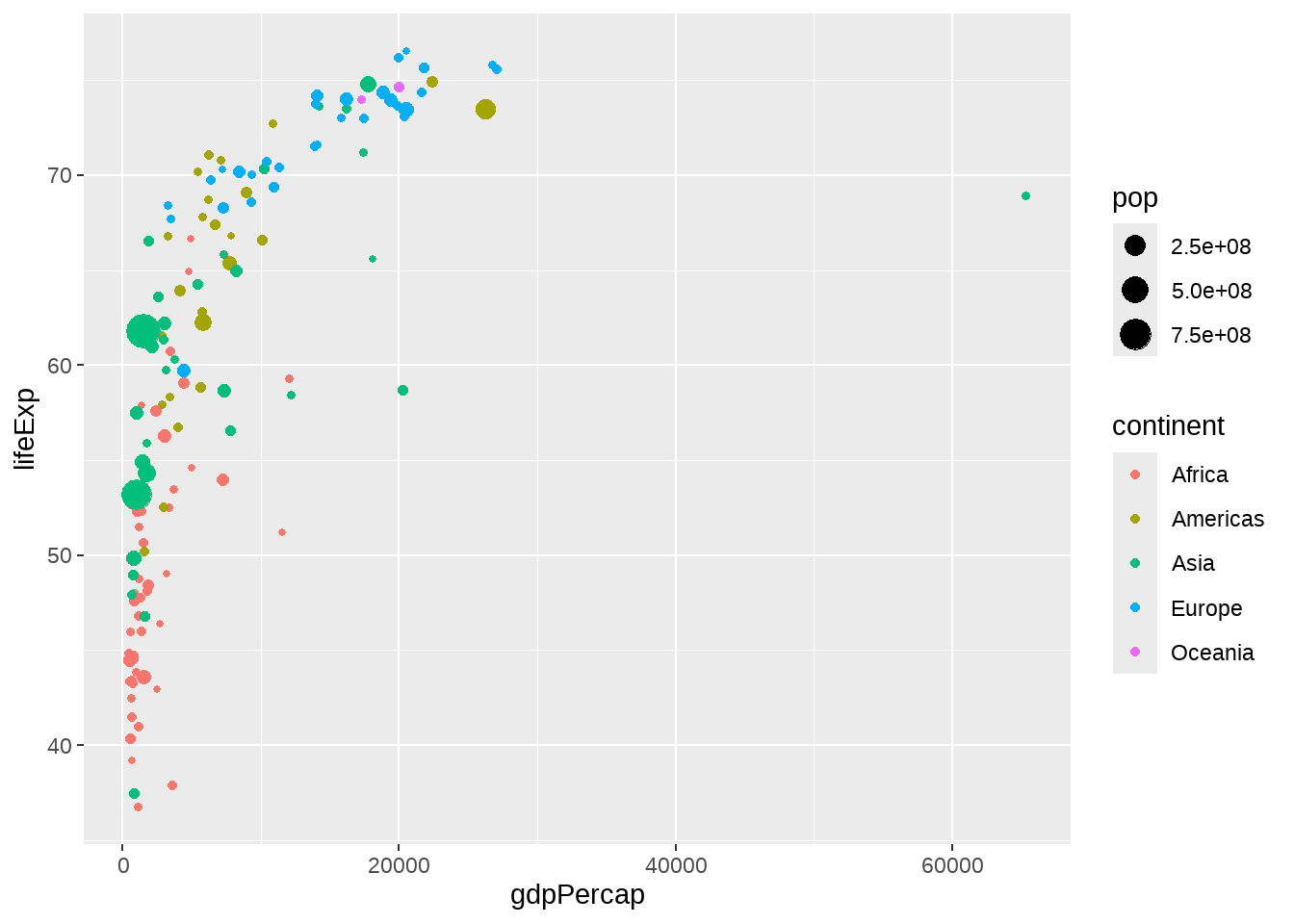
newgapdata %>%
  ggplot(aes(x = gdpPercap, y = lifeExp)) +
    geom_point(aes(color = continent, size = pop)) +
    scale_x_log10()
newgapdata %>%
  ggplot(aes(x = gdpPercap, y = lifeExp)) +
    geom_point(aes(color = continent, size = pop)) +
    scale_x_log10(breaks = c(500, 1000, 3000, 10000, 30000),
                  labels = scales::dollar)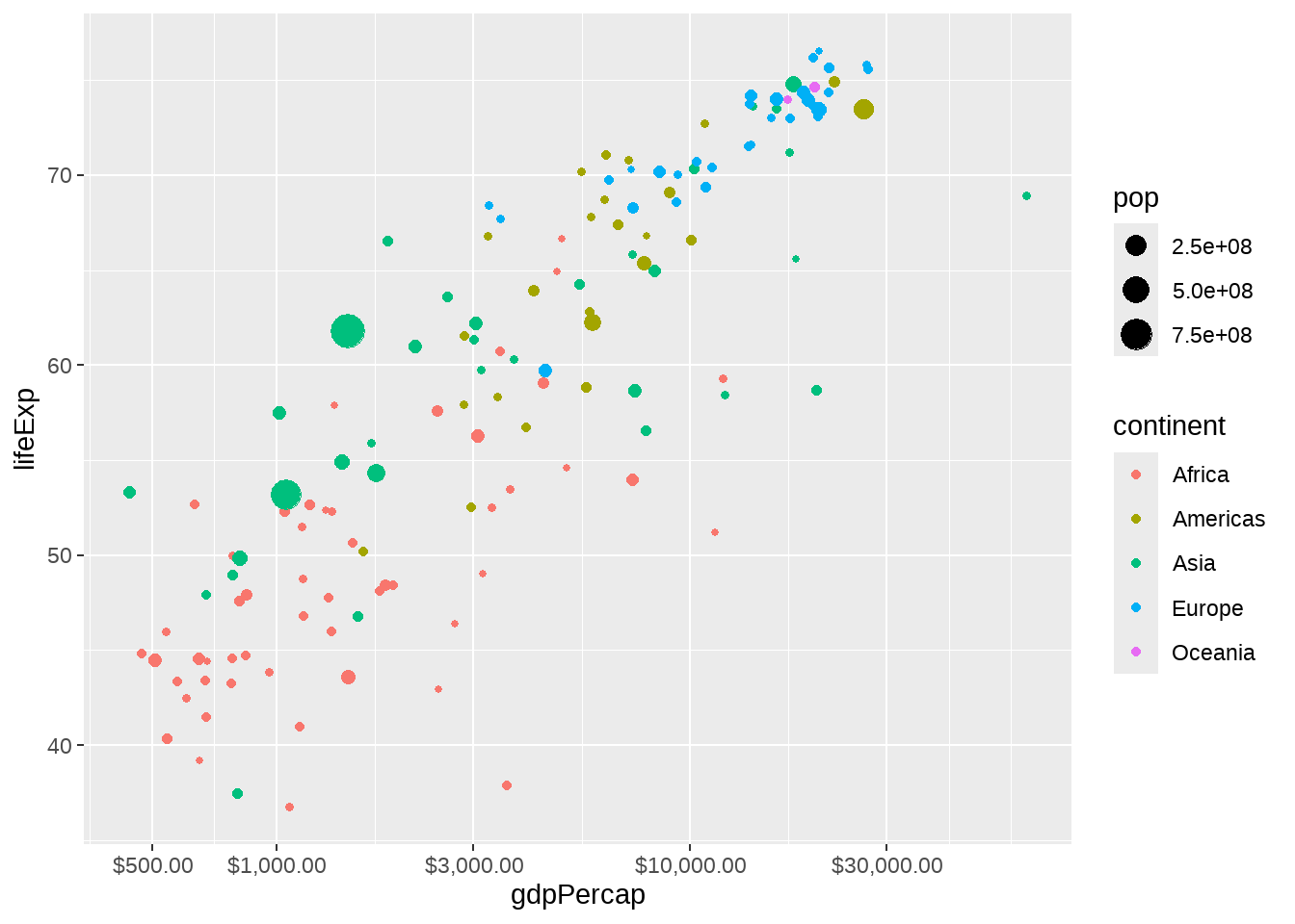
newgapdata %>%
  ggplot(aes(x = gdpPercap, y = lifeExp)) +
    geom_point(aes(color = continent, size = pop)) +
    scale_x_log10(
      name = "GDP per capita",
      breaks = c(500, 1000, 3000, 10000, 30000),
      labels = scales::unit_format(unit = "dollar"))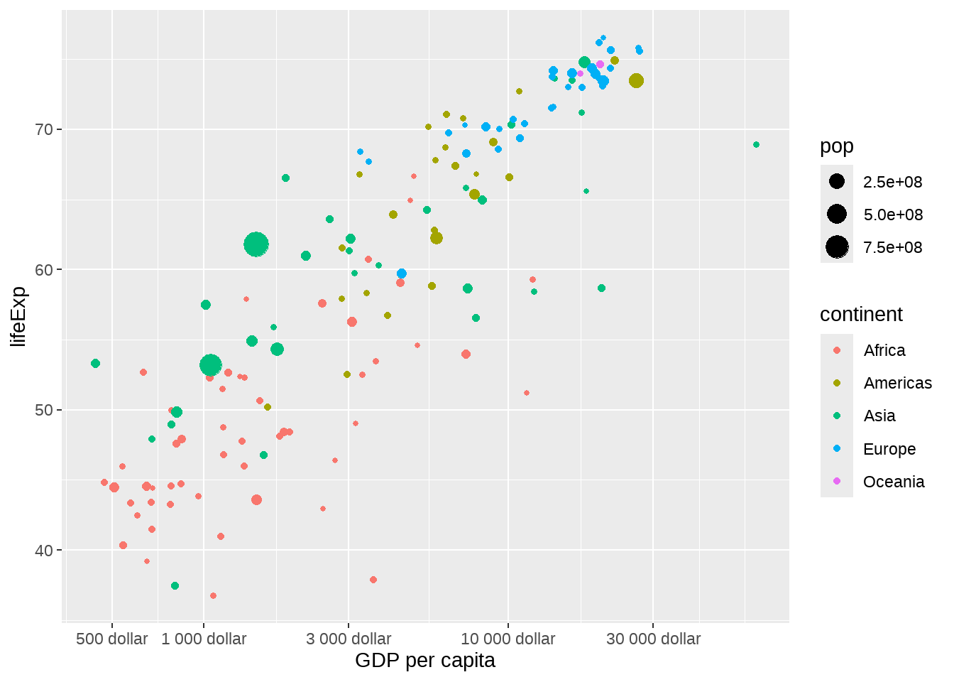
newgapdata %>%
  ggplot(aes(x = gdpPercap, y = lifeExp)) +
    geom_point(aes(color = continent, size = pop)) +
    scale_x_log10() +
    scale_color_viridis_d()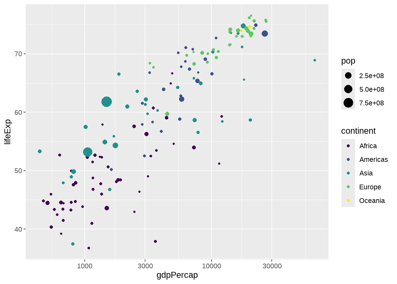
离散变量映射到色彩的情形,可以使用ColorBrewer色彩。
newgapdata %>%
  ggplot(aes(x = gdpPercap, y = lifeExp)) +
    geom_point(aes(color = continent, size = pop)) +
    scale_x_log10() +
    scale_color_brewer(type = "qual", palette = "Set1")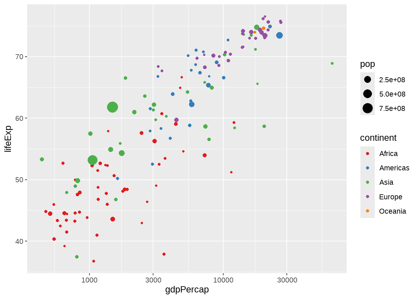
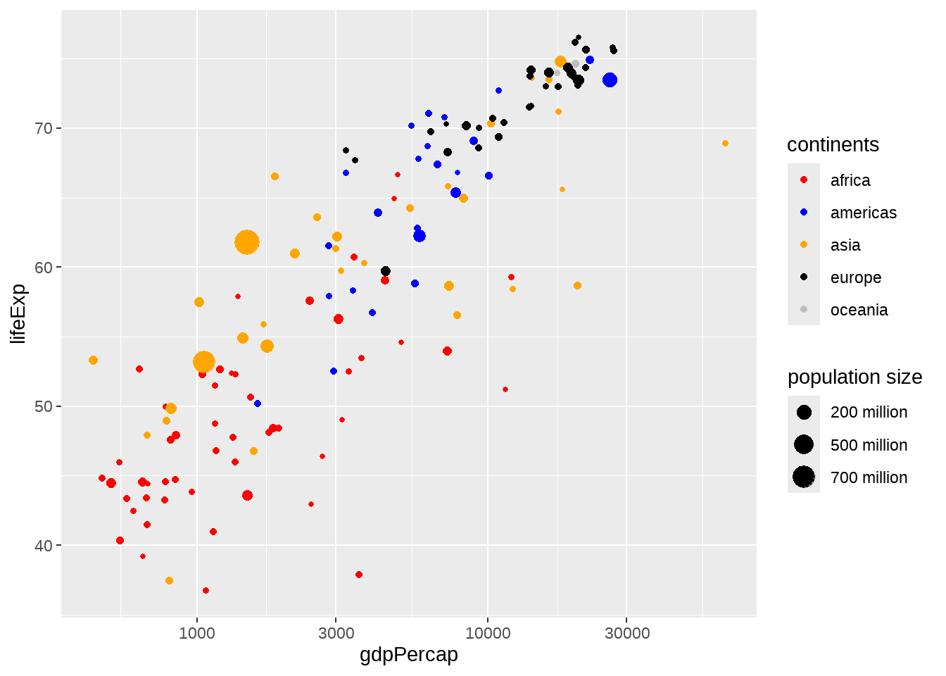
newgapdata %>%
  ggplot(aes(x = gdpPercap, y = lifeExp)) +
    geom_point(aes(color = continent, size = pop)) +
    scale_x_log10() +
    scale_color_manual(
      name = "continents",
      values = c("Africa" = "red", "Americas" = "blue", "Asia" = "orange",
                 "Europe" = "black", "Oceania" = "gray"),
      breaks = c("Africa", "Americas", "Asia", "Europe", "Oceania"),
      labels = c("africa", "americas", "asia", "europe", "oceania")
    ) +
   scale_size(
     name = "population size",
     breaks = c(2e8, 5e8, 7e8),
     labels = c("200 million", "500 million", "700 million")
   )