第 33 章 ggplot2之让你的数据骚动起来
这节课,我们讲如何让我们的图动起来。(因为渲染需要花费很长时间,所以文档中的动图代码都没有执行。)
33.2 gganimate宏包
动图可以将其理解为多张静态图堆在一起,当然不是随意的堆放,而是按照一定的规则,比如按照时间的顺序,或者类别的顺序。一般而言,动图制作包括两个步骤: 静态图制作及图形组装。静态图制作,前面几章我们讲过主要用ggplot2宏包实现;对于图形组装,需要用到今天我们要讲Thomas Lin Pedersen的gganimate宏包,来自同一工厂的产品,用起来自然是无缝衔接啦。
install.packages("gganimate")33.2.1 先来一张静态图
covdata::covnat %>%
  dplyr::filter(iso3 == "USA") %>%
  dplyr::filter(cu_cases > 0) %>%
  ggplot(aes(x = date, y = cases)) +
  geom_path() +
  labs(
    title = "美国新冠肺炎累积确诊病例",
    subtitle = "数据来源https://kjhealy.github.io/covdata/"
  )
让它动起来,我们只需要增加一行代码!
33.2.2 相对复杂点的例子
library(datasauRus)
ggplot(datasaurus_dozen) +
  aes(x, y, color = dataset) +
  geom_point()
用分面展示
ggplot(datasaurus_dozen) +
  aes(x, y, color = dataset) +
  geom_point() +
  facet_wrap(~dataset)
可以用动图展示
ggplot(datasaurus_dozen) +
  aes(x, y, color = dataset) +
  geom_point() +
  transition_states(dataset, 3, 1) + # <<
  labs(title = "Dataset: {closest_state}")
是不是很炫酷,下面我们就一个个讲解其中的函数。
33.3 The grammar of animation
使用gganimate做动画,只需要掌握以下五类函数:
-
transition_*(): 定义动画是根据哪个变量进行”动”,以及如何”动” -
view_*(): 定义坐标轴随数据变化. -
shadow_*(): 影子(旧数据的历史记忆)?定义点相继出现的方式. -
enter_*()/exit_*(): 定义新数据出现和旧数据退去的方式. -
ease_aes(): 美观定义,控制变化的节奏(如何让整个动画看起来更舒适).
下面通过案例依次讲解这些函数功能。
33.4 希望动画随哪个变量动起来
变量如何选择,这需要从变量类型和变量代表的信息来确定。
33.4.1 transition_states
-
transition_states(states = ), 这里的参数states往往带有分组信息,可以等价于静态图中的分面。
diamonds %>%
  ggplot(aes(carat, price)) +
  geom_point()
diamonds %>%
  ggplot(aes(carat, price)) +
  geom_point() +
  facet_wrap(vars(color))
diamonds %>%
  ggplot(aes(carat, price)) +
  geom_point() +
  transition_states(states = color, transition_length = 3, state_length = 1)
33.4.2 transition_time
-
transition_time(time = ), 这里的time一般认为是连续的值,相比于transition_states,没有了transtion_length这个选项,是因为transtion_length默认为time. 事实上,transition_time是transition_states的一种特例,但其实也有分组的要求
library(ggplot2)
library(gganimate)
library(gapminder)

plot <- ggplot(gapminder, aes(gdpPercap, lifeExp, size = pop, color = country)) +
  geom_point(alpha = 0.7, show.legend = FALSE) +
  scale_colour_manual(values = gapminder::country_colors) +
  scale_size(range = c(2, 12)) +
  scale_x_log10() +
  facet_wrap(vars(continent)) +
  labs(title = "Year: {frame_time}", x = "GDP Per capita", y = "life expectancy") +
  transition_time(year) +
  ease_aes("linear")
plot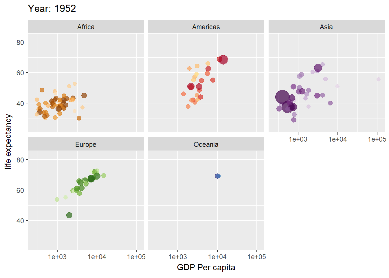
# save as a GIF
# animate(plot, fps = 30, width = 750, height = 750)
# anim_save("gapminder.gif")
p <- gapminder::gapminder %>%
  ggplot(aes(x = gdpPercap, y = lifeExp, size = pop, colour = country)) +
  geom_point(alpha = 0.7, show.legend = FALSE) +
  scale_size(range = c(2, 12)) +
  scale_x_log10() +
  labs(
    x = "GDP per capita",
    y = "life expectancy"
  )
p
anim <- p +
  transition_time(time = year) +
  labs(title = "year: {frame_time}")
anim
33.4.3 transition_reveal
-
transition_reveal(along = ), along 这个词可以看出,它是按照某个变量依次显示的意思,比如顺着x轴显示
ggplot(economics) +
  aes(x = date, y = unemploy) +
  geom_line() +
  transition_reveal(along = date) +
  labs(title = "now is {frame_along}")
33.4.4 transition_filter
-
transition_filter( 至少2个筛选条件,transition_length = , filter_length =), 动图将会在这些筛选条件对应的子图之间转换
diamonds %>%
  ggplot(aes(carat, price)) +
  geom_point() +
  transition_filter(
    transition_length = 3,
    filter_length = 1,

    cut == "Ideal",
    Deep = depth >= 60
  )
33.4.5 transition_layers
-
transition_layers(): 依次显示每个图层
mtcars %>%
  ggplot(aes(mpg, disp)) +
  geom_point() +
  geom_smooth(colour = "grey", se = FALSE) +
  geom_smooth(aes(colour = factor(gear))) +
  transition_layers(
    layer_length = 1, transition_length = 2,
    from_blank = FALSE, keep_layers = c(Inf, 0, 0)
  ) +
  enter_fade() +
exit_fade()33.5 希望坐标轴随数据动起来
动画过程中,绘图窗口怎么变化呢?
33.5.1 view_follow
ggplot(iris, aes(Sepal.Length, Sepal.Width)) +
  geom_point() +
  labs(title = "{closest_state}") +
  transition_states(Species, transition_length = 4, state_length = 1) +
view_follow()33.6 希望动画有个记忆
-
shadow_wake(wake_length =, )旧数据消退时,制造点小小的尾迹的效果(wake除了叫醒,还有尾迹的意思,合起来就是记忆_尾迹) -
shadow_trail(distance = 0.05)旧数据消退时,制造面包屑一样的残留痕迹(记忆_零星残留) -
shadow_mark(past = TRUE, future = FALSE)将旧数据和新数据当作背景(记忆_标记)
33.6.1 shadow_wake()
p +
  transition_time(time = year) +
  labs(title = "year: {frame_time}") +
  shadow_wake(wake_length = 0.1, alpha = FALSE)
ggplot(iris, aes(Petal.Length, Sepal.Length)) +
  geom_point(size = 2) +
  labs(title = "{closest_state}") +
  transition_states(Species, transition_length = 4, state_length = 1) +
  shadow_wake(wake_length = 0.1)
33.6.2 shadow_trail()
p +
  transition_time(time = year) +
  labs(title = "year: {frame_time}") +
  shadow_trail(distance = 0.1)
ggplot(iris, aes(Petal.Length, Sepal.Length)) +
  geom_point(size = 2) +
  labs(title = "{closest_state}") +
  transition_states(Species, transition_length = 4, state_length = 1) +
  shadow_trail(distance = 0.1)
33.6.3 shadow_mark()
p +
  transition_time(time = year) +
  labs(title = "year: {frame_time}") +
  shadow_mark(alpha = 0.3, size = 0.5)
ggplot(airquality, aes(Day, Temp)) +
  geom_line(color = "red", size = 1) +
  transition_time(Month) +
  shadow_mark(colour = "black", size = 0.75)
33.7 定义新数据出现和旧数据退去的方式
出现和退去的函数是成对的
33.7.1 enter/exit_fade()
透明度上的变化,我这里用柱状图展示,效果要明显一点。
tibble(
  x = month.name,
  y = sample.int(12)
) %>%
  ggplot(aes(x = x, y = y)) +
  geom_col() +
  theme(axis.text.x = element_text(angle = 45, hjust = 1, vjust = 1)) +
  transition_states(states = month.name)
tibble(
  x = month.name,
  y = sample.int(12)
) %>%
  ggplot(aes(x = x, y = y)) +
  geom_col() +
  theme(axis.text.x = element_text(angle = 45, hjust = 1, vjust = 1)) +
  transition_states(states = month.name) +
  shadow_mark(past = TRUE) +
  enter_fade()
p +
  transition_time(time = year) +
  labs(title = "year: {frame_time}") +
  enter_fade()
33.7.2 enter_grow()/exit_shrink()
大小上的变化
tibble(
  x = month.name,
  y = sample.int(12)
) %>%
  ggplot(aes(x = x, y = y)) +
  geom_col() +
  theme(axis.text.x = element_text(angle = 45, hjust = 1, vjust = 1)) +
  transition_states(states = month.name) +
  shadow_mark(past = TRUE) +
  enter_grow()
p +
  transition_time(time = year) +
  labs(title = "year: {frame_time}") +
  enter_grow() +
  enter_fade()
33.8 控制变化的节奏
控制数据点变化的快慢
knitr::include_graphics("images/ease.png")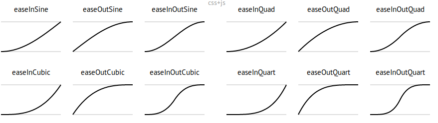
Source: https://easings.net/
看下面的案例:
diamonds %>%
  ggplot(aes(carat, price)) +
  geom_point() +
  transition_states(color, transition_length = 3, state_length = 1) +
  ease_aes("cubic-in") # Change easing of all aesthetics
diamonds %>%
  ggplot(aes(carat, price)) +
  geom_point() +
  transition_states(color, transition_length = 3, state_length = 1) +
  ease_aes(x = "elastic-in") # Only change `x` (others remain “linear”)
33.9 标签
我们可能需要在标题中加入每张动画的信息,常用罗列如下
transition_states(states = ) +
  labs(title = "previous is {previous_state},
                current is {closest_state},
                next is {next_state}")

transition_layers() +
  labs(title = "previous is {previous_layers},
                current is {closest_layers},
                next is {next_layers}")

transition_time(time = ) +
  labs(title = "now is {frame_time}")


transition_reveal(along = ) +
  labs(title = "now is {frame_along}")
33.10 保存
33.10.1 Renderer options
## # A tibble: 6 × 2
##   Function        Description
##   <chr>           <chr>
## 1 gifski_renderer Default, super fast gif renderer.
## 2 magick_renderer Somewhat slower gif renderer.
## 3 ffmpeg_renderer Uses ffmpeg to create a video from the animation.
## 4 av_renderer     Uses the av package to create a video (using ffmpeg).
## 5 file_renderer   Dumps a list of image frames from the animation.
## 6 sprite_renderer Creates a spritesheet from frames of the animation.
33.10.2 常用方法
一般用anim_save()保存为 gif 格式,方法类似ggsave()
animation_to_save <- diamonds %>%
  ggplot(aes(carat, price)) +
  geom_point() +
  transition_states(color, transition_length = 3, state_length = 1) +
  ease_aes("cubic-in")

anim_save("first_saved_animation.gif", animation = animation_to_save)
33.11 案例演示一
这是网上有段时间比较火的racing_bar图
ranked_by_date <- covdata::covnat %>%
  group_by(date) %>%
  arrange(date, desc(cu_cases)) %>%
  mutate(rank = 1:n()) %>%
  filter(rank <= 10) %>%
  ungroup()
ranked_by_date %>%
  filter(date >= "2020-05-01") %>%
  ggplot(
    aes(x = rank, y = cname, group = cname, fill = cname)
  ) +
  geom_tile(
    aes(
      y = cu_cases / 2,
      height = cu_cases,
      width = 0.9
    ),
    alpha = 0.8,
    show.legend = F
  ) +
  geom_text(aes(
    y = cu_cases,
    label = cname
  ),
  show.legend = FALSE
  ) +
  scale_x_reverse(
    breaks = c(1:10),
    label = c(1:10)
  ) +
  theme_minimal() +
  coord_flip(clip = "off", expand = FALSE) +
  labs(
    title = "日期: {closest_state}",
    x = "",
    caption = "Source: github/kjhealy/covdata"
  ) +
  transition_states(date,
    transition_length = 4,
    state_length = 1,
    wrap = TRUE
  ) +
  ease_aes("cubic-in-out")
33.12 案例演示二
bats %>%
  ggplot(aes(
    x = longitude,
    y = latitude,
    group = id,
    color = id
  )) +
  geom_point()
33.12.1 常规的方法
bats %>%
  ggplot(aes(
    x = longitude,
    y = latitude,
    group = id,
    color = id
  )) +
  geom_point() +
  transition_time(time) +
shadow_mark(past = TRUE)- geom_path()是按照数据点出现的先后顺序
- geom_line()是按照数据点在x轴的顺序
bats %>%
  ggplot(aes(
    x = longitude,
    y = latitude,
    group = id,
    color = id
  )) +
  geom_path() +
  transition_time(time) +
  shadow_mark(past = TRUE)
33.12.2 炫酷点的
bats %>%
  dplyr::mutate(
    image = "images/bat-cartoon.png"
  ) %>%
  ggplot(aes(
    x = longitude,
    y = latitude,
    group = id,
    color = id
  )) +
  geom_path() +
  ggimage::geom_image(aes(image = image), size = 0.1) +
  transition_reveal(time)
33.13 案例演示三
全球R-Ladies组织,会议活动的情况,我们在地图上用动图展示
rladies <- read_csv("./demo_data/rladies.csv")
rladies
这里需要一个地图,可以这样
当然,最好是这样
library(maps)
world <- map_data("world")

world_map <- ggplot() +
  geom_polygon(data = world,
               aes(x = long, y = lat, group = group),
               color = "white", fill = "gray80"
               ) +
  ggthemes::theme_map()

world_map
然后把点打上去
world_map +
  geom_point(
    data = rladies,
    aes(x = lon, y = lat, size = followers),
    colour = "purple", alpha = .5
  ) +
  scale_size_continuous(
    range = c(1, 8),
    breaks = c(250, 500, 750, 1000)
  ) +
  labs(size = "Followers")
用动图展示(这种方法常用在流行病传播的展示上)
world_map +
  geom_point(aes(x = lon, y = lat, size = followers),
    data = rladies,
    colour = "purple", alpha = .5
  ) +
  scale_size_continuous(
    range = c(1, 8),
    breaks = c(250, 500, 750, 1000)
  ) +
  transition_states(created_at) +
  shadow_mark(past = TRUE) +
  labs(title = "Day: {closest_state}")
33.14 课后作业
33.14.1 作业1
把下图弄成你喜欢的样子
library(gapminder)
theme_set(theme_bw())

ggplot(gapminder) +
  aes(
    x = gdpPercap, y = lifeExp,
    size = pop, colour = country
  ) +
  geom_point(show.legend = FALSE) +
  scale_x_log10() +
  scale_color_viridis_d() +
  scale_size(range = c(2, 12)) +
  labs(x = "GDP per capita", y = "Life expectancy") +
  transition_time(year) +
  labs(title = "Year: {frame_time}")
33.14.2 作业2
那请说说这以下三个的区别?
bats %>%
  dplyr::filter(id == 1) %>%
  ggplot(
    aes(
      x = longitude,
      y = latitude
    )
  ) +
  geom_point() +
  transition_reveal(time) # <<


bats %>%
  dplyr::filter(id == 1) %>%
  ggplot(
    aes(
      x = longitude,
      y = latitude
    )
  ) +
  geom_point() +
  transition_states(time) # <<


bats %>%
  dplyr::filter(id == 1) %>%
  ggplot(
    aes(
      x = longitude,
      y = latitude
    )
  ) +
  geom_point() +
  transition_time(time) # <<