第 80 章 探索性数据分析-新冠疫情
library(tidyverse)
library(lubridate)
library(maps)
library(viridis)
library(ggrepel)
library(paletteer)
library(shadowtext)
library(showtext)
showtext_auto()新型冠状病毒(COVID-19)疫情在多国蔓延,本章通过分析疫情数据,了解疫情发展,祝愿人类早日会战胜病毒!

图 80.1: 电影《传染病》,《流感》海报

图 80.2: 电影《传染病》,《流感》海报
80.1 数据来源
我们打开链接https://github.com/CSSEGISandData/COVID-19,

找到疫情时间序列数据,你可以通过点击该网页Clone or download直接下载的方式获取数据。
80.2 读取数据
假定你已经下载了数据,比如time_series_covid19_confirmed_global.csv, 那么我们可以用readr::read_csv()函数直接读取, 关于在R语言里文件读取的方法可以参考第 11 章。
d <- read_csv("./demo_data/time_series_covid19_confirmed_global.csv")
d
## # A tibble: 256 × 74
## `Province/State` `Country/Region` Lat Long `1/22/20` `1/23/20` `1/24/20`
## <chr> <chr> <dbl> <dbl> <dbl> <dbl> <dbl>
## 1 <NA> Afghanistan 33 65 0 0 0
## 2 <NA> Albania 41.2 20.2 0 0 0
## 3 <NA> Algeria 28.0 1.66 0 0 0
## 4 <NA> Andorra 42.5 1.52 0 0 0
## 5 <NA> Angola -11.2 17.9 0 0 0
## 6 <NA> Antigua and Bar… 17.1 -61.8 0 0 0
## 7 <NA> Argentina -38.4 -63.6 0 0 0
## 8 <NA> Armenia 40.1 45.0 0 0 0
## 9 Australian Capit… Australia -35.5 149. 0 0 0
## 10 New South Wales Australia -33.9 151. 0 0 0
## # ℹ 246 more rows
## # ℹ 67 more variables: `1/25/20` <dbl>, `1/26/20` <dbl>, `1/27/20` <dbl>,
## # `1/28/20` <dbl>, `1/29/20` <dbl>, `1/30/20` <dbl>, `1/31/20` <dbl>,
## # `2/1/20` <dbl>, `2/2/20` <dbl>, `2/3/20` <dbl>, `2/4/20` <dbl>,
## # `2/5/20` <dbl>, `2/6/20` <dbl>, `2/7/20` <dbl>, `2/8/20` <dbl>,
## # `2/9/20` <dbl>, `2/10/20` <dbl>, `2/11/20` <dbl>, `2/12/20` <dbl>,
## # `2/13/20` <dbl>, `2/14/20` <dbl>, `2/15/20` <dbl>, `2/16/20` <dbl>, …80.3 数据集结构
探索数据之前,我们一定要对数据存储结构、数据变量名及其含义要非常清楚,重要的事情说三遍。
glimpse(d)## Rows: 256
## Columns: 74
## $ `Province/State` <chr> NA, NA, NA, NA, NA, NA, NA, NA, "Australian Capital T…
## $ `Country/Region` <chr> "Afghanistan", "Albania", "Algeria", "Andorra", "Ango…
## $ Lat <dbl> 33.0000, 41.1533, 28.0339, 42.5063, -11.2027, 17.0608…
## $ Long <dbl> 65.0000, 20.1683, 1.6596, 1.5218, 17.8739, -61.7964, …
## $ `1/22/20` <dbl> 0, 0, 0, 0, 0, 0, 0, 0, 0, 0, 0, 0, 0, 0, 0, 0, 0, 0,…
## $ `1/23/20` <dbl> 0, 0, 0, 0, 0, 0, 0, 0, 0, 0, 0, 0, 0, 0, 0, 0, 0, 0,…
## $ `1/24/20` <dbl> 0, 0, 0, 0, 0, 0, 0, 0, 0, 0, 0, 0, 0, 0, 0, 0, 0, 0,…
## $ `1/25/20` <dbl> 0, 0, 0, 0, 0, 0, 0, 0, 0, 0, 0, 0, 0, 0, 0, 0, 0, 0,…
## $ `1/26/20` <dbl> 0, 0, 0, 0, 0, 0, 0, 0, 0, 3, 0, 0, 0, 0, 1, 0, 0, 0,…
## $ `1/27/20` <dbl> 0, 0, 0, 0, 0, 0, 0, 0, 0, 4, 0, 0, 0, 0, 1, 0, 0, 0,…
## $ `1/28/20` <dbl> 0, 0, 0, 0, 0, 0, 0, 0, 0, 4, 0, 0, 0, 0, 1, 0, 0, 0,…
## $ `1/29/20` <dbl> 0, 0, 0, 0, 0, 0, 0, 0, 0, 4, 0, 1, 0, 0, 1, 0, 0, 0,…
## $ `1/30/20` <dbl> 0, 0, 0, 0, 0, 0, 0, 0, 0, 4, 0, 3, 0, 0, 2, 0, 0, 0,…
## $ `1/31/20` <dbl> 0, 0, 0, 0, 0, 0, 0, 0, 0, 4, 0, 2, 0, 0, 3, 0, 0, 0,…
## $ `2/1/20` <dbl> 0, 0, 0, 0, 0, 0, 0, 0, 0, 4, 0, 3, 1, 0, 4, 0, 0, 0,…
## $ `2/2/20` <dbl> 0, 0, 0, 0, 0, 0, 0, 0, 0, 4, 0, 2, 2, 0, 4, 0, 0, 0,…
## $ `2/3/20` <dbl> 0, 0, 0, 0, 0, 0, 0, 0, 0, 4, 0, 2, 2, 0, 4, 0, 0, 0,…
## $ `2/4/20` <dbl> 0, 0, 0, 0, 0, 0, 0, 0, 0, 4, 0, 3, 2, 0, 4, 0, 0, 0,…
## $ `2/5/20` <dbl> 0, 0, 0, 0, 0, 0, 0, 0, 0, 4, 0, 3, 2, 0, 4, 0, 0, 0,…
## $ `2/6/20` <dbl> 0, 0, 0, 0, 0, 0, 0, 0, 0, 4, 0, 4, 2, 0, 4, 0, 0, 0,…
## $ `2/7/20` <dbl> 0, 0, 0, 0, 0, 0, 0, 0, 0, 4, 0, 5, 2, 0, 4, 0, 0, 0,…
## $ `2/8/20` <dbl> 0, 0, 0, 0, 0, 0, 0, 0, 0, 4, 0, 5, 2, 0, 4, 0, 0, 0,…
## $ `2/9/20` <dbl> 0, 0, 0, 0, 0, 0, 0, 0, 0, 4, 0, 5, 2, 0, 4, 0, 0, 0,…
## $ `2/10/20` <dbl> 0, 0, 0, 0, 0, 0, 0, 0, 0, 4, 0, 5, 2, 0, 4, 0, 0, 0,…
## $ `2/11/20` <dbl> 0, 0, 0, 0, 0, 0, 0, 0, 0, 4, 0, 5, 2, 0, 4, 0, 0, 0,…
## $ `2/12/20` <dbl> 0, 0, 0, 0, 0, 0, 0, 0, 0, 4, 0, 5, 2, 0, 4, 0, 0, 0,…
## $ `2/13/20` <dbl> 0, 0, 0, 0, 0, 0, 0, 0, 0, 4, 0, 5, 2, 0, 4, 0, 0, 0,…
## $ `2/14/20` <dbl> 0, 0, 0, 0, 0, 0, 0, 0, 0, 4, 0, 5, 2, 0, 4, 0, 0, 0,…
## $ `2/15/20` <dbl> 0, 0, 0, 0, 0, 0, 0, 0, 0, 4, 0, 5, 2, 0, 4, 0, 0, 0,…
## $ `2/16/20` <dbl> 0, 0, 0, 0, 0, 0, 0, 0, 0, 4, 0, 5, 2, 0, 4, 0, 0, 0,…
## $ `2/17/20` <dbl> 0, 0, 0, 0, 0, 0, 0, 0, 0, 4, 0, 5, 2, 0, 4, 0, 0, 0,…
## $ `2/18/20` <dbl> 0, 0, 0, 0, 0, 0, 0, 0, 0, 4, 0, 5, 2, 0, 4, 0, 0, 0,…
## $ `2/19/20` <dbl> 0, 0, 0, 0, 0, 0, 0, 0, 0, 4, 0, 5, 2, 0, 4, 0, 0, 0,…
## $ `2/20/20` <dbl> 0, 0, 0, 0, 0, 0, 0, 0, 0, 4, 0, 5, 2, 0, 4, 0, 0, 0,…
## $ `2/21/20` <dbl> 0, 0, 0, 0, 0, 0, 0, 0, 0, 4, 0, 5, 2, 0, 4, 0, 0, 0,…
## $ `2/22/20` <dbl> 0, 0, 0, 0, 0, 0, 0, 0, 0, 4, 0, 5, 2, 0, 4, 0, 0, 0,…
## $ `2/23/20` <dbl> 0, 0, 0, 0, 0, 0, 0, 0, 0, 4, 0, 5, 2, 0, 4, 0, 0, 0,…
## $ `2/24/20` <dbl> 1, 0, 0, 0, 0, 0, 0, 0, 0, 4, 0, 5, 2, 0, 4, 0, 0, 0,…
## $ `2/25/20` <dbl> 1, 0, 1, 0, 0, 0, 0, 0, 0, 4, 0, 5, 2, 0, 4, 0, 2, 0,…
## $ `2/26/20` <dbl> 1, 0, 1, 0, 0, 0, 0, 0, 0, 4, 0, 5, 2, 0, 4, 0, 2, 0,…
## $ `2/27/20` <dbl> 1, 0, 1, 0, 0, 0, 0, 0, 0, 4, 0, 5, 2, 0, 4, 0, 3, 0,…
## $ `2/28/20` <dbl> 1, 0, 1, 0, 0, 0, 0, 0, 0, 4, 0, 5, 2, 0, 4, 0, 3, 0,…
## $ `2/29/20` <dbl> 1, 0, 1, 0, 0, 0, 0, 0, 0, 4, 0, 9, 3, 0, 7, 2, 9, 0,…
## $ `3/1/20` <dbl> 1, 0, 1, 0, 0, 0, 0, 1, 0, 6, 0, 9, 3, 0, 7, 2, 14, 3…
## $ `3/2/20` <dbl> 1, 0, 3, 1, 0, 0, 0, 1, 0, 6, 0, 9, 3, 1, 9, 2, 18, 3…
## $ `3/3/20` <dbl> 1, 0, 5, 1, 0, 0, 1, 1, 0, 13, 0, 11, 3, 1, 9, 2, 21,…
## $ `3/4/20` <dbl> 1, 0, 12, 1, 0, 0, 1, 1, 0, 22, 1, 11, 5, 1, 10, 2, 2…
## $ `3/5/20` <dbl> 1, 0, 12, 1, 0, 0, 1, 1, 0, 22, 1, 13, 5, 1, 10, 3, 4…
## $ `3/6/20` <dbl> 1, 0, 17, 1, 0, 0, 2, 1, 0, 26, 0, 13, 7, 1, 10, 3, 5…
## $ `3/7/20` <dbl> 1, 0, 17, 1, 0, 0, 8, 1, 0, 28, 0, 13, 7, 1, 11, 3, 7…
## $ `3/8/20` <dbl> 4, 0, 19, 1, 0, 0, 12, 1, 0, 38, 0, 15, 7, 2, 11, 3, …
## $ `3/9/20` <dbl> 4, 2, 20, 1, 0, 0, 12, 1, 0, 48, 0, 15, 7, 2, 15, 4, …
## $ `3/10/20` <dbl> 5, 10, 20, 1, 0, 0, 17, 1, 0, 55, 1, 18, 7, 2, 18, 6,…
## $ `3/11/20` <dbl> 7, 12, 20, 1, 0, 0, 19, 1, 0, 65, 1, 20, 9, 3, 21, 9,…
## $ `3/12/20` <dbl> 7, 23, 24, 1, 0, 0, 19, 4, 0, 65, 1, 20, 9, 3, 21, 9,…
## $ `3/13/20` <dbl> 7, 33, 26, 1, 0, 1, 31, 8, 1, 92, 1, 35, 16, 5, 36, 1…
## $ `3/14/20` <dbl> 11, 38, 37, 1, 0, 1, 34, 18, 1, 112, 1, 46, 19, 5, 49…
## $ `3/15/20` <dbl> 16, 42, 48, 1, 0, 1, 45, 26, 1, 134, 1, 61, 20, 6, 57…
## $ `3/16/20` <dbl> 21, 51, 54, 2, 0, 1, 56, 52, 2, 171, 1, 68, 29, 7, 71…
## $ `3/17/20` <dbl> 22, 55, 60, 39, 0, 1, 68, 78, 2, 210, 1, 78, 29, 7, 9…
## $ `3/18/20` <dbl> 22, 59, 74, 39, 0, 1, 79, 84, 3, 267, 1, 94, 37, 10, …
## $ `3/19/20` <dbl> 22, 64, 87, 53, 0, 1, 97, 115, 4, 307, 1, 144, 42, 10…
## $ `3/20/20` <dbl> 24, 70, 90, 75, 1, 1, 128, 136, 6, 353, 3, 184, 50, 1…
## $ `3/21/20` <dbl> 24, 76, 139, 88, 2, 1, 158, 160, 9, 436, 3, 221, 67, …
## $ `3/22/20` <dbl> 40, 89, 201, 113, 2, 1, 266, 194, 19, 669, 5, 259, 10…
## $ `3/23/20` <dbl> 40, 104, 230, 133, 3, 3, 301, 235, 32, 669, 5, 319, 1…
## $ `3/24/20` <dbl> 74, 123, 264, 164, 3, 3, 387, 249, 39, 818, 6, 397, 1…
## $ `3/25/20` <dbl> 84, 146, 302, 188, 3, 3, 387, 265, 39, 1029, 6, 443, …
## $ `3/26/20` <dbl> 94, 174, 367, 224, 4, 7, 502, 290, 53, 1219, 12, 493,…
## $ `3/27/20` <dbl> 110, 186, 409, 267, 4, 7, 589, 329, 62, 1405, 12, 555…
## $ `3/28/20` <dbl> 110, 197, 454, 308, 5, 7, 690, 407, 71, 1617, 15, 625…
## $ `3/29/20` <dbl> 120, 212, 511, 334, 7, 7, 745, 424, 77, 1791, 15, 656…
## $ `3/30/20` <dbl> 170, 223, 584, 370, 7, 7, 820, 482, 78, 2032, 15, 689…
## $ `3/31/20` <dbl> 174, 243, 716, 376, 7, 7, 1054, 532, 80, 2032, 17, 74…80.4 数据清洗规整
80.4.1 必要的预备知识之select()
d %>% select(-c(1:4))
d %>% select(5:ncol(.))
d %>% select(matches("/20"))
d %>% select(ends_with("/20"))
应该还有其他的方法。
80.4.2 必要的预备知识之pivot_longer()
宽表格变长表格,需要用到pivot_longer() 和 pivot_wider(), 比如
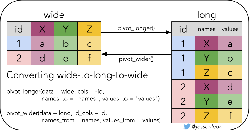
table4a## # A tibble: 3 × 3
## country `1999` `2000`
## <chr> <dbl> <dbl>
## 1 Afghanistan 745 2666
## 2 Brazil 37737 80488
## 3 China 212258 213766
longer <- table4a %>%
  pivot_longer(
    cols = `1999`:`2000`,
    names_to = "year",
    values_to = "cases"
  )

longer
## # A tibble: 6 × 3
## country year cases
## <chr> <chr> <dbl>
## 1 Afghanistan 1999 745
## 2 Afghanistan 2000 2666
## 3 Brazil 1999 37737
## 4 Brazil 2000 80488
## 5 China 1999 212258
## 6 China 2000 213766
80.4.3 必要的预备知识之pivot_wider()
有时候我们想折腾下,比如把长表格再变回宽表格
longer %>%
  pivot_wider(
    names_from = year,
    values_from = cases
  )
## # A tibble: 3 × 3
## country `1999` `2000`
## <chr> <dbl> <dbl>
## 1 Afghanistan 745 2666
## 2 Brazil 37737 80488
## 3 China 212258 21376680.4.4 必要的预备知识之日期格式
有时候,我会遇到日期date这种数据类型,我推荐使用lubridate包来处理,比如
## [1] "2020-03-25" "2020-03-25" "2020-03-25" "2020-03-25"## [1] "2020-03-25" "2020-03-25" "2020-03-25"遇到这种010210日期的,请把输入数据的人扁一顿,他会告诉你的
80.4.5 必要的预备知识之时间差
## Time difference of 1 days或者更直观的表述
## Time difference of 1 days转换为天数
(ymd("2020-03-24") - ymd("2020-03-23")) %>% as.numeric()## [1] 180.4.6 有时候需要log10_scale
tb <- tibble(
  days_since_100 = 0:18,
  cases = 100 * 1.33^days_since_100
)


p1 <- tb %>%
  ggplot(aes(days_since_100, cases)) +
  geom_line(size = 0.8) +
  geom_point(pch = 21, size = 1)

p2 <- tb %>%
  ggplot(aes(days_since_100, log10(cases))) +
  geom_line(size = 0.8) +
  geom_point(pch = 21, size = 1)


p3 <- tb %>%
  ggplot(aes(days_since_100, cases)) +
  geom_line(size = 0.8) +
  geom_point(pch = 21, size = 1) +
  scale_y_log10()

library(patchwork)
p1 + p2 + p3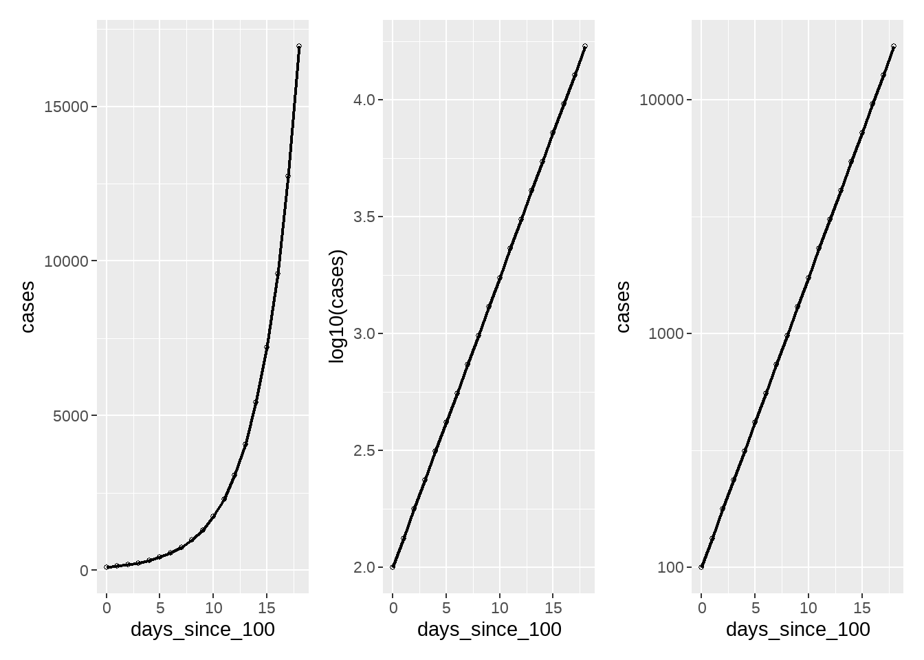
80.4.7 数据清洗规整
d1 <- d %>%
  pivot_longer(
    cols = 5:ncol(.),
    names_to = "date",
    values_to = "cases"
  ) %>%
  mutate(date = lubridate::mdy(date)) %>%
  janitor::clean_names() %>%
  group_by(country_region, date) %>%
  summarise(cases = sum(cases)) %>%
  ungroup()

d1
## # A tibble: 12,600 × 3
## country_region date cases
## <chr> <date> <dbl>
## 1 Afghanistan 2020-01-22 0
## 2 Afghanistan 2020-01-23 0
## 3 Afghanistan 2020-01-24 0
## 4 Afghanistan 2020-01-25 0
## 5 Afghanistan 2020-01-26 0
## 6 Afghanistan 2020-01-27 0
## 7 Afghanistan 2020-01-28 0
## 8 Afghanistan 2020-01-29 0
## 9 Afghanistan 2020-01-30 0
## 10 Afghanistan 2020-01-31 0
## # ℹ 12,590 more rows## # A tibble: 70 × 2
## date confirmed
## <date> <dbl>
## 1 2020-01-22 555
## 2 2020-01-23 654
## 3 2020-01-24 941
## 4 2020-01-25 1434
## 5 2020-01-26 2118
## 6 2020-01-27 2927
## 7 2020-01-28 5578
## 8 2020-01-29 6166
## 9 2020-01-30 8234
## 10 2020-01-31 9927
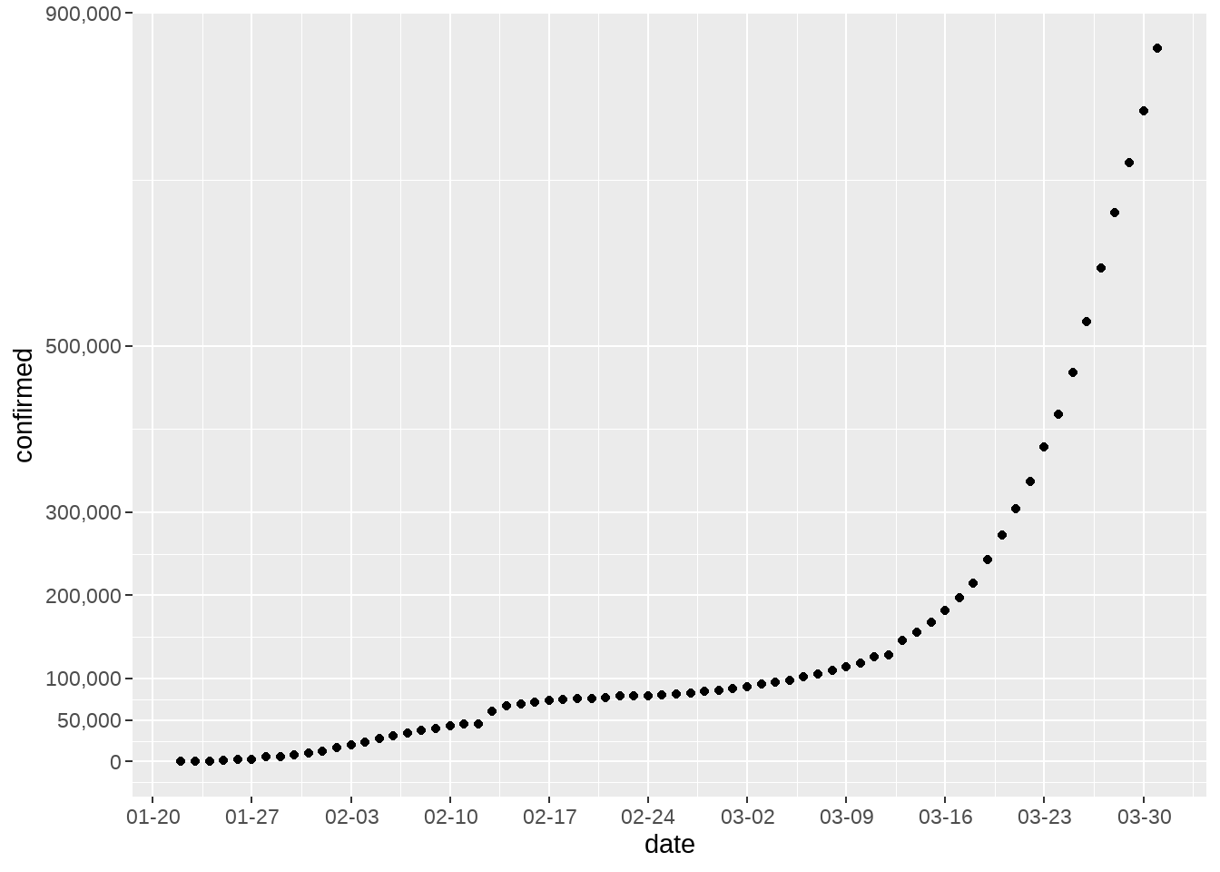
## # ℹ 60 more rows【WHO:2019冠状病毒全球大流行正在“加速”】世界卫生组织(WHO)昨日发出警告,指2019冠状病毒全球感染者已超过30万人,全球大流行正在“加速”。世卫组织指,从首例病例报告到感染者达到10万人用了67天;感染人数增至20万用了11天;从20万到突破30万则只用了4天。
d1 %>%
  group_by(date) %>%
summarise(confirmed = sum(cases)) %>%
ggplot(aes(x = date, y = confirmed)) +
geom_point() +
scale_x_date(
date_labels = "%m-%d",
date_breaks = "1 week"
) +
scale_y_continuous(
breaks = c(0, 50000, 100000, 200000, 300000, 500000, 900000),
labels = scales::comma
)
## # A tibble: 180 × 1
##    country_region
##    <chr>
##  1 Afghanistan
##  2 Albania
##  3 Algeria
##  4 Andorra
##  5 Angola
##  6 Antigua and Barbuda
##  7 Argentina
##  8 Armenia
##  9 Australia
## 10 Austria
## # ℹ 170 more rows## # A tibble: 70 × 3
## country_region date cases
## <chr> <date> <dbl>
## 1 China 2020-01-22 548
## 2 China 2020-01-23 643
## 3 China 2020-01-24 920
## 4 China 2020-01-25 1406
## 5 China 2020-01-26 2075
## 6 China 2020-01-27 2877
## 7 China 2020-01-28 5509
## 8 China 2020-01-29 6087
## 9 China 2020-01-30 8141
## 10 China 2020-01-31 9802
## # ℹ 60 more rows
d1 %>%
filter(country_region == "China") %>%
ggplot(aes(x = date, y = cases)) +
geom_point() +
scale_x_date(date_breaks = "1 week", date_labels = "%m-%d") +
scale_y_log10(labels = scales::comma)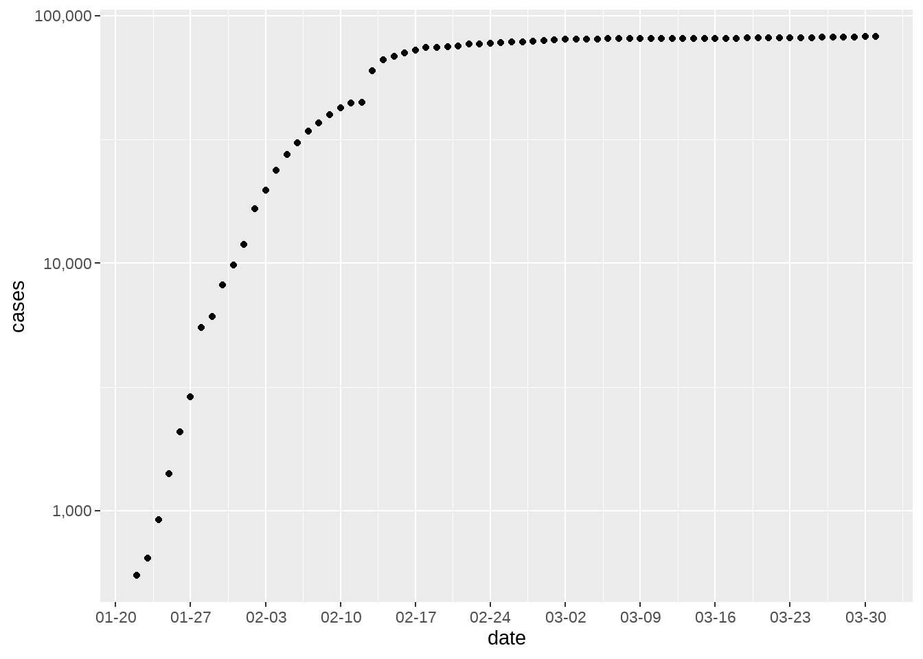
d1 %>%
  group_by(country_region) %>%
  filter(max(cases) >= 20000) %>%
  ungroup() %>%
  ggplot(aes(x = date, y = cases, color = country_region)) +
  geom_point() +
  scale_x_date(date_breaks = "1 week", date_labels = "%m-%d") +
  scale_y_log10() +
  facet_wrap(vars(country_region), ncol = 2) +
  theme(
    axis.text.x = element_text(angle = 45, hjust = 1)
  ) +
  theme(legend.position = "none")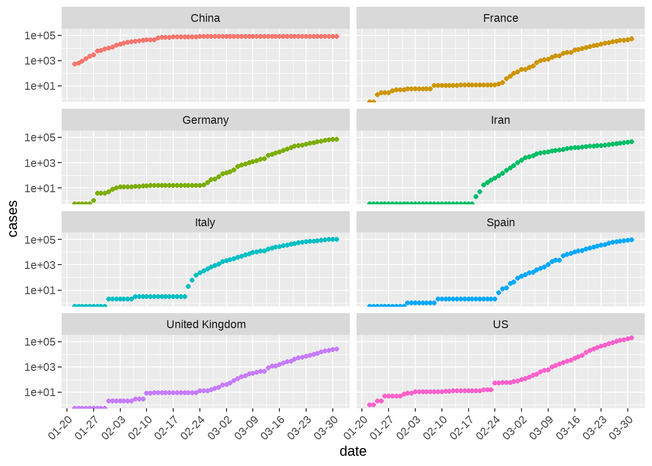
80.5 可视化探索
网站https://www.ft.com/coronavirus-latest 这张图很受关注,于是打算重复
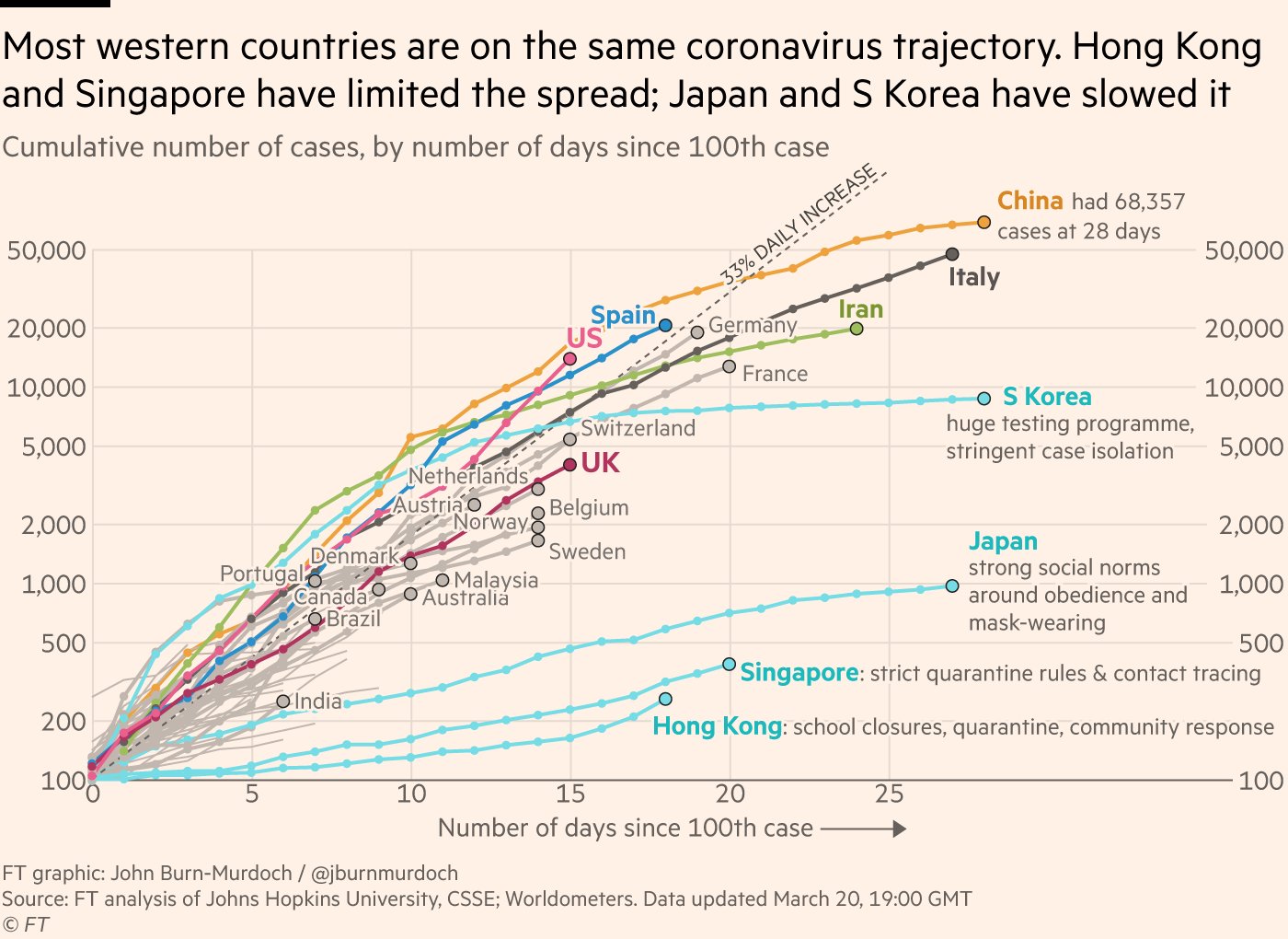
图 80.3: 图片来源www.ft.com
这张图想表达的是,出现100个案例后,各国确诊人数的爆发趋势
- 横坐标是天数,即在出现100个案例后的第几天
- 纵坐标是累积确诊人数
那么,我们需要对数据的时间轴做相应的变形
- 首先按照国家分组
- 筛选,累积确诊人数超过
100的国家 - 找到所有
case >= 100的日期,date[cases >= 100] - 最早的日期,就说我们要找的第 0 day,
min(date[cases >= 100]) - 构建新的一列
mutate( days_since_100 = date - min(date[cases >= 100]) - 将
days_since_100转换成数值型as.numeric()
d2 <- d1 %>%
  group_by(country_region) %>%
  filter(max(cases) >= 100) %>%
  mutate(
    days_since_100 = date - min(date[cases >= 100])
  ) %>%
  mutate(days_since_100 = as.numeric(days_since_100)) %>%
  filter(days_since_100 >= 0) %>%
  ungroup()
d2
## # A tibble: 1,710 × 4
## country_region date cases days_since_100
## <chr> <date> <dbl> <dbl>
## 1 Afghanistan 2020-03-27 110 0
## 2 Afghanistan 2020-03-28 110 1
## 3 Afghanistan 2020-03-29 120 2
## 4 Afghanistan 2020-03-30 170 3
## 5 Afghanistan 2020-03-31 174 4
## 6 Albania 2020-03-23 104 0
## 7 Albania 2020-03-24 123 1
## 8 Albania 2020-03-25 146 2
## 9 Albania 2020-03-26 174 3
## 10 Albania 2020-03-27 186 4
## # ℹ 1,700 more rows大家都谈过恋爱,也有可能失恋。大家失恋时间是不同的,若把失恋的当天作为第 0 day, 就可以比较失恋若干天后每个人精神波动情况。参照《失恋33天》
d2_most <- d2 %>%
  group_by(country_region) %>%
  top_n(1, days_since_100) %>%
  filter(cases >= 10000) %>%
  ungroup() %>%
  arrange(desc(cases))
d2_most
## # A tibble: 13 × 4
## country_region date cases days_since_100
## <chr> <date> <dbl> <dbl>
## 1 US 2020-03-31 188172 28
## 2 Italy 2020-03-31 105792 37
## 3 Spain 2020-03-31 95923 29
## 4 China 2020-03-31 82279 69
## 5 Germany 2020-03-31 71808 30
## 6 France 2020-03-31 52827 31
## 7 Iran 2020-03-31 44605 34
## 8 United Kingdom 2020-03-31 25481 26
## 9 Switzerland 2020-03-31 16605 26
## 10 Turkey 2020-03-31 13531 12
## 11 Belgium 2020-03-31 12775 25
## 12 Netherlands 2020-03-31 12667 25
## 13 Austria 2020-03-31 10180 23
d2 %>%
  bind_rows(
    tibble(country = "33% daily rise", days_since_100 = 0:30) %>%
      mutate(cases = 100 * 1.33^days_since_100)
  ) %>%

  ggplot(aes(days_since_100, cases, color = country_region)) +
  geom_hline(yintercept = 100) +
  geom_vline(xintercept = 0) +
  geom_line(size = 0.8) +
  geom_point(pch = 21, size = 1) +
#   scale_colour_manual(
#    values = c(
#     "US" = "#EB5E8D",
#     "Italy" = "black",
#     "Spain" = "#c2b7af",
#     "China" = "red",
#     "Germany" = "#c2b7af",
#     "France" = "#c2b7af",
#     "Iran" = "#9dbf57",
#     "United Kingdom" = "#ce3140",
#     "Korea, South" = "#208fce",
#     "Japan" = "#208fce",
#     "Singapore" = "#1E8FCC",
#      "33% daily rise" = "#D9CCC3",
#     "Switzerland" = "#c2b7af",
#     "Turkey" = "#208fce",
#     "Belgium" = "#c2b7af",
#     "Netherlands" = "#c2b7af",
#     "Austria" = "#c2b7af",
#     "Hong Kong" = "#1E8FCC",
#     # gray
#     "India" = "#c2b7af",
#     "Switzerland" = "#c2b7af",
#     "Belgium" = "#c2b7af",
#     "Norway" = "#c2b7af",
#      "Sweden" = "#c2b7af",
#     "Austria" = "#c2b7af",
#     "Australia" = "#c2b7af",
#     "Denmark" = "#c2b7af",
#     "Canada" = "#c2b7af",
#     "Brazil" = "#c2b7af",
#     "Portugal" = "#c2b7af"
#   )
# ) +

  geom_shadowtext(
    data = d2_most, aes(label = paste0("  ", country_region)),
    bg.color = "white"
  ) +
  scale_y_log10(
    expand = expansion(mult = c(0, .1)),
    breaks = c(100, 200, 500, 1000, 2000, 5000, 10000, 20000, 50000),
    labels = scales::comma
  ) +
  scale_x_continuous(
    expand = expansion(mult = c(0, .1)),
    breaks = c(0, 5, 10, 15, 20, 25, 30)
  ) +
  theme_minimal() +
  theme(
    panel.grid.minor = element_blank(),
    plot.background = element_rect(fill = "#FFF1E6"),
    legend.position = "none",
    panel.spacing = margin(3, 15, 3, 15, "mm")
  ) +
  labs(
    x = "Number of days since 100th case",
    y = "",
    title = "Country by country: how coronavirus case trajectories compare",
    subtitle = "Cumulative number of cases, by Number of days since 100th case",
    caption = "data source from @www.ft.com"
  )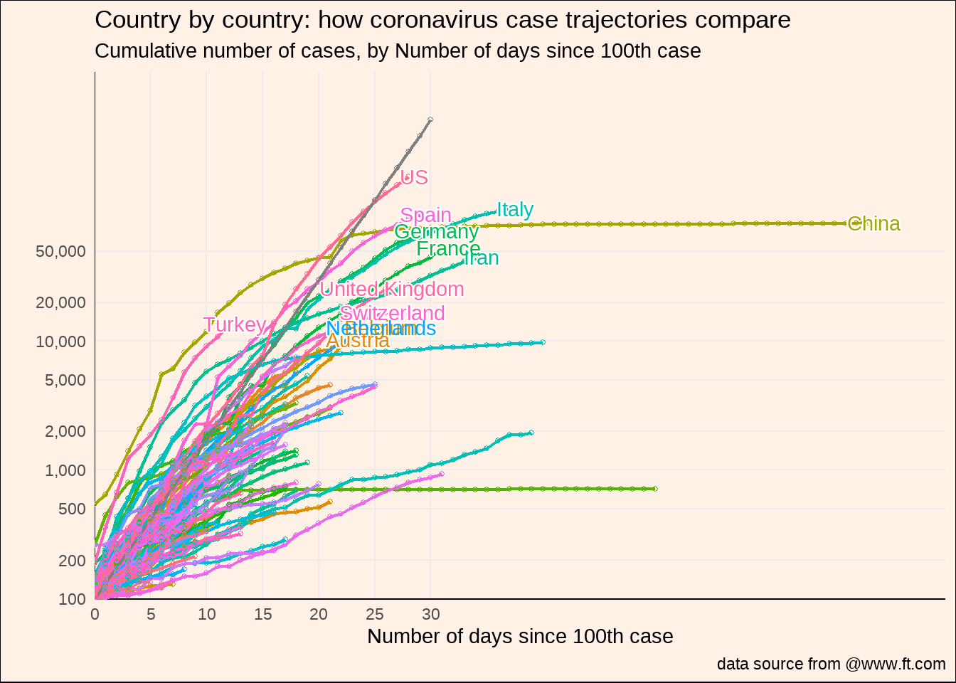
有点乱,还有很多细节没有实现,后面再弄弄了
80.5.1 简便的方法
d2a <- d1 %>%
  group_by(country_region) %>%
  filter(cases >= 100) %>%
  mutate(days_since_100 = 0:(n() - 1)) %>%
  # same as
  # mutate(edate = as.numeric(date - min(date)))
  ungroup()
d2a
## # A tibble: 1,710 × 4
## country_region date cases days_since_100
## <chr> <date> <dbl> <int>
## 1 Afghanistan 2020-03-27 110 0
## 2 Afghanistan 2020-03-28 110 1
## 3 Afghanistan 2020-03-29 120 2
## 4 Afghanistan 2020-03-30 170 3
## 5 Afghanistan 2020-03-31 174 4
## 6 Albania 2020-03-23 104 0
## 7 Albania 2020-03-24 123 1
## 8 Albania 2020-03-25 146 2
## 9 Albania 2020-03-26 174 3
## 10 Albania 2020-03-27 186 4
## # ℹ 1,700 more rows这里的d2a 和d2是一样的了,但方法简单很多。
80.5.2 疫情持续时间最久的国家
d3 <- d2a %>%
  group_by(country_region) %>%
  filter(days_since_100 == max(days_since_100)) %>%
  # same as
  # top_n(1, days_since_100) %>%
  ungroup() %>%
  arrange(desc(days_since_100))
d3
## # A tibble: 110 × 4
## country_region date cases days_since_100
## <chr> <date> <dbl> <int>
## 1 China 2020-03-31 82279 69
## 2 Diamond Princess 2020-03-31 712 50
## 3 Korea, South 2020-03-31 9786 40
## 4 Japan 2020-03-31 1953 39
## 5 Italy 2020-03-31 105792 37
## 6 Iran 2020-03-31 44605 34
## 7 France 2020-03-31 52827 31
## 8 Singapore 2020-03-31 926 31
## 9 Germany 2020-03-31 71808 30
## 10 Spain 2020-03-31 95923 29
## # ℹ 100 more rows## [1] "China" "Diamond Princess" "Korea, South" "Japan"
## [5] "Italy" "Iran" "France" "Singapore"
## [9] "Germany" "Spain"
d2a %>%
  bind_rows(
    tibble(country = "33% daily rise", days_since_100 = 0:30) %>%
      mutate(cases = 100 * 1.33^days_since_100)
  ) %>%
  ggplot(aes(days_since_100, cases, color = country_region)) +
  geom_hline(yintercept = 100) +
  geom_vline(xintercept = 0) +
  geom_line(size = 0.8) +
  geom_point(pch = 21, size = 1) +
  scale_y_log10(
    expand = expansion(mult = c(0, .1)),
    breaks = c(100, 200, 500, 1000, 2000, 5000, 10000, 20000, 50000, 100000),
    labels = scales::comma
  ) +
  scale_x_continuous(
    expand = expansion(mult = c(0, .1)),
    breaks = c(0, 5, 10, 15, 20, 25, 30, 40, 50, 60)
  ) +
  theme_minimal() +
  theme(
    panel.grid.minor = element_blank(),
    plot.background = element_rect(fill = "#FFF1E6"),
    legend.position = "none",
    panel.spacing = margin(3, 15, 3, 15, "mm")
  ) +
  labs(
    x = "Number of days since 100th case",
    y = "",
    title = "Country by country: how coronavirus case trajectories compare",
    subtitle = "Cumulative number of cases, by Number of days since 100th case",
    caption = "data source from @www.ft.com"
  ) +
  gghighlight::gghighlight(country_region %in% highlight,
    label_key = country_region, use_direct_label = TRUE,
    label_params = list(segment.color = NA, nudge_x = 1),
    use_group_by = FALSE
  )
灰色线条的国家名,有点不好弄,在想办法
80.5.3 笨办法吧
笨办法,实际上是4张表共同完成
highlight <- c(
  "China", "Spain", "US", "United Kingdom", "Korea, South",
  "Italy", "Japan", "Singapore", "Germany", "France", "Iran"
)

gray <- c(
  "India", "Switzerland", "Belgium", "Netherlands",
  "Sweden", "Austria", "Australia", "Denmark",
  "Canada", "Brazil", "Portugal"
)

d3_highlight <- d2a %>% filter(country_region %in% highlight)

d3_gray <- d2a %>% filter(country_region %in% gray)
d2a %>%
  ggplot(aes(days_since_100, cases, group = country_region)) +
  geom_hline(yintercept = 100) +
  geom_vline(xintercept = 0) +
  geom_line(size = 0.8, color = "gray70") +
  geom_point(pch = 21, size = 1, color = "gray70") +

  # highlight country
  geom_line(data = d3_highlight, aes(color = country_region)) +
  geom_point(data = d3_highlight, aes(color = country_region)) +
  geom_text(
    data = d3_highlight %>%
      group_by(country_region) %>%
      top_n(1, days_since_100) %>%
      ungroup(),
    aes(color = country_region, label = country_region),
    hjust = 0,
    vjust = 0,
    nudge_x = 0.5
  ) +


  # gray country
  geom_text(
    data = d3_gray %>%
      group_by(country_region) %>%
      top_n(1, days_since_100) %>%
      ungroup(),
    aes(label = country_region),
    color = "gray50",
    hjust = 0,
    vjust = 0,
    nudge_x = 0.5
  ) +
  geom_point(
    data = d3_gray %>%
      group_by(country_region) %>%
      top_n(1, days_since_100) %>%
      ungroup(),
    size = 2,
    color = "gray50"
  ) +
  scale_y_log10(
    expand = expansion(mult = c(0, .1)),
    breaks = c(100, 200, 500, 2000, 5000, 10000, 20000, 50000, 100000, 150000),
    labels = scales::comma
  ) +
  scale_x_continuous(
    expand = expansion(mult = c(0, .1)),
    breaks = c(0, 5, 10, 15, 20, 25, 30, 40, 50, 60)
  ) +
  theme_minimal() +
  theme(
    panel.grid.minor = element_blank(),
    plot.background = element_rect(fill = "#FFF1E6"),
    legend.position = "none",
    panel.spacing = margin(3, 15, 3, 15, "mm")
  ) +
  labs(
    x = "Number of days since 100th case",
    y = "",
    title = "Country by country: how coronavirus case trajectories compare",
    subtitle = "Cumulative number of cases, by Number of days since 100th case",
    caption = "data source from @www.ft.com"
  )
差强人意,再想想有没有好的办法
80.5.4 比较tidy的方法
对数据框d2a增加两列属性(有无标签,有无颜色),然后手动改颜色
highlight_country <- d2a %>%
  group_by(country_region) %>%
  filter(days_since_100 == max(days_since_100)) %>%
  ungroup() %>%
  arrange(desc(days_since_100)) %>%
  top_n(10, days_since_100) %>%
  pull(country_region)

highlight_country
## [1] "China" "Diamond Princess" "Korea, South" "Japan"
## [5] "Italy" "Iran" "France" "Singapore"
## [9] "Germany" "Spain"
## Colors
cgroup_cols <- c(prismatic::clr_darken(paletteer_d("ggsci::category20_d3"), 0.2)[1:length(highlight_country)], "gray70")
scales::show_col(cgroup_cols)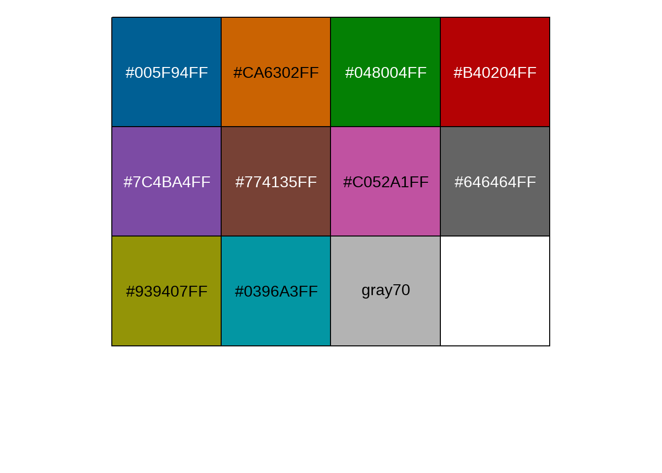
d2a %>%
  group_by(country_region) %>%
  filter(max(days_since_100) > 9) %>%
  mutate(
    end_label = ifelse(days_since_100 == max(days_since_100), country_region, NA_character_)
  ) %>%
  mutate(end_label = case_when(country_region %in% highlight_country ~ end_label,
                               TRUE ~ NA_character_),
         cgroup = case_when(country_region %in% highlight_country ~ country_region,
                            TRUE ~ "ZZOTHER")) %>% # length(highlight_country) + gray


  ggplot(aes(x = days_since_100, y = cases,
         color = cgroup, label = end_label,
         group = country_region)) +
  geom_line(size = 0.8) +
  geom_text_repel(nudge_x = 1.1,
                  nudge_y = 0.1,
                  segment.color = NA) +
  guides(color = FALSE) +
  scale_color_manual(values = cgroup_cols) +
  scale_y_continuous(labels = scales::comma_format(accuracy = 1),
                     breaks = 10^seq(2, 8),
                     trans = "log10"
                     ) +
  labs(x = "Days Since 100 Confirmed Death",
       y = "Cumulative Number of Deaths (log10 scale)",
       title = "Cumulative Number of Reported Deaths from COVID-19, Selected Countries",
    subtitle = "Cumulative number of cases, by Number of days since 100th case",
caption = "data source from @www.ft.com") 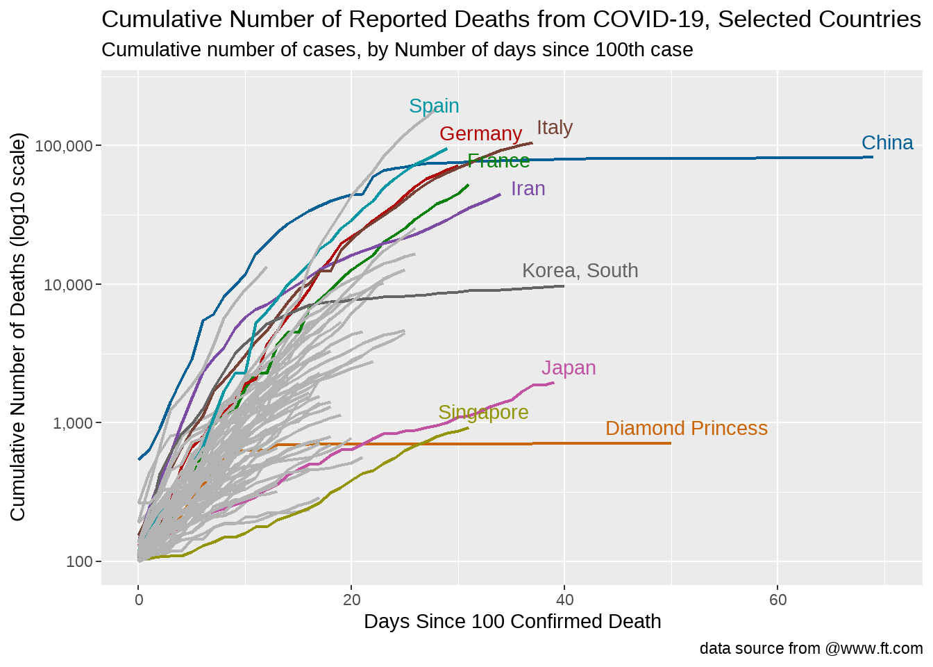
感觉这样是最好的方案。
80.6 每个国家的情况
## # A tibble: 1,060 × 4
## country_region date cases days_since_100
## <chr> <date> <dbl> <dbl>
## 1 Argentina 2020-03-20 128 0
## 2 Argentina 2020-03-21 158 1
## 3 Argentina 2020-03-22 266 2
## 4 Argentina 2020-03-23 301 3
## 5 Argentina 2020-03-24 387 4
## 6 Argentina 2020-03-25 387 5
## 7 Argentina 2020-03-26 502 6
## 8 Argentina 2020-03-27 589 7
## 9 Argentina 2020-03-28 690 8
## 10 Argentina 2020-03-29 745 9
## # ℹ 1,050 more rows
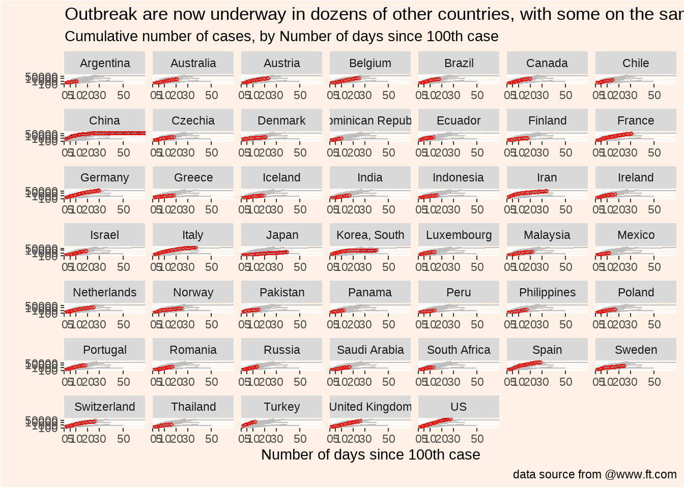
d2 %>%
  group_by(country_region) %>%
  filter(max(cases) >= 1000) %>%
ungroup() %>%
ggplot(aes(days_since_100, cases)) +
geom_line(size = 0.8) +
geom_line(
data = d2 %>% rename(country = country_region),
aes(days_since_100, cases, group = country),
color = "grey"
) +
geom_point(pch = 21, size = 1, color = "red") +
scale_y_log10(
expand = expansion(mult = c(0, .1)),
breaks = c(100, 1000, 10000, 50000)
) +
scale_x_continuous(
expand = expansion(mult = c(0, 0)),
breaks = c(0, 5, 10, 20, 30, 50)
) +
facet_wrap(vars(country_region), scales = "free_x") +
theme(
panel.background = element_rect(fill = "#FFF1E6"),
plot.background = element_rect(fill = "#FFF1E6")
) +
labs(
x = "Number of days since 100th case",
y = "",
title = "Outbreak are now underway in dozens of other countries, with some on the same trajectory as Italy",
subtitle = "Cumulative number of cases, by Number of days since 100th case",
caption = "data source from @www.ft.com"
)
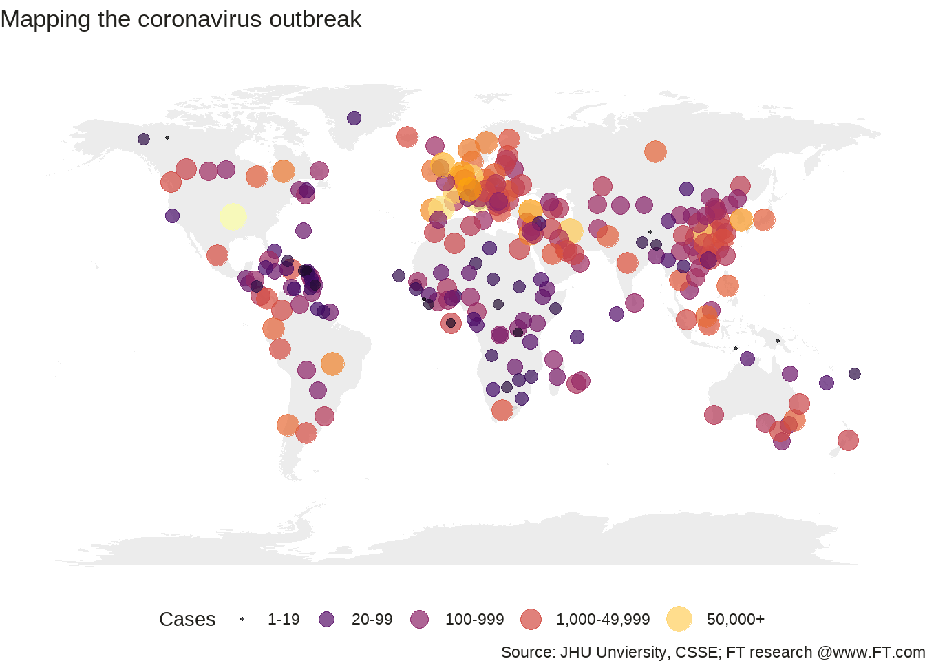
80.7 地图
library(countrycode)
# countrycode('Albania', 'country.name', 'iso3c')

d2_newest %>%
  mutate(ISO3 = countrycode(country_region,
    origin = "country.name", destination = "iso3c"
  ))
我们选取最新的日期
d_newest <- d %>%
  select(Long, Lat, last_col()) %>%
  set_names("Long", "Lat", "newest_date")
d_newest
## # A tibble: 256 × 3
## Long Lat newest_date
## <dbl> <dbl> <dbl>
## 1 65 33 174
## 2 20.2 41.2 243
## 3 1.66 28.0 716
## 4 1.52 42.5 376
## 5 17.9 -11.2 7
## 6 -61.8 17.1 7
## 7 -63.6 -38.4 1054
## 8 45.0 40.1 532
## 9 149. -35.5 80
## 10 151. -33.9 2032
## # ℹ 246 more rows
world <- map_data("world")


ggplot() +
  geom_polygon(
    data = world,
    aes(x = long, y = lat, group = group),
    fill = "grey", alpha = 0.3
  ) +
  geom_point(
    data = d_newest,
    aes(x = Long, y = Lat, size = newest_date, color = newest_date),
    stroke = F, alpha = 0.7
  ) +
  scale_size_continuous(
    name = "Cases", trans = "log",
    range = c(1, 7),
    breaks = c(1, 20, 100, 1000, 50000),
    labels = c("1-19", "20-99", "100-999", "1,000-49,999", "50,000+")
  ) +
  scale_color_viridis_c(
    option = "inferno",
    name = "Cases",
    trans = "log",
    breaks = c(1, 20, 100, 1000, 50000),
    labels = c("1-19", "20-99", "100-999", "1,000-49,999", "50,000+")
  ) +
  theme_void() +
  guides(colour = guide_legend()) +
  labs(
    title = "Mapping the coronavirus outbreak",
    subtitle = "",
    caption = "Source: JHU Unviersity, CSSE; FT research @www.FT.com"
  ) +
  theme(
    legend.position = "bottom",
    text = element_text(color = "#22211d"),
    plot.background = element_rect(fill = "#ffffff", color = NA),
    panel.background = element_rect(fill = "#ffffff", color = NA),
    legend.background = element_rect(fill = "#ffffff", color = NA)
  )