第 30 章 ggplot2之控制图例的外观
前面ggplot2章节,我们知道美学映射和相应的标度函数可以同时调整图形的效果和图例的外观。但有时候,我们只想改变图例的外形,并不想影响图形的效果。
本章首先介绍使用guide_legned()中的override.aes的缘由(让图例更具有可读性,或者构建某种组合图例的效果),然后给出三个应用场景。
30.1 使用override.aes的缘由
在画散点图的时候,我们可能会设置点的透明度和大小,比如alpha = 0.5和size = 1,这种方法在点的量很大的时候是比较有用的,但也会导致图例中的点比较淡和小,比如下图(这里点的数量不算多,只是为了演示如何修改图例而设定的参数)
penguins %>%
  ggplot(aes(x = bill_length_mm, y = bill_depth_mm, color = species)) +
  geom_point(alpha = .5, size = 1)
30.1.1 使用guides()函数
这个时候,为了强图例的可读性,可以让图例中点的变大以及减少透明度。guides() 函数提供了
scale name - guide 对方便用户修改,比如我们想修改color标度对应的图例,可以这样写
guide(color = guide_legend(override.aes = ____ )), 这里override.aes 可接受size、shape等美学参数,然后覆盖(override)默认的图例外观。
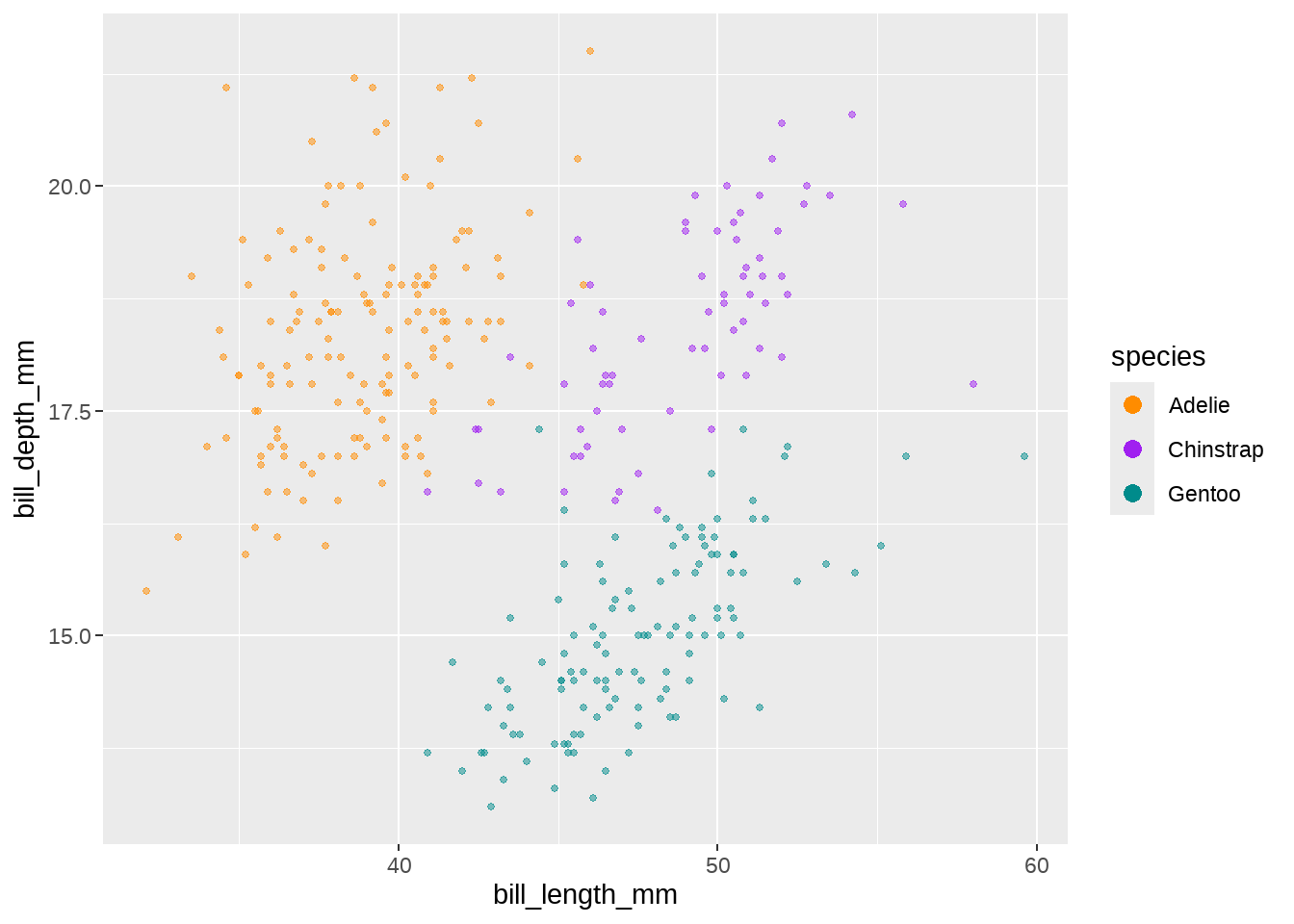
对刚才的图形,我们提供size = 3给 override.aes
guides(color = guide_legend(override.aes = list(size = 3) ) )
penguins %>%
  ggplot(aes(x = bill_length_mm, y = bill_depth_mm, color = species)) +
  geom_point(alpha = .5, size = 1) +
  guides(color = guide_legend(override.aes = list(size = 3)))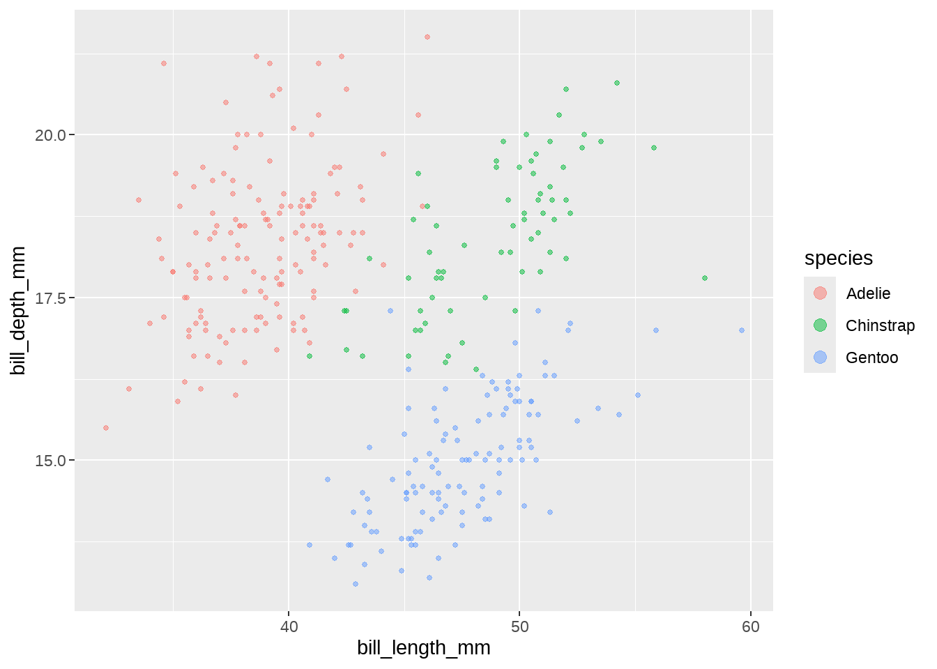
可以看到图例中的点,变大了。
30.1.2 使用scale_*()函数
R总是让一件事情,可以有好几种方法完成。上面的效果还可以在scale_*()函数里完成。比如,我们手动设置scale_color_manual()让三种企鹅分别有不同的颜色,然后把上面guide()里guide_legend()的代码复制过来
penguins %>%
  ggplot(aes(x = bill_length_mm, y = bill_depth_mm, color = species)) +
  geom_point(alpha = .5, size = 1) +
  scale_color_manual(
    breaks = c("Adelie", "Chinstrap", "Gentoo"),
    values = c("darkorange", "purple", "cyan4"),
    guide = guide_legend(override.aes = list(size = 3))
  )
30.1.3 调整多个美学参数
除了传递size到override.aes,还可以传递更多参数,装到list()里打包一起就行
penguins %>%
  ggplot(aes(x = bill_length_mm, y = bill_depth_mm, color = species)) +
  geom_point(alpha = .5, size = 1) +
  scale_color_manual(
    breaks = c("Adelie", "Chinstrap", "Gentoo"),
    values = c("darkorange", "purple", "cyan4"),
    guide = guide_legend(override.aes = list(size = 3, alpha = 1))
  )
30.2 压缩图例中一部分美学映射
override.aes还有一个用途是,删除图例中一部分美学映射。比如,这里有一个数据集points,points 的id变量有3个分组,
points <- tribble(
  ~x, ~y, ~id,
   5, 51, "a",
  10, 54, "a",
   7, 50, "a",
   9, 60, "a",
  86, 97, "b",
  46, 74, "b",
  22, 59, "b",
  94, 68, "b",
  21, 45, "c",
   6, 56, "c",
  24, 25, "c",
   3, 70, "c"
)
另一个数据集box,box数据框的id变量,有1个分组
box <- data.frame(
  left   = 1,
  right  = 10,
  bottom = 50,
  top    = 60,
  id     = "a"
)
box
## left right bottom top id
## 1 1 10 50 60 a先画个图看看,散点图层中有3个分组(“a”,“b” “c”),因此点是三种颜色;矩形图层只有1个分组,只有一个矩形框,它的边框是颜色与散点图层的”a”组颜色一致。同时看到,图例外观是边框中间加一个点。
points %>%
  ggplot(aes(color = id)) +
  geom_point(aes(x = x, y = y), size = 4) +
  geom_rect(
    data = box, aes(
      xmin = left,
      xmax = right,
      ymin = 50,
      ymax = top
    ),
    fill = NA, size = 1
  )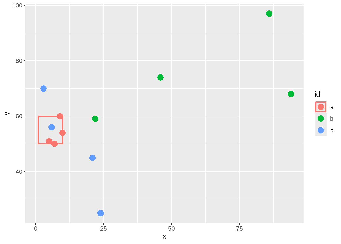
矩阵图层是没有”b”和”c”组的,因此,为了与图形中匹配,我需要删除图例中”b”和”c”组的边框。
因为图例中的边框是基于linetype的美学映射,那么要想移除图例的边框线条,可以在override.aes中设置参数line types = 0。具体方法是,这三组的line type构成一个向量linetype = c(__, __, __),然后让需要保留的第一组为 1,让需要移除的第二和第三组为 0
points %>%
  ggplot(aes(color = id)) +
  geom_point(aes(x = x, y = y), size = 4) +
  geom_rect(
    data = box, aes(
      xmin = left,
      xmax = right,
      ymin = 50,
      ymax = top
    ),
    fill = NA, size = 1
  ) +
  guides(color = guide_legend(override.aes = list(linetype = c(1, 0, 0))))
30.3 组合两个图层的图例
我们经常在画了散点图后会增加一个拟合曲线,
penguins %>%
  ggplot(aes(x = bill_length_mm, y = bill_depth_mm, color = factor(species))) +
  geom_point(size  = 3) +
  geom_smooth(method = "lm", se = FALSE)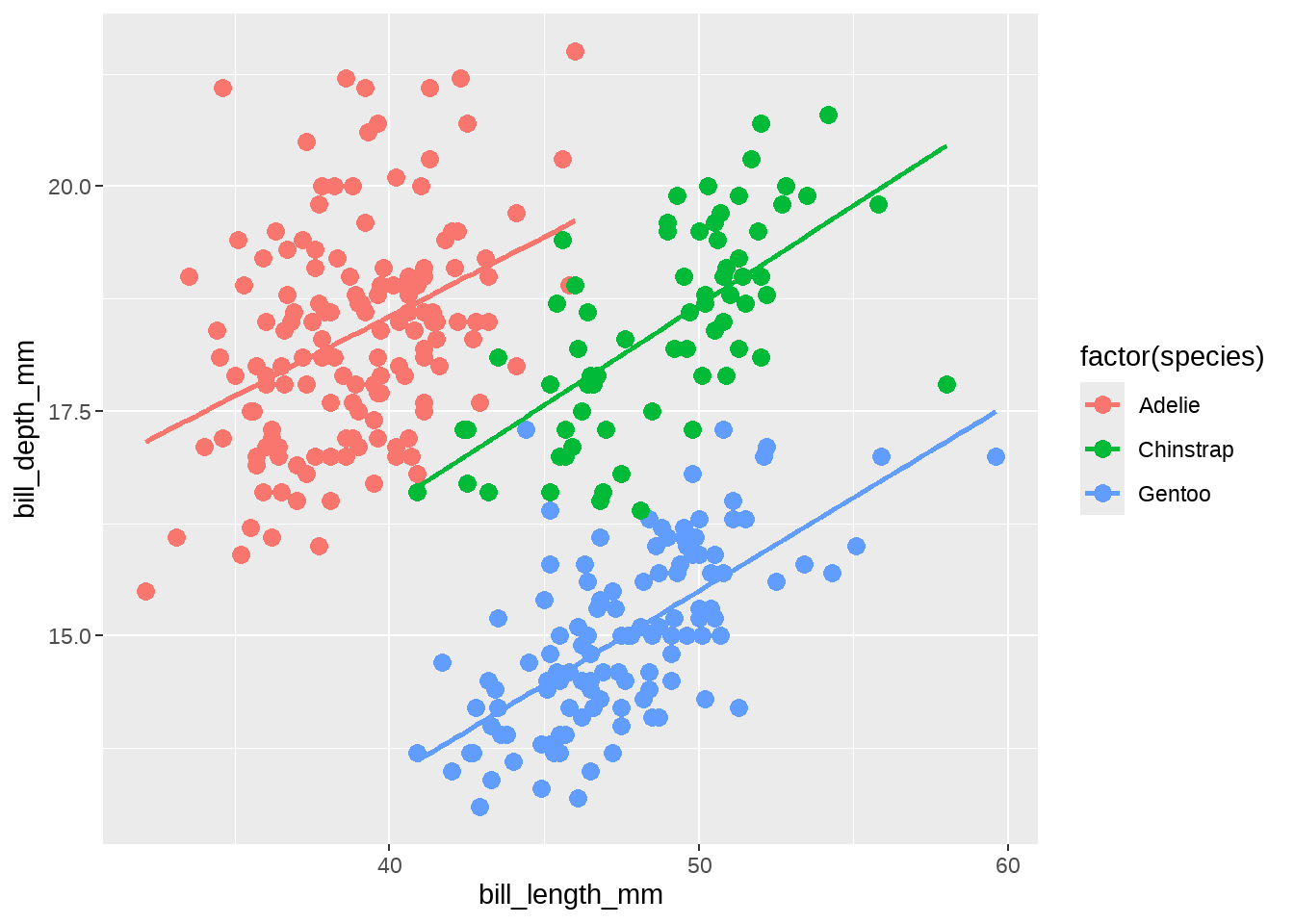
但为了把图中的信息说明地更清楚点,比如哪些是原始观测值,哪些是拟合直线,就需要增加一个图例。
具体思路,是把一个都没用的美学属性映射成常数,这样会形成一个新的图例,然后再修改这个图例,把图例中的符号弄成想要的。
接下来,我们演示选取两个图层共有的一个美学参数(不是真正使用它),然后映射到一个新图例,最后为这个新的图例赋予清晰的图例符号。
30.3.1 借鸡下蛋
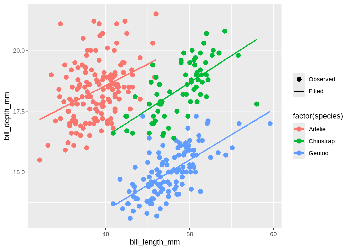
我这里保留上图中color的图例,同时增加第二个图例,目的是指明图中的“点”是观测值, “线条”是拟合值。
当我们增加一个额外的图例的时候,我们会借用图层中没有使用的美学元素,比如透明度alpha,但我们的本意不是用 alpha 影响图形外观,而是在后面会添加scale_alpha_manual()语句,并让values = c(1, 1),两组都为1,也就说并不增加每个图层的透明度,随后可以删除图例名(legend name ),并设置breaks的顺序,让图例中 Observed 组为顺序第一个。
penguins %>%
  ggplot(aes(x = bill_length_mm, y = bill_depth_mm, color = factor(species))) +
  geom_point(aes(alpha = "Observed"), size = 3) +
  geom_smooth(method = "lm", se = FALSE, aes(alpha = "Fitted")) +
  scale_alpha_manual(
    name = NULL,
    values = c(1, 1),
    breaks = c("Observed", "Fitted")
  )
30.3.2 赋予新的图例符号
我们现在有了一个新的图例了,但是发现在这个新图例中仍然是点线的符号,因此,我们需要采用上一节的方法,重写当前的图例符号,让 Observed 只有点的符号,而 Fitted 只有线条符号
penguins %>%
  ggplot(aes(x = bill_length_mm, y = bill_depth_mm, color = factor(species))) +
  geom_point(aes(alpha = "Observed"), size = 3) +
  geom_smooth(method = "lm", se = FALSE, aes(alpha = "Fitted")) +
  scale_alpha_manual(
    name = NULL,
    values = c(1, 1),
    breaks = c("Observed", "Fitted")
  ) +
  guides(alpha = guide_legend(override.aes = list(
    linetype = c(0, 1),  # 0无线条; 1有线条
    shape = c(16, NA),   # 16点的形状; NA没有点
    color = "black"
  )))
当然也可以写在scale_alpha_*()里
penguins %>%
  ggplot(aes(x = bill_length_mm, y = bill_depth_mm, color = factor(species))) +
  geom_point(aes(alpha = "Observed"), size = 3) +
  geom_smooth(method = "lm", se = FALSE, aes(alpha = "Fitted")) +
  scale_alpha_manual(
    name = NULL,
    values = c(1, 1),
    breaks = c("Observed", "Fitted"),
    guide = guide_legend(override.aes = list(linetype = c(0, 1),
                                             shape = c(16, NA),
                                             color = "black"))
  )
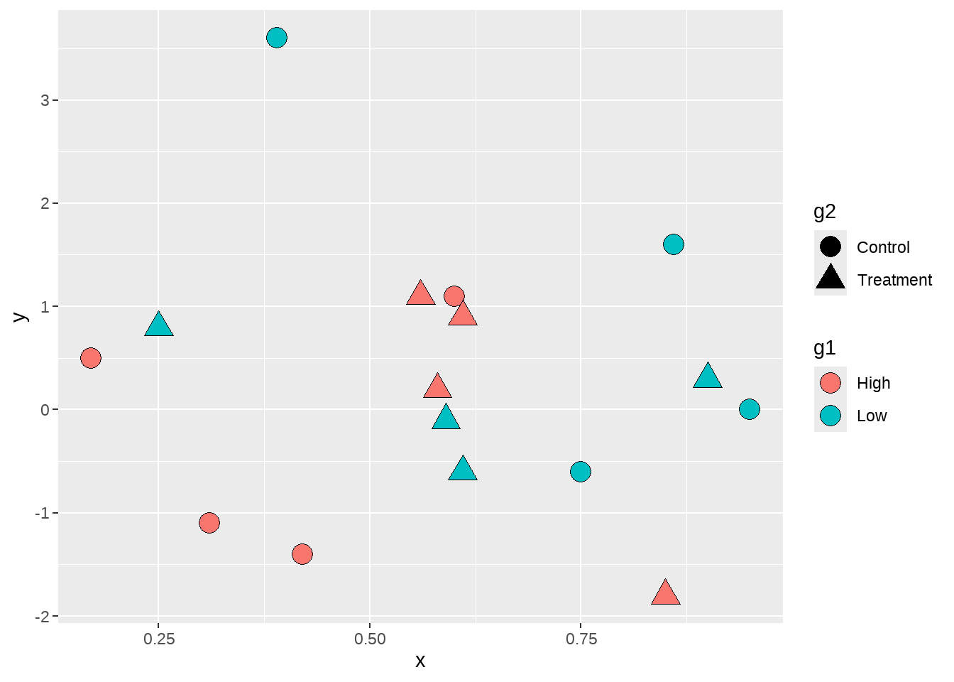
30.4 控制多个图例的外观
最后一个例子,是控制多个图例的外观,刚开始可能有点难以理解。
dat <- tibble::tribble(
        ~g1,         ~g2,   ~x,   ~y,
     "High",   "Control", 0.42, -1.4,
      "Low",   "Control", 0.39,  3.6,
     "High", "Treatment", 0.56,  1.1,
      "Low", "Treatment", 0.59, -0.1,
     "High",   "Control", 0.17,  0.5,
      "Low",   "Control", 0.95,    0,
     "High", "Treatment", 0.85, -1.8,
      "Low", "Treatment", 0.25,  0.8,
     "High",   "Control", 0.31, -1.1,
      "Low",   "Control", 0.75, -0.6,
     "High", "Treatment", 0.58,  0.2,
      "Low", "Treatment",  0.9,  0.3,
     "High",   "Control",  0.6,  1.1,
      "Low",   "Control", 0.86,  1.6,
     "High", "Treatment", 0.61,  0.9,
      "Low", "Treatment", 0.61, -0.6
     )
下面画出了散点图,两个分类变量g1和g2分别映射到 fill 和 shape
dat %>%
  ggplot(aes(x = x, y = y, fill = g1, shape = g2) ) +
  geom_point(size = 5)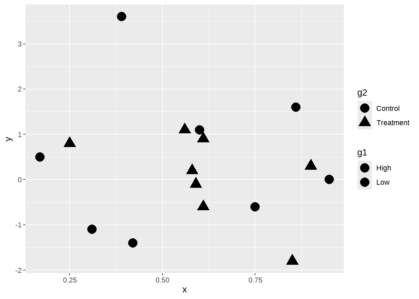
但是,我们看到图中点并没有填充颜色,这是是因为默认的点的形状是不可填充颜色的,因此,我们使用scale_shape_manual()修改点的类型。
dat %>%
  ggplot(aes(x = x, y = y, fill = g1, shape = g2) ) +
  geom_point(size = 5) +
  scale_shape_manual(values = c(21, 24) )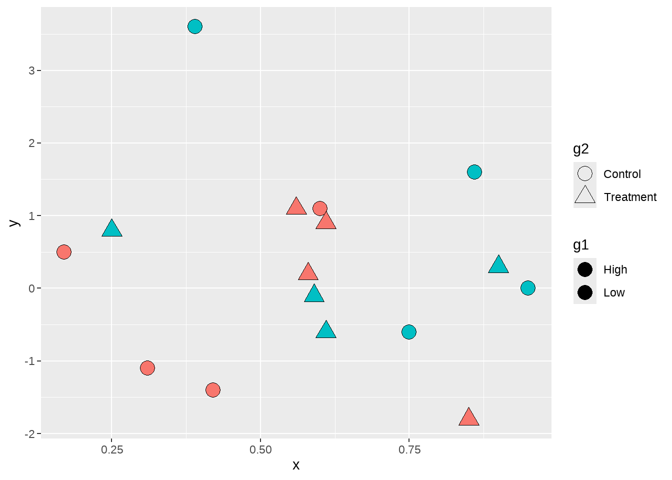
现在图中的点有了填充色,但图例 g1中没有显示每组的填充色,原因还是在于图例默认的形状也是不可填充颜色的形状。因此,我们还需要修改图例中的点的类型,让它变成可填充颜色的类型。方法同上节,在guides() 图层中使用 scale name-guide 对,然后把点的shape传递给override.aes。
dat %>%
  ggplot(aes(x = x, y = y, fill = g1, shape = g2) ) +
  geom_point(size = 5) +
  scale_shape_manual(values = c(21, 24) ) +
  guides(fill = guide_legend(override.aes = list(shape = 21)))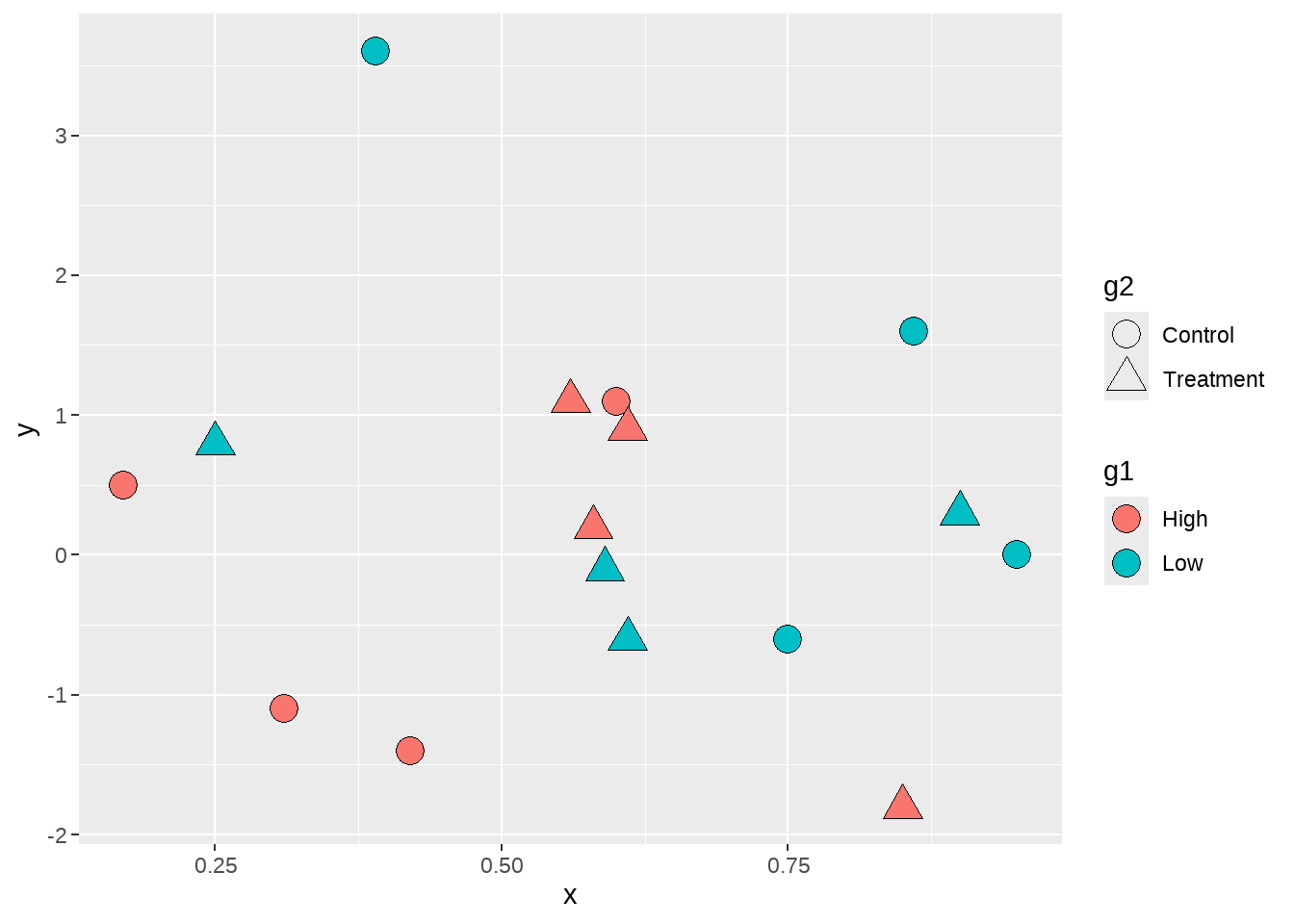
最后,为了更加美观,还可以修改shape图例g2的填充色为黑色。
dat %>%
  ggplot(aes(x = x, y = y, fill = g1, shape = g2) ) +
  geom_point(size = 5) +
  scale_shape_manual(values = c(21, 24) ) +
  guides(fill = guide_legend(override.aes = list(shape = 21) ),
         shape = guide_legend(override.aes = list(fill = "black") ) )